Ever wondered why some Shopify stores convert visitors like magic while others struggle to make a single sale? The secret often lies in one critical element: optimized landing pages.
Are your landing pages working as hard as you are? If you’re pouring money into ads but not seeing the sales you deserve, this guide is your rescue boat in a sea of missed opportunities.
By the time you finish reading, you’ll know exactly how to create landing pages that don’t just look pretty—they convert. You’ll learn the psychology behind high-converting pages, discover step-by-step methods to build them, and master the techniques that turn curious visitors into paying customers.
Ready to transform your Shopify store’s performance? Let’s dive in!
Introduction to Shopify Landing Page Optimization
Before we jump into the how-to, let’s make sure we’re on the same page about what landing pages actually are and why they matter so much for your Shopify store.
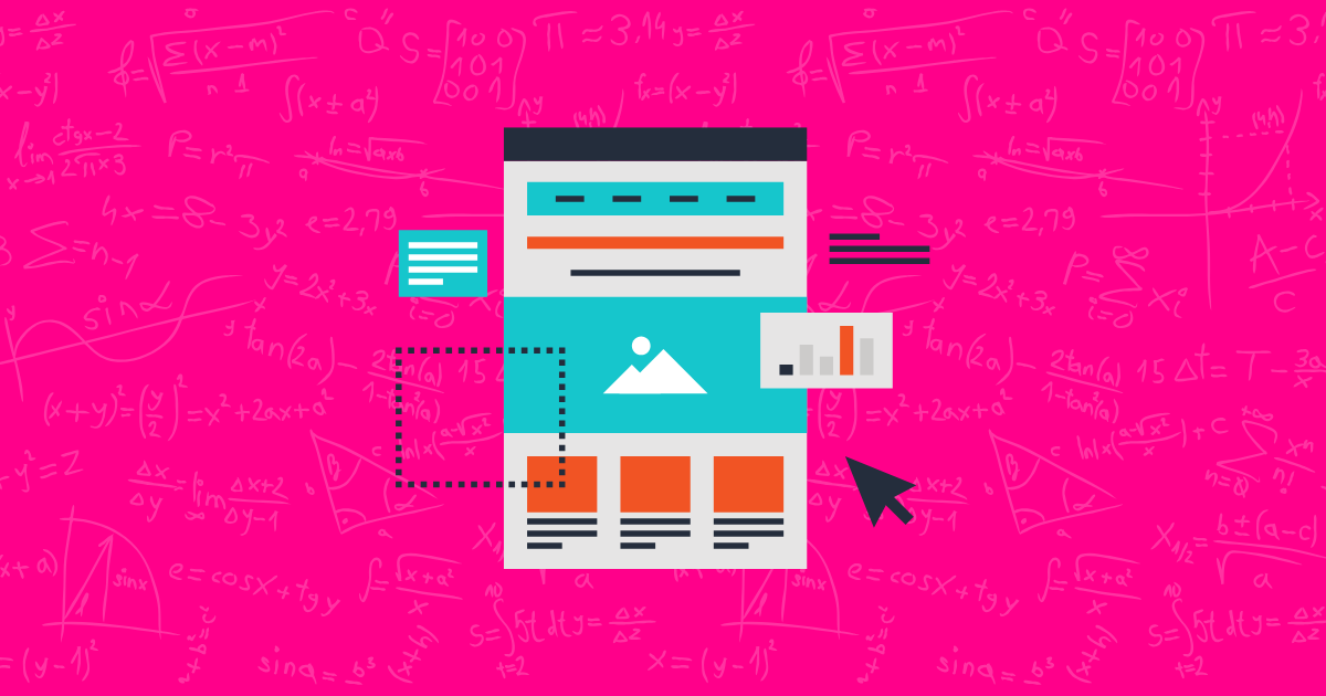
A landing page is a standalone web page designed with a single focus: converting visitors into customers. Unlike regular store pages that offer multiple navigation options and purposes, landing pages have one job—getting visitors to take a specific action, whether that’s making a purchase, signing up for a newsletter, or downloading a resource.
Here’s why landing pages are absolute game-changers for e-commerce:
- They drive focused action – Without the distractions of navigation menus and related products, visitors are more likely to complete your desired action
- They boost conversion rates – Studies show that optimized landing pages can increase conversion rates by up to 200-300% compared to standard store pages
- They improve ad performance – When ads lead to targeted landing pages (instead of your homepage), your marketing spend works harder
- They create personalized experiences – Different traffic sources can lead to different landing pages tailored to specific customer segments
Consider this eye-opening stat: According to recent e-commerce studies, businesses using optimized landing pages see an average of 30% higher conversion rates than those sending traffic to general pages. That’s the difference between a 2% and a 2.6% conversion rate—which can mean thousands in additional revenue each month!
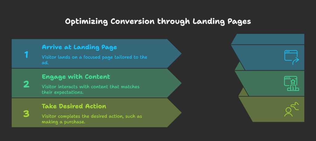
The psychology behind this is simple: When a visitor clicks an ad for a specific product or offer, they want to see exactly that—not your entire catalog. Landing pages create a seamless experience that matches their expectations and reduces the mental effort needed to take action.
Now that we understand why landing pages are so powerful, let’s explore what makes them tick in the minds of your customers. After all, to create pages that convert, we first need to understand how your visitors think!
Understanding Landing Page Psychology
Want to know the real secret to creating landing pages that convert? It’s not about flashy designs or clever copy alone—it’s about understanding what makes your customers tick. Let’s dive into the psychology that drives successful landing pages.
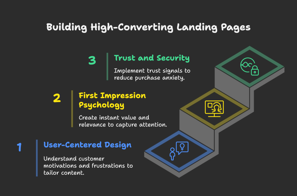
User-Centered Design Approach
The foundation of every high-converting landing page is thinking like your customer. This means:
- Understanding motivations – What problem is your visitor trying to solve? What desire are they looking to fulfill?
- Recognizing frustrations – What obstacles have they faced? What’s prevented them from solving their problem until now?
- Speaking their language – Use the words and phrases your customers use, not industry jargon
The best way to gather this insight is through customer research. Try:
- Surveying existing customers about why they purchased
- Reading reviews of your products (and competitors’) to spot common themes
- Analyzing support questions to identify confusion points
- Creating buyer personas for different customer segments
With this understanding, you can tailor your landing page content to speak directly to specific customer segments, addressing their unique concerns and desires.
First Impression Psychology
Did you know visitors form an opinion about your website in just 0.05 seconds? That’s faster than you can say “Shopify!” This split-second judgment affects everything that follows.
To make those crucial first moments count:
- Communicate value instantly – Your headline and hero image should immediately show what’s in it for them
- Create visual appeal – Clean design, appropriate colors, and professional imagery signal quality and trustworthiness
- Ensure relevance – Visitors should immediately see that they’ve landed in the right place based on what they were looking for
Remember, first impressions are about emotion more than logic. The feeling a visitor gets when landing on your page sets the tone for their entire experience.
Trust and Security Perception
Even the most compelling offer won’t convert if visitors don’t trust your store. Trust signals are critical elements that reduce purchase anxiety:
- Reviews and testimonials – Real feedback from real customers is the #1 trust builder
- Trust badges – Security seals, payment logos, and industry certifications
- Money-back guarantees – Reducing risk makes purchasing feel safer
- Clear policies – Easy-to-find information on shipping, returns, and privacy
Design consistency also plays a huge role in trust. When your landing page looks consistent with the ad that led visitors there, it creates a seamless experience that feels reliable and professional.
Now that we understand the psychological foundations of effective landing pages, it’s time to put this knowledge into action with a strategic approach. Ready to plan landing pages that speak directly to your visitors’ needs and desires? Let’s get strategic!
Planning Your Shopify Landing Page Strategy
A great landing page doesn’t happen by accident. It’s the result of careful planning and strategic thinking. Let’s build the roadmap for your landing page success.
Defining Clear Goals
Every effective landing page starts with a specific, measurable goal. What exactly do you want visitors to do?
- Make a purchase – Direct sale of a product or service
- Join your email list – Lead generation for nurturing campaigns
- Sign up for a free trial – First step in a longer conversion journey
- Register for an event – Webinar, workshop, or product launch
Your goal should be SMART: Specific, Measurable, Achievable, Relevant, and Time-bound. For example, instead of “get more sales,” aim for “increase conversion rate of winter collection products by 15% by December 31st.”
This clear goal will influence every design decision, from layout to copy to call-to-action buttons. It also gives you a concrete way to measure success.
Audience Research
The more you know about your target audience, the more effective your landing page will be. Dig deep into:
- Demographics – Age, location, income level, family status
- Psychographics – Values, interests, lifestyle, shopping habits
- Pain points – Problems they’re trying to solve, frustrations they face
- Objections – Concerns that might prevent them from buying
Different audience segments may need different landing pages. For example, a first-time visitor needs more educational content and trust-building elements than a returning customer who’s already familiar with your brand.
Use this research to create content that speaks directly to each segment’s specific needs and expectations.
Campaign Alignment
Your landing page should feel like a natural continuation of the ad or link that led visitors there. This alignment creates a seamless experience and fulfills the promise that got them to click in the first place.
For strong campaign alignment:
- Match visual elements – Use similar colors, images, and design styles from your ads
- Echo the headline – Your landing page headline should reflect the message in your ad
- Deliver on promises – If your ad mentioned a special offer, make it prominently visible on the landing page
- Maintain tone and voice – The writing style should be consistent from ad to landing page
Consider creating specific landing pages for different traffic sources. A visitor from Instagram might respond to different messaging than someone who clicked through from a Google search.
Now that we’ve laid the strategic groundwork, let’s get practical. How exactly do you create these landing pages in Shopify? You’ve got several options, and we’re about to explore each one. Ready to get your hands dirty with some real Shopify techniques? Let’s build something amazing!
Methods for Creating Shopify Landing Pages
Now comes the exciting part—actually creating your landing pages! Shopify offers several approaches, each with its own pros and cons. Let’s find the right method for your needs and skills.
Native Shopify Page Creation
The simplest way to create a landing page is using Shopify’s built-in page creation tools:
- Go to Online Store → Pages in your Shopify admin
- Click Add page
- Enter your page title and content
- Select a template from your theme’s options
- Click Save
Pros:
- No additional apps or costs
- Simple to implement
- Works within your existing theme
Cons:
- Limited customization options
- Typically includes navigation and footer (potential distractions)
- Fewer conversion-focused features
This approach works best for simple landing pages that don’t require advanced functionality or when you’re just getting started with landing page testing.
Custom Development with Liquid
For more control and customization, you can create custom page templates using Shopify’s Liquid templating language:
- Go to Online Store → Themes → Actions → Edit code
- Create a new template in the Templates folder (e.g.,
page.landing.liquid) - Write custom HTML/CSS and Liquid code for your landing page
- Create a new page and select your custom template
Pros:
- Complete creative control
- Can remove navigation, footer, and other distractions
- Full access to all Shopify’s functionality
Cons:
- Requires coding knowledge (HTML, CSS, Liquid)
- More time-consuming to create and test
- Changes to theme can affect your landing pages
This method is ideal if you have development resources and need highly customized landing pages that integrate seamlessly with your Shopify store.
Third-Party Landing Page Builders
For the best balance of ease and power, consider using specialized landing page apps from the Shopify App Store:
- Instant – Drag-and-drop builder with conversion-focused templates
- Replo – Advanced page builder with A/B testing capabilities
- PageFly – Feature-rich page builder with extensive element library
- GemPages – Powerful visual editor with responsive design controls
Pros:
- User-friendly drag-and-drop interfaces
- Pre-designed conversion-optimized templates
- Built-in elements like timers, popups, and custom forms
- Often include A/B testing tools
Cons:
- Monthly subscription costs
- Potential performance impact if not optimized properly
- Another tool to learn and manage
Landing page builders are ideal for most store owners who want professional results without coding knowledge. When choosing an app, consider factors like ease of use, template quality, feature set, and price.
Now that you know how to create your landing page, let’s focus on what to include on it. What elements separate high-converting pages from those that flop? Let’s discover the essential components that turn visitors into customers!
Essential Elements of High-Converting Landing Pages
The difference between an average landing page and one that converts like crazy often comes down to a few key elements. Let’s explore the building blocks of high-performance landing pages.
Compelling Headlines and Copy
Your words are the backbone of your landing page. They need to grab attention, communicate value, and drive action:
- Primary headline – Clear, benefit-focused, and aligned with your visitors’ intent (what they clicked on to get here)
- Supporting headline – Expands on the primary headline, adding context or addressing a key pain point
- Body copy – Concise, scannable text that focuses on benefits rather than features
- Call to action (CTA) – Action-oriented button text that clearly states what happens next
When writing your copy:
- Focus on “you” language that speaks directly to the visitor
- Highlight the transformation your product provides (“From… to…”)
- Use bullet points for easy scanning
- Include specific, concrete details rather than vague claims
For your CTA, use active verbs that create urgency or excitement. “Get My Free Guide” works better than “Submit” or “Click Here.”
Visual Elements and Imagery
Humans are visual creatures, processing images 60,000 times faster than text. Make those visuals count:
- Hero image – A high-quality visual that shows your product in use or illustrates the key benefit
- Product photography – Clear, professional images showing your product from multiple angles
- Lifestyle imagery – Photos showing people enjoying the benefits of your product
- Videos – Product demonstrations, testimonials, or explainer videos (can increase conversions by up to 80%)
For maximum impact:
- Use authentic imagery over generic stock photos whenever possible
- Ensure images are high-quality but optimized for fast loading
- Add directional cues that guide eyes toward your CTA
- Test different visual approaches to see what resonates with your audience
Social Proof and Trust Indicators
Nothing persuades quite like seeing others have already taken the leap. Build trust with:
- Customer reviews – Real feedback from verified buyers
- Testimonials – Focused stories of customer transformation
- User statistics – Numbers of satisfied customers or products sold
- Media mentions – Logos of publications that have featured your brand
- Trust badges – Security seals, payment method icons, guarantees
For maximum credibility:
- Include customer photos alongside testimonials when possible
- Feature specific, detailed reviews rather than vague praise
- Position trust elements near points of friction (like checkout buttons)
- Highlight guarantees that reduce purchase risk
Mobile Responsiveness
With over 60% of online shopping now happening on mobile devices, your landing page must perform flawlessly on small screens:
- Touch-friendly buttons – Large enough (at least 44×44 pixels) for easy tapping
- Streamlined content – Even more concise and focused than desktop version
- Properly sized text – No squinting required (16px minimum for body text)
- Simplified forms – Fewer fields and mobile-optimized keyboards
Always test your landing page on multiple devices before launch. What looks perfect on your desktop might be frustrating on a smartphone.
Now that we’ve covered the essential building blocks, let’s put it all together into a systematic process. How do you take these elements from concept to launch and beyond? Let’s explore the step-by-step optimization journey!
Step-by-Step Optimization Process
Creating a high-converting landing page isn’t a one-and-done task—it’s an ongoing process of refinement. Let’s walk through the complete optimization journey, from planning to continuous improvement.
Pre-Launch Optimization
Before your landing page goes live, take these critical steps:
- Define your goal and KPIs – What specific action do you want visitors to take? How will you measure success?
- Research your audience – Understand their needs, pain points, and language
- Create a wireframe – Sketch the layout and content hierarchy
- Write compelling copy – Focus on benefits, not features
- Gather/create visual assets – Product photos, lifestyle images, logos, trust badges
- Build the page – Using one of the methods we covered earlier
- Set up tracking – Ensure analytics and conversion tracking are properly configured
- Conduct pre-launch testing – Check functionality across devices and browsers
Use a pre-launch checklist to ensure you haven’t missed any critical elements:
- Is the page goal clear?
- Does the headline match visitor intent?
- Is the value proposition obvious?
- Are all links and buttons working?
- Is the page loading quickly?
- Is the mobile experience seamless?
Launch and Initial Analysis
Once your page is live, the real learning begins:
- Soft launch – Begin with a small percentage of your traffic to identify any issues
- Collect baseline data – Gather at least 100-200 visitors before making judgments
- Analyze key metrics:
- Conversion rate
- Bounce rate
- Time on page
- Scroll depth
- Click-through rates on CTAs
- Identify trouble spots – Where are visitors dropping off or hesitating?
- Gather qualitative feedback – Ask early visitors for their impressions
Don’t be discouraged if your initial results aren’t perfect. The first version of your landing page is just the beginning of an iterative process.
Ongoing Optimization
This is where the magic happens—turning good landing pages into great ones:
- Develop testing hypotheses – Based on data, form theories about what could improve performance
- Create variations – Change one element at a time (headline, image, CTA, etc.)
- Run A/B tests – Split traffic between original and variation
- Analyze results – Wait for statistical significance before declaring a winner
- Implement winning changes – Update your page with proven improvements
- Repeat the process – Continue testing new elements
Remember that optimization is never complete. Even high-performing pages can be improved, and consumer preferences change over time. Schedule regular reviews of your landing pages to ensure they remain effective.
Speaking of optimization, one area deserves special attention—what visitors see immediately when they land on your page. Let’s explore the critical “above the fold” section that can make or break your conversion rate!
Above-the-Fold Optimization Techniques
The “fold” refers to the content visible without scrolling when a visitor first lands on your page. This prime real estate creates your first impression and determines whether visitors will stick around to learn more. Let’s optimize this crucial section.
Critical Above-Fold Elements
Your above-the-fold content must communicate value instantly and entice visitors to explore further:
- Primary headline – Clear value proposition that speaks to visitor needs
- Supporting subheadline – Expands on the main benefit
- Hero image or video – Visual representation of your offer
- Primary CTA button – Clear next step for visitors ready to convert
- Trust indicators – Quick proof points to establish credibility
The key is prioritization. With limited space, include only the most persuasive elements that directly support your conversion goal.
Remember that “the fold” varies across devices. What’s visible on a desktop might require scrolling on mobile. Design with the smallest screen in mind first, then enhance for larger displays.
Headline and CTA Optimization
These two elements work together as the “power couple” of your above-fold content:
Headline strategies that work:
- Problem-solving format – “Never Deal With [Pain Point] Again”
- Benefit-focused – “Achieve [Desired Outcome] in Just [Timeframe]”
- Question format – “Want to [Benefit] Without [Common Obstacle]?”
- Social proof inclusion – “Join 10,000+ Customers Who [Benefit]”
CTA button optimization:
- Use first-person language – “Get My Free Guide” vs. “Get Your Free Guide”
- Create contrast – Button color should stand out from surrounding elements
- Add urgency – “Start My Free Trial Now” vs. just “Start Free Trial”
- Reduce risk – Include “No Credit Card Required” or similar reassurance nearby
- Keep it action-oriented – Begin with verbs that drive action
Test different combinations of headlines and CTAs to find what resonates best with your specific audience.
Visual Focus Techniques
Guide your visitors’ eyes to the most important elements using these visual techniques:
- Directional cues – Arrows, human gaze, or pointing elements that lead to your CTA
- White space – Strategic empty space that creates focus on key elements
- Color psychology – Use contrasting colors to highlight important areas
- Visual hierarchy – Size and position elements according to their importance
- Z-pattern layout – Arrange content to follow natural eye movement (for text-heavy pages)
- F-pattern layout – Optimize for quick scanning (for image-focused pages)
The goal is to create a visual path that naturally leads visitors from your headline to your offer details to your CTA, with minimal distractions along the way.
While compelling content above the fold is essential, even the most persuasive messaging won’t convert if your page loads too slowly. Let’s tackle the technical side of optimization to ensure your landing page performs at lightning speed!
Optimizing Page Speed and Performance
Speed matters—a lot. Studies show that 47% of customers expect a web page to load in 2 seconds or less, and 40% will abandon a site that takes more than 3 seconds to load. Let’s make sure your landing page doesn’t lose sales due to slow performance.
Speed Impact on Conversions
Understanding the real business impact of speed can help prioritize these optimizations:
- Every 1-second delay in page response can result in a 7% reduction in conversions
- Pages that load within 2 seconds have an average bounce rate of 9%, while pages that take 5 seconds to load have bounce rates around 38%
- Mobile users are even more impatient, with 53% abandoning sites that take longer than 3 seconds to load
Speed isn’t just about user experience—it’s directly tied to your bottom line. A faster page means more conversions, period.
Image and Asset Optimization
Images and other media typically account for over 75% of a page’s weight. Optimize them with these techniques:
- Compress images – Use tools like TinyPNG or Shopify’s built-in image optimization
- Choose the right format – JPG for photos, PNG for graphics with transparency, WebP when supported
- Specify dimensions – Always include width and height attributes to prevent layout shifts
- Implement lazy loading – Load images only as they enter the viewport
- Use responsive images – Serve different image sizes based on device screen size
For videos:
- Host on external platforms (YouTube, Vimeo) and embed rather than self-hosting
- Set videos to not autoplay unless critical to your message
- Include a compelling thumbnail that encourages clicks
Technical Performance Factors
Beyond images, these technical optimizations can dramatically improve loading times:
- Minimize HTTP requests – Combine CSS and JavaScript files where possible
- Enable browser caching – Store static resources locally in visitors’ browsers
- Reduce server response time – Use a high-quality hosting provider
- Implement a CDN – Content Delivery Networks serve assets from locations closer to your visitors
- Minify code – Remove unnecessary characters from your HTML, CSS, and JavaScript
- Prioritize critical rendering path – Load above-the-fold content first
Tools to help you measure and improve performance:
- Google PageSpeed Insights
- Shopify’s Online Store Speed Report
- GTmetrix
- WebPageTest
A fast-loading page creates a strong foundation, but the real optimization magic happens when you start testing different elements to see what works best for your specific audience. Let’s explore the world of A/B testing!
A/B Testing Methodology
The most successful e-commerce brands don’t rely on guesswork—they test, measure, and optimize based on real data. A/B testing (sometimes called split testing) is the scientific approach to landing page optimization. Let’s master this essential skill.
Test Planning and Hypotheses
Effective testing starts with a structured approach and clear hypotheses:
- Analyze existing data – Review your analytics to identify potential problem areas (high bounce rates, abandonment points, etc.)
- Form a hypothesis – Create a specific, testable statement about what you think will improve performance
- Define success metrics – Decide exactly how you’ll measure whether your change was successful
- Prioritize tests – Focus on changes that have the highest potential impact with the least effort
A good hypothesis follows this format: “If we change [element], then [metric] will improve by [amount] because [reasoning].”
For example: “If we change our product image from a plain white background to a lifestyle photo showing the product in use, then our conversion rate will improve by at least 5% because visitors will better visualize the benefits of owning the product.”
Elements to Test First
Some elements have a bigger impact on conversions than others. Start with these high-impact areas:
- Headlines – Test different value propositions, formats, and lengths
- CTAs – Experiment with button text, color, size, and placement
- Hero images – Test product-only vs. lifestyle images, different angles, or people vs. no people
- Pricing presentation – Test different ways of displaying prices, discounts, and payment options
- Social proof – Test different types, placements, and amounts of testimonials or reviews
- Form fields – Test number of fields, order, and required vs. optional fields
Important: Test only one element at a time. If you change multiple things simultaneously, you won’t know which change caused the difference in performance.
Test Analysis and Implementation
Once your test is running, follow these steps to analyze results and implement changes:
- Collect sufficient data – Wait until you have enough traffic for statistical significance (usually 100+ conversions per variation)
- Check for external factors – Be aware of sales, holidays, or other events that might skew results
- Analyze beyond the primary metric – Look at secondary metrics to understand the full impact
- Document learnings – Create a “test library” to track what you’ve learned, even from failed tests
- Implement winners – Update your landing page with the winning variation
- Plan your next test – Use insights from the current test to inform your next hypothesis
Remember that testing is an ongoing process, not a one-time event. The most successful brands are constantly testing and refining their pages.
Now that we understand how to properly test and optimize, let’s look at some common mistakes to avoid. Learning what not to do can be just as valuable as knowing what to do!
Common Landing Page Mistakes to Avoid
Even experienced marketers make these mistakes. Being aware of these common pitfalls can help you avoid them and create more effective landing pages from the start.
Design and Usability Errors
These mistakes create friction and frustration for your visitors:
- Cluttered layout – Too many elements competing for attention
- Poor mobile experience – Tiny buttons, horizontal scrolling, or cut-off content
- Slow loading times – Heavy images or unnecessary scripts
- Distracting navigation – Full menus that lead visitors away from your offer
- Inconsistent design – Mismatched colors, fonts, or styles that feel unprofessional
- Unclear next steps – Hidden or confusing call-to-action buttons
- Form friction – Asking for too much information too soon
The fix: Focus on simplicity and clarity. Every element should serve your primary conversion goal.
Content and Messaging Issues
These mistakes weaken your persuasive power:
- Focusing on features over benefits – Talking about what your product does rather than how it improves customers’ lives
- Vague value propositions – Generic statements that could apply to any product
- Industry jargon – Using technical terms your customers don’t understand
- Message mismatch – Landing page content that doesn’t align with your ads or emails
- Forgetting to address objections – Not answering common concerns or questions
- Weak calls to action – Unclear or uninspiring button text
- Missing social proof – No evidence that others have successfully used your product
The fix: Write from the customer’s perspective, focusing on their needs and desires rather than your product’s specifications.
Technical and Performance Problems
These mistakes can undermine even the best content and design:
- No tracking setup – Unable to measure performance or gather insights
- Poor SEO fundamentals – Missing title tags, meta descriptions, or header structure
- Broken functionality – Forms that don’t submit, buttons that don’t work, or links that lead nowhere
- Security concerns – Missing SSL certificate or security indicators
- Cross-browser issues – Page looks or functions differently across browsers
- Not testing thoroughly – Launching without checking functionality across devices
- Ignoring load times – Not optimizing images and code for speed
The fix: Implement proper tracking, test thoroughly across devices and browsers, and prioritize technical performance.
Learning from others’ successes can be just as valuable as avoiding their mistakes. Let’s explore some real-world examples of high-converting Shopify landing pages to inspire your own!
Successful Shopify Landing Page Examples
Studying successful landing pages can provide valuable insights and inspiration. Let’s analyze some top-performing Shopify landing pages and what makes them work.
Case Study Analysis
Case Study 1: Beardbrand
Beardbrand’s product-specific landing pages excel because they:
- Lead with clear, benefit-focused headlines that speak directly to their target customer’s desires
- Use high-quality lifestyle photography showing real people using their products
- Include detailed, authentic reviews from verified customers
- Address common objections with comprehensive FAQs
- Use concise, conversational copy that matches their brand voice
Case Study 2: Pretty Litter
Pretty Litter’s subscription landing pages convert well because they:
- Highlight their unique value proposition immediately (health-monitoring cat litter)
- Use problem-solution formatting to address specific pain points
- Include strong visual demonstrations of how the product works
- Feature prominently displayed trust badges and money-back guarantee
- Create urgency with limited-time offer messaging
- Simplify the subscription process with clear pricing and easy sign-up
Case Study 3: Allbirds
Allbirds creates effective product landing pages by:
- Using clean, minimalist design that lets their products stand out
- Incorporating sustainability messaging that appeals to their eco-conscious audience
- Showcasing products from multiple angles with zoom functionality
- Including specific material information and comfort benefits
- Displaying real customer reviews sorted by relevance
- Offering clear size guides to reduce return concerns
Industry-Specific Best Practices
Different product categories require different approaches. Here are some industry-specific best practices:
Fashion and Apparel
- Include multiple product images from different angles
- Show products on diverse models
- Provide detailed size guides
- Highlight fabric and material information
- Include care instructions
Beauty and Skincare
- Feature before/after images when appropriate
- Include ingredient information and benefits
- Address skin type compatibility
- Showcase application techniques
- Highlight dermatologist testimonials or certifications
Subscription Services
- Clearly explain the subscription process
- Emphasize flexibility and ease of cancellation
- Show unboxing experiences
- Provide subscription tier comparisons
- Include customer retention statistics
High-Ticket Items
- Provide more detailed product information
- Include comparison charts with competitors
- Feature more extensive testimonials and case studies
- Offer virtual consultations or demo options
- Highlight warranty and return policies prominently
The key takeaway from these successful examples is that they all understand their specific audience deeply and create landing pages that address their unique needs, concerns, and desires.
Launching your landing page is just the beginning. To maximize its long-term effectiveness, you need a system for ongoing analysis and improvement. Let’s explore how to continuously optimize your landing page after it’s live!
Post-Launch Analysis and Iteration
The most successful landing pages are never truly “finished.” They evolve based on data and customer feedback. Let’s set up a framework for ongoing improvement.
Key Performance Indicators
To improve your landing page, you first need to measure the right metrics:
- Conversion rate – The percentage of visitors who complete your desired action
- Bounce rate – The percentage who leave without interacting
- Average time on page – How long visitors stay engaged
- Scroll depth – How far down the page visitors typically read
- CTA click-through rate – Percentage of visitors who click your buttons
- Form completion rate – For lead generation pages
- Revenue per visitor – For direct sales pages
Set up tracking for these metrics using:
- Google Analytics or Shopify Analytics
- Heatmap tools like Hotjar or Crazy Egg
- Dedicated landing page analytics from your builder app
- Custom event tracking for specific interactions
Compare your metrics against industry benchmarks, but more importantly, track improvements over time against your own baseline.
User Behavior Analysis
Numbers tell you what is happening, but behavior analysis shows you why:
- Heatmaps – Visual representations of where visitors click, move, and scroll
- Session recordings – Videos of real user interactions with your page
- Form analytics – Tracking which fields cause abandonment
- Exit-intent surveys – Asking visitors why they’re leaving
- User testing – Watching real people try to complete tasks on your page
Look for patterns in visitor behavior:
- Where do they get stuck or confused?
- Which elements get the most attention?
- Where do they stop scrolling?
- Are they looking for information you’re not providing?
- Do they try to click on non-clickable elements?
Conversion Funnel Optimization
Your landing page is often part of a larger conversion funnel. Analyze the entire journey:
- Map your funnel stages – From traffic source to final conversion
- Identify drop-off points – Where visitors abandon the process
- Track micro-conversions – Smaller steps that lead to your main goal
- Test transitions between stages – Smooth the path from landing page to checkout
- Implement retargeting – Bring back visitors who didn’t convert initially
Consider the entire customer journey and how your landing page fits within it. Sometimes the biggest improvements come from better aligning your page with what comes before and after it.
For those ready to take their landing pages to the next level, let’s explore some advanced strategies that can dramatically boost conversion rates!
Advanced Landing Page Strategies
Once you’ve mastered the fundamentals, these advanced techniques can help you squeeze even more conversions from your landing pages.
Personalization Techniques
Personalized experiences can increase conversions by up to 70%. Try these approaches:
- Traffic source personalization – Show different content based on referral source (e.g., Facebook vs. Google)
- Returning visitor recognition – Welcome back previous visitors with tailored messaging
- Geographic customization – Adjust content based on visitor location
- Behavior-based adjustments – Change content based on previous interactions
- Device-specific experiences – Optimize beyond basic responsiveness for different devices
Implementation options:
- Use URL parameters to customize content
- Leverage cookies to recognize returning visitors
- Implement dynamic content apps like Hyperise or Pathfinder
- Create segment-specific landing pages for major customer groups
Psychological Triggers
These powerful psychological principles can significantly boost conversions:
- Scarcity – Limited quantities or time-limited offers (“Only 5 left in stock”)
- Urgency – Deadlines that prompt immediate action (“Offer ends tonight”)
- Social proof – Advanced techniques like real-time notifications (“15 people bought this today”)
- Reciprocity – Offering value before asking for conversion (“Free guide download”)
- Commitment – Starting with small agreements before big asks (“Take our quick quiz”)
- Authority – Expert endorsements or scientific backing for claims
- Loss aversion – Framing benefits in terms of avoiding losses (“Stop wasting money on…”)
Use these triggers ethically and authentically. False scarcity or manipulative tactics can damage trust and hurt your brand long-term.
Multi-Step Landing Pages
Instead of asking for the conversion all at once, guide visitors through a sequence:
- Progressive disclosure – Reveal information gradually as visitors show interest
- Multi-step forms – Break long forms into smaller, less intimidating steps
- Quiz-based personalization – Use interactive questions to guide product recommendations
- Guided selling approach – Walk visitors through a decision-making process
- Micro-commitments – Start with small, easy actions before asking for the main conversion
This approach works particularly well for:
- Complex products that require education
- High-ticket items with longer decision processes
- Products that need personalization or customization
- Services where qualification is important
We’ve covered a lot of ground in this guide! Let’s wrap things up with a clear implementation plan and a look at emerging trends in landing page optimization.
Conclusion and Future Trends
You now have a comprehensive toolkit for creating high-converting Shopify landing pages. Let’s conclude with an actionable implementation plan and a glimpse at what’s coming next in landing page optimization.
Implementation Roadmap
Here’s a step-by-step action plan to implement what you’ve learned:
- Audit your current landing pages – Evaluate performance and identify improvement opportunities
- Prioritize improvements – Focus first on:
- Pages with high traffic but low conversion rates
- Pages connected to paid advertising (to improve ROI)
- Pages for your best-selling or highest-margin products
- Create a testing calendar – Schedule regular tests for key elements
- Build your measurement system – Set up analytics and tracking
- Implement basic optimizations – Apply the fundamentals from this guide
- Gradually add advanced techniques – Once basics are solid, incorporate more sophisticated strategies
- Document and share learnings – Create a knowledge base of what works for your specific audience
Remember that optimization is a marathon, not a sprint. Expect to see incremental improvements over time rather than overnight transformations.
Emerging Technologies and Trends
Stay ahead of the curve by keeping an eye on these emerging landing page trends:
- AI-powered personalization – Dynamic content that adapts in real-time based on visitor behavior
- Voice-optimized experiences – Landing pages designed for voice search and voice-activated devices
- Augmented reality integration – Try-before-you-buy experiences embedded in landing pages
- Video-centric designs – Short-form video becoming the primary content format
- Conversational interfaces – Chatbots and guided experiences replacing traditional forms
- Zero-party data collection – Explicitly asking visitors for preferences rather than inferring them
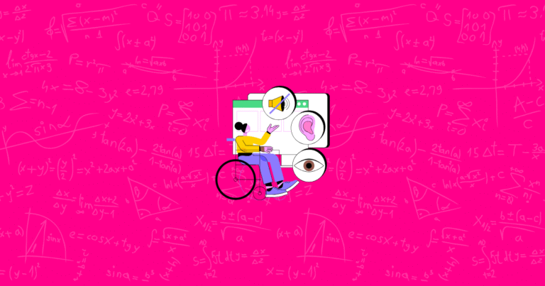
- Accessibility-first design – Inclusive experiences that work for everyone becoming standard
The core principles of effective landing pages will remain the same: understand your audience, communicate clear value, build trust, and make taking action easy. The tools and techniques will evolve, but these fundamentals are timeless.
Remember: Your Shopify store can grow even faster with Growth Suite, the all-in-one tool that helps optimize not just your landing pages but your entire customer journey. Try it today to boost your store’s performance!
References
- Digismoothie. (2025, January 27). 12 tips to optimize your Shopify one-page checkout
- Replo. (2025, February 21). How To Create A Landing Page On Shopify
- Instant. (2025, March 4). Creating a Shopify landing page: What most guides don’t tell you
- Shopify. (2020, May 12). Landing Page Optimization: 10 Tips for Increasing Conversions
- Tim Ash, Maura Ginty, Rich Page. (2012). Landing Page Optimization: The Definitive Guide to Testing and Tuning for Conversions
- Passport Global. (2024, July 1). How to Create Custom Landing Pages on Shopify for Global Markets
- Instant. (2025, February 28). Creating high-converting Shopify landing pages (complete guide)
- Bidnamic. (2024, October 30). How to build a Shopify landing page that converts