Have you ever wondered why some online stores convert visitors into customers like magic, while others struggle to make sales even with amazing products? The secret often lies in one critical place: the checkout process.
Did you know that about 70% of online shoppers abandon their carts before completing a purchase? That’s a lot of lost sales! But here’s the good news – understanding the psychology behind how people make buying decisions can dramatically improve your conversion rates.
In this article, you’ll discover:
- Why customers abandon their carts at the last minute
- How to design checkout pages that feel natural and easy to complete
- Simple tweaks that can boost your conversion rates immediately
- Strategies that top-selling Shopify stores use to optimize their checkout process
Ready to transform your Shopify store’s checkout into a conversion machine? Let’s dive in!
Understanding Consumer Psychology in E-commerce Checkout
Before we jump into specific strategies, let’s understand what’s happening in your customer’s mind when they reach your checkout page. These psychological principles form the foundation of all effective checkout optimization.
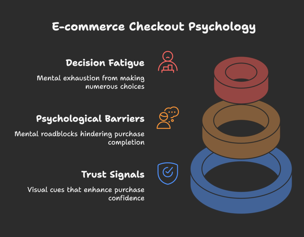
Decision Fatigue: The Hidden Conversion Killer
Have you ever felt mentally exhausted after a day of making decisions? This is called decision fatigue, and it affects your customers too.
By the time shoppers reach your checkout, they’ve already made dozens of decisions: which product to buy, what color, what size, whether the price is worth it, and so on. Each decision uses up mental energy, making it harder to complete the purchase process if it requires even more decisions.
Research shows that after making numerous choices, our ability to make good decisions deteriorates. This helps explain why many customers abandon their carts when faced with complicated checkout forms, multiple shipping options, or requests to create accounts.
Psychological Barriers That Stop Purchases
Several mental roadblocks can appear during checkout:
- Risk perception: Customers worry about sharing personal and payment information online
- Commitment anxiety: Hesitation about finalizing a purchase, especially for expensive items
- Uncertainty: Questions about return policies, delivery times, or product quality
- Time pressure: The feeling that checkout is taking too long, leading to abandonment
Trust and Security Perception
Trust is the foundation of any online purchase. Without it, even the most streamlined checkout won’t convert well.
Visual trust signals like security badges, payment provider logos, and HTTPS indicators have a powerful psychological impact. Studies show that displaying trusted security badges can increase conversions by up to 42%.
Transparency in your policies also builds trust. Clear shipping costs, return policies, and privacy statements reduce uncertainty and increase confidence in completing the purchase.
Now that we understand the psychological forces at work, let’s look at how different checkout designs affect your customers’ minds. Are you intrigued by how small design changes can have big impacts on your conversion rates? Let’s explore that next!
One-Page vs. Multi-Step Checkout Psychology
One of the biggest decisions you’ll make for your checkout is whether to use a single-page design or break it into multiple steps. Both approaches have psychological advantages and disadvantages.
Cognitive Load Comparison
Cognitive load refers to the mental effort required to process information and complete tasks. High cognitive load leads to frustration and abandonment.
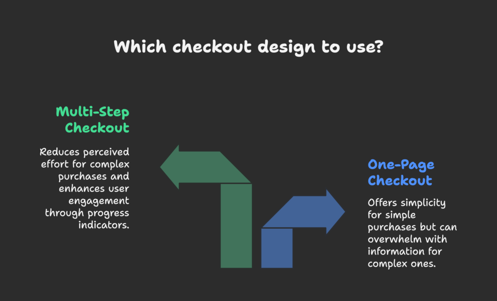
Single-page checkouts show all form fields at once. For simple purchases with few fields, this creates a sense of simplicity. Customers can see exactly what information they need to provide and how close they are to finishing.
Multi-step checkouts break the process into smaller chunks. Research shows this approach works better for complex purchases because it reduces the perceived effort. Each step feels manageable, even if the total number of fields is the same.
For most Shopify stores, multi-step checkout performs better because it matches how our brains prefer to process information – in small, organized chunks rather than all at once.
Progress Indicators: The Secret Motivation Tool
Have you ever noticed how satisfying it feels to check items off a to-do list? This psychological effect, called the Zeigarnik effect, explains why progress indicators are so powerful in checkout design.
Progress indicators create a sense of advancement and commitment. Once customers start the checkout process and see they’re making progress, they become psychologically invested in completing it.
Effective progress indicators:
- Show clear steps (e.g., “Shipping → Payment → Review → Complete”)
- Highlight the current step
- Provide a sense of forward momentum
Form Field Psychology
Every form field you add to your checkout creates friction. Research by the Baymard Institute found that the average checkout has 23.48 form elements, but only 14.88 are actually necessary.
The psychological impact of form fields goes beyond just their number:
- Required vs. optional fields: Clearly mark optional fields to reduce anxiety about missing information
- Field sequencing: Group related fields together to match how people naturally think about information
- Field size: Match the visual size of fields to the expected input length to set correct expectations
Fascinating how small design choices can have such a big impact on conversions, isn’t it? But what happens when your customers shop on their phones? Let’s look at the unique psychology of mobile checkout next.
Mobile Checkout Psychology
More than 70% of e-commerce traffic now comes from mobile devices, yet mobile conversion rates are typically lower than desktop. Understanding the psychological differences between mobile and desktop users is crucial for optimizing your checkout.
Mobile-Specific Psychological Challenges
Mobile shoppers face unique mental hurdles:
- Shorter attention spans: Mobile users are often multitasking or in distracting environments
- Limited screen space: Seeing less information at once increases cognitive load
- Touch interface challenges: Typing and selecting on mobile is more error-prone and frustrating
- Context-based constraints: Mobile users might be on public transport, waiting in line, or in other situations that limit their focus
Mobile Optimization Strategies
To overcome these challenges, consider these psychological optimizations:
- Use larger touch targets (at least 44×44 pixels) to reduce typing errors and frustration
- Minimize keyboard switches between numbers, text, and special characters
- Show only essential information to reduce cognitive overload
- Design for one-handed operation, keeping important elements within thumb reach
Mobile Payment Psychology
Mobile payment options like Apple Pay, Google Pay, and Shop Pay have transformed the checkout experience by reducing it to a single tap or biometric verification.
These options work so well because they eliminate several psychological barriers at once:
- They remove the need to type card details on a small screen
- They leverage existing trust in major technology brands
- They use biometric authentication (like fingerprints or face recognition), which feels both secure and effortless
Stores that prominently offer digital wallets can see mobile conversion increases of 30% or more. Now that’s impressive!
We’ve covered the structural elements of checkout psychology, but what about the visual aspects that your customers see? Let’s explore how colors, spacing, and visual elements influence purchase decisions.
Visual Design Psychology in Checkout
The visual design of your checkout doesn’t just make it look good—it directly affects how customers feel about completing their purchase. Smart visual design reduces anxiety and guides customers smoothly through the process.
Color Psychology
Colors trigger emotional responses that can either help or hurt your conversion rates:
- Blue creates feelings of trust and security—ideal for checkout pages
- Green associates with growth and “go,” making it effective for proceed buttons
- Red can create urgency but might also trigger caution—use carefully
- Orange often performs well for call-to-action buttons as it balances urgency with positivity
More important than the specific colors is how you use contrast to direct attention. Your “Continue to Payment” or “Complete Order” button should stand out visually from everything else on the page.
White Space and Cognitive Processing
Have you ever felt overwhelmed looking at a cluttered webpage? That’s your brain experiencing cognitive overload.
Proper use of white space (empty space between elements) isn’t just about aesthetics—it’s about helping the brain process information more easily. Research shows that appropriate use of white space can increase comprehension by up to 20%.
In checkout design, use white space to:
- Separate different sections (shipping, payment, review)
- Group related information together
- Make form fields and buttons easy to identify and tap
Visual Trust Signals
Strategic placement of trust elements can significantly boost conversion rates:
- Security badges: Display near payment information where security concerns are highest
- Payment method logos: Show recognized payment options early to assure customers their preferred method is available
- Guarantee seals: Place close to the final purchase button to overcome last-minute hesitation
A/B testing different placements of these trust elements often reveals surprising insights about what works best for your specific audience.
Now that we understand how visual elements affect checkout psychology, let’s look at something equally powerful but often overlooked: the words you use throughout the checkout process.
Micro-Copy and Language Psychology
The words you use in your checkout—even small pieces of text like button labels and error messages—have a surprising impact on conversion rates. Let’s examine how to use language psychology to guide customers to purchase completion.
Button Label Psychology
Your call-to-action buttons deserve special attention. Small changes in wording can lead to significant conversion differences:
- Action-oriented vs. benefit-oriented: “Complete Purchase” (action) vs. “Get Your New Shoes” (benefit)
- Ownership language: Using possessive pronouns like “your” creates a sense of ownership before purchase
- Avoiding negative associations: “Continue” feels more positive than “Pay Now” which emphasizes money leaving
In one study, changing a button from “Register” to “Create Account” increased conversions by 45%. The second option sounds easier and more rewarding.
Error Message Psychology
Error messages are critical moments that can either frustrate customers into abandoning or helpfully guide them to completion.
Psychologically effective error messages:
- Use positive, helpful language rather than blaming the customer
- Clearly explain what went wrong and how to fix it
- Appear immediately after the error occurs, not after form submission
- Use color and icons thoughtfully (red creates anxiety, while yellow suggests caution)
Instead of “Invalid input,” try “Please enter your 5-digit zip code so we can calculate shipping.”
Urgency and Scarcity Language
Urgency and scarcity triggers tap into the fear of missing out (FOMO), a powerful psychological motivator:
- Time-based urgency: “Complete your order in the next 15 minutes to get same-day shipping”
- Inventory-based scarcity: “Only 3 left in stock”
- Exclusive offers: “Limited-time checkout discount”
While these techniques are effective, use them ethically and honestly. False scarcity damages trust and hurts long-term customer relationships.
Now let’s tackle one of the biggest conversion killers in e-commerce: forced account creation. How do you balance the business need for customer accounts with the customer’s desire for a quick checkout?
Guest Checkout and Account Creation Psychology
The battle between guest checkout and account creation is really about balancing the store’s desire for customer data with the customer’s desire for convenience. Understanding the psychology behind this tension helps you make better decisions.
Forced Account Creation Barriers
Requiring an account before checkout is one of the biggest conversion killers. Studies show that up to 35% of shoppers will abandon their cart if forced to create an account.
From a psychological perspective, account creation:
- Increases perceived effort to complete the purchase
- Raises privacy concerns about how data will be used
- Creates a “commitment barrier” that feels disproportionate for first-time buyers
- Interrupts the natural flow toward purchase completion
Most successful Shopify stores now prominently offer guest checkout options, placing them visually ahead of account creation options.
Post-Purchase Account Creation
A more effective approach is to offer account creation after the purchase is complete. This works well because:
- The customer has already provided most of the information needed
- They’ve established trust through a successful transaction
- You can frame the account as a benefit for order tracking and future convenience
- The purchase goal has been achieved, so you’re not risking conversion
Incentivizing post-purchase account creation with a small discount on the next order can boost account creation rates significantly while maintaining high conversion rates.
Now that we understand how to handle account creation, let’s look at another powerful psychological tool: showing customers that other people trust and buy from your store.
Social Proof in Checkout Psychology
Humans are social creatures who look to others for guidance on what to do, especially in uncertain situations. Smart use of social proof during checkout can reduce anxiety and boost confidence in completing the purchase.
Types of Social Validation
Different types of social proof work at different stages of the checkout:
- Customer reviews and ratings: Remind customers why they wanted the product
- Purchase counters: “Over 10,000 happy customers” signals widespread approval
- Real-time notifications: “Jane from Chicago just purchased this item” creates urgency and validation
- Expert endorsements: Especially effective for technical or specialized products
Trust-Building Through Others’ Actions
The psychological principle of “social consensus” means we tend to believe something is correct when we see others doing it. This is why showing customer activity can be so effective.
Implementations that work well in Shopify checkouts include:
- Subtle notifications of recent purchases
- Customer testimonials specifically about the checkout experience (“Fast shipping and easy returns!”)
- Trust badges showing the number of satisfied customers
One Shopify study found that adding social proof elements to the checkout page increased conversions by up to 15%, with the highest impact on new visitors who had no previous experience with the brand.
Since we’re talking about psychology that drives additional purchases, let’s look at how you can ethically increase order values during checkout.
Cross-Selling and Upselling Psychology
The checkout process isn’t just about completing the current sale—it’s also an opportunity to increase order value. When done well, cross-selling and upselling feel helpful rather than pushy.
Timing and Placement Psychology
The psychology of when and where to offer additional products is crucial:
- Pre-checkout: Cart page suggestions feel natural and give customers time to consider
- Mid-checkout: Use sparingly to avoid disrupting the purchase flow
- Post-checkout: One-click add-ons after purchase completion can work well as they don’t delay the main purchase
The psychological state of customers changes throughout this journey. Early in checkout, they’re still in “shopping mode,” but by the end, they’re focused on completing the transaction.
Price Anchoring Strategies
Price anchoring uses the initial product price as a reference point that makes additional purchases seem reasonable.
Effective techniques include:
- Suggesting items that are 15-25% of the main purchase price (a $20 accessory feels reasonable after buying a $100 product)
- Bundle offers that provide a clear discount compared to buying separately
- Limited-time checkout discounts on complementary items
Helm Boots, a Shopify store, successfully uses this approach by offering leather care products during checkout for their premium boots—at a price point that feels small compared to the boots themselves.
Value-Add vs. Pure Upselling
The most effective additional offers enhance the value of the main purchase rather than just increasing price:
- Value-enhancing: Products that make the main item work better or last longer
- Protection offers: Warranties or insurance that reduce purchase anxiety
- Ethical additions: Options like carbon offset contributions that align with customer values
Tentree, an eco-conscious Shopify store, offers carbon emissions offsetting during checkout. This aligns with their customers’ values and provides psychological satisfaction.
We’ve covered many psychological principles, but now let’s focus on removing barriers that might stop customers from completing their purchase.
Reducing Friction Through Psychological Design
Every extra click, form field, or moment of confusion creates friction that can lead to abandonment. Psychological design focuses on making the checkout feel effortless.
Autofill and Form Optimization
Entering information is the most tedious part of checkout. Smart form design can reduce this burden:
- Enable browser autofill by using standard field names and types
- Implement address lookup tools that complete forms after entering just a zip code
- Use smart defaults based on common selections
- Automatically format phone numbers and credit card inputs as the customer types
These convenience features create positive psychological reactions—customers feel the store is working with them, not making them work.
Payment Method Psychology
Payment preferences vary widely across different customer segments:
- Younger shoppers often prefer digital wallets and buy-now-pay-later options
- Some customers feel more secure using PayPal than entering credit card details
- International customers may have entirely different preferred payment methods
The psychological principle here is simple: when customers see their preferred payment method, it creates comfort and familiarity in an otherwise new environment.
Buy-now-pay-later options like Affirm, Klarna, and Shop Pay Installments work well psychologically because they separate the pleasure of getting the product from the pain of paying for it.
Shipping Options and Psychology
Shipping costs and options have a powerful psychological impact:
- Free shipping removes a major psychological barrier to purchase
- Threshold-based free shipping (“Free shipping on orders over $60”) creates a strong incentive to add more items
- Displaying estimated delivery dates reduces uncertainty and anxiety
When customers can see exactly when their items will arrive, it creates mental ownership before purchase, increasing conversion likelihood.
Now that we’ve covered all these psychological principles, how do you know which ones will work best for your specific store? Let’s talk about testing and optimization.
Testing and Optimization Framework
Psychology provides the theory, but testing shows what actually works for your unique customers. A systematic approach to testing is essential for continuous improvement.
Psychology-Based Test Hypotheses
Start your testing with clear hypotheses based on psychological principles:
- “Adding a security badge near the payment fields will increase conversions by reducing perceived risk”
- “Changing the button text from ‘Purchase’ to ‘Complete My Order’ will increase click-through by creating a sense of ownership”
- “Simplifying the shipping option presentation will reduce abandonment by decreasing cognitive load”
When analyzing test results, look beyond just the overall conversion rate. Segment your data to see if different customer groups respond differently to the changes.
Tools and Techniques
Several tools can provide deeper psychological insights:
- Heat maps show where customers focus attention and where they hesitate
- Session recordings reveal confusion points and abandonment patterns
- Exit surveys ask customers directly why they didn’t complete the purchase
- A/B testing provides clear data on which version performs better
Look for patterns in your data rather than one-off results. If multiple tests point to the same psychological principle (like reducing cognitive load), you’ve discovered something important about your customers.
The checkout journey doesn’t end when the customer clicks “Buy.” Let’s look at what happens psychologically after the purchase is complete.
Post-Checkout Psychology
The moments after a purchase are psychologically powerful. Customers may experience a mix of excitement, relief, and sometimes doubt. How you handle this phase affects both immediate add-on sales and long-term customer relationships.
Confirmation Page Optimization
The order confirmation page serves multiple psychological purposes:
- Providing reassurance that the order was successful
- Reducing post-purchase anxiety by confirming details
- Creating positive associations with your brand
- Setting expectations for what happens next
Effective confirmation pages include:
- Clear order numbers and purchase details
- Expected delivery dates
- Next steps information
- Social sharing options (which leverage the psychological desire to share good experiences)
Cart Abandonment Recovery
When customers do abandon checkout, recovery emails can be surprisingly effective:
- Timing is crucial—the first 1-3 hours after abandonment have the highest recovery rates
- A sequence of 2-3 emails works better than a single attempt
- Including the actual cart contents creates a visual reminder of desired items
- Small incentives (like free shipping) can overcome minor price objections
The psychology behind abandonment recovery is simple: the customer already showed interest in your products. You’re just helping them complete what they already started.
Now, let’s focus on a critical aspect of modern e-commerce: mobile-first strategies that recognize the unique psychology of smartphone shoppers.
Mobile-First Psychological Strategies
With most e-commerce traffic now coming from mobile devices, designing for mobile psychology isn’t optional—it’s essential.
Touch-Based Interaction Design
Mobile interfaces create unique psychological considerations:
- Touch accuracy is less precise than mouse clicks, creating frustration when targets are too small
- Thumb zones determine what’s easy or difficult to reach on the screen
- Hand size differences affect usability across different customer segments
Design for these realities by:
- Making all interactive elements large enough (minimum 44×44 pixels)
- Placing important buttons in the central and bottom areas of the screen for easy thumb access
- Providing clear visual feedback for all interactions
Distraction Minimization
Mobile users are particularly vulnerable to distractions:
- They might be shopping while waiting in line, commuting, or watching TV
- Notifications from other apps can interrupt the checkout process
- Environmental distractions compete for attention
Psychological strategies to maintain focus include:
- Simplifying the checkout to require minimal concentration
- Using progressive disclosure to show only what’s needed at each step
- Creating clear visual hierarchies that guide attention
- Designing for interruption recovery (saving cart state automatically)
By acknowledging and designing for these mobile-specific psychological factors, you can significantly improve your mobile conversion rates.
Conclusion
We’ve journeyed through the fascinating psychology behind checkout optimization, from understanding decision fatigue and building trust to creating frictionless experiences across all devices.
The most important takeaways are:
- Reduce cognitive load wherever possible
- Build trust through visual cues and transparent policies
- Optimize for both desktop and mobile experiences
- Use language that encourages completion
- Test your assumptions to discover what works for your specific customers
Remember, checkout optimization isn’t a one-time task—it’s an ongoing process of understanding your customers’ psychology and adapting to their needs.
Implementing even a few of these psychology-based strategies can significantly impact your conversion rates and bottom line. The most successful Shopify stores are those that continually refine their checkout experience based on both psychological principles and data-driven testing.
Looking for an all-in-one solution to optimize your Shopify store? Growth Suite can help you implement these psychological principles and boost your sales. Try it today to transform your checkout experience and watch your conversion rates soar!
References
- Shopify Blog (2023, August 10). 13 Checkout Optimization Tips To Increase Ecommerce Revenue.
- Shopify Enterprise Blog (2024, May 24). How to Create a Good Checkout Experience: 11 Steps.
- Digital Silk (2024, April 15). Shopify Checkout: How To Customize & Optimize For More Sales.
- Acowebs (2025, January 10). How Shopify and WooCommerce Templates Influence Buyer Behavior.
- Akohub (2023, December 11). 15 Proven Best Tips To Customize Shopify Checkout That Skyrocket Your Sales.
- Samuel Larsen – eCommerce Optimization (2020, March 18). The Ultimate Guide to Shopify Checkout Optimization (100% Free).
- Baymard Institute. Checkout Usability Research.
- Nielsen Norman Group. E-Commerce User Experience.
- Behavioral Economics in Action Research Center. Consumer Psychology in Digital Environments.
- Harvard Business Review. The Psychology of Online Conversions.
- Journal of Consumer Psychology. Decision Making in Digital Commerce.
- MIT Sloan Management Review. Customer Experience Research.