
Have you ever visited a website and immediately felt overwhelmed by flashing banners, pop-ups, and aggressive promotional messages? Or maybe you’ve noticed how some online stores seem to strike the perfect balance – keeping you informed without making you want to run away screaming?
Here’s a startling fact: 86% of users suffer from “banner blindness,” meaning they automatically ignore promotional content that feels pushy or irrelevant. Yet, when done right, announcement bars can boost conversion rates by up to 35%. So what’s the secret sauce?
The difference lies in understanding the delicate art of being helpful without being annoying. It’s about creating announcement bars and banners that add genuine value to your visitors’ shopping experience rather than interrupting it.
In this comprehensive guide, you’ll discover how to design announcement bars that actually work – ones that inform, engage, and convert without driving your customers away. You’ll learn the psychology behind effective messaging, master the technical implementation on Shopify, and avoid the common pitfalls that turn helpful notifications into user experience nightmares.
Ready to transform your Shopify store’s communication strategy? Let’s dive in!
The Power and Peril of Announcement Bars
In this section, we’ll explore why announcement bars can be your store’s best friend or worst enemy, and how to ensure they land on the right side of that equation.
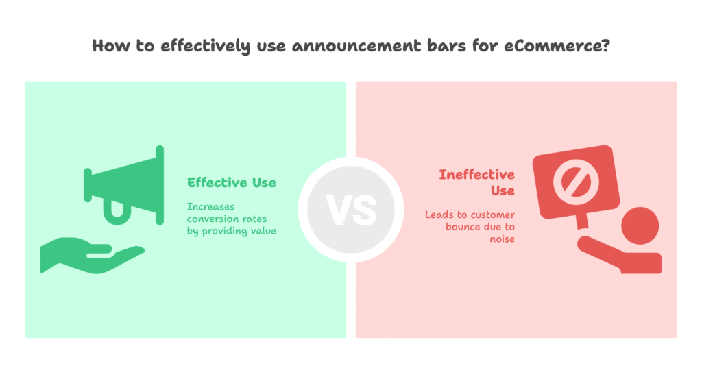
Picture this: You’re browsing online for a new jacket, and you land on a store that immediately hits you with a bright red banner screaming “SALE! SALE! SALE!” in flashing letters. Your first instinct? Probably to close the tab and look elsewhere. This is the peril side of announcement bars – when they become digital noise that pushes customers away instead of drawing them in.
But here’s where it gets interesting. Well-designed announcement bars can increase conversion rates by 20-35% when they provide genuine value. Think about Amazon’s clean, informative delivery notifications or Apple’s subtle product launch announcements. These work because they solve problems or provide information users actually want.
The key lies in understanding what your customers need to know versus what you want to tell them. Your announcement bar should answer questions like:
- When will my order arrive? (Free shipping thresholds, delivery times)
- Is this a trustworthy store? (Security badges, return policies)
- Am I getting a good deal? (Limited-time offers, price match guarantees)
- What’s new or important? (Holiday hours, new collections)
The challenge is that mobile users now make up over 70% of eCommerce traffic, and they have even less patience for intrusive elements. A banner that looks perfectly fine on desktop can completely overwhelm a mobile screen, leading to immediate bounces.
Understanding this balance is crucial, but knowing the difference between announcement bars and banners is equally important. So what exactly sets these two apart, and when should you use each one?
Understanding Announcement Bars vs. Banners in Shopify
Before we dive deeper, let’s clarify what we’re actually talking about and explore the technical differences that can make or break your implementation.
Many store owners use “announcement bars” and “banners” interchangeably, but they’re actually quite different beasts with distinct purposes and behaviors.
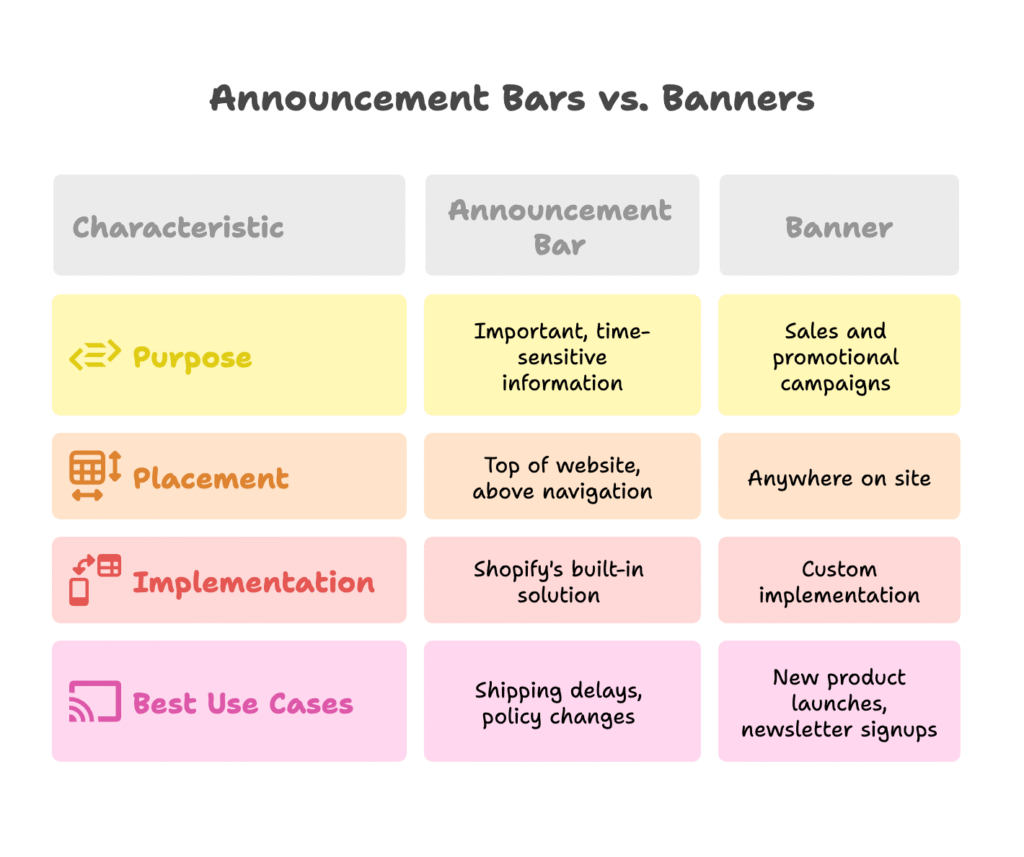
Announcement Bars: The Gentle Informers
Announcement bars are Shopify’s built-in solution for site-wide messaging. They typically appear at the very top of your website, above your navigation menu, and are designed for important, time-sensitive information. Think of them as your store’s public address system – they should be used sparingly and only for messages that truly matter to everyone.
Shopify’s native announcement bar feature allows you to:
- Add up to 12 different announcements that rotate automatically
- Customize colors, fonts, and links directly through your theme editor
- Create mobile-responsive designs without additional coding
- Schedule messages to appear and disappear automatically
Banners: The Promotional Powerhouses
Banners, on the other hand, are typically custom implementations that can appear anywhere on your site. They’re more flexible in terms of design and placement but require more technical know-how to implement effectively. Banners are your promotional workhorses – perfect for sales, new product launches, or seasonal campaigns.
The placement strategy matters enormously. While most stores default to top placement, companies like ASOS have found success placing promotional banners below their navigation menu. This approach respects the user’s need to navigate first while still maintaining visibility for promotional content.
When to Use Each Type
Use announcement bars for:
- Shipping delays or service interruptions
- Holiday hours or important policy changes
- Free shipping thresholds
- Customer service contact information
Use banners for:
- Sales and promotional campaigns
- New product launches
- Newsletter signups
- Brand storytelling elements
Now that we understand the tools at our disposal, the real question becomes: how do we design these elements in a way that users actually appreciate rather than ignore? The answer lies in adopting a user-centric design philosophy.
User-Centric Design Philosophy
In this section, we’ll explore the mindset shift that separates successful announcement bars from annoying ones – putting your users’ needs first.
Here’s a uncomfortable truth: most announcement bars are designed from the business’s perspective, not the customer’s. They scream about what the company wants to sell rather than addressing what the visitor needs to know. This approach is not just ineffective – it’s counterproductive.
Understanding Your Audience Deeply
Effective announcement bar design starts with understanding your specific audience segments. A luxury jewelry store’s customers have different information needs than a budget electronics retailer’s shoppers.
For example:
- Price-conscious shoppers want to see savings opportunities and free shipping thresholds
- Quality-focused buyers care more about authenticity guarantees and craftsmanship details
- Convenience seekers prioritize fast shipping and easy returns
- Brand enthusiasts want early access to new releases and exclusive offers
The most sophisticated stores use behavioral triggers to personalize these messages. A visitor who’s spent five minutes browsing without adding anything to their cart might see a different message than someone who’s already initiated checkout.
The Psychology of Non-Intrusive Design
Our brains are hardwired to ignore repetitive or irrelevant stimuli – it’s called habituation. This is why that flashing “SALE” banner becomes invisible after the first few seconds. But there’s a way to work with this psychological principle rather than against it.
Value-first messaging flips the script. Instead of “Buy now and save 20%!” try “Get free expert styling advice with any purchase.” The first message is about what you want (a sale), while the second is about what they get (value).
Consider the cognitive load you’re adding to your visitor’s experience. Every element on your page competes for attention. Your announcement bar should reduce mental effort, not increase it. This means:
- Using familiar icons and clear language
- Providing information that helps with decision-making
- Avoiding information overload
- Making the message scannable in under 3 seconds
But understanding psychology is only half the battle. The other half is translating these insights into actual design principles that work in the real world. So what do effective announcement bars actually look like?
Design Principles for Effective Announcement Bars
Now we’ll translate theory into practice with specific design guidelines that create announcement bars people actually want to see.
Great announcement bar design isn’t about making the biggest, brightest, most attention-grabbing element possible. It’s about creating something that feels like a natural, helpful part of your store’s experience.
Visual Design That Enhances Rather Than Disrupts
Color choice is your secret weapon. Your announcement bar should complement your brand colors, not compete with them. If your store uses a clean white and navy theme, a neon green announcement bar will feel like visual pollution.
Here’s a practical approach to color selection:
- For informational messages: Use neutral colors (light gray, soft blue) that convey trustworthiness
- For promotional content: Use your brand’s accent colors to maintain consistency
- For urgent messages: Use warm colors (orange, red) sparingly and only when truly necessary
Typography matters just as much. Your announcement bar text should be easily readable at a glance. This means:
- Font size at least 14px on mobile, 16px on desktop
- High contrast between text and background
- Sans-serif fonts for maximum readability
- Consistent with your site’s overall typography
Strategic Positioning for Maximum Impact
The traditional top-of-page placement isn’t always the best choice. ASOS discovered that placing promotional banners below their navigation menu actually improved both user experience and conversion rates. Why? Because it respects the user’s primary goal (navigation) while still maintaining visibility.
Consider these placement strategies:
- Above navigation: Perfect for urgent information (shipping delays, site maintenance)
- Below navigation: Ideal for promotional content and non-urgent announcements
- Sticky positioning: Use sparingly and only for high-value information
- Dismissible bars: Give users control over their experience
Size and Spacing That Breathes
Your announcement bar should feel spacious, not cramped. Adequate padding makes content more readable and gives your design a professional appearance. A good rule of thumb is at least 12-15 pixels of padding on all sides.
On mobile devices, be especially mindful of screen real estate. Your announcement bar shouldn’t consume more than 10-15% of the visible screen area, or users will feel overwhelmed before they even start browsing.
Speaking of mobile, responsive design isn’t optional – it’s essential. But creating great-looking announcement bars is only half the equation. How do you actually implement these designs in Shopify without breaking your store?
Technical Implementation in Shopify
Here’s where we roll up our sleeves and get into the practical steps for bringing your announcement bar vision to life in Shopify.
The good news is that Shopify makes basic announcement bar implementation surprisingly straightforward. The challenge comes in customizing these basic features to match your specific design and functionality needs.
The Native Shopify Method: Quick and Clean
Shopify’s built-in announcement bar feature is perfect for most basic needs. Here’s how to set it up:
- Navigate to your theme customizer (Online Store > Themes > Customize)
- Look for the “Announcement bar” section in your theme settings
- Add your content using Shopify’s text editor
- Customize colors and fonts using the built-in style options
- Add up to 12 different announcements that can rotate automatically
The native method handles mobile responsiveness automatically and integrates seamlessly with your theme’s existing styles. You can add links, change colors, and even schedule announcements to appear at specific times.
Custom Code Approach: When You Need More Control
Sometimes you need features that go beyond Shopify’s basic options. This is where custom code comes in handy. You’ll be working primarily with three files in your theme editor:
- theme.liquid: For site-wide announcements
- sections/announcement-bar.liquid: For modular announcement components
- assets/theme.css: For custom styling
A simple custom announcement bar might look like this:
<div class="custom-announcement-bar">
  <p>📦 Free shipping on orders over $75 | 🔄 30-day returns</p>
</div>
With corresponding CSS for styling and responsiveness.
Third-Party App Solutions: Power Without Complexity
For stores that need advanced features without custom coding, several excellent apps can help:
- Smart Bar by Qikify: Offers advanced targeting and scheduling features
- Essential Announcement Bar: Provides multiple bar types and animations
- Sense Announcement Bars: Includes countdown timers and personalization
When choosing an app, prioritize those that:
- Don’t slow down your site
- Offer good customer support
- Integrate well with your existing theme
- Provide detailed analytics
Now that you know how to build announcement bars, the next crucial step is crafting messages that people actually want to read. What separates compelling content from digital noise?
Content Strategy and Messaging
This is where the magic happens – transforming your announcement bars from ignored background noise into valuable communication tools that customers appreciate.
The difference between an announcement that gets clicked and one that gets ignored often comes down to just a few words. But those words need to be chosen very carefully.
Writing Copy That Adds Value
Forget everything you know about traditional advertising copy. Announcement bar messaging follows different rules. You have maybe 5-8 words to communicate value, and every single word needs to earn its place.
Instead of: “Amazing sale! Don’t miss out! Up to 50% off everything!”
Try: “Free shipping on orders $50+ | Ships same day”
The first example is all hype and no substance. The second provides specific, actionable information that helps customers make decisions.
Here are some proven message frameworks:
- Benefit + Threshold: “Free shipping over $75”
- Time + Action: “Order by 2pm for same-day shipping”
- Problem + Solution: “Can’t decide? Chat with our style experts”
- Social Proof + Offer: “Join 10,000+ happy customers | First order 10% off”
Strategic Message Rotation
If you have multiple important messages, rotation can keep your announcement bar fresh and relevant. But there’s a right way and a wrong way to do this.
Auto-rotation best practices:
- Change messages every 5-7 seconds (fast enough to notice, slow enough to read)
- Use smooth transitions, not jarring cuts
- Keep the number of rotating messages to 3-5 maximum
- Ensure each message is valuable on its own
Consider the user journey when deciding message priority. First-time visitors might need trust signals (“30-day returns”), while returning customers might prefer exclusive offers (“Welcome back! Your favorites are 15% off”).
Call-to-Action Optimization
Not every announcement bar needs a clickable CTA, but when you do include one, make it count. The best CTAs in announcement bars are:
- Specific: “Shop winter coats” instead of “Shop now”
- Benefit-focused: “Unlock free shipping” instead of “Add to cart”
- Action-oriented: “Get your discount” instead of “Learn more”
But even the best content needs some extra features to truly shine in today’s competitive landscape. What advanced functionality can take your announcement bars from good to exceptional?
Advanced Features and Functionality
In this section, we’ll explore the sophisticated features that can transform your basic announcement bars into dynamic, engaging elements that adapt to user behavior.
Basic text announcements are fine, but today’s savvy shoppers expect more interactive and personalized experiences. The key is adding advanced features that enhance rather than complicate the user experience.
Dynamic Elements That Create Urgency
Countdown timers can be incredibly effective when used authentically. The key word here is “authentically” – fake urgency backfires spectacularly and damages trust. Use countdown timers for:
- Real flash sales with genuine end times
- Shipping deadlines (“Order in next 4 hours for Friday delivery”)
- Limited inventory situations
- Seasonal promotions with actual expiration dates
When implementing countdown timers, ensure they’re accurate across time zones and don’t reset when users refresh the page. Nothing destroys credibility faster than a “last chance” timer that keeps resetting.
Scrolling text effects can work well for longer messages, but use them sparingly. They’re particularly effective for:
- Multiple shipping options with different timeframes
- Long lists of accepted payment methods
- Multiple language or currency options
Personalization and Smart Targeting
This is where announcement bars become truly powerful. Instead of showing the same message to everyone, you can tailor content based on user behavior and characteristics.
Behavioral targeting examples:
- First-time visitors: “New here? Get 10% off your first order”
- Returning customers: “Welcome back! Your saved items are waiting”
- Cart abandoners: “Complete your purchase and get free shipping”
- Mobile users: “Download our app for exclusive mobile deals”
Geographic targeting can make messages more relevant:
- Weather-based product suggestions
- Local shipping options and timeframes
- Regional promotions and events
- Currency and language preferences
Multi-functional Integration
Modern announcement bars can do more than just display text. Consider integrating:
- Search functionality: Quick product search without leaving the current page
- Social media links: Subtle icons that don’t overwhelm the message
- Language selectors: For international stores
- Live chat triggers: “Need help? Chat with us now”
The key is balance – each additional feature should serve a clear purpose and not clutter the interface.
But here’s the thing about advanced features: they’re meaningless if they don’t work properly on mobile devices. With mobile traffic dominating eCommerce, how do you ensure your announcement bars shine on smaller screens?
Mobile Optimization Strategies
Here we’ll tackle the unique challenges of creating announcement bars that work beautifully on mobile devices without overwhelming limited screen space.
Mobile optimization isn’t just about making things smaller – it’s about rethinking the entire user experience for touch-based, smaller-screen interactions.
Mobile-First Design Principles
When over 70% of your traffic comes from mobile devices, starting with mobile design makes perfect sense. This approach forces you to prioritize the most essential information and create cleaner, more focused messaging.
Mobile-specific considerations:
- Thumb-friendly touch targets: Any clickable elements should be at least 44×44 pixels
- Readable text size: Never smaller than 16px, even for secondary information
- Simplified messaging: Mobile users scan faster, so get to the point quickly
- Portrait orientation focus: Most mobile browsing happens in portrait mode
Consider how mobile users interact with your site differently. They’re often multitasking, have shorter attention spans, and are more likely to be in “quick browse” mode rather than deep research mode.
Responsive Design That Actually Works
True mobile optimization goes beyond just scaling down desktop designs. Your announcement bar might need completely different messaging on mobile devices.
Desktop message: “Free shipping on orders over $75 | 30-day returns | Customer service: 1-800-STYLE”
Mobile message: “Free shipping $75+ | Easy returns”
Use CSS media queries to create these responsive experiences:
/* Desktop styling */
.announcement-bar {
  padding: 15px;
  font-size: 16px;
}

/* Mobile adjustments */
@media (max-width: 768px) {
  .announcement-bar {
    padding: 10px;
    font-size: 14px;
  }
}
Performance Optimization for Mobile
Mobile users are particularly sensitive to page loading speed. Your announcement bar should never be the reason a page loads slowly.
Performance best practices:
- Optimize any background images for mobile file sizes
- Use CSS animations instead of JavaScript when possible
- Minimize HTTP requests from external fonts or scripts
- Test loading speed on actual mobile devices, not just browser developer tools
Tools like Google’s PageSpeed Insights can help identify if your announcement bar is impacting mobile performance.
Creating beautiful, functional mobile announcement bars is crucial, but how do you know if they’re actually working? The answer lies in systematic testing and optimization.
Testing and Optimization
This section will show you how to scientifically improve your announcement bars using data-driven testing methods that reveal what actually works for your specific audience.
Here’s the truth that many store owners learn the hard way: what looks good and what converts well are often two completely different things. The only way to know for sure what works is to test systematically.
A/B Testing That Actually Matters
A/B testing announcement bars isn’t just about changing colors and fonts. The most impactful tests focus on fundamental messaging and positioning strategies.
High-impact elements to test:
- Message positioning: Benefit-first vs. offer-first
- Urgency language: Specific deadlines vs. general urgency
- Value propositions: Free shipping vs. fast shipping vs. easy returns
- Call-to-action wording: “Shop now” vs. “Explore collection” vs. “Get started”
- Placement strategy: Above navigation vs. below vs. floating
Run tests for at least one full business cycle (typically 1-2 weeks) to account for daily and weekly variations in traffic and behavior.
Key Metrics to Track
Not all metrics are created equal when it comes to announcement bar performance. Focus on the ones that actually correlate with business success:
- Click-through rate (CTR): What percentage of viewers click on your announcement?
- Conversion rate impact: How does the presence of the announcement bar affect overall store conversion?
- Time on site: Do users stay longer or bounce faster with different announcements?
- Revenue per visitor: The ultimate measure of announcement bar effectiveness
Be careful with vanity metrics like impressions or views. What matters is whether your announcement bar drives meaningful business results.
Continuous Improvement Process
Optimization isn’t a one-time activity – it’s an ongoing process that adapts to changing customer behavior, seasonal trends, and business priorities.
Monthly optimization checklist:
- Review performance data and identify trends
- Update seasonal messaging and offers
- Test new value propositions based on customer feedback
- Audit mobile performance and user experience
- Analyze competitor approaches for inspiration
Keep a testing calendar that aligns with your business calendar. Black Friday announcements should be tested well before the holiday rush, not during it.
But even with the best testing practices, mistakes happen. What are the most common pitfalls that trip up even experienced store owners, and how can you avoid them?
Common Mistakes and How to Avoid Them
Let’s examine the costly mistakes that can turn your helpful announcement bars into conversion killers, and more importantly, how to avoid them entirely.
Learning from other people’s mistakes is much cheaper than making them yourself. These are the most common announcement bar failures I see, along with practical solutions.
Design Disasters That Kill Conversions
Mistake #1: Information Overload
Trying to cram every possible benefit into your announcement bar creates cognitive overload. Users’ brains simply shut down when presented with too much information at once.
Solution: Follow the “one message, one purpose” rule. If you have multiple important messages, use rotation or create separate announcement bars for different pages.
Mistake #2: Ignoring Brand Consistency
Your announcement bar should feel like a natural part of your store, not a foreign element that was slapped on as an afterthought.
Solution: Use your brand’s color palette, fonts, and tone of voice. If your store has a minimalist aesthetic, don’t use a neon-bright announcement bar with flashing animations.
Mistake #3: Mobile Nightmare Experiences
Desktop-first design often creates announcement bars that are completely unusable on mobile devices.
Solution: Always design for mobile first, then enhance for desktop. Test on actual mobile devices, not just browser developer tools.
Content and Strategy Blunders
Mistake #4: Zombie Announcements
Nothing damages credibility faster than outdated announcement bars. “Black Friday Sale” messages in January, expired shipping deadlines, or links to sold-out products create negative brand impressions.
Solution: Create a content calendar with regular review dates. Set calendar reminders to update time-sensitive content.
Mistake #5: Fake Urgency Tactics
Countdown timers that reset, “limited time” offers that never end, or “only 3 left in stock” messages for unlimited digital products destroy trust permanently.
Solution: Only use urgency when it’s genuine. If you’re running a sale, have a real end date. If you’re showing inventory levels, make sure they’re accurate.
Technical Implementation Errors
Mistake #6: Performance Killers
Heavy scripts, unoptimized images, or poorly coded animations can slow down your entire site.
Solution: Regularly test your site speed with tools like Google PageSpeed Insights. Every element should earn its place through improved conversions, not just look pretty.
Mistake #7: Accessibility Failures
Announcement bars that can’t be read by screen readers, have insufficient color contrast, or can’t be dismissed are not just bad user experience – they may violate accessibility laws.
Solution: Follow WCAG guidelines: ensure sufficient color contrast, provide alternative text for images, and make all interactive elements keyboard accessible.
Learning from mistakes is valuable, but learning from successes is even better. What do top-performing stores actually do with their announcement bars?
Case Studies and Real-World Examples
Now let’s examine how successful brands use announcement bars effectively, and what specific lessons you can apply to your own store.
Real-world examples often reveal insights that theoretical knowledge alone cannot provide. These case studies show how different approaches work for different types of businesses.
Case Study: Visible’s Minimalist Approach
The Strategy: Visible, the wireless carrier, uses extremely simple announcement bars with just essential information: “Unlimited data for $30/month” with no additional clutter or competing messages.
Why It Works:
- Crystal clear value proposition
- No cognitive load or decision fatigue
- Consistent with their minimalist brand identity
- Price-focused messaging matches their target audience
Key Takeaway: Sometimes less really is more. If you have one compelling offer, don’t dilute it with additional messages.
Case Study: ASOS’s Below-Navigation Innovation
The Strategy: ASOS places their promotional banners below their main navigation rather than above it, contrary to industry standard practice.
The Results: This unconventional placement actually improved both user experience scores and conversion rates.
Why It Works:
- Respects users’ primary goal (navigation) first
- Promotional content doesn’t interfere with site functionality
- Still maintains high visibility without being intrusive
- Creates a logical visual hierarchy
Key Takeaway: Don’t blindly follow conventional wisdom. Test unconventional approaches that might work better for your specific audience.
Industry-Specific Success Patterns
Fashion/Apparel Stores: Most successful fashion retailers focus on social proof and styling guidance rather than just discounts. Messages like “Style advice available via chat” or “Featured in Vogue Magazine” often outperform pure discount offers.
Electronics/Tech Stores: Technical specifications and warranty information perform well. “1-year warranty included” or “Free technical support” resonate more than generic sales messages.
Home/Lifestyle Brands: Shipping and return policies are crucial. “White glove delivery available” or “Room-by-room design consultation” add perceived value.
Lessons from Failed Implementations
Learning from failures is equally important. One major retailer saw conversion rates drop 15% after implementing an aggressive announcement bar strategy with multiple rotating promotional messages.
What went wrong:
- Too many competing messages created decision paralysis
- Constant rotation was distracting rather than helpful
- Messages were discount-focused rather than value-focused
- Mobile implementation was poorly optimized
The recovery strategy: They simplified to a single, value-focused message and saw conversions recover within two weeks.
These examples show what works today, but the digital landscape is constantly evolving. What trends should you be preparing for to future-proof your announcement bar strategy?
Future Trends and Considerations
In this final strategic section, we’ll explore emerging trends and technologies that will shape how announcement bars evolve in the coming years.
The announcement bar landscape is evolving rapidly, driven by advancing technology, changing consumer expectations, and new privacy regulations. Staying ahead of these trends can give you a significant competitive advantage.
AI-Powered Personalization
Artificial intelligence is making it possible to create truly personalized announcement bar experiences at scale. Instead of broad behavioral targeting, AI can analyze hundreds of data points to predict exactly what message will resonate with each individual visitor.
Emerging AI applications:
- Predictive messaging: AI algorithms determine which visitors are most likely to convert and tailor urgency accordingly
- Dynamic content optimization: Messages automatically adjust based on real-time inventory, weather, and trending products
- Sentiment analysis: AI analyzes customer reviews and social media to craft messages that address current customer concerns
- Cross-device journey mapping: AI tracks users across devices to provide consistent, contextual messaging
The key is implementing AI in ways that feel helpful rather than creepy. Transparency about data usage will become increasingly important.
Voice Commerce Integration
As voice shopping grows, announcement bars may need to include voice-activated elements. Imagine an announcement bar that says “Ask Alexa to reorder your favorites” or includes voice search functionality.
This trend is particularly relevant for repeat-purchase items and subscription-based businesses.
Privacy and Consent Management
Evolving privacy regulations worldwide are changing how we can collect and use customer data for personalization. Future announcement bars will need to balance personalization with privacy compliance.
Privacy-first strategies:
- Zero-party data collection (information customers willingly provide)
- Progressive disclosure of personalization benefits
- Transparent data usage policies
- Opt-in rather than opt-out personalization
Cross-Platform Consistency
As customers interact with brands across multiple touchpoints – website, mobile app, social media, physical stores – announcement bar messaging needs to be consistent across all platforms.
This requires integrated marketing technology stacks and unified customer data platforms.
Understanding these trends is important, but the real value comes from taking action on what you’ve learned. Let’s bring everything together with a clear path forward.
Your Action Plan for Announcement Bar Success
Now that we’ve covered everything from psychology to implementation, let’s create a practical roadmap for transforming your Shopify store’s announcement bars into conversion-driving assets.
The difference between stores that succeed with announcement bars and those that fail isn’t knowledge – it’s execution. Here’s your step-by-step guide to implementation.
Phase 1: Foundation (Week 1-2)
Audit your current setup:
- Review all existing announcement bars and banners
- Test mobile experience on actual devices
- Analyze current performance metrics
- Identify quick wins and obvious problems
Define your strategy:
- Choose 2-3 primary messages that align with business goals
- Decide on placement strategy (above/below navigation)
- Establish brand consistency guidelines
- Set up tracking and measurement systems
Phase 2: Implementation (Week 3-4)
Technical setup:
- Implement chosen solution (native, custom, or app-based)
- Optimize for mobile responsiveness
- Test loading speed and performance
- Ensure accessibility compliance
Content creation:
- Write clear, value-focused messaging
- Create seasonal content calendar
- Design visual elements that match your brand
- Plan A/B testing variations
Phase 3: Optimization (Ongoing)
Monthly activities:
- Review performance data and adjust messaging
- Test new value propositions
- Update seasonal content
- Monitor competitor strategies
Quarterly activities:
- Comprehensive performance analysis
- Major design or strategy updates
- Technology stack evaluation
- Customer feedback integration
Success Measurement Framework
Track these key metrics to ensure your announcement bars are driving real business value:
- Primary metrics: Conversion rate, revenue per visitor, average order value
- Secondary metrics: Click-through rate, time on site, bounce rate
- Qualitative metrics: Customer feedback, user experience scores
Remember: the goal isn’t just to create announcement bars that look good – it’s to create ones that drive measurable business results while enhancing the customer experience.
Quick Tip: If you’re looking for additional ways to boost your Shopify store’s conversion rates through intelligent, behavior-based strategies, consider exploring Growth Suite. This app uses advanced visitor behavior tracking to deliver personalized, time-limited offers to visitors who are most likely to convert – all while maintaining your brand’s integrity and providing a seamless user experience.
References
- Shopify Help Center. “Add an announcement bar – Shopify Help Center.” Retrieved from https://help.shopify.com/en/manual/online-store/themes/customizing-themes/common-customizations/add-announcement-banner
- BSS Commerce. (2025). “Shopify Announcement Bar: Full Tutorials for Beginners.” Retrieved from https://bsscommerce.com/shopify/shopify-announcement-bar/
- YouTube Tutorial. (2024). “How to Customize Your Shopify Announcement Bar | 2024 Tutorial.” Retrieved from https://www.youtube.com/watch?v=tOEIlU8rNyg
- WizzCommerce. (2024). “7 Fresh Ideas to Spice Up Your Shopify Promo Banner.” Retrieved from https://wizzcommerce.io/blog/home-page-ideas/shopify-promo-banners/