
Have you ever visited an online store and instantly felt like you knew exactly where to click? Or perhaps you’ve gotten lost in a maze of confusing menus and gave up before buying. This article is here to show you how to guide your Shopify customers effortlessly from point A to point B. By the time you finish reading, you’ll know how to set up a clear, logical navigation that keeps visitors happy and boosts your store’s success. Ready to begin? Let’s dive in!
Introduction to Shopify Navigation
In this section, you’ll learn what navigation is and why it’s so vital for your e-commerce store. We’ll also look at some surprising facts that show just how much your site’s navigation can make or break sales.
Defining Navigation
Navigation refers to the menu systems, links, and overall structure that help customers move around your Shopify store. Great navigation feels almost invisible—customers find what they need without even thinking about it.
Why It Matters
Research shows that 94% of online users believe that intuitive navigation is the most important feature of a website. If your menus are confusing, people leave, and you lose sales.
Impact on Conversions
A well-designed navigation can lead to higher conversion rates because it guides shoppers to products fast. The easier it is to locate an item, the more likely they are to buy.
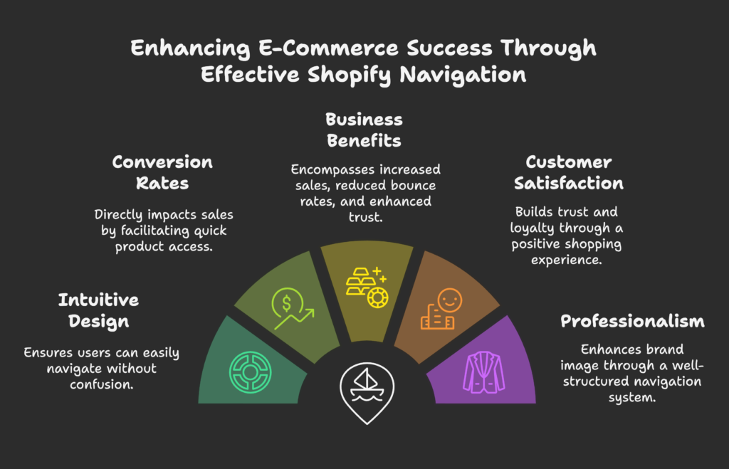
Business Benefits
Optimizing your navigation can:
- Increase sales and average order value
- Reduce bounce rates
- Boost customer satisfaction and trust
- Enhance your brand’s professionalism
What’s Next?
We’ll walk you through best practices you can implement right away to create navigation that feels natural and welcoming.
You now know why navigation is crucial. Next, let’s explore the basics of Shopify navigation so you can start planning your structure!
Understanding the Fundamentals of Shopify Navigation
Here, you’ll learn the core elements that make up Shopify navigation, plus how to structure them effectively within your admin interface.
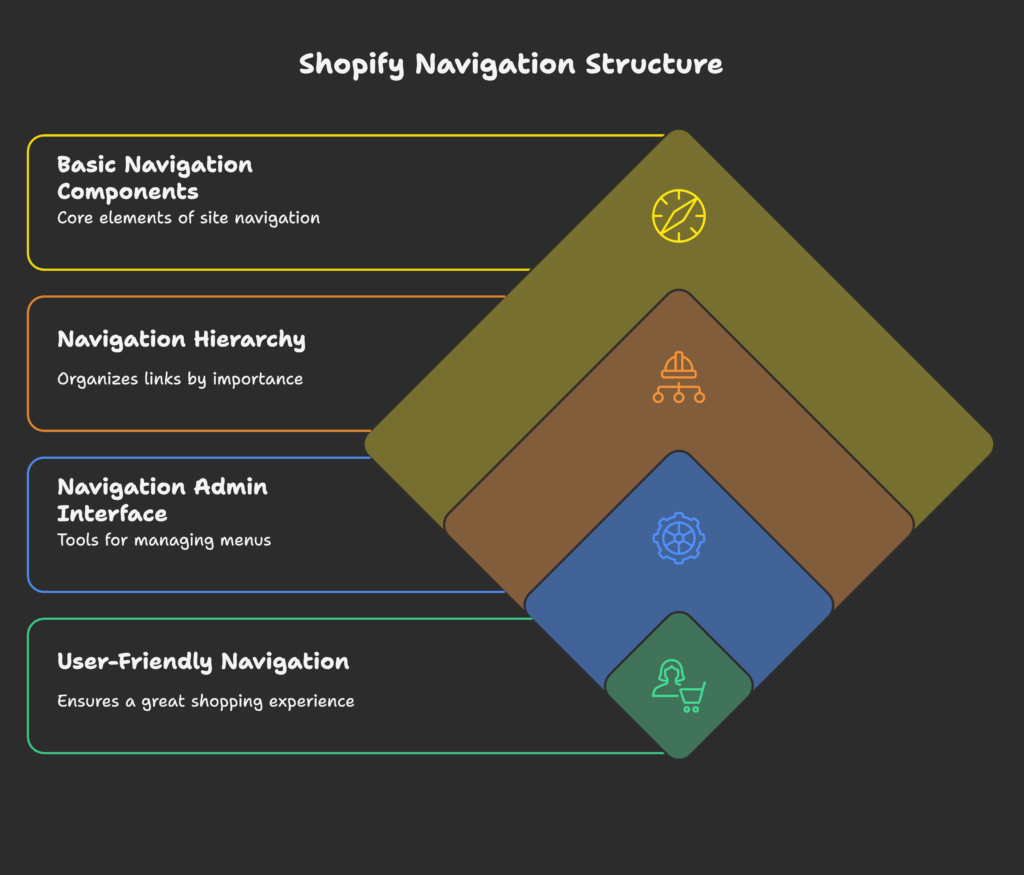
Basic Navigation Components
Header Navigation (Main Menu): Usually located at the top of your site, this is where visitors expect to find primary categories or pages.
Footer Navigation: Placed at the bottom of the site, often including links to policies, contact info, or FAQs.
Secondary Navigation Elements: These might be side menus or quick links for important pages like Sale items or a Size Guide.
Collections and Navigation: In Shopify, collections let you group related products, and linking them in your menus helps customers explore easily.
Navigation Hierarchy and Structure
Primary vs. Secondary Navigation: Your most important links (like Shop, About, Contact) go in the primary menu, while secondary links (like Blog or specific subcategories) can appear in dropdowns.
Parent-Child Relationships: When you have a dropdown, the parent is in the main menu, while child items show up when hovered over or clicked.
Psychological Principles: People love simplicity. Too many menu levels can cause confusion. Limit yourself to about three levels to keep things clean.
The Navigation Admin Interface
Accessing Navigation: In your Shopify admin, go to Online Store > Navigation to manage menus.
Main vs. Footer Menus: You can have a separate menu setup for your footer to keep less-critical links out of the main header.
Menu Item Creation: It’s straightforward to add, edit, or remove links in Shopify. You can link to collections, products, pages, and more.
Linking Options: Make sure each menu item points directly to the relevant page, avoiding any extra clicks.
You’ve got the building blocks. Now, let’s uncover some user-friendly best practices to ensure a great shopping experience.
Shopify Navigation Best Practices for User Experience
In this part, we’ll focus on how to keep your menus simple, logical, visually appealing, and consistent, all of which help customers find what they need quickly.
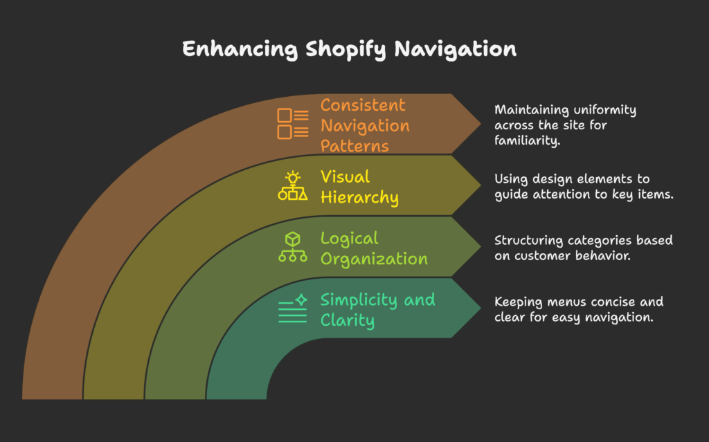
Simplicity and Clarity
“7±2” Rule: People can only hold around 7 items in their short-term memory. Keep your main menu items within this range if possible.
Descriptive Labels: Instead of “Stuff,” use “Men’s Hoodies” or “Kitchen Essentials.” Clarity reduces confusion.
Fewer Options, Better Focus: Avoid an endless list of menu items. Group related products into collections to simplify browsing.
Condensing Large Catalogs: If you have hundreds of products, break them into logical categories so the menu isn’t overwhelming.
Logical Organization
Customer-Centric Categories: Think like a shopper. Group products based on how people typically search (by style, purpose, or usage).
Prioritize Main Items: Place your best-selling or high-demand categories first in the menu.
Product Type vs. User Intent: Some stores prefer to categorize by product type (Shoes, Bags), others by scenario (Outdoor, Gym). Choose what makes sense for your audience.
Intuitive Architecture: Use headings and subheadings that guide the eye naturally.
Visual Hierarchy
Guiding the Eye: Make the most important menu items stand out—using bold text or slightly larger font sizes.
Color and Contrast: Ensure your navigation links are easy to read by using high contrast against the background.
Whitespace: Give each menu link some breathing room so nothing feels cluttered.
Current Location Indicators: Highlight the active page or subcategory so shoppers know where they are.
Consistent Navigation Patterns
Site-Wide Consistency: Keep your menu in the same place and style across all pages.
Familiar Patterns: Users expect a top horizontal menu, so try not to reinvent the wheel.
Persistent Elements: Make sure your cart, account, and search icons are always visible if possible.
Design Consistency: If you use dropdowns on one page, use them everywhere they fit.
You’ve learned how to keep navigation user-friendly on desktops. But what about the mobile experience? Let’s see how to optimize for smaller screens.
Mobile Navigation Optimization
Mobile users often have less patience and smaller screens. This section shows how to adapt your navigation so people can still shop happily on any device.
Mobile-Specific Navigation Challenges
Screen Size Limits: Small screens mean fewer visible menu items at once, so keep everything tidy.
Short Attention Spans: Mobile users might be on-the-go, so quick access is crucial.
Context-Based Shopping: Many mobile shoppers might be looking for instant answers or a single product type.
Responsive Design: Ensure your theme scales down properly so menus stay readable.
Effective Mobile Menu Types
Hamburger Menus: The three-line icon that opens a sliding or dropdown menu. It’s widely recognized, saving space.
Bottom Navigation Bars: Some stores put main links at the bottom, making them easier to tap. Studies suggest an 86% higher engagement with bottom tabs.
Card-Based Navigation: Shows options as cards or tiles—good for visually driven stores.
Hybrid Approaches: Combine a few visible links with a hamburger for secondary options.
Touch-Friendly Design
Optimal Touch Targets: Make clickable elements at least 44×44 pixels so fingers can tap easily.
Thumb-Friendly Placement: Place critical links within easy thumb reach, especially for one-handed use.
Gesture-Based Navigation: Some advanced themes allow swiping to open menus, but always ensure it’s easy to learn.
Touch Usability Testing: Test on actual devices to see if you accidentally mis-tap.
Performance Considerations
Load Times: Slow sites frustrate mobile shoppers. Optimize images and code for faster menu loading.
Code Optimization: Unnecessary scripts or large libraries can delay menu displays.
Asset Loading: Lazy-load images or fonts for speedier initial rendering.
Monitoring Tools: Use Google’s PageSpeed Insights or similar to track mobile performance.
Now you have a handle on mobile optimization. Next, let’s explore some advanced techniques that go beyond the basics.
Advanced Navigation Techniques
This section covers special features and enhancements, such as mega menus, integrated search, filters, and dynamic personalization.
Mega Menus
When to Use Them: If you have a large catalog with multiple subcategories, a mega menu can show everything at a glance.
Design Considerations: Keep it clean and organized—group items logically with headings.
Organization Strategies: Use columns, sub-headers, or images to break up options.
Technical Tips: Some Shopify themes have built-in support, or you can use apps or custom code.
Search Integration
Search & Navigation Relationship: A good search bar is part of your overall navigation—some users prefer searching over clicking through menus.
Auto-Suggest Features: Suggest popular products or recent searches to guide shoppers quickly.
Search Placement: Make sure the search bar is easy to find, typically in the header.
Analytics: Track search queries to see what users are really looking for, then improve your navigation accordingly.
Filtered Navigation
Collection Filters: Let users narrow down products by color, size, or other attributes.
Faceted Navigation: Offer multiple filter options so shoppers can combine them (e.g., size + color + brand).
Best Practices: Keep filter labels clear and user-friendly.
Shopify Apps for Filtering: Several apps provide advanced filtering to upgrade your default options.
Dynamic and Personalized Navigation
Context-Aware Menus: Display different menu items based on user location or browsing history.
Personalization: If you know a user’s past purchases, suggest related categories or promotions in the main menu.
Region-Specific Links: If you sell internationally, link to local shipping info or currency settings.
Implementation Tools: Some advanced apps or custom coding can enable dynamic menus.
You’ve seen ways to supercharge your menus. Let’s jump into the technical side of how to make these changes in Shopify.
Technical Implementation in Shopify
Now you’ll learn exactly where to customize navigation in your Shopify theme and how to tweak it using code or apps.
Theme Navigation Customization
Themes and Options: Different themes have different built-in navigation settings. Explore Customize in your admin.
Theme Settings: You can typically pick which menu serves as your header or footer and adjust layout details.
Built-In Limitations: Some themes limit how many sub-levels or layout options you can have, so check documentation.
Key Files: For deeper changes, check header.liquid and possibly navigation-drawer.liquid in your theme code.
Code-Level Customization
Liquid Templating: Shopify uses Liquid to display dynamic content. You can find navigation code blocks in your theme.
Linklists and Handles: In older references, “linklists” control menu data. Now you mostly interact with “navigation” sections in the admin.
Nesting Menus: You can go up to three levels deep, but remember not to overwhelm shoppers.
Custom Snippets: You can create reusable snippets for fancy menu elements and include them across your site.
App-Based Navigation Enhancements
Navigation Apps: There are several apps on the Shopify App Store designed to provide advanced menus, search, or filters.
Integration Considerations: Installing too many apps can slow your site, so choose wisely.
Performance Impact: Look for well-reviewed apps known for efficiency and support.
Selection Criteria: Does the app offer the exact features you need without overcomplicating your menu?
Great, now let’s see how navigation strategies differ based on the type of store you run.
Navigation for Different Store Types
This section outlines unique navigation strategies for stores with large catalogs, niche offerings, and business-focused (B2B) requirements.
Large Catalog Stores
Organizing Many Products: Use broad categories, then subcategories, to help shoppers find items quickly.
Scalable Hierarchy: Plan for growth so new products can fit into existing categories without chaos.
Cross-Categorization: Some products might belong in multiple sections, which is easy with collections.
Mega Menus and Filtering: Consider these advanced features to avoid a cluttered main menu.
Niche and Specialty Stores
Focused Navigation: If you only sell a few product types, keep your menu minimal and highlight unique items.
Storytelling Elements: Use navigation labels that reflect the brand’s personality or theme.
USP Highlighting: Add a link to “Our Craft” or “Our Ethos” to showcase what sets you apart.
Simplified Menus: Don’t confuse customers with too many categories if your product range is small.
B2B vs. B2C Navigation Differences
B2B Requirements: Buyers may want quick reorders, account management, or bulk ordering links.
Account-Specific Navigation: Show relevant prices or catalogs only to logged-in users.
Industry Standards: Some industries expect certain layout norms (e.g., “Product Lines,” “Technical Specs”).
Multi-Tier Pricing: Let B2B customers see tiered pricing by adding specialized links in the menu.
Now you know how navigation changes for different store types. Let’s explore how to test and refine your setup for continuous improvement.
Testing and Optimizing Navigation
In this part, we’ll cover methods to make sure your navigation truly meets customer needs, plus how to track and improve it over time.
User Testing Methodologies
Card Sorting: Let real people group items into categories, helping you see how they intuitively expect to find products.
Tree Testing: Show a simplified menu structure to testers and see if they can find a specific item.
Usability Sessions: Watch people browse your site and note where they hesitate or get lost.
Online Tools: Use software like Optimal Workshop or Maze to streamline these tests.
Analytics for Navigation Assessment
Key Metrics: Monitor bounce rates, time on page, and click-through rates on main menu links.
Navigation Engagement: Check how many users click top-level menus vs. submenus.
Heat Maps: Visualize where users click or drop off.
Goal Tracking: Set goals for navigational paths (for example, how many people reach a product page in 2 clicks).
A/B Testing Navigation Elements
Testing Method: You can try different menu layouts or label names and see which version leads to better engagement.
Hypothesis Development: For instance, “Renaming ‘Men’ to ‘Men’s Clothing’ will increase clicks by 10%.”
Interpreting Results: Consider both quantitative (clicks, conversions) and qualitative feedback.
Implementation Strategy: Once a clear winner is found, roll it out to your entire store.
You’re equipped to keep improving your menus. Now, let’s see real-life examples to inspire your own Shopify store navigation.
Case Studies and Examples
Let’s look at some stores and industries that have nailed their navigation—and how you can borrow their ideas.
Successful Shopify Navigation Implementations
- Zara’s Mobile Navigation: Known for a streamlined app-like menu on mobile, focusing on top categories first.
- Pipers Farm: Uses clear sections like “Meat Boxes,” “Everyday Essentials,” and story-driven pages to guide customers.
- Red Dress: Their subcategories are clearly labeled (“Dresses,” “New Arrivals,” “Shoes”), helping shoppers find items instantly.
Lessons Learned: Keep categories obvious, use sub-labels wisely, and don’t forget about your brand’s personality.
Industry-Specific Navigation Approaches
Different Product Categories: Fashion might separate by gender and type, while electronics might separate by device type or brand.
Business Models: Subscription box services often highlight “How it Works” near the top, while standard retail may skip that.
Seasonal Adaptations: Add or remove prominent seasonal links (like “Holiday Gifts”) during special periods.
Multi-Language Navigation: If you serve multiple regions, you may need duplicated menus or language switchers.
Now you’ve seen examples and best practices. Ready to integrate your menu strategy with the overall customer journey? Let’s find out how.
Navigation and Customer Journey Mapping
In this section, you’ll see how to align your navigation with the steps customers take when discovering, researching, and buying products from you.
Aligning Navigation with Customer Journey Stages
Awareness Stage: Put helpful info like “About Us” or “Why Choose Us?” in a visible spot for first-time visitors.
Consideration Stage: Highlight product categories, comparison pages, and customer reviews to guide deeper research.
Decision Stage: Make the cart and checkout extremely easy to access. Possibly show recommended add-ons.
Retention Stage: Provide links to support, returns, and loyalty programs for existing customers.
Navigation as a Conversion Optimization Tool
Strategic High-Conversion Links: Include links to bestsellers or sale items in prominent spots.
Upselling/Cross-Selling: Place links to “Matching Accessories” or “Complete the Look” in the main or submenus.
CTAs in Navigation: Sometimes, a “Shop Now” button in the top menu can spark immediate action.
Measuring Impact: Track conversions from specific navigation links to see which ones drive the most sales.
We’re almost at the end! Next, let’s glimpse into the future of Shopify navigation and see how trends might shape your store.
Future Trends in Shopify Navigation
In this part, discover emerging technologies and changing user preferences that could influence how we structure menus and guide customers.
Emerging Navigation Technologies
AI-Driven Personalization: Menus that adapt to each user’s browsing history or location.
Voice-Activated Navigation: As voice search grows, thinking about how your content is structured for voice queries matters.
AR Integration: Augmented reality could let shoppers virtually “navigate” your products in a new way.
Preparing for Change: Stay flexible and watch tech updates from Shopify and third-party developers.
Evolving User Expectations
Preference for Simplicity: Users increasingly like minimal menus and quick paths.
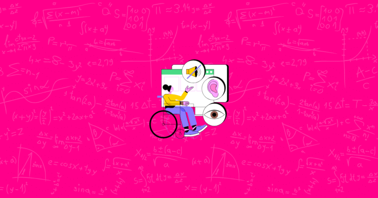
Inclusive Design: Ensure your navigation is accessible to all, including those using screen readers.
Industry Movements: More retailers are adopting mobile-first designs, so keep refining that aspect.
Device Shifts: With new gadgets or screens, your site should adapt without breaking navigation.
We’re almost there. Let’s wrap everything up with a practical guide and checklist you can follow.
Implementation Guide and Checklist
In this section, you’ll get a simple roadmap to evaluate your current navigation, fix issues, and keep improving over time.
Step-by-Step Navigation Audit
- Evaluate Your Current Menus: Check if any items are redundant or confusing.
- Identify Pain Points: Use analytics or surveys to see where shoppers struggle.
- Prioritize Improvements: Fix the most critical issues (like broken links) first.
- Set a Timeline: Schedule your updates to avoid overwhelming your team or customers.
Navigation Optimization Checklist
- Ensure main menu is simple, with 7 or fewer top-level items.
- Make labels descriptive and user-friendly.
- Double-check mobile responsiveness and tap targets.
- Use analytics (e.g., heat maps) to confirm that users find what they need.
You now have a solid approach to refining your navigation. Let’s conclude with some final tips and the benefits of a well-structured store.
Conclusion
Effective Shopify navigation is like a friendly tour guide, leading your customers through your store without confusion. By keeping things simple, logical, visually clear, and consistent, you’ll create a shopping environment where people enjoy browsing—and actually complete their purchases. Whether you manage a massive catalog or a tiny niche store, well-planned navigation boosts sales, customer satisfaction, and brand loyalty.
Quick Note: If you’d like an extra way to increase your Shopify sales, consider using Growth Suite. It’s an easy-to-use tool that helps optimize your marketing, track vital metrics, and boost revenue without the stress!
References
- Praella. (2024, November 29). Shopify Menu Design Tips: Elevate Your Online Store’s Navigation.
- Instant. (2025, March 4). The ultimate guide on Shopify UX for store owners.
- IdentixWeb. (2024, September 27). Importance of Shopify Customer Journey Mapping.
- Shopney. (2023, October 18). Mobile app menu design guidelines for increasing conversions.
- Shopify.dev. (n.d.). Add navigation to your theme.
- Webinopoly. (n.d.). Shopify Website Navigation: Tips for a Seamless UX.
- Shopify Community. (2024, May 1). How can I understand menus, collections and navigation better?
- Shopify Community. (2021, September 14). Best Tips to Optimize Mobile Menu Design for Your eCommerce Store.
- Mageplaza. (2024, January 24). Shopify Navigation: 10 Tips to Optimize Your Online Store.
- Shopify Community. (2021, October 12). Shopify Navigation: Best Practices for Your Store?