



Are you still designing your Shopify store with desktop users in mind first? You might be missing out on more than half of your potential customers! Did you know that over 60% of online shoppers now browse and make purchases directly from their smartphones? The mobile shopping revolution isn’t coming – it’s already here!
In this comprehensive guide, we’ll explore everything you need to know about creating a mobile-first experience for your Shopify store that converts browsers into buyers. By the time you finish reading, you’ll understand:
- Why mobile-first design is no longer optional for e-commerce success
- How mobile shoppers behave differently than desktop users
- Essential design elements that create seamless mobile shopping experiences
- Practical strategies to optimize your Shopify store for smartphones
- Advanced techniques to stay ahead of the competition
Ready to transform your Shopify store into a mobile conversion machine? Let’s dive in!
Introduction to Mobile-First Design for Shopify
Mobile-first design isn’t just a trendy buzzword – it’s a fundamental approach to building your online store that prioritizes the smartphone experience from the very beginning. Instead of designing for desktop and then squeezing that design onto smaller screens, mobile-first starts with the smallest screen and then expands outward.
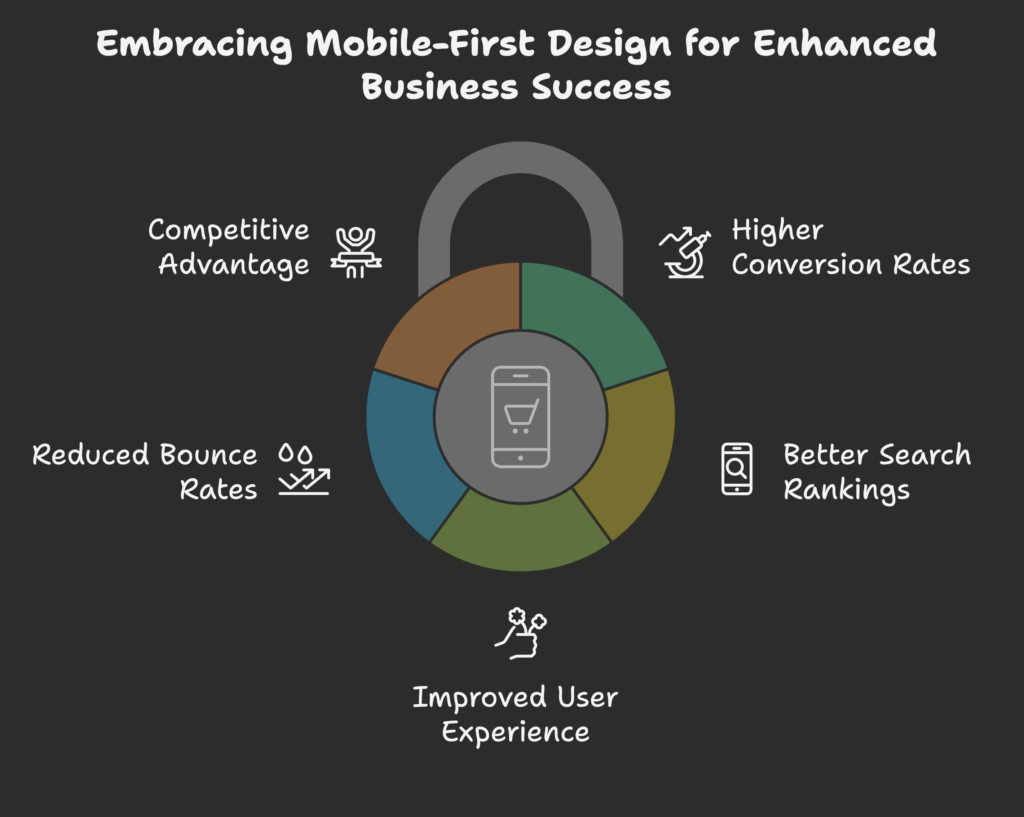
The statistics speak for themselves. With more than 60% of online shoppers now browsing and purchasing on their smartphones, businesses that don’t prioritize mobile are leaving money on the table. This shift reflects a broader change in consumer behavior, with smartphones becoming the primary device for most digital activities.
The business benefits of adopting a mobile-first mindset are substantial:
- Higher conversion rates from mobile visitors
- Better search engine rankings due to Google’s mobile-first indexing
- Improved user experience leading to increased customer loyalty
- Reduced bounce rates as visitors find what they need quickly
- Competitive advantage in markets where competitors lag behind
This shift from desktop-first to mobile-first thinking represents a complete reversal in design priorities. It forces us to focus on what truly matters to customers and eliminate unnecessary elements that might distract or slow down the shopping experience.
Now that we understand why mobile-first design is crucial, let’s explore how mobile shoppers actually behave – because designing effectively requires understanding your customer’s mindset. What makes mobile shoppers tick? Let’s find out!
Understanding the Mobile Shopper’s Journey
To create an effective mobile shopping experience, we first need to understand how people actually shop on their phones. Mobile shopping behavior differs significantly from desktop in several important ways.
Mobile User Behavior
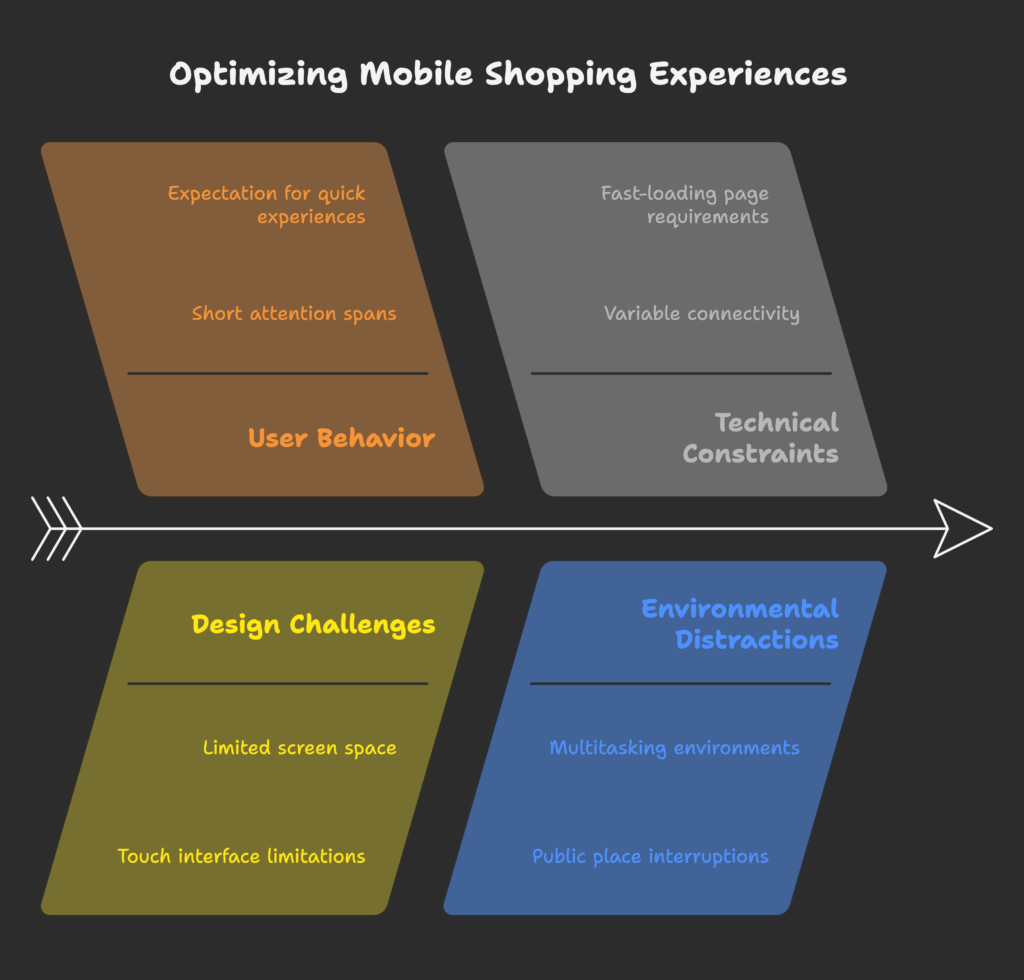
Mobile shoppers tend to have shorter attention spans, often browsing in brief sessions throughout the day rather than in extended shopping sessions. They might be shopping while waiting for a bus, during a lunch break, or while watching TV – context matters tremendously.
These shoppers are typically looking for quick, easy experiences. Studies show that mobile users are 5 times more likely to abandon a task if a website isn’t optimized for mobile. They expect:
- Fast-loading pages (53% of mobile users leave sites that take longer than 3 seconds to load)
- Easy navigation with minimal typing required
- Clear, large buttons that are easy to tap with thumbs
- Simple checkout processes that save their information
Mobile Shopping Challenges
Shopping on a smartphone comes with inherent challenges that your design must address:
- Limited screen space – requiring careful prioritization of content
- Touch interfaces – less precise than mouse pointers, requiring larger tap targets
- Variable connectivity – users might browse in areas with spotty connections
- Distractions – mobile shoppers are often multitasking or in public places
- Form filling frustration – typing on mobile keyboards is more tedious
Understanding these behaviors and challenges is essential because they directly inform how we should design mobile shopping experiences. The psychological factors at play – like the need for immediate gratification and lower tolerance for friction – mean that every extra step or second of loading time can lead to lost sales.
Now that we understand who we’re designing for, let’s explore the essential elements that make up an effective mobile-first Shopify design. How can we transform these challenges into opportunities? Let’s see!
Essential Elements of Mobile-First Shopify Design
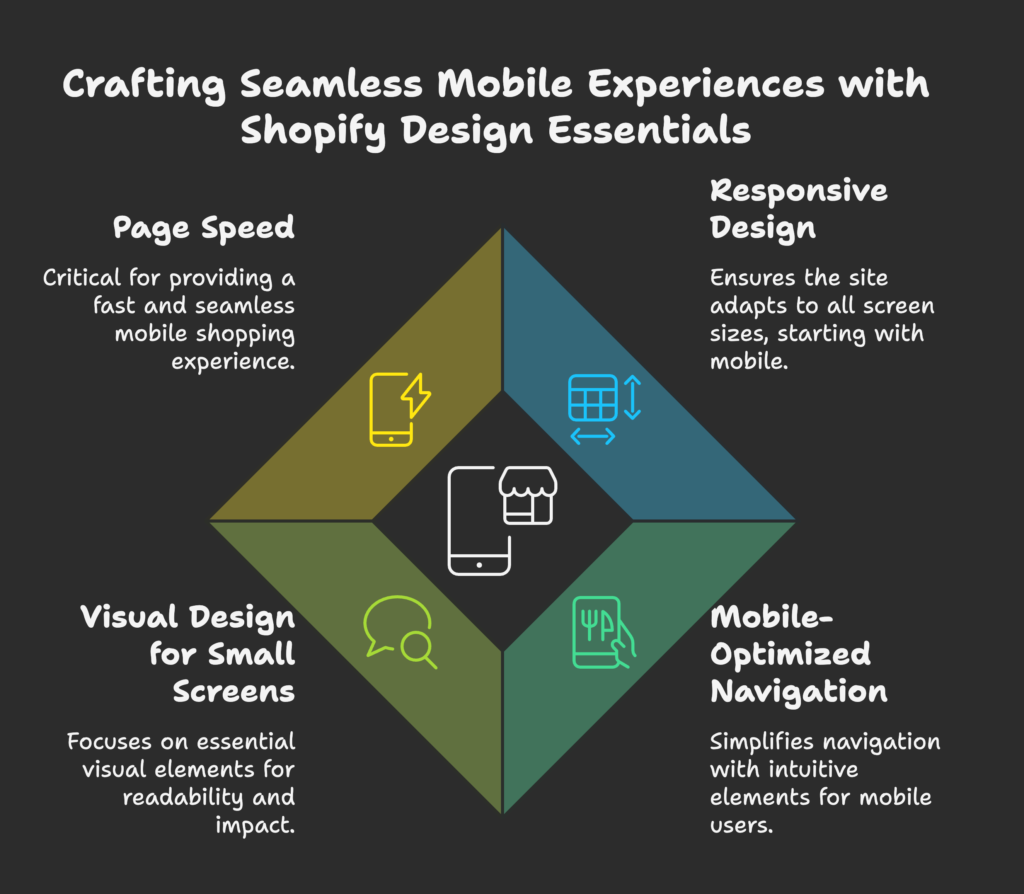
Creating a truly mobile-first Shopify store requires mastering several fundamental design elements. Each of these building blocks plays a crucial role in creating a seamless shopping experience on small screens.
Responsive Design Fundamentals
While “responsive design” and “mobile-first” are often used interchangeably, they’re not quite the same thing. Responsive design ensures your site works on all screen sizes, while mobile-first means you start with the mobile experience and then enhance for larger screens.
The key components of a responsive, mobile-first foundation include:
- Fluid grid systems that use relative units (percentages) instead of fixed pixels
- Flexible images that scale appropriately for different screen sizes
- Media queries that allow specific styles to apply at different screen widths
- Viewport settings that ensure proper rendering on mobile devices
For Shopify stores, this often means selecting a theme that’s built with these principles in mind or customizing your current theme to better support mobile users.
Mobile-Optimized Navigation
Navigation is perhaps the most critical element of mobile design – if users can’t easily find what they’re looking for, they’ll leave. Mobile-friendly navigation typically includes:
- Hamburger menus that conceal navigation options until needed
- Sticky headers that remain visible as users scroll
- Prominent search functionality for users who know what they want
- Thumb-friendly tap targets (at least 44×44 pixels)
- Limited menu depth – ideally no more than 2-3 levels deep
The goal is to simplify navigation while still making it easy for shoppers to explore your product catalog intuitively.
Visual Design for Small Screens
When designing for mobile, every pixel counts. This means being intentional about visual elements:
- Typography – Use readable fonts at appropriate sizes (minimum 16px for body text)
- Color contrast – Ensure text is easily readable against backgrounds
- Content hierarchy – Prioritize what matters most to mobile shoppers
- White space – Give elements room to breathe, especially tap targets
- Clear CTAs – Make buttons stand out with contrasting colors
The key is simplification – eliminating decorative elements that don’t serve the shopping experience and emphasizing what really matters to customers on the go.
With these essential design elements in place, your mobile Shopify store will already be ahead of many competitors. But to truly excel, we need to focus on a critical factor that can make or break the mobile experience: page speed. Let’s explore how to make your mobile store lightning-fast!
Optimizing Page Speed for Mobile Shopify Stores
When it comes to mobile shopping, speed isn’t just a nice-to-have – it’s essential. Let’s explore why page speed matters so much and how to optimize your Shopify store for maximum performance.
Mobile Performance Fundamentals
The impact of page speed on mobile conversion rates is dramatic:
- For every second delay in mobile page load, conversions can drop by up to 20%
- 53% of mobile users abandon sites that take longer than 3 seconds to load
- Google’s mobile-first indexing means slow mobile sites rank lower in search results
Before making improvements, establish a baseline using tools like Google PageSpeed Insights, GTmetrix, or Shopify’s own speed score. Your target should be a loading time under 2 seconds for optimal performance.
Image Optimization Techniques
Images typically account for the majority of a page’s weight. Optimize them by:
- Compressing images without sacrificing quality (tools like TinyPNG can help)
- Using appropriate formats – JPG for photos, PNG for images with transparency, WebP where supported
- Implementing lazy loading so images load only as users scroll to them
- Serving responsive images that deliver different sizes based on screen dimensions
For Shopify specifically, apps like Crush.pics can automate much of this process.
Code and Asset Optimization
Beyond images, optimize your store’s code and other assets:
- Minify CSS and JavaScript to remove unnecessary characters
- Leverage browser caching so returning visitors load resources faster
- Reduce third-party scripts and apps that aren’t essential
- Use a content delivery network (CDN) – Shopify includes this by default
- Consider AMP (Accelerated Mobile Pages) for select content
Remember that each app you add to your Shopify store potentially adds weight and slows down your site, so choose carefully and regularly audit their impact on performance.
Now that we’ve built a solid foundation and optimized for speed, let’s focus on one of the most critical pages in your mobile store: the product page. After all, this is where the buying decision happens!
Mobile-Optimized Product Pages
Product pages are where shoppers make their buying decisions, making them perhaps the most important pages to optimize for mobile. Let’s explore how to create product pages that convert on small screens.
Product Image Presentation
On mobile, product images need special attention since they’re often the primary factor in purchase decisions:
- Use high-quality images that remain sharp on high-resolution screens
- Implement easy swiping galleries with clear indicators of additional images
- Add pinch-to-zoom functionality for examining product details
- Consider 360° views or short videos to show products from all angles
- Ensure variant images (colors, sizes, etc.) update instantly when selected
Remember that mobile shoppers can’t physically touch your products, so your images need to do extra work to convey quality and features.
Product Information Architecture
With limited screen space, organize product information thoughtfully:
- Place critical information first – price, title, key features, and buy button
- Use expandable sections (accordions) for detailed specifications
- Implement tabs to separate different types of information
- Use bullet points to make key features scannable
- Make customer reviews easily accessible but not overwhelming
The goal is to provide all necessary information without forcing extensive scrolling or tiny text.
Mobile-Friendly Call-to-Actions
Your “Add to Cart” and other CTAs need special treatment on mobile:
- Make buttons large enough to tap easily (minimum 44px height)
- Use high-contrast colors that stand out from the rest of the page
- Consider sticky add-to-cart buttons that remain visible while scrolling
- Reduce the number of steps between “Add to Cart” and checkout
- Provide clear visual feedback when buttons are tapped
The primary action button should be immediately obvious, even at a quick glance.
With optimized product pages in place, we’re getting closer to conversion. But even the most beautiful product page won’t matter if your checkout process frustrates mobile users. Let’s look at how to streamline the path to purchase!
Mobile Checkout Optimization
The checkout process is where many mobile sales are won or lost. Even minor friction at this stage can lead to abandoned carts. Let’s explore how to create a frictionless mobile checkout experience.
Streamlined Checkout Process
For mobile shoppers, simplicity is everything during checkout:
- Minimize form fields – ask only for essential information
- Use appropriate keyboard types for different inputs (number pad for phone numbers, etc.)
- Implement autofill to reduce typing
- Offer guest checkout as a prominent option
- Show clear progress indicators for multi-step checkouts
- Provide inline validation to catch errors before submission
Each field you remove from your checkout form can increase conversion rates significantly.
Mobile Payment Integration
Modern payment options can dramatically improve mobile conversion rates:
- Implement digital wallets like Apple Pay and Google Pay
- Offer Shop Pay for quick, one-tap checkouts
- Display security badges prominently to build trust
- Consider buy-now-pay-later options like Afterpay or Klarna
- Save payment information for returning customers
The goal is to reduce the checkout to as few taps as possible – ideally just one or two.
Cart Optimization
Before checkout, the cart experience needs special attention on mobile:
- Implement slide-out carts that don’t interrupt the shopping flow
- Make it easy to edit quantities with plus/minus controls rather than dropdown menus
- Show thumbnail images of cart items for quick recognition
- Display shipping costs and taxes early to avoid surprise costs
- Suggest relevant products without overwhelming the cart interface
An optimized cart should make it easy to review purchases and proceed to checkout without frustration.
With our checkout process streamlined, let’s turn our attention to another crucial aspect of mobile design: content strategy. How can we communicate effectively on small screens? Let’s find out!
Mobile-First Content Strategy
Content strategy takes on special importance in mobile design, where every word and image must earn its place on the screen. Let’s explore how to craft content that works beautifully on smartphones.
Content Prioritization
When space is limited, prioritization becomes essential:
- Embrace the “content hierarchy pyramid” – most important information at the top
- Use progressive disclosure – reveal details as users dig deeper
- Conduct content audits to eliminate unnecessary elements
- Focus on benefits first, details second
- Cut word count by 30-50% compared to desktop versions
Remember that mobile users are often looking for specific information quickly, so make it easy to find without wading through paragraphs of text.
Mobile-Friendly Typography
Typography needs special consideration on small screens:
- Use a minimum 16px font size for body text
- Choose fonts with good readability at small sizes
- Maintain sufficient line height (1.4-1.5 is often ideal)
- Ensure strong contrast between text and background
- Limit line length to improve readability
- Use responsive type scaling for headings
Good mobile typography balances readability with efficient use of limited screen space.
Visual Content Optimization
Images and visual elements need special treatment for mobile:
- Consider different image crops for mobile (landscape images often work poorly)
- Break complex infographics into mobile-friendly chunks
- Use SVG icons for sharp display at any size
- Ensure sufficient contrast in all visual elements
- Optimize charts and graphs for small-screen viewing
Visual content should enhance the mobile experience, not complicate it.
With our content strategy optimized for mobile, let’s turn our attention to ensuring customers can actually find your store. Mobile SEO is a critical piece of the puzzle!
Mobile SEO for Shopify Stores
Search engine optimization takes on new dimensions when prioritizing mobile. Let’s explore how to ensure your Shopify store ranks well in mobile search results.
Mobile-First Indexing Optimization
Since Google now primarily uses the mobile version of your site for indexing and ranking, mobile optimization directly impacts SEO:
- Ensure content parity between mobile and desktop versions
- Implement structured data to help search engines understand your content
- Optimize meta titles and descriptions for mobile display (shorter is better)
- Use mobile-friendly URLs that are concise and readable
- Include the same internal links on mobile as on desktop
Remember that hiding content on mobile can hurt your rankings, so focus on reorganizing rather than removing important information.
Mobile User Experience Signals
Google’s Core Web Vitals and other user experience metrics directly impact rankings:
- Optimize LCP (Largest Contentful Paint) – aim for under 2.5 seconds
- Improve FID (First Input Delay) – aim for under 100 milliseconds
- Minimize CLS (Cumulative Layout Shift) – aim for under 0.1
- Follow Google’s interstitial guidelines to avoid penalties
- Regularly test mobile usability with Google’s tools
These technical metrics directly reflect the quality of user experience, which is now a ranking factor.
Local Mobile SEO
Mobile searches often have local intent, making local SEO especially important:
- Claim and optimize your Google Business Profile
- Include your address and phone number on your site (in text, not images)
- Implement local structured data markup
- Create store locator pages (if you have physical locations)
- Optimize for local keywords with location modifiers
For businesses with physical locations, local mobile SEO can drive both online and in-store traffic.
Now that our store is optimized and discoverable, we need to ensure it’s actually working well for real users. Let’s explore how to test and continuously improve your mobile experience!
Testing and Optimization Framework
Creating a great mobile experience isn’t a one-time project – it requires ongoing testing and optimization. Let’s explore how to build a framework for continuous improvement.
Mobile Usability Testing
Real-world testing is essential for identifying issues that analytics might miss:
- Test on actual devices, not just emulators
- Include a variety of device types and sizes in your testing
- Conduct task-based testing with real users
- Use session recording tools like Hotjar to observe real behavior
- Pay attention to rage clicks, unusual scrolling patterns, and form abandonment
Watching real users interact with your site will reveal friction points that might otherwise go unnoticed.
A/B Testing for Mobile
Data-driven optimization requires systematic testing:
- Test one element at a time for clear results
- Prioritize tests based on potential impact
- Ensure sufficient traffic for statistical significance
- Consider segmenting tests by device type
- Document findings for future reference
Common elements worth testing include CTA buttons, product page layouts, checkout steps, and navigation patterns.
Analytics for Mobile Optimization
Effective analytics setup helps identify opportunities:
- Segment data by device type in Google Analytics
- Set up conversion funnels to identify drop-off points
- Track mobile-specific interactions like swipes and taps
- Monitor page speed metrics over time
- Create dashboards focusing on mobile performance
Look for significant differences in behavior between mobile and desktop users to identify opportunities for improvement.
With a solid testing framework in place, we’re ready to explore some advanced strategies that can take your mobile Shopify store to the next level. Are you ready to leap ahead of the competition? Let’s see what’s possible!
Advanced Mobile Optimization Strategies
For those ready to push the boundaries of mobile e-commerce, these advanced strategies can provide a significant competitive edge.
Progressive Web App Implementation
Progressive Web Apps (PWAs) blend the best of websites and mobile apps:
- Offline functionality allows browsing even without an internet connection
- App-like experience with smooth animations and transitions
- Push notifications enable re-engagement opportunities
- Add-to-home-screen functionality increases repeat visits
- Faster loading through caching and service workers
While implementing a full PWA requires technical resources, even partial implementation of these features can improve the user experience significantly.
Personalization for Mobile Users
Mobile offers unique opportunities for personalization:
- Location-based recommendations using geolocation
- Time-of-day personalization for contextually relevant offers
- Behavior-based product suggestions based on browsing history
- Personalized push notifications (with PWA implementation)
- Saved preferences across sessions
Tools like Shopify’s own product recommendation API or third-party apps can help implement these personalization strategies.
Emerging Mobile Technologies
Stay ahead by exploring cutting-edge mobile technologies:
- Augmented reality (AR) for virtual product try-ons
- Voice search optimization for hands-free shopping
- Mobile chat and conversational commerce for assistance
- One-tap checkout innovations beyond current options
- Visual search capabilities for product discovery
While not all these technologies will be relevant for every store, identifying which ones align with your customer needs can provide significant advantages.
Now that we’ve explored various strategies and techniques, let’s look at some real-world examples to inspire your own mobile optimization journey.
Case Studies and Examples
Learning from successful mobile-first Shopify stores can provide valuable insights and inspiration for your own optimization efforts.
Successful Mobile-First Shopify Implementations
Consider these examples of exceptional mobile experiences:
- Allbirds – Streamlined product pages with minimal distractions and prominent CTAs
- Gymshark – Excellent category navigation and mobile-optimized product filtering
- Bombas – Simplified checkout process with prominent Shop Pay integration
- MVMT Watches – Effective use of video content optimized for mobile viewing
- Kylie Cosmetics – Mobile-optimized image galleries and streamlined checkout
Each of these brands has prioritized mobile user experience, resulting in higher conversion rates and customer satisfaction.
Industry-Specific Approaches
Different product categories often require tailored approaches:
- Fashion – Focus on high-quality images, easy size selection, and virtual try-on
- Electronics – Detailed specifications in expandable sections and comparison features
- Food & Beverage – Simplified reordering and subscription options
- Home Goods – AR implementation for visualizing products in space
- Beauty – Prominent reviews and before/after galleries
The most successful stores recognize the unique needs of their specific customer base and adapt their mobile experience accordingly.
With inspiration from these examples, let’s move on to a practical implementation guide that will help you put these principles into action!
Implementation Guide
Turning theory into practice requires a structured approach. Let’s create a roadmap for implementing mobile-first design in your Shopify store.
Step-by-Step Implementation Plan
Follow this sequence for the most efficient transformation:
- Audit your current mobile experience – Use Google’s Mobile-Friendly Test and PageSpeed Insights
- Analyze mobile analytics – Identify key drop-off points and opportunities
- Choose a mobile-optimized theme or plan customizations to your existing theme
- Prioritize improvements based on impact vs. effort
- Implement core optimizations – navigation, product pages, checkout
- Optimize images and assets for performance
- Test thoroughly on multiple devices
- Launch improvements (consider A/B testing major changes)
- Monitor performance through analytics
- Continuously refine based on data and feedback
This phased approach allows you to make meaningful improvements without overwhelming your resources.
Tools and Resources
These tools can help with your mobile optimization efforts:
- Testing Tools: Google PageSpeed Insights, Mobile-Friendly Test, Chrome DevTools
- Shopify Apps: Crush.pics (image optimization), PageFly (page builder with mobile focus), Instafeed (mobile-optimized Instagram feed)
- Analytics: Google Analytics, Hotjar, Lucky Orange for session recording
- Shopify Themes: Dawn (Shopify’s reference theme), Prestige, Impulse, Venue – all with strong mobile optimization
Leveraging these resources can significantly streamline your optimization process.
We’ve covered a lot of ground! Let’s wrap up with some final thoughts on mobile-first Shopify design.
Conclusion
Mobile-first design for Shopify isn’t just a trend – it’s an essential approach for e-commerce success in today’s smartphone-dominated world. By prioritizing the mobile experience from the beginning, you’re ensuring that the majority of your customers have the best possible shopping experience.
Remember these key principles as you optimize your store:
- Always design for mobile users first, then enhance for larger screens
- Speed is critical – optimize every element for fast loading
- Simplify navigation and checkout to reduce friction
- Test with real users on real devices
- Continuously monitor and improve based on data
As mobile technology continues to evolve, the most successful Shopify merchants will be those who stay ahead of the curve, embracing new opportunities to enhance the mobile shopping experience.
By implementing the strategies outlined in this guide, you’ll not only improve conversion rates and customer satisfaction but also gain a significant competitive advantage in your market.
Remember: Want to take your Shopify store’s performance to the next level? The Growth Suite app for Shopify can help you increase sales with powerful conversion optimization tools specifically designed for mobile shoppers. Try it today to see the difference a truly optimized mobile experience can make!
References
- Inventorysource. (2025, March 5). Why Mobile Optimization is Crucial for Shopify Stores? https://www.inventorysource.com/why-mobile-optimization-is-crucial-for-shopify-stores/
- Erawatech. (2024, August 2). Embracing Mobile-First Design for E-commerce Success. https://erawatech.com/embracing-mobile-first-design-for-e-commerce-success/
- Ashish Tagra. (2025, February 5). Mobile-First Design: Why It’s Crucial for Shopify Success. https://ashishtagra.com/blogs/design/mobile-first-design-why-it-s-crucial-for-shopify-success
- Instant. (2025, February 28). 15 best Shopify mobile optimization tips to enhance user experience. https://instant.so/blog/shopify-mobile-optimization
- TinyIMG. (2023, August 25). Optimize Shopify for Mobile: Best Practices and Tips. https://tiny-img.com/blog/mobile-shopify-optimization/
- LinkedIn. (2025, January 7). 10 Shopify Themes for Mobile-First Shopping Experiences in 2025. https://www.linkedin.com/pulse/10-shopify-themes-mobile-first-shopping-experiences-2025-eman-k-0d5sf
- Collabnix. (2024, October 29). A Developer’s Guide to Mobile-First Shopify Store Design. https://collabnix.com/a-developers-guide-to-mobile-first-shopify-store-design/
- Praella. (2024, November 29). Mastering Mobile-Friendly Shopify Design: Creating Seamless Shopping Experiences on Any Device. https://praella.com/blogs/shopify-insights/mastering-mobile-friendly-shopify-design-creating-seamless-shopping-experiences-on-any-device
- SimiCart. (2025, January 14). 10+ Best Shopify Themes For Mobile [With 5 Star-rated]. https://simicart.com/blog/best-shopify-themes-for-mobile/
- TechMagic. (2024, May 16). Mobile-First Design: The Best Practices. https://www.techmagic.co/blog/best-practices-for-mobile-first-design/