Have you ever wished you could point shoppers straight toward the “Buy” button without saying a word? Visual cues make that possible, and they’re more powerful than many realize. In fact, an estimated 92.6% of customers say visuals guide their decisions when shopping online. That’s a huge number. Yet in a virtual setting, you can’t offer textures or let anyone pick up an item and see how it feels. That’s where visuals step in, working like signposts to guide, reassure, and excite.
By the time you finish reading, you’ll discover how strategic images, design elements, and even color choices can spark trust and increase conversions. You’ll learn the science behind visual processing, see how imagery shapes emotions, and get practical tips for making your Shopify store look amazing. Ready to see how this all works? Let’s begin!
Understanding the Psychology of Visual Cues in E-commerce
In this section, we’ll look at the brain’s unique way of handling images and how emotional triggers can push shoppers toward a purchase. You’ll also learn about different visual cues that can simplify decisions and amplify trust.
The Science Behind Visual Processing
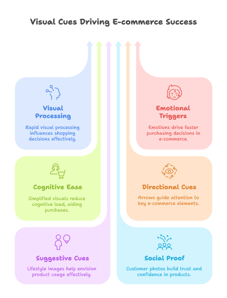
The human brain is built to process visuals at lightning speed. This is where the Stimulus-Organism-Response (S-O-R) model comes into play: an image or design (stimulus) influences how we think or feel (organism), which then shapes our actions (response). Sensation transference is another piece of the puzzle, where the appearance of a product influences how we judge its quality. Meanwhile, visual hierarchy guides our eyes along a page, meaning certain elements grab our attention first.
Interested so far? Let’s keep going to explore how emotions and reduced mental strain can lead to a purchase.
Emotional and Cognitive Responses to Visual Elements
Images can spark delight, trust, or even a sense of urgency. When a shopper’s heart is in it, buying decisions happen faster. Reducing the amount of mental effort is also key. Straightforward visuals and clear design elements keep things simple, stopping confusion in its tracks. Add color and shape psychology, and you have subtle signals that influence whether someone clicks “Add to Cart.”
But emotions aren’t the only factor. There are many types of visual cues that work on both conscious and subconscious levels. Let’s check those out next.
Types of Visual Cues for E-commerce
Visual cues come in all shapes and sizes. Arrows and lines (directional cues) pull the eye toward important spots. Suggestive cues like lifestyle images help people imagine using the product. Navigational cues might be color changes or hover effects that keep users oriented. Social proof cues—such as photos from real customers—reinforce trust. Finally, design cues like color contrast and typography make sure your message stands out and stays readable.
We’ve covered the psychology behind these cues, but how do you put them into action on a product page? Let’s discover that next.
Essential Visual Cues for Shopify Product Pages
Here, we’ll tackle four main areas: product imagery, advanced visualization, color and variant displays, and lifestyle photography. Each one works differently to capture attention and build confidence.
High-Quality Product Imagery
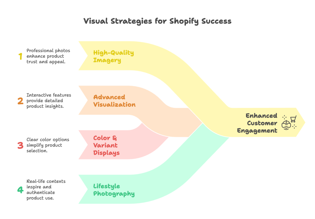
Clear, professional photos convey value in seconds. Show the item from multiple angles, include a zoom feature to highlight details, and give a sense of size by placing the item next to something familiar. A clean background keeps the focus on the product. For Shopify stores, simple photography upgrades can lead to a big boost in trust.
But photos alone aren’t always enough. Sometimes you need something more interactive. Let’s see how that works.
Advanced Product Visualization
When a product begs for a closer look, 360-degree spins or interactive rotations let shoppers see every side without leaving the page. For certain items, a short video or interactive tour offers even more clarity. Some brands are also adding augmented reality (AR) previews, which allow users to virtually place an item in their home or even on themselves. This level of depth helps people feel more certain about their choices.
Of course, color matters too, especially when items have multiple variants. Let’s explore how to display those next.
Color and Variant Visualization
If you sell a shirt in five different shades, don’t make users click around in confusion. Show them swatches or thumbnail images for each option. Keep the style consistent and ensure these elements look good on a phone screen. Shopify themes sometimes include basic swatch features, but specialized apps or custom coding can give you finer control and help you stand out.
Still, colors and technical details only go so far without context. That’s where lifestyle imagery enters the picture.
Contextual and Lifestyle Imagery
Seeing a product in real-life scenarios can spark imagination. If you sell a sleek office chair, show it in a modern workspace. If you specialize in camping gear, place that tent in a lush forest scene. This approach can be both inspirational and realistic, provided you don’t oversell. Aim for authenticity—people are savvy enough to notice if an image feels staged.
You now know how to improve product pages. But visual guidance should flow all the way from homepage to checkout. Let’s see how that looks.
Strategic Visual Cues Throughout the Customer Journey
Next, we’ll travel through the entire shopping experience, from the homepage to the checkout page. You’ll see how different visual signals at each step can keep people engaged and prevent cart abandonment.
Homepage and Landing Page Visual Guidance
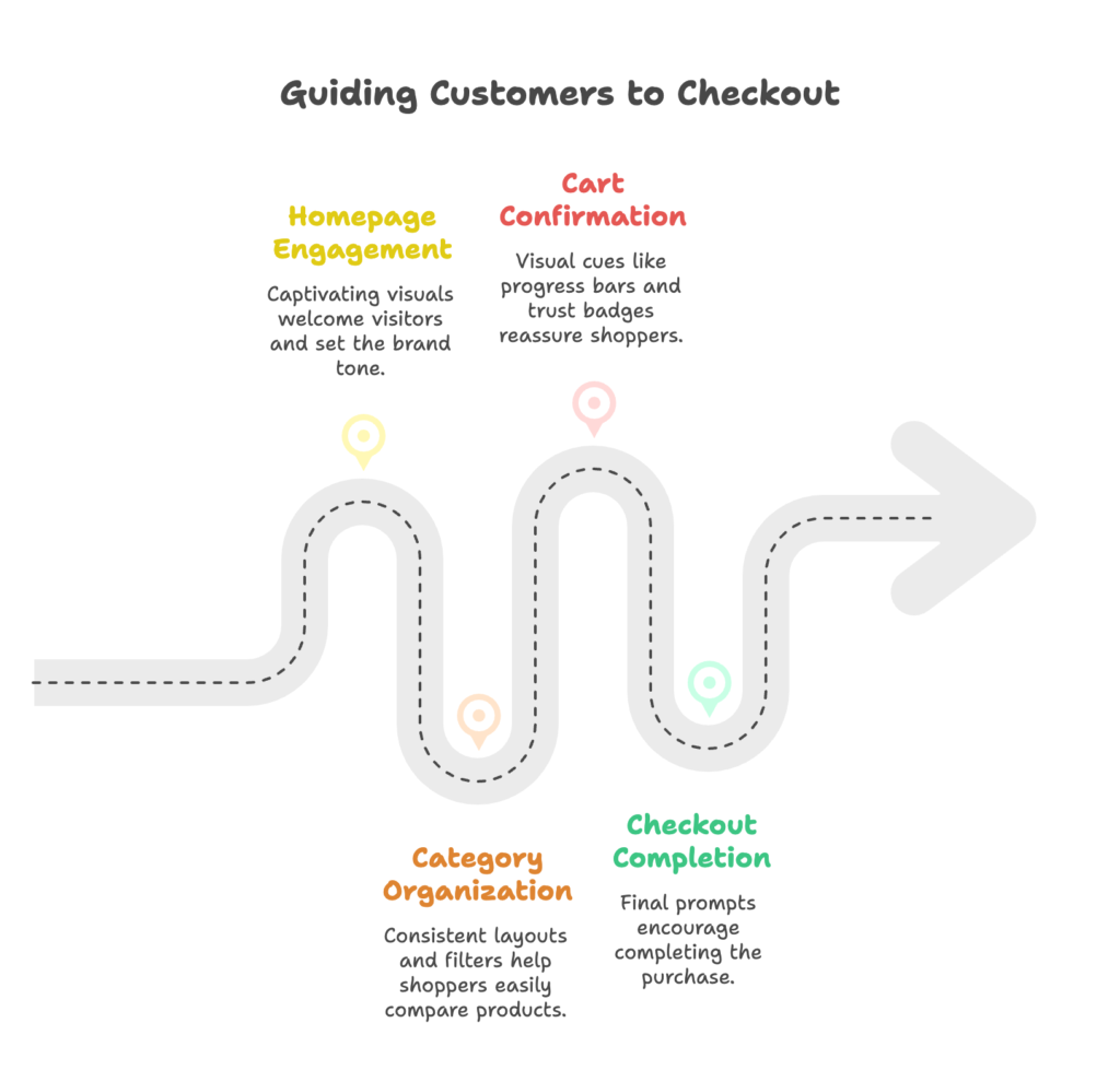
Your homepage is the store’s welcome mat. A captivating hero image can instantly show what you’re all about. Using arrows or text overlays, guide visitors to a featured collection or promotion. Seasonal graphics are also helpful—if you’re running a summer sale, a bright banner lets people know at a glance. Visual elements that tie back to your brand story can build a quick emotional connection.
But once they click into a category, you need to keep that momentum. Let’s check out collection pages next.
Category and Collection Page Visual Organization
Collection pages shouldn’t feel like chaotic grids. Consistent thumbnails, hover effects, and well-sized images help users compare items quickly. Offering a quick view feature or clearly displayed filters also encourages browsing. You might include a header image that sets the tone for that category, like a cozy living room shot for home goods.
Finally, shoppers move on to the cart. Let’s explore how visuals can help close the sale.
Cart and Checkout Visual Cues
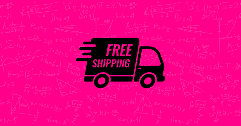
Ever notice a progress bar in a checkout process? It tells shoppers exactly where they stand, which lessens confusion and reduces drop-offs. You can also use images to confirm items, show trust badges for security, and highlight any free shipping thresholds. Visual cross-sells and upsells—like a small product image with a “You might also like” suggestion—can spur additional purchases.
We’ve seen how to guide customers through your store. Next, let’s explore how real shoppers themselves can add even more visual proof.
User-Generated Content as Visual Social Proof
Real buyers have a unique influence that polished brand images sometimes lack. This section covers how to gather and display customer photos or videos, plus tips on visual reviews and influencer collaborations.
Customer Photos and Videos
Imagine a grid of happy customers showing off your product in daily life. That’s the power of user-generated content (UGC). Gather these snapshots and place them on product pages, showcasing genuine experiences. Make sure your design is mobile-friendly, and consider a separate gallery section. A quick tip: you can filter or curate UGC to stay on brand, but leave enough variety to feel authentic.
Of course, star ratings and visual reviews work wonders too. Let’s discuss that next.
Visual Reviews and Ratings
Numbers alone can feel abstract, but colorful star ratings or photo-based reviews bring them to life. Verified purchase icons and at-a-glance review summaries build trust. Some Shopify apps also let customers add pictures or short videos of themselves using the product. These visual details help future buyers imagine the item in real use.
What if you want someone with a larger audience showing off your product? That’s where influencers come in.
Influencer Content Integration
When influencers share images of your product, their followers often see it as a personal recommendation. Display these posts on your store to reinforce that sense of social proof. Just be careful to keep it authentic—overly stylized content might seem forced. Proper attribution is key, and you can test how well influencer images perform in various parts of your site.
User-generated visuals spark trust, but making them fit your store takes a bit of work. Next, let’s explore the technical side of all these visual cues.
Technical Implementation of Visual Cues in Shopify
Here, we’ll see how theme selection, helpful apps, and maybe a bit of coding can turn creative ideas into real designs. You’ll also learn how to avoid slowing your site down.
Theme Selection and Customization
Shopify has numerous themes, both free and paid. Some come with robust visual options right out of the box. Examine the demo to see if it supports large hero images, swatches, or custom layouts for images and text. If something is missing, you might tweak the theme code or enlist the help of a developer to fine-tune your visual approach. Keep an eye on theme performance as well, because loading speeds matter.
If changing your theme isn’t an option, consider using apps to add more visual flair. Let’s see how.
Apps and Extensions for Visual Enhancement
Want 3D product views or easy UGC integration? There’s likely a Shopify app for that. Image optimization tools can compress files without hurting quality. Visual merchandising apps let you rearrange or highlight items in a more eye-catching way. However, each new app can slow your site, so install wisely and watch performance metrics.
Sometimes, though, nothing beats custom solutions. Let’s check when custom development makes sense.
Custom Development Considerations
If your brand needs unique visual features or an advanced AR demo, you may go beyond standard templates and apps. Collaborating with a developer can open up new possibilities, such as tailor-made animations or specialized galleries. Just remember to balance a visually rich experience with fast loading times—no one likes a slow store.
So how do you know if these visual cues are actually working? That’s next on our list.
Testing and Optimizing Visual Cues
In this section, you’ll learn how to run tests on your visual elements, track how shoppers respond, and constantly refine your approach.
A/B Testing Visual Elements
Guesswork can be expensive, so tools like Google Optimize or third-party testing solutions let you compare two versions of a page. Maybe one version has a product video at the top, while the other shows it further down. Look at metrics such as conversion rates or time on page. Just be careful not to test too many elements at once—you want clear results.
A/B testing can tell you what changes lead to more sales, but visual heat maps show you where people focus their gaze. Let’s talk about that.
Heat Mapping and User Interaction Analysis
Heat map tools show you “hot” areas where visitors click or hover, helping you see if an arrow or color highlight is doing its job. Session recordings take it further, revealing stumbling blocks or points of interest. Keep in mind that mobile users often interact differently than desktop users. Data from these tools can inform your next round of changes.
Yet, optimization shouldn’t be a one-time project. Let’s see how to keep this process going.
Continuous Optimization Framework
Create a set of visual goals—like improving clicks on a specific banner or raising add-to-cart rates. Each time you run tests, gather results and revise your strategy. Seasonal campaigns might call for fresh imagery, but remember to maintain brand consistency so customers still recognize you. Over time, these gradual tweaks can accumulate into big improvements.
While you’re optimizing for conversions, keep inclusivity in mind. That’s our next topic.
Visual Accessibility and Inclusivity
This part highlights how to make your store welcoming for everyone, from color contrast guidelines to adapting visuals for different cultural backgrounds.
Color Contrast and Visibility
Your site should be comfortable to view. WCAG guidelines recommend good contrast between text and background. Consider forms of color blindness as well—if your store depends too heavily on certain shades, some users may struggle. Provide descriptive alt text so visitors using screen readers know what each image depicts.
Color choices aren’t the only form of inclusivity. Cultural nuances matter, too.
Cultural and Demographic Considerations
Images that speak to one region might not translate well in another. Keep an eye on factors like language, style, and typical imagery that local audiences relate to. If you cater to many age groups, consider showing a variety of people in your marketing photos to reflect that diversity. This approach helps customers see themselves using your products.
Accessibility is crucial, but seeing success stories in action can inspire new ideas. Let’s move on to real-life examples.
Case Studies: Successful Visual Cue Implementation
Ready for a glimpse of how different industries have used visual cues to lift conversions? This section will walk you through actual results from fashion, beauty, and home goods brands.
Fashion and Apparel
Online clothing retailers often rely on interactive features that let buyers zoom in on fabrics or check out 360-degree views. A big-name fashion store once revealed that when they introduced these features, shoppers returned fewer items. Some Shopify-based fashion stores also include personal styling videos, giving a more human feel to the buying process.
Looking good is one thing, but beauty brands take visual cues to another level. Let’s see how.
Beauty and Cosmetics
Before-and-after images can be powerful for skincare or makeup. Many cosmetics brands add short videos showing application techniques or results over time. One popular store found that featuring user-generated before-and-after comparisons led to higher engagement because it was easy to see the difference a product made.
Furniture and home goods also gain from interactive previews. Here’s how.
Home Goods and Furniture
Some furniture brands let you view a couch in a virtual living room, resizing or retexturing it in real time. This helps shoppers feel confident in large purchases. Another approach is a 3D model you can rotate and place within a photo of your actual room. These advanced visuals reduce hesitation and return rates.
Imagery keeps evolving, and there are even more exciting developments on the horizon. Let’s look ahead.
Future Trends in E-commerce Visual Cues
Curious about where visuals are headed? We’ll talk about AI, VR, and how storytelling is expanding in online shopping.
AI-Generated and Personalized Visuals
Artificial intelligence is moving beyond chatbots. Some brands now create personalized imagery on the fly, showing items in scenarios tailored to a shopper’s past browsing habits. Others rely on AI to recommend content, so each visitor sees pictures that match their preferences. This can lead to highly relevant experiences.
But AI isn’t the only innovation taking shape. Let’s check out new forms of interaction.
Advanced Interactive Technologies
Virtual reality stores allow customers to “walk” through a digital space, picking up items as though they were in a physical shop. AR is also becoming more accessible, helping people see how an item fits into their daily life. Interactive videos with clickable product hotspots are appearing, so viewers can shop directly from what they watch.
While tech is cool, it’s the story that truly resonates. Let’s see how storytelling is evolving.
Visual Storytelling Evolution
Stories told through images or short videos can strengthen brand loyalty. Many brands feature behind-the-scenes content, showing how items are made or the people behind the products. Visual storytelling can also highlight ethical or community-focused initiatives. Over time, it builds an emotional link that makes people feel more connected.
Ready to put all this into practice? Our next section outlines a roadmap for action.
Implementation Roadmap for Shopify Store Owners
Sometimes, the biggest question is “Where do I start?” Here’s a step-by-step plan for the next 12 months, broken into quick wins, medium-term tactics, and long-term strategies.
Quick Wins (1-30 Days)
Focus on simple updates with strong impact. Swap out any low-resolution images. Add high-quality lifestyle photos for key products. Explore a basic app for reviews with customer photos. These small changes can deliver immediate improvements and build momentum.
Next, let’s plan for the slightly bigger steps you can take over the next few months.
Medium-Term Strategy (1-3 Months)
Conduct a store-wide visual audit. Make sure your branding is consistent across product photos, banners, and collection pages. Test out 360-degree spins or short product videos. You can also implement UGC galleries and experiment with more advanced color swatches. Use A/B testing and heat maps to confirm which changes make a difference.
Once you’ve covered these elements, consider more ambitious updates.
Long-Term Visual Excellence (3-12 Months)
For brands aiming to stand out, custom development projects might be the next step. Consider advanced AR features or tailor-made design elements that set you apart in the marketplace. Document your visual guidelines, and keep optimizing based on user feedback and performance data. This approach lays the groundwork for ongoing success in a changing e-commerce scene.
We’ve walked through a lot of advice. Let’s wrap it up with some final suggestions.
Conclusion
Visual cues can be the difference between a shopper who browses and one who buys. Whether it’s a well-placed arrow, an authentic customer photo, or an interactive product demo, these signals shape confidence and spark excitement. As trends shift, keep testing and adjusting to make sure you’re offering an experience that feels seamless and trustworthy. With the right balance of inspiration and practicality, your Shopify store can grow into a place people love to explore and purchase from.
References
- Golden Ratio. (2025, April). The Impact of Visual Marketing on Purchasing Behavior in E-commerce. Retrieved from https://goldenratio.id/index.php/grdis/article/download/769/538/5308
- Haptic. (2025, March). Illuminating Online Shopping: The Power of Visual Cues in Consumer Decision-Making. Retrieved from https://www.haptic.ro/illuminating-online-shopping-the-power-of-visual-cues-in-consumer-decision-making/
- ConvertCart. (2022, October 27). 22 Ways to Use Visual Cues to Drive More Conversions in E-commerce. Retrieved from https://www.convertcart.com/blog/visual-cues-ecommerce
Ready to supercharge your Shopify store’s sales with perfectly optimized discount codes? Growth Suite is a Shopify app that helps you do just that. Install it with a single click and start seeing results!