Have you ever pictured an online shopper loading up their cart, only to disappear right before paying? It happens more often than you might think—around 70% of potential buyers leave their carts behind at checkout. That’s a huge slice of revenue that slips away. This article aims to reveal why people abandon their carts, how you can address their hesitation, and what practical steps you can take to turn casual browsers into happy customers. By the end, you’ll understand the psychology behind checkout decisions and how to use it to boost conversions in your Shopify store. Ready to get started?
Introduction
When a customer reaches checkout, it feels like you’re just inches away from securing the sale. Yet statistics show that many carts go unfinished. It’s not just about convenience; psychology plays a major part. Why do shoppers hesitate at the last step? What mental barriers pop up? This section will explain the core reasons behind cart abandonment and why it’s so crucial to tackle them. Once you see the power of psychology in this area, you’ll be ready to explore ways to optimize your own checkout flow.
You’ll learn about current abandonment rates and discover how psychology can shift the odds in your favor. Let’s jump in, then we’ll move on to a deeper look at specific mental factors that shape checkout behavior.
Understanding the Psychology of Checkout Behavior
In this section, you’ll see the mental triggers that influence people at checkout. Many of us assume buying decisions are purely logical. The truth is, subtle mental shortcuts and emotional cues play a huge part in whether someone completes a purchase.
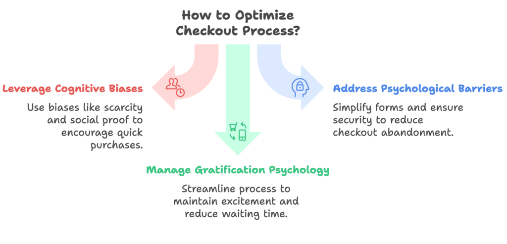
We’ll talk about cognitive biases, barriers to completion, and how immediate gratification can push shoppers to the finish line. By the end, you’ll have a clearer view of the hidden drivers behind each click.
Cognitive Biases Affecting Checkout Decisions
Scarcity and urgency bias: When we think a product is in short supply or a special offer is ending soon, we’re more likely to act quickly. Words like “Only 3 left!” or “Sale ends tonight!” can nudge shoppers to buy before they miss out.
Loss aversion: We tend to feel losses more strongly than gains. Shoppers might worry they’ll lose out on a discount or a bonus if they don’t purchase right away.
Social proof: Knowing others have bought the same item and loved it builds confidence. Testimonials, reviews, or “Most popular choice” badges reinforce the idea that the item is worthwhile.
Choice overload: Too many options can lead to decision paralysis. When confronted with too many choices, shoppers might delay or abandon the purchase altogether.
Psychological Barriers to Checkout Completion
Mental fatigue: Long forms and extra steps can tire out a customer’s mind. If the checkout process feels demanding, they might quit midway.
Form filling strain: People dislike providing unnecessary information. Reducing fields or adding autofill can make checkout feel less exhausting.
Trust and security concerns: Shoppers often wonder if their details are safe. Without clear security signals or trusted payment methods, they might hesitate.
The gap between intent and completion: Even if someone wants a product, last-minute doubts or distractions can derail the process.
The Psychology of Immediate vs. Delayed Gratification
Disconnect from excitement: A lengthy or complicated checkout kills the spark shoppers felt when they first chose the product.
Thrill of quick purchasing: A streamlined process keeps the momentum going and makes the purchase feel almost instant.
Waiting time and abandonment: Every extra second spent on loading screens or extra pages raises the chance of a shopper clicking away.
So far, we’ve uncovered the mental factors that steer people during checkout. Ready to transform that knowledge into action? The next section shows you how to optimize your checkout from start to finish.
Fundamental Checkout Optimization Strategies
Now that you know why shoppers pause or abandon their carts, it’s time to explore proven tactics that reduce friction and boost completion rates.
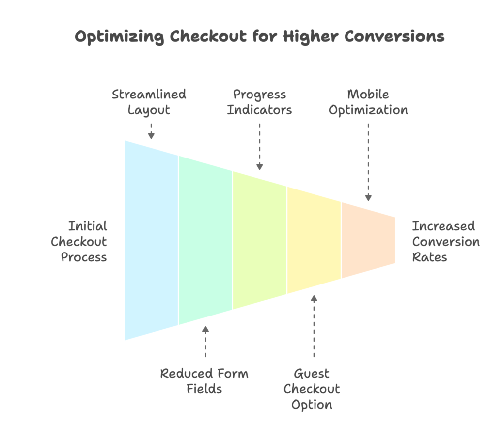
We’ll cover streamlined layouts, the option for guest checkout, and mobile-centric design tweaks. By the end of this section, you’ll have practical ways to make your checkout process far more inviting.
Streamlining the Checkout Process
Single-page vs. multi-page: One-page checkouts keep everything in one place, which feels simpler to the user. However, multi-page checkouts can break steps into smaller tasks. Test both to see which resonates with your audience.
Fewer form fields: Ask only for the details you absolutely need. Each extra field is a chance for the shopper to reconsider whether the purchase is worth the hassle.
Progress indicators: Little status bars showing how close someone is to finishing can motivate them to push through. It’s a visual nudge that says, “Almost there!”
Case study: Stellar Eats boosted its conversions by 3.5% simply by switching to a one-page checkout. That small change made the process feel faster and friendlier.
Guest Checkout Implementation
Why accounts create resistance: Shoppers may worry about spam or privacy. Sometimes they just don’t want to commit to creating yet another account.
Combining guest checkout and account benefits: Let people buy as guests to keep things hassle-free, but invite them to create an account afterward to enjoy perks like faster reorders.
Abandonment due to mandatory account creation: About 26% of shoppers leave if they’re forced to sign up. Give them breathing room, and watch your conversions climb.
Mobile Checkout Optimization
User psychology on smartphones: Mobile users have less patience for clutter and slow loading. A glitchy experience or too many steps means they’ll exit quickly.
Touch-friendly design: Buttons and form fields need to be large enough for fingers, not just mice. Make the checkout easy to tap.
Faster speed: Mobile buyers expect checkout to load quickly, so trim down images and code. Each second matters.
We’ve highlighted core tactics for a smooth and simple checkout. Next, we’ll shift focus to building trust signals and reassuring shoppers that your store is secure and dependable.
Building Trust and Security at Checkout
Once the process is smooth, the next priority is trust. If shoppers are unsure about safety or hidden costs, they’ll vanish. This section covers how to project security and transparency.
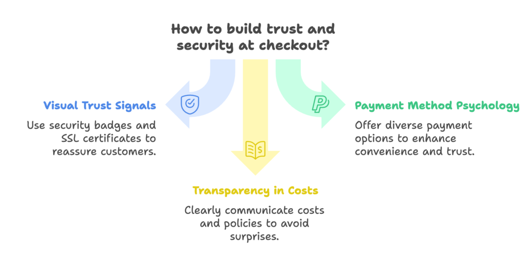
You’ll see how to leverage badges, multiple payment methods, and clear pricing to reassure customers and keep them moving toward the final click.
Visual Trust Signals
Security badges: Icons from well-known providers like Norton or McAfee send a message that you’re serious about safety.
SSL certificates and payment indicators: That little lock symbol in the address bar goes a long way in calming nerves.
Privacy policy visibility: Make it easy to find and read. People want to know how you handle their personal data.
The role of trust in online payments: Digital transactions can feel risky, so visible signs of security help ease tension.
Payment Method Psychology
Popular payment options: Familiar choices like PayPal or major credit cards reduce concerns about security and reliability.
Multiple payment methods: Offer a range of choices to suit different users. Some prefer a debit card, others may want Apple Pay or Google Pay.
Buy now, pay later: These plans speak to shoppers looking for flexibility, making a purchase feel less heavy.
Express payments: One-tap solutions speed up the process, which often leads to higher completion rates.
Transparency in Costs and Policies
Unexpected fees: Around 44% of buyers abandon carts when they see extra shipping or handling costs at the last moment. Always show these fees early.
Delivery date clarity: Provide realistic shipping times. Specific timelines (“Arrives in 3-5 days”) feel more reliable than vague promises.
Return policy placement: If returns or exchanges are simple, highlight that policy to give buyers extra peace of mind.
We’ve tackled the trust factor. Next up, let’s focus on advanced triggers—like urgency, social proof, and friction reduction—that can give your checkout an added boost.
Advanced Psychological Triggers in Checkout Design
Now we dive deeper into tactics that tap into human psychology in more subtle but powerful ways. By sprinkling urgency and social proof throughout your checkout, you can inspire that final push toward completion. You’ll also learn friction-busting techniques that keep the process feeling smooth. After this section, you’ll have a clear sense of how small design choices can spark significant results.
Urgency and Scarcity Techniques
Limited-time offers: Adding a countdown clock or a “Sale ends tonight” note makes the deal feel momentary and special.
Low stock notices: When an item is almost out of stock, shoppers are more likely to act quickly.
Subtle pressure: While urgency can drive sales, balance it so shoppers don’t feel overwhelmed or cornered.
Social Proof at Checkout
Recent purchase notifications: “Anna from New York just bought this product” serves as a friendly nudge, showing that other folks are buying right now.
Review highlights: Display quick quotes from satisfied customers to quell last-minute doubts.
Active viewer counts: Let people know how many others are looking at the same product. This can prompt faster decisions.
Friction Reduction Techniques
Address autocomplete: Saving people time and effort with automatic address suggestions is a simple way to keep them engaged.
Stored payment info: Returning customers appreciate not having to re-enter card details.
One-click checkout: This option practically eliminates extra steps, driving up conversion rates.
With these triggers in mind, let’s move on to how you can tailor the entire checkout experience to different types of shoppers, making each journey feel personalized.
Personalization in the Checkout Experience
Ever wish you could talk to each customer in a way that matches their preferences? Personalization helps you do exactly that. We’ll explore ways to customize checkout for first-timers, returning fans, and different devices. By the end, you’ll see how small tweaks can create big loyalty.
Tailoring the Checkout to Customer Segments
First-time vs. returning customers: Newcomers might need reassurance, while regulars value a speedier path. Design your checkout to cater to both groups.
Geographic preferences: Shipping options, language, or currency formatting can shift depending on location.
Device-based optimization: A tablet user might expect a slightly different layout than a smartphone user.
Purchase history-based customization: Offer recommended items or relevant upsells based on past orders.
Dynamic Checkout Elements
Personalized upsells and cross-sells: Suggest items related to what’s already in the cart. It’s a friendly reminder that they might need something else.
Location-specific shipping: Adjust shipping details in real time based on the shopper’s region.
Tailored discounts: A special offer shown at checkout can feel like a pleasant surprise, encouraging people to finalize their purchase.
Personalized post-purchase pages: After they buy, thank them with recommendations for their next order.
Behavioral-Based Checkout Optimization
Cart abandonment recovery: If someone leaves at the final step, email or retarget them with a gentle reminder.
Browse behavior insights: If they spent a long time checking certain items, highlight them again for reassurance.
Time on site: If a shopper has been browsing for a while, offer a quick checkout shortcut to reduce any lingering reluctance.
Feeling inspired? Next, we’ll see how to bring these ideas to life specifically within the Shopify ecosystem, ensuring you can implement them smoothly.
Technical Implementation for Shopify Stores
Having the perfect plan is one thing, but making it happen in Shopify can feel like a puzzle. This section breaks down the tools and tactics available, from basic Shopify features to advanced customization options on Shopify Plus. By the end, you’ll know exactly what levers you can pull to shape your ideal checkout.
Shopify Checkout Customization Options
Standard checkout features: Shopify’s default checkout is already quite streamlined. You can tweak colors, add your logo, and modify certain fields.
Shopify Plus: Larger stores or those looking for deeper customization might prefer Shopify Plus. It allows for script edits and more advanced changes.
Helpful apps: Various plugins exist to add extras like one-click checkout or advanced analytics.
Custom code: If you have a developer on hand, you can push the boundaries of the platform and tailor the entire experience more precisely.
A/B Testing Checkout Elements
What to test: Page layout, button colors, form field labels—sometimes even tiny tweaks lead to big gains.
How to test: Split your traffic so half see one version of the checkout and half see the other. Track the difference in completion rates.
Sample size and reading results: Collect enough data to be sure your findings are accurate. Then implement the winning version.
Analytics and Measurement
Key metrics: Checkout abandonment rate, average order value, and cart recovery statistics help you track performance.
Tracking checkout drop-off points: Identify where users exit. If many leave at the payment stage, it might point to a form or security concern.
Visual analysis tools: Heatmaps or session recordings can reveal unexpected friction areas.
Now that you see how to build and measure your checkout, let’s look at real-world success stories that show these principles in action. Next up: case studies!
Case Studies: Successful Checkout Psychology Implementation
Case studies provide real proof that these methods work. We’ll look at fashion, food products, and high-value items to see how different brands overcame checkout challenges. By the end, you’ll have fresh ideas to apply to your own store, regardless of your niche.
Fashion and Apparel
Nike’s streamlined checkout: A fast, single-page approach reduced form fields and kept shoppers engaged. Minimal distractions helped buyers stay focused until the final click.
Taylor Stitch’s value reminders: Throughout checkout, the brand emphasizes quality and ethical sourcing to reassure buyers that their purchase is worthwhile.
Gymshark’s clear expectations: Short notes on shipping times and returns keep confidence high for impulse buys.
Food and Consumer Packaged Goods
Stellar Eats: We already saw how they raised conversions by 3.5% after shrinking the checkout to a single page. That small tweak relieved friction.
Happy Socks: Progress indicators and free shipping thresholds keep customers motivated to spend more and complete the purchase.
Consumable products often hinge on quick decisions, so a smooth process can drastically reduce abandonment.
High-Consideration Purchases
For luxury items: Detailed descriptions, robust security signals, and finance options help justify a big investment.
Confidence-building details: Shoppers paying premium prices want to see thorough product pages and a checkout that’s both secure and swift.
Financing psychology: Offering a pay-over-time option eases sticker shock, making large purchases less intimidating.
Let’s shift gears and tackle the most common checkout snags, along with proven ways to fix them.
Common Checkout Issues and Solutions
Even the best strategies can hit speed bumps. This section reviews frequent pain points, from technical glitches to user confusion, and explains how you can overcome them. By understanding these common pitfalls, you’ll be better prepared to handle problems efficiently and keep the checkout flow on track.
Technical Checkout Problems
Payment gateway hiccups: If a gateway is down or slow, buyers lose patience. Offer more than one gateway as a fallback.
Validation errors: Clear error messages can reduce frustration. Vague red text can lead to cart abandonment.
Mobile-specific glitches: Some forms or scripts don’t behave well on smaller screens. Always test on multiple devices.
Speed optimization: Compressed images and optimized code reduce page load times, which is vital during checkout.
User Experience Friction Points
Overly complicated steps: Long forms or extra screens add friction. Trim any step that isn’t essential.
Confusing layout: Keep buttons and instructions clear. Don’t hide essential info behind extra clicks.
Lack of clarity: Shoppers hate surprises at the end, so display fees and shipping details early.
Balancing security with convenience: Find the sweet spot where you collect enough information to prevent fraud but don’t scare people away.
Psychological Barriers and Mitigation
Last-minute hesitation: Use positive reviews or guarantees near the final button to build confidence.
Price sensitivity: Show discounts or promotions clearly to remind shoppers of the value they’re receiving.
Reducing cognitive dissonance: Order confirmation emails that restate the product’s benefits can help buyers feel good about their decision.
Next, we’ll peek at where checkout is heading. Technology and consumer habits are evolving, and your store can stay ahead of the curve.
Future Trends in Checkout Psychology
The world of online shopping never stands still. New payment methods, AI-driven personalization, and shifting consumer expectations all influence how checkouts look and feel. This section offers a glimpse of what’s next, giving you a head start on tomorrow’s best practices.
AI and Machine Learning in Checkout Optimization
Predictive customization: AI can recommend shipping methods or payment options based on each user’s past behavior.
Behavioral analysis: Automated systems can watch where buyers hesitate and adapt the checkout in real time.
Dynamic offers: Machine learning can present discounts tailored to the shopper’s purchase history or cart value.
Emerging Payment Technologies
Cryptocurrency: A niche but growing group of shoppers appreciate crypto. Accepting it can set you apart, though it’s not for everyone.
Biometric authorization: Fingerprint or face scans might soon be standard for certain checkout experiences.
Voice-activated purchases: Some brands experiment with voice assistants. While still maturing, it’s an interesting direction for hands-free shopping.
Evolving Consumer Expectations
Gen Z’s preferences: Younger shoppers often value speed, convenience, and social media-driven experiences.
Post-pandemic habits: Many shoppers got more comfortable buying online, raising the bar for smooth checkouts.
Privacy considerations: People want personalization but also worry about data safety. Offer transparency at every turn.
Ready to put all these insights into action? Let’s outline a step-by-step plan for Shopify merchants, from quick tweaks to long-term goals.
Implementation Roadmap for Shopify Merchants
You know the strategies, but how do you roll them out in a realistic timeline? This section breaks down a roadmap so you can see quick wins, medium-term plans, and long-term visions for checkout success. By organizing your approach, you’ll deliver steady improvements without overwhelming your team.
Quick Wins (1-30 Days)
Immediate fixes: Simplify form fields, highlight security badges, and enable guest checkout if you haven’t already.
Start an audit: Look at your current checkout funnel to identify the biggest drop-off points.
Low-resource changes: Update any slow-loading images or scripts that might be causing friction.
Medium-Term Strategy (1-3 Months)
Systematic enhancements: Implement A/B tests on checkout layouts, button designs, and payment methods.
Ongoing iteration: Use the data from your tests to refine and improve. Keep experimenting until you find top-performing versions.
Team focus: Allocate the right developers or apps to address deeper customization needs.
Long-Term Checkout Excellence (3-12 Months)
Advanced personalization: Layer in AI tools to automatically display targeted offers and shipping methods.
Comprehensive checkout strategy: Integrate multiple payment gateways, one-click checkout, and location-based shipping rules.
Commitment to improvement: Keep analyzing checkout data. Consumer preferences evolve, and your checkout should too.
That covers a solid plan. To wrap up, let’s tie everything together and talk about how a psychology-first approach to checkout can set your Shopify store apart.
Conclusion
Shoppers place items in their carts for a reason. By embracing the psychology of checkout, you’ll encourage them to complete that final step. From cutting out pointless fields and showing transparent pricing, to offering multiple payment choices and building trust through security indicators, every element shapes the buying decision.
The best approach is a balance between conversion optimization and a pleasant user journey. Keep testing, refining, and staying open to emerging trends. When you recognize the mental and emotional aspects of online shopping, you’ll enjoy higher conversions and happier customers.
References
- Plural Online. (2025, March 11). The Psychology of Payments: How Checkout Experience Impacts Conversions. Retrieved from https://www.pluralonline.com/the-psychology-of-payments/
- Bloomreach. (2024, November 8). How AI Enhances Ecommerce Checkout Conversion Rates. Retrieved from https://www.bloomreach.com/en/blog/how-to-increase-checkout-conversion-rate
- Duran, I. (2024, October 16). How to Boost Conversions with Shopify’s Custom Checkout Experiences. LinkedIn. Retrieved from https://www.linkedin.com/pulse/how-boost-conversions-shopifys-custom-checkout-experiences-duran-inci-uf9re
- CheckoutLinks. (2024, September 24). Shopify Checkout Issues, Fixes, and Troubleshooting. Retrieved from https://checkoutlinks.com/blog/shopify-checkout-issues-fixes-and-troubleshooting/
- Miah. (2025, February 12). Case Study: Fixing Checkout Friction for a Shopify Fashion Brand. LinkedIn. Retrieved from https://www.linkedin.com/pulse/case-study-fixing-checkout-friction-shopify-fashion-brand-miah-zhknc
Ready to boost your Shopify store’s sales by perfecting your discount codes? Growth Suite is a Shopify app that helps you do exactly that. Install it with a single click and watch your revenue grow!