Have you ever clicked on a store’s category page and felt instantly guided toward the exact item you wanted? That moment isn’t by chance. It’s the result of a well-planned layout and strategy. You might be surprised to learn that category pages can bring in around 413% more estimated traffic than individual product pages. That’s a huge deal for store owners who want both more visitors and stronger conversions.
In this article, you’ll discover how category pages fit into your Shopify store’s funnel, why they matter for search optimization, and how they can transform casual browsers into loyal buyers. By the time you reach the end, you’ll know exactly how to structure, design, and optimize your category pages for improved visitor experience and higher sales. Ready to begin? Let’s jump in!
But first, let’s set the stage. We’ll look at why these pages are so important, then explore ways to build and boost them. You’ll see real-world examples and get practical ideas you can apply right away. Stick with us, because each section adds another piece to the puzzle. Let’s head into the first topic and understand the powerful role that category pages play.
Understanding the Strategic Value of Category Pages
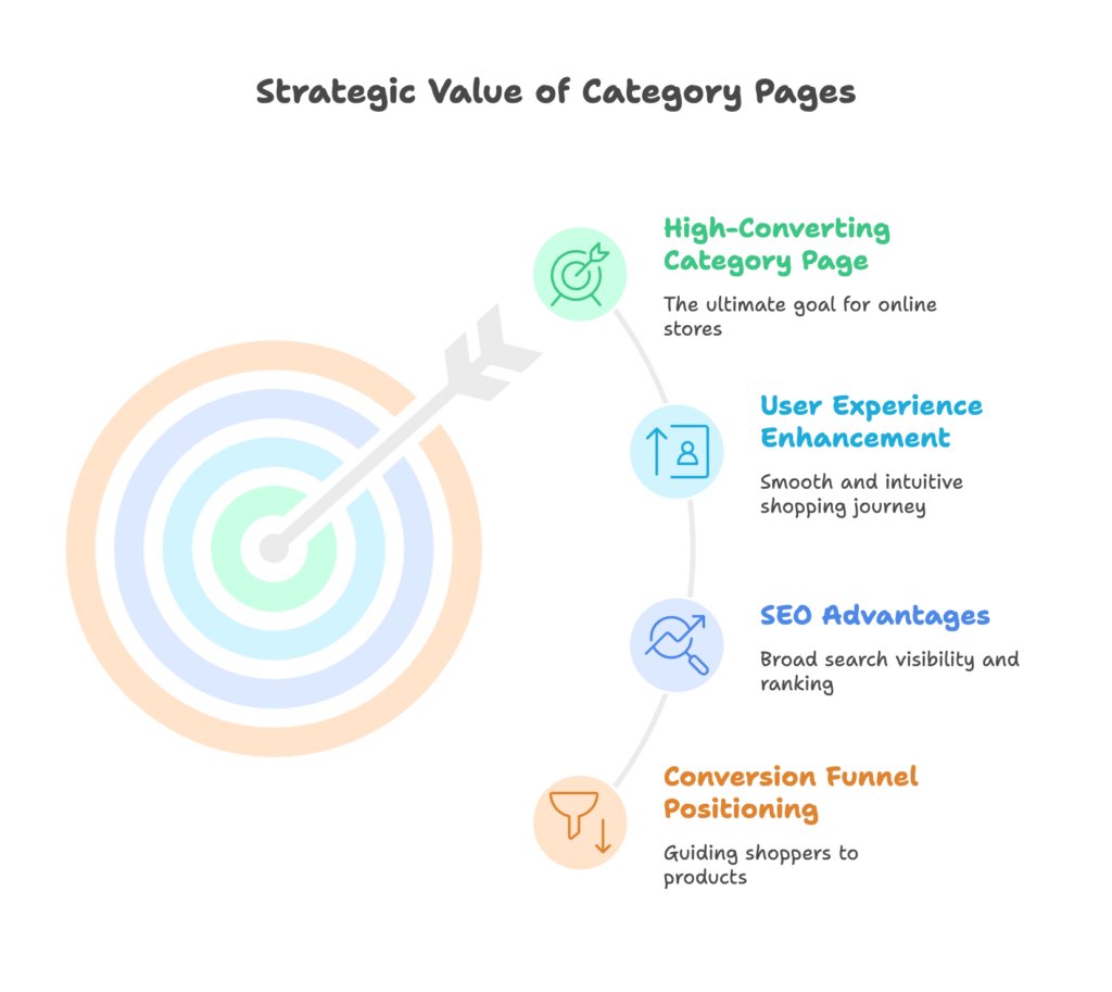
You’re about to see how category pages connect browsing customers to the products they want. These pages do more than just group items; they can shape a shopper’s path, keep them on your site longer, and set the stage for better conversions.
By the end of this section, you’ll appreciate how they serve both your customers and your search ranking goals. Get ready, because the insights here might change how you view your store’s organization.
The Conversion Funnel Position
Category pages sit at a crucial point in the buying journey. They guide visitors from your homepage to a focused selection of products. Instead of sifting through everything, shoppers can narrow their view to just what they need. This helps keep bounce rates low and session durations higher. A great category page can even act as a first touchpoint for those coming straight from search engines, giving them a clear route to the items they want.
Now that you know how category pages fit into the conversion funnel, let’s see how they do more than just help with browsing. They can also give your store a nice boost in search engine rankings. Let’s move on and explore how that works.
SEO Significance of Category Pages
Search engines love category pages. They’re often packed with relevant keywords and link-friendly content. Compared to individual products, category pages tend to rank for broader search terms, plus they can catch long-tail phrases through well-structured subcategories. This keeps your site tidy for both visitors and search engine crawlers.
With SEO advantages in mind, you’re probably wondering about the human side—how real shoppers experience these pages. Let’s transition to the next piece and uncover the user experience aspect.
User Experience Considerations
Imagine browsing a store with hazy category labels or no clear path to the products you want. Frustrating, right? A well-crafted category page helps visitors decide faster. It anticipates their questions and uses visuals, filters, and descriptions to guide them. Mobile responsiveness is key too, since many people shop on phones. Whether on a large screen or a small one, users want a smooth experience without extra steps.
You’ve learned that category pages can boost SEO and guide shoppers effectively. Next, let’s break down the essential building blocks that form a high-converting category page.
Fundamental Elements of High-Converting Category Pages
This section will show you the foundational ingredients every category page needs. From creating a neat structure to choosing the right visual elements, we’ll go step by step.
By the end, you’ll have a solid blueprint you can adapt for your own Shopify store. Are you ready to see how it all comes together?
Clear and Strategic Category Structure
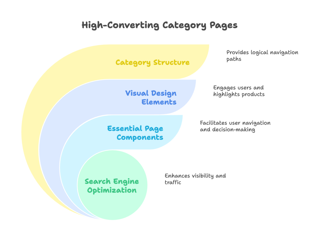
A logical setup helps visitors find their way without guesswork. Start with major (parent) categories, then branch into subcategories for specific needs. Keep it simple enough that shoppers know exactly where to click. If you have too many layers, users may feel lost. If you have too few, your pages could seem disorganized. Aim for a pleasant balance that leads shoppers from general to specific items with minimal confusion.
Now you see the importance of structure. But structure alone won’t wow your customers. Let’s explore how visuals can turn a basic page into a shopper’s favorite hangout.
Visual Design Elements
How you present products can make a big impact. Grid layouts are a popular choice for allowing quick scanning, while list views can work if you have fewer products or need more details. Pay attention to your use of empty space so it doesn’t feel cluttered. Colors can also set the mood or guide the eye to certain items, but keep the flow appealing rather than overwhelming. Use headings, subheadings, and clear fonts to direct attention where it needs to go.
Your design pulls visitors in, but they also need details to make decisions. Let’s look next at what essential features every category page should offer.
Essential Page Components
A descriptive title and brief category explanation help people understand what they’re browsing. Breadcrumb navigation shows them exactly where they are on your site, making it easier to backtrack or jump to a related section. Helpful filters and sorting tools let visitors rearrange the list by size, color, popularity, or price. Decide whether you prefer pagination or an infinite scroll approach—just make sure it feels smooth. Each product card should display a clear image, name, and any key details like price or sale status. All these elements together create a straightforward path to choosing products.
With the fundamental layout and components in place, you’re set for the next part: tuning your category pages for better search engine performance. Let’s move on!
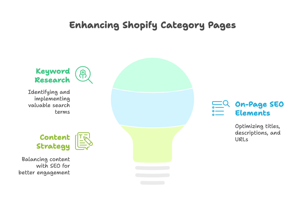
SEO Optimization for Shopify Category Pages
Optimizing your category pages for search engines can mean extra visitors and higher sales. In this section, you’ll learn about targeting the right keywords, using good on-page practices, and weaving helpful content into your pages.
Once you apply these methods, your category pages can rise through the search results more easily.
Keyword Research and Implementation
Begin by identifying valuable search terms that match the theme of each category. If you notice related, more specific keywords, create subcategories to capture them. Look at what competitors rank for and see if there’s a gap you can fill. Place your chosen keywords in the page title, headers, and descriptions naturally, so the text still reads nicely.
Once your keyword plan is set, the next step is putting it into action on your pages. Let’s check out how to handle on-page SEO details.
On-Page SEO Elements
Make your category titles short but descriptive, and craft meta descriptions that give a genuine reason to click. Keep your URLs tidy by avoiding random strings of numbers. Use H1 for the main category header and H2 or H3 for subheadings. You might also consider schema markup, which can help search engines understand your content better and improve how your pages appear in results.
With your on-page elements polished, it’s time to explore how to balance reader-friendly content with search optimization. That’s up next.
Content Strategy for Category Pages
Some store owners skip writing text for their category pages. That’s a missed opportunity. A short intro can help your customers quickly know what to expect. Just avoid overdoing it. Too much text can push your products too far down the page. Also, watch out for duplicate descriptions across similar categories. If you gather reviews or user photos in the category area, that can bring extra keywords and add trust.
Alright, your category pages are now primed for both visitors and search engines. Let’s move on to an equally important topic: user experience upgrades.
User Experience Optimization Strategies
This section will help you focus on ease of navigation, filtering, and product presentation. By creating a smooth journey, you encourage visitors to stay longer and explore more. Ready to refine how your shoppers interact with your store? Let’s see how to do it.
Navigation and Information Architecture
Your store’s menu is often the first place visitors look for direction. A dropdown or mega menu can help, depending on the size of your inventory. On mobile, ensure the navigation doesn’t overshadow the rest of the page. Linking related categories can also drive extra exploration. Let people hop around easily and they’re more likely to find exactly what suits them.
We’ve covered broad navigation, so it’s time to zoom in on filters. After all, filters are the lifelines of category pages when your product list is big.
Filtering and Sorting Functionality
Filters let shoppers quickly refine results by size, color, brand, or other details. Think about what matters most to your target customers. Faceted navigation is a fancy term for showing only the filters that apply to the products at hand. That way, visitors aren’t overwhelmed. Also be mindful of how filters look on mobile. Simple icons or neatly collapsed sections can go a long way toward making the experience straightforward.
After setting up filters, the final piece is how you display products. Let’s look at how to make those product cards shine.
Product Display Optimization
Each product card should have a quality image, an easy-to-see price, and a label if it’s on sale or new. Let shoppers view extra angles or details with a quick hover or click. If you use a hover effect, make sure it works smoothly. In some cases, a “quick view” button helps people see basic info without leaving the category page. That small touch keeps them engaged and more likely to add items to their cart.
You’ve got the user experience sorted. Now it’s time to explore more specialized tactics for boosting your conversion rate even higher. Let’s move on to some advanced approaches.
Advanced Conversion Optimization Techniques
Here we’ll talk about personalizing your shopper’s journey, adding social proof, and organizing products in clever ways. By the end, you’ll have fresh ideas to test on your own Shopify store. Ready to hear about strategies that can push conversions further?
Personalization Strategies
Personalizing category pages can lead to higher sales. One simple example is tailoring the product order based on what a shopper previously viewed. If you know someone’s location, you might highlight region-specific items first. You can also adjust your pages for different devices, ensuring that mobile users get a layout that feels natural for touch. The goal is to show people what they need most, right when they need it.
Next, we’ll explore a straightforward way to build trust: adding social proof. It’s a simple concept that can have a big payoff.
Social Proof Integration
Social proof shows that other people like your products. Displaying ratings or reviews on a category page can spark interest before someone even sees the product detail. You might also highlight bestsellers or trending items. Some stores show pop-ups telling visitors what others have recently viewed or bought. Think of it as a gentle nudge that says, “Others love this, so you might, too.”
Once you’ve established trust, the final part of this section is about using layout tweaks to create desire. Let’s see how visual merchandising can do that.
Visual Merchandising Tactics
Highlight items you want to promote with a bigger image or a special label. Group similar items together, or arrange products by theme to lead shoppers down a natural path. If something is on sale, make sure it’s clearly marked. You can also pin seasonal collections at the top so visitors see them right away. These little hints can encourage shoppers to explore more deeply and put more items in their cart.
Now we’ll turn our focus to the technical side. After all, a slow-loading page can undo all these efforts. Keep going to learn how to keep your pages running smoothly.
Technical Optimization for Performance
Here, we’ll cover how to speed up your pages, ensure they adapt nicely to different screen sizes, and keep them in good shape for search engines. A fancy design means nothing if it loads too slowly or breaks on mobile. Let’s get to it.
Page Speed Optimization
Fast-loading images are your friend. Compress and resize them so they don’t bog down the page. Lazy loading can help by only loading images when they’re about to appear on the screen. Combine and minimize your CSS and JavaScript if you can, and always keep an eye on how these changes affect mobile load times. Better speed equals happier visitors—and fewer abandoned carts.
With speed handled, the next step is ensuring the layout flexes properly on any device. Let’s take a closer look at responsive design.
Responsive Design Implementation
Building for smartphones first makes you see the entire layout in a smaller format, which can lead to a more polished final result. Touch-friendly elements, like bigger buttons, keep visitors from tapping the wrong link. And if you have an adaptive approach for different screen sizes, you’ll reduce pinch-zoom frustrations. The more comfortable shoppers feel, the more likely they are to buy.
Now let’s lock in the technical side with SEO best practices. Because even the fastest, nicest design needs search engines to find it.
Technical SEO Considerations
Pagination should be set up so that search engines understand the relationship between pages, which keeps them from flagging duplicate content. If your filters add parameters to the URL, ensure you’re using canonical tags or other methods so you don’t get multiple versions of the same page indexed. Also, check that your category pages show up in your XML sitemap and that any relevant structured data is in place.
With performance and technical factors in order, the next step is putting everything to the test. Let’s jump into testing and measurement.
Testing and Optimization Framework
Nothing stays perfect for long in e-commerce. Customer behaviors shift, and trends come and go. In this section, you’ll learn how to run tests, study performance metrics, and keep improving. Excited to see which tweaks lead to more sales? Let’s begin.
A/B Testing Methodologies
When you test, pick only one variable at a time if possible. Maybe you try a new filter layout or a different way of displaying product images. Then split your traffic evenly between the old and new designs. Watch the numbers closely to see if the change helps or hurts. If you want to test multiple elements at once, that’s called multivariate testing, but it can be more complex to analyze.
Once you’ve got a handle on running tests, the next piece is tracking data so you can make smart decisions. Let’s learn how.
Analytics and Measurement
Track metrics like bounce rate, time on page, average order value, and conversion rate. Enhanced e-commerce tracking in tools like Google Analytics can show exactly where shoppers drop off. Heat maps or session recordings can reveal if visitors struggle with certain buttons or links. It’s all about understanding what’s really happening when people browse your store.
But collecting data is just one side of the coin. Next, let’s see how to use those findings to create a continuous cycle of improvement.
Continuous Improvement Process
Create a schedule for regular updates to your category pages. Focus on the changes that promise the biggest returns first. After you make an update, watch the metrics and document any insights you find. This lets you build on the changes that succeed and quickly fix the ones that don’t. It’s a never-ending loop, but that’s what keeps your store ahead of the curve.
You now know how to refine and measure improvements. Let’s look at some real-world examples to see these methods in action.
Case Studies: Successful Shopify Category Page Implementations
Here, we’ll see how leading brands organize their category pages. Each example shows a unique strategy that might spark an idea for your store. By the end of this section, you’ll have a deeper appreciation of how different industries tackle similar challenges.
Fashion and Apparel
Take a look at ASOS. They focus on a clean filtering system with simple color blocks and clear size options. Their images are consistent, helping shoppers compare items quickly. Another example is H&M, which uses strong personalization by showing items based on individual browsing patterns. These approaches keep shoppers engaged and ready to buy.
Fashion loves filters, but what about larger, more complex product lines like home goods? Let’s check out how it’s handled in the next category.
Home Goods and Furniture
IKEA stands out with faceted navigation, ensuring people can filter by room, color, material, and style. Plus, the product images stay visually uniform, which helps the entire category page feel cohesive. Large inventories can be tricky, but thoughtful organization keeps visitors from feeling overwhelmed.
Moving from giant furniture items to smaller beauty products reveals another angle on category page organization. Let’s see.
Beauty and Cosmetics
Sephora uses a neat layout and invites visitors to filter by brand, price, or product type. Images show the product packaging clearly, and there are hints of user-generated content in reviews and ratings. This is a strong way to handle items where appearance really matters, and it helps visitors trust what they’re seeing.
Now that you’ve seen how different stores handle their categories, let’s jump into the practical side for Shopify owners. Ready for direct methods you can use right away? Let’s go.
Implementation Guide for Shopify Store Owners
In this section, we’ll walk through Shopify-specific features, helpful apps, and custom development tips. By the time you’re done, you’ll know exactly how to set up or improve your own category pages without getting lost in technical details.
Using Shopify’s Native Functionality
Shopify collection pages are a great starting point. You can customize them within the theme editor by rearranging sections, images, and text boxes. Set up your main navigation under Online Store > Navigation, where you can create menus and sub-menus. Smart collections let you automate how products are grouped (for example, all items above a certain price or in a specific tag). If you’re on Shopify Plus, you’ll find extra features like advanced checkout customization, but even the basic plans give you a solid foundation.
After you’ve explored the built-in tools, you might want to add apps for filtering, merchandising, or SEO. Let’s look at some popular options.
Recommended Apps and Extensions
- Collection Filter Apps: Tools that let shoppers sort items by size, color, or rating.
- Visual Merchandising Tools: Apps that let you drag and drop product positions within a collection.
- SEO Boosters: Extensions that scan your site for broken links, missing meta tags, or large images.
- Analytics Tools: Options that offer A/B testing, heat mapping, or user session recordings.
Apps can be incredibly helpful, but you might need even more customization. That’s where custom development enters the picture.
Custom Development Considerations
If your design needs go beyond standard templates, consider hiring a developer. They can help you code custom category layouts or special filtering options. It’s wise to pick a developer who knows Shopify’s Liquid language and is familiar with theme structures. And when planning for big changes, try to keep future store growth in mind so you won’t have to redo everything later.
You now have a roadmap for implementing better category pages. But what about the trends of tomorrow? Let’s wrap up with a glimpse into what might be on the horizon.
Future Trends in Category Page Design
This section shines a light on some forward-thinking approaches. Whether it’s machine learning that adjusts categories on the fly or interactive tools that help shoppers explore products in new ways, the future is full of creative options. Let’s see what’s coming up next.
AI and Machine Learning Applications
Shops can use AI to change product order based on individual browsing patterns or to suggest matching items. Voice search could eventually be more common in category browsing, and AI might help generate new subcategories if certain filters get a lot of attention. It’s all about letting technology do some of the heavy lifting behind the scenes.
But cool tech alone doesn’t guarantee a great experience. Let’s also check out fresh visual ideas that may influence how we design category pages.
Visual and Interactive Innovations
Some brands experiment with using brief videos, 3D images, or interactive filters that shift in real time. Others add subtle animations to guide shoppers’ attention. Virtual or augmented reality features might let shoppers preview products in a more exciting way. While these ideas can be fun, always remember to keep load times in mind.
Finally, let’s consider how user expectations keep evolving, especially as more people shop on mobile and expect extra convenience.
Evolving User Expectations
Many shoppers now look for consistent experiences across devices. They also care about social and ethical considerations, like sorting items by eco-friendly or fair-trade options. Voice or visual search might become standard, so it’s smart to plan for these possibilities. Keeping your store flexible is a great way to appeal to changing shopper needs.
You’ve seen a glimpse of what’s coming. Now let’s bring it all together with a quick final recap.
Conclusion
Category pages are more than just lists of items; they hold the key to a smoother shopping journey, better search visibility, and higher conversions. By structuring them well, polishing their design, and continually testing changes, you can keep visitors engaged and eager to add products to their cart. You don’t have to be a coding expert to pull it off—Shopify’s native features and a few well-chosen apps can get you far.
Use this article as your go-to guide whenever you need to assess your category pages. Keep refining and adapting, and your efforts will pay off in visitor satisfaction and sales growth. Now, go turn those pages into conversion powerhouses!
References
- CRO Media. (2024, March 31). Shopify CRO: Optimizing Collection Pages for Higher Conversions. Retrieved from https://cro.media/insights/seo/shopify-category-page-optimization-cro/
- Search Engine Land. (2022, March 3). E-commerce category pages outperform product detail pages in SERPs. Retrieved from https://searchengineland.com/e-commerce-category-pages-outperform-product-detail-pages-in-serps-329477
- Shopify. (2024, October 30). Category Management in Retail: Definition & Best Practices. Retrieved from https://www.shopify.com/ca/retail/category-management
- PageFly. (2025, February 10). How to Organize Shopify Product Categories: 5 Effective Strategies. Retrieved from https://pagefly.io/blogs/shopify/shopify-product-categories
- First Pier. (2023, August 15). Shopify Collection Pages: Design Tips for Stunning Layouts. Retrieved from https://www.firstpier.com/resources/collection-page-design-shopify
Ready to give your Shopify store an extra boost? Growth Suite is a Shopify app that helps you use the power of discount codes to grow sales. It’s quick to install with just one click. Go ahead and see the difference for yourself!