Ever wondered why some online stores seem to magically convert visitors into customers while others struggle? The secret isn’t magic—it’s methodical testing. If you’re running a Shopify store and aren’t seeing the conversion rates you’d hoped for, you might be missing out on one of the most powerful tools in your e-commerce toolkit: A/B testing.
Think about it—what if you could increase your conversion rate by 20%, 30%, or even 45% just by making a few strategic changes to your store? These aren’t made-up numbers—they’re real results from real Shopify stores that implemented smart A/B testing strategies.
In this article, you’ll discover:
- What A/B testing is and why it’s crucial for your Shopify store
- The fundamentals of setting up effective tests
- 10 real-world examples of successful A/B tests with impressive results
- Best practices to follow and common mistakes to avoid
- A step-by-step approach to implement A/B testing in your store
Ready to stop guessing and start knowing what works for your store? Let’s dive in!
Introduction to A/B Testing for Shopify Stores
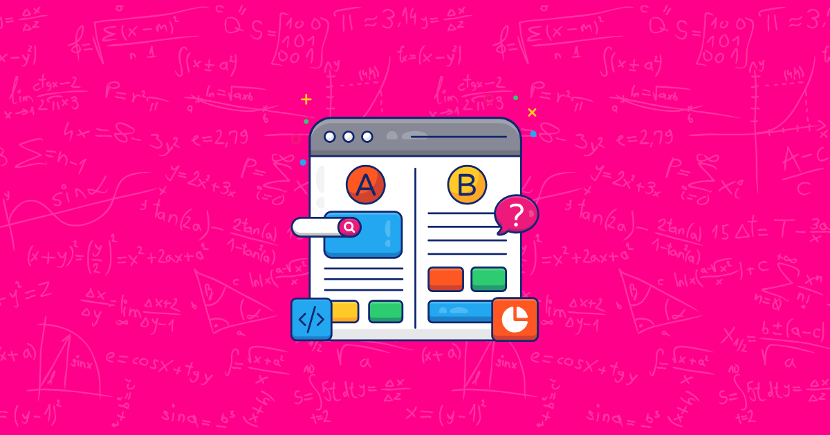
A/B testing (sometimes called split testing) is like a scientific experiment for your online store. Instead of making changes based on hunches or what your competitor is doing, you show two different versions of a page to similar visitors at the same time and measure which one performs better.
For Shopify store owners, A/B testing is particularly valuable because every element of your store—from product images to checkout process—can impact your bottom line. And the beauty of e-commerce is that everything can be measured.
The numbers don’t lie: stores that regularly conduct A/B tests see an average increase of 20% in their conversion rates, according to a recent e-commerce study. That’s potentially thousands of dollars in additional revenue simply by making data-backed decisions.
Beyond the immediate conversion boosts, A/B testing brings several long-term benefits:
- Reduced risk when making changes to your store
- Better understanding of your customers’ preferences
- Continuous improvement culture that keeps you ahead of competitors
- Higher return on investment for your marketing efforts
But enough theory—let’s get practical. In the following sections, we’ll explore 10 real-world examples of Shopify stores that used A/B testing to achieve significant improvements in their conversion rates. You’ll see exactly what they tested, how they did it, and the results they achieved.
Ready to see what’s possible when you start making decisions based on data instead of guesswork? Let’s first make sure you understand the building blocks of effective A/B testing.
Understanding A/B Testing Fundamentals
Core Concepts
Before diving into our success stories, let’s make sure you have a solid grasp of A/B testing basics. Here’s what you need to know:
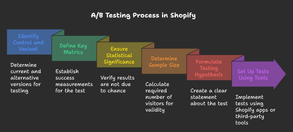
- Control vs. Variant: The control is your current design or element, while the variant is the alternative version you want to test. For example, your control might be your current product page, and your variant could be the same page with larger product images.
- Key Metrics: These are the measurements that determine success. For most Shopify stores, this includes conversion rate (percentage of visitors who make a purchase), average order value, add-to-cart rate, and revenue per visitor.
- Statistical Significance: This tells you whether your results happened by chance or because of the changes you made. Most A/B testing tools aim for at least 95% confidence before declaring a winner.
- Sample Size: You need enough visitors to make your test valid. For a Shopify store with average conversion rates (1-3%), you typically need at least 2,000-5,000 visitors per variation to get reliable results.
- Testing Hypothesis: A clear statement about what you’re testing and why. For example: “Adding customer reviews to product pages will increase conversion rates because they build trust.”
Setting Up A/B Tests on Shopify
Shopify doesn’t have built-in A/B testing capabilities, but there are plenty of ways to run tests on your store:
- Shopify Apps: Tools like Split, Convert, or Neat A/B Testing allow you to create and run tests directly within your Shopify admin.
- Third-party Tools: Platforms like Google Optimize, VWO, or Optimizely work with Shopify and offer more advanced testing features.
- Implementation Considerations: Smaller stores (under 1,000 monthly visitors) should focus on testing major elements like headlines or product images. Larger stores can test more subtle changes since they’ll reach statistical significance faster.
- Test Duration: Most tests need to run for at least 2 weeks to account for day-of-week variations. Don’t end a test early just because you see promising initial results!
Now that you understand the foundations, let’s explore some inspiring examples of Shopify stores that used A/B testing to dramatically improve their results. These case studies will give you plenty of ideas for tests you can run on your own store!
Example #1: Product Page Optimization (Gymshark Case Study)
The Challenge
Gymshark, a leading fitness apparel brand, was experiencing decent traffic to their product pages, but their conversion rates weren’t matching up with their expectations. The marketing team suspected that certain elements on their product pages might be creating friction in the customer journey, preventing visitors from making purchases.
Their initial hypothesis focused on several key product page elements: product images, description placement, call-to-action (CTA) button color and size, and social proof indicators. They believed that optimizing these elements could significantly improve their conversion rates.
The Test Implementation
Rather than changing everything at once (which would make it impossible to determine which changes made an impact), Gymshark created a systematic testing plan. They focused on testing:
- Larger, more detailed product images showing the apparel from multiple angles
- Moving the product description above the fold so customers wouldn’t need to scroll
- Changing their CTA button from gray to a high-contrast green
- Adding a “Bestseller” tag to popular items
- Including the number of items sold in the last 24 hours
They tracked several metrics during the test, including product page views, add-to-cart rate, and most importantly, the conversion rate from product page to purchase.
The Results
After running the test for three weeks with thousands of visitors, the results were clear: the variant page outperformed the control with a 25% increase in conversion rate.
The most impactful changes were:
- The high-contrast green CTA button (contributed to approximately 10% of the improvement)
- The “Bestseller” tag and sales count (contributed to approximately 8% of the improvement)
- The larger product images (contributed to approximately 7% of the improvement)
For Shopify store owners, the key takeaway from Gymshark’s success is that small visual changes can make a big difference. High-contrast CTA buttons and social proof elements like bestseller tags are relatively easy to implement but can significantly boost your conversion rates.
Impressed by how a few strategic changes to product pages led to a 25% conversion increase? Just wait until you see how simplifying the checkout process can transform abandonment rates!
Example #2: Checkout Process Simplification
The Challenge
A popular beauty brand was struggling with high cart abandonment rates—nearly 75% of customers who added items to their cart were leaving without completing their purchase. After analyzing their checkout funnel, they identified a potential issue: their checkout process required customers to complete four separate steps before finalizing their purchase.
Their hypothesis was straightforward: reducing the number of steps in the checkout process would decrease friction, leading to fewer abandoned carts and more completed purchases.
The Test Implementation
The brand created two versions of their checkout flow:
- Control: The original four-step checkout (Account Creation, Shipping Information, Payment Information, Order Review)
- Variant: A streamlined two-step checkout (Combined Shipping and Account on page one, Payment and Review on page two)
In addition to reducing the number of steps, they also:
- Made guest checkout the default option
- Removed unnecessary form fields
- Added a progress indicator to show customers how close they were to completing their purchase
- Ensured that the cart summary remained visible throughout the checkout process
The primary metric tracked was the cart abandonment rate, but they also monitored the time spent in checkout and the conversion rate from cart to completed purchase.
The Results
The results were impressive: the simplified two-step checkout process resulted in a 15% decrease in cart abandonment. This translated to a significant revenue boost, with the brand calculating an additional $57,000 in monthly revenue from the change.
Key insights from the test included:
- Customers spent 30% less time completing the checkout process
- Mobile users showed the most significant improvement, with a 22% decrease in abandonment rate
- The guest checkout option was chosen by 78% of new customers
For Shopify store owners, this case study highlights the importance of reducing friction in the purchase process. By using Shopify’s customizable checkout options or apps like Fast Checkout, you can implement similar simplifications to your checkout flow and potentially see comparable improvements in your abandonment rates.
We’ve seen how streamlining the checkout process can recover lost sales, but what about getting more visitors to even consider a purchase? That’s where our next example comes in, focusing on the power of product imagery.
Example #3: Product Imagery Testing
The Challenge
A home decor Shopify store was experiencing lower-than-industry-average conversion rates on their product pages. Despite having high-quality products and competitive pricing, visitors weren’t adding items to their carts at the expected rate.
After collecting customer feedback, the store owner suspected that their product images—which featured items against plain white backgrounds—weren’t helping customers visualize how the products would look in their homes. Their hypothesis was that contextual, lifestyle imagery would help customers better connect with the products and increase conversion rates.
The Test Implementation
The store created two versions of their product pages for testing:
- Control: Products photographed on white backgrounds, showing the items from multiple angles
- Variant: The same products photographed in realistic home settings, showing how they would look when used in actual living spaces
Both versions maintained the same number of images per product, the same descriptive text, and identical pricing information. The only difference was the style of photography used.
The test tracked several key metrics, including:
- Time spent on product pages
- Add-to-cart rate
- Product page bounce rate
- Conversion rate
The Results
After running the test for three weeks, the lifestyle images outperformed the white background images with a 12% increase in conversion rate. Additionally, the variant with lifestyle images showed:
- 18% more time spent on product pages
- 15% higher add-to-cart rate
- 9% lower bounce rate
The psychological factors behind these results are compelling: lifestyle images help customers imagine owning and using the products, creating an emotional connection that plain product photos often fail to establish. This emotional connection increases purchase intent and reduces purchase anxiety.
For Shopify store owners, especially those selling products where aesthetics or usage context matters (like home decor, fashion, or furniture), investing in lifestyle photography can be a game-changer. While it requires more resources upfront, the return on investment through increased conversions makes it worthwhile.
Product images create the first impression, but sometimes customers need a little push to take action right away. Let’s see how adding urgency elements can create that necessary momentum.
Example #4: Urgency Elements Testing
The Challenge
A fashion retailer on Shopify was running frequent flash sales but noticed that even with significant discounts, their conversion rates weren’t improving as much as expected. Customers seemed interested in the sales but weren’t feeling compelled to make immediate purchases.
Their hypothesis was that adding urgency elements to their sales pages would create a fear of missing out (FOMO) that would motivate customers to complete their purchases rather than postponing their decisions.
The Test Implementation
The store decided to test the impact of countdown timers on their limited-time sales pages:
- Control: Sales pages with discount information but no urgency indicators
- Variant: The same sales pages with prominent countdown timers showing hours, minutes, and seconds remaining until the sale ended
The countdown timers were added to:
- The announcement bar at the top of the site
- Product pages for items included in the sale
- The shopping cart page
They tracked metrics including page views, add-to-cart rate, cart abandonment rate, and most importantly, conversion rate and total sales volume.
The Results
The results were dramatic: pages with countdown timers saw a 20% increase in sales compared to the control version. Other notable findings included:
- 25% lower cart abandonment rate
- 15% higher average order value (suggesting customers were adding more items to take advantage of the limited-time offer)
- A significant spike in purchases in the final hours of the sale
The psychological principle at work here is well-established: urgency compels action. When customers see a countdown timer, it transforms the shopping decision from “Do I want this?” to “Do I want to miss this opportunity?” This shift in thinking is often enough to convert browsers into buyers.
For Shopify store owners, adding urgency elements like countdown timers is relatively easy through apps like Countdown Timer or Timer Bar. This test demonstrates that such a simple addition can have a significant impact on your bottom line during promotional periods.
Creating urgency can drive immediate sales, but building long-term trust is equally important. Let’s explore how adding social proof can boost customer confidence and conversions.
Example #5: Social Proof Implementation
The Challenge
A new clothing store on Shopify was struggling to establish trust with first-time visitors. Despite having quality products and competitive pricing, their conversion rate was below 1%, which they attributed to being a relatively unknown brand in a competitive market.
Their hypothesis was that adding social proof in the form of customer reviews would build trust with potential customers and increase their willingness to make purchases from an unfamiliar store.
The Test Implementation
The store set up an A/B test comparing:
- Control: Product pages without customer reviews
- Variant: Product pages with customer reviews prominently displayed, including star ratings and text testimonials
To implement this test, they:
- Collected reviews from early customers via post-purchase emails
- Displayed an average star rating below each product title
- Added a review section with detailed customer feedback and photos below the product description
- Highlighted the most helpful reviews at the top of the section
The primary metrics tracked were product page conversion rate, time spent on page, and bounce rate.
The Results
After running the test for four weeks, the variant with customer reviews showed a 10% increase in conversion rate. Additionally, they observed:
- 22% more time spent on product pages with reviews
- Visitors viewed 30% more pages per session
- Products with more than five reviews converted at twice the rate of products with fewer reviews
The psychological impact of social proof is powerful: when shoppers see that others have purchased and enjoyed a product, it reduces perceived risk and increases confidence in the buying decision. This is especially important for new or lesser-known brands that don’t have established reputations.
For Shopify store owners, implementing customer reviews can be easily done through apps like Judge.me, Loox, or Shopify’s Product Reviews app. The key is to actively solicit reviews from customers and display them prominently on your product pages.
Trust-building elements can significantly boost conversions, but sometimes it’s the navigation elements that make the biggest difference. Let’s see how one brand improved results by optimizing their announcement bar.
Example #6: Navigation Optimization (Salty Captain Case Study)
The Challenge
Salty Captain, a nautical-themed apparel brand, was using an announcement bar to promote their free shipping offer, but noticed that many customers weren’t taking advantage of it. The announcement bar wasn’t generating the expected click-through rates, suggesting that visitors either weren’t noticing it or weren’t finding it compelling enough to click.
Their hypothesis was that the visibility and design of the announcement bar were affecting its performance. They believed that changing the color for better contrast and making it sticky (visible as users scrolled) would increase its effectiveness.
The Test Implementation
Salty Captain created two variations for testing:
- Control: Original announcement bar with navy blue background and white text, positioned at the top of the page but disappearing when users scrolled down
- Variant: Redesigned announcement bar with a bright red background and white text, made sticky so it remained visible as users scrolled through the site
The content of the announcement (“Free shipping on orders over $50”) remained the same in both versions. The only changes were the color and the sticky positioning.
The test tracked announcement bar click-through rates, overall site conversion rate, and average order value.
The Results
The results were impressive: the variant with the red, sticky announcement bar led to a 13.39% increase in overall conversion rate. Even more dramatically, clicks on the announcement bar increased by 234.54%, indicating that the visibility improvements had a significant impact on user engagement.
Additional findings included:
- 8.2% increase in average order value
- 12.6% increase in the number of orders that qualified for free shipping
- Reduced exit rate from product pages
This test demonstrates the importance of making key information highly visible and persistent throughout the user journey. Many customers make decisions based on shipping costs, but if they don’t notice your shipping policy, it can’t influence their behavior.
For Shopify store owners, this is a relatively simple change to implement through your theme settings or with apps like Announcement Bar. The key is to ensure that important information stands out visually and remains accessible throughout the shopping experience.
Navigation elements can guide customers through your site, but pricing strategies can significantly impact their purchasing decisions. Let’s examine how one store increased their average order value through shipping threshold testing.
Example #7: Free Shipping Threshold Testing
The Challenge
A mid-sized Shopify store selling kitchen accessories was looking to increase their average order value (AOV), which had been stagnant at around $45. They noticed that many customers were placing orders just below their free shipping threshold of $50, suggesting that the threshold wasn’t providing enough incentive to add more items to the cart.
Their hypothesis was that increasing the free shipping threshold but making it more prominent would encourage customers to add more items to reach the new threshold, ultimately increasing average order value and overall revenue.
The Test Implementation
The store set up an A/B test with two variations:
- Control: $50 free shipping threshold mentioned only on the shipping policy page
- Variant: $60 free shipping threshold prominently displayed in the announcement bar, product pages, and cart page, with progress indicators showing how close customers were to reaching the threshold
In the variant, when customers added items to their cart but hadn’t reached the $60 threshold, they would see messages like “Add $12 more to get free shipping!” with product recommendations below to help them reach the threshold.
The test tracked metrics including average order value, revenue per visitor, conversion rate, and the percentage of orders that qualified for free shipping.
The Results
After running the test for three weeks, the variant with the higher but more prominent free shipping threshold showed a 4.39% uplift in conversion rate. More importantly, it led to a 22% increase in average order value, from $45 to $55.
Other notable findings included:
- 68% of orders in the variant group reached the free shipping threshold (compared to 52% in the control group)
- Revenue per visitor increased by 27%
- The “You’re $X away from free shipping” messaging had a click-through rate of 35% on recommended products
This test reveals that customers are often willing to spend more to get “free” shipping, but they need clear visibility of the threshold and helpful guidance to reach it. The additional revenue from higher order values more than offset the increased shipping costs for the store.
For Shopify store owners, implementing this strategy can be done using apps like Free Shipping Bar or through cart upsell features. The key is to make the threshold visible and provide easy ways for customers to add more items to qualify for free shipping.
Shipping thresholds can increase order values, but sometimes it’s your core messaging that needs optimization. Let’s see how one brand dramatically increased orders by testing different value propositions.
Example #8: Value Proposition Testing (Bukvybag Case Study)
The Challenge
Bukvybag, a premium bag and accessory brand, was experiencing lower-than-expected conversion rates from their homepage. Despite having attractive products and a well-designed site, visitors weren’t clicking through to product pages at the desired rate.
Their hypothesis was that their homepage headline and value proposition weren’t effectively communicating the unique benefits of their products. They believed that testing different messaging approaches would reveal which value propositions resonated most strongly with their target audience.
The Test Implementation
Bukvybag created four different headline variations for their homepage hero section:
- Control: “Handcrafted Bags for Modern Life”
- Variant A: “Luxury Bags That Last a Lifetime. Guaranteed.”
- Variant B: “The Perfect Bag for Work, Travel, and Everything in Between”
- Variant C: “Ethically Made Bags That Give Back: 10% of Profits Support Women Entrepreneurs”
Each headline was paired with matching subtext that expanded on the core value proposition. The rest of the homepage content remained identical across all variations.
The test tracked metrics including bounce rate, time on site, click-through rate to product pages, and overall conversion rate.
The Results
After testing all variations with equal traffic for three weeks, the results showed a clear winner: Variant C, focusing on the ethical and social impact aspects of the brand, led to a remarkable 45% increase in orders compared to the control version.
The performance breakdown of each variant was illuminating:
- Control: Baseline performance
- Variant A (durability focus): 12% increase in orders
- Variant B (versatility focus): 8% increase in orders
- Variant C (ethical/social focus): 45% increase in orders
This test revealed that Bukvybag’s customers were strongly motivated by the social impact of their purchases—something the brand had not emphasized previously in their main messaging. The dramatic improvement suggested that this value proposition aligned powerfully with their target audience’s values.
For Shopify store owners, this case study highlights the importance of testing different value propositions to discover what truly resonates with your specific audience. What works for one brand or product category might not work for another, and assumptions about what customers value most can often be wrong.
Value propositions set the tone for your brand, but the specific elements on your product pages can make or break your conversion rates. Let’s explore how one company found the perfect combination of product page elements.
Example #9: Product Page Element Testing (Hannah & Henry Case Study)
The Challenge
Hannah & Henry, a children’s clothing brand on Shopify, was experiencing lower-than-expected conversion rates on their product pages. Their high-quality products were getting plenty of visibility, but visitors weren’t adding items to their carts at the rate the brand had projected.
Their hypothesis was that the product pages were missing key elements that would build confidence and provide the information parents needed before making a purchase decision. They wanted to test different combinations of product page elements to find the optimal arrangement.
The Test Implementation
Hannah & Henry created four variations of their product pages for testing:
- Control: Basic product page with images, price, and size selection
- Variant A: Control plus a brand slogan and expanded product description
- Variant B: Control plus customer review section, brand slogan, and expanded product description
- Variant C: Control plus customer review section and brand slogan (without expanded description)
All other elements of the product pages, including images, pricing, and calls-to-action, remained identical across all variations. The test evenly split traffic between the four versions and ran for four weeks to ensure sufficient data collection.
The primary metrics tracked were add-to-cart rate, product page bounce rate, time on page, and conversion rate.
The Results
The test results showed that Variant B (with reviews, slogan, and expanded description) significantly outperformed all other variations, leading to a remarkable 45% increase in revenue compared to the control version.
The performance breakdown by variant was:
- Control: Baseline performance
- Variant A (slogan + description): 12% increase in revenue
- Variant B (reviews + slogan + description): 45% increase in revenue
- Variant C (reviews + slogan): 28% increase in revenue
This test revealed several important insights:
- Customer reviews had the strongest positive impact on conversion rates
- The combination of social proof (reviews) and detailed product information created the most compelling product page
- The brand slogan alone had minimal impact without supporting elements
For Shopify store owners, this case study emphasizes the importance of providing both emotional reassurance (through social proof) and practical information (through detailed descriptions) on product pages. It also demonstrates the value of testing combinations of elements rather than individual changes in isolation.
Product pages are critical conversion points, but sometimes it’s the well-timed popup that can make the difference. Let’s see how adding urgency to popups boosted one brand’s conversion rate.
Example #10: Popup Optimization (Obvi Case Study)
The Challenge
Obvi, a health supplement brand, was using email capture popups to offer first-time visitors a 10% discount on their first order. While the popups were generating email signups, the conversion rate from email subscriber to customer was lower than expected.
Their hypothesis was that adding urgency elements to the discount offer would encourage more immediate purchases rather than allowing potential customers to indefinitely postpone their buying decision.
The Test Implementation
Obvi created two versions of their discount popup:
- Control: Standard popup offering “10% off your first order” in exchange for an email address
- Variant: Similar popup but with a 24-hour countdown timer and text stating “Offer expires in [time remaining]”
Both popups appeared after a visitor had been on the site for 30 seconds or when they showed exit intent. Both collected email addresses and delivered discount codes instantly to the subscriber’s inbox.
The key difference was that the variant popup created a sense of urgency by implying that the discount offer was time-limited, while the control popup had no such time pressure.
Metrics tracked included popup conversion rate (email signups), email-to-purchase conversion rate, time between email signup and purchase, and overall revenue from new subscribers.
The Results
After running the test for three weeks, the variant with the countdown timer showed a 7.97% higher conversion rate from email subscriber to customer. The urgency-based popup also demonstrated:
- 43% shorter time between email signup and first purchase
- 12% higher average order value from first-time purchases
- 8.5% increase in overall revenue from new subscribers
The psychological impact of the countdown timer was clear: when faced with a time-limited offer, customers were more likely to act quickly rather than saving the discount code for some undefined future use. The timer created a sense of scarcity and potential loss that motivated immediate action.
For Shopify store owners, implementing countdown timers in popups is straightforward with apps like Privy, Popup by Xetra, or Justuno. The key is to create genuine urgency—if customers perceive that your “limited time” offers are always available, the urgency effect will diminish.
Now that we’ve explored ten powerful examples of A/B testing on Shopify stores, let’s look at some best practices to ensure your own testing efforts yield meaningful results.
Best Practices for Successful A/B Testing
Strategic Planning
Before diving into A/B testing, it’s essential to approach it with a strategic mindset:
- Develop clear hypotheses: Every test should start with a specific hypothesis based on customer data or feedback. For example: “Adding customer photos to reviews will increase conversion rates because it builds trust and helps customers visualize the product in use.”
- Prioritize tests for maximum impact: Use frameworks like the ICE model (Impact, Confidence, Ease) to prioritize which tests to run first. Focus on changes that could have the biggest impact on your bottom line.
- Allocate sufficient resources: Successful A/B testing requires time, tools, and sometimes design or development resources. Make sure you have what you need before starting.
- Create a testing roadmap: Instead of random tests, develop a structured plan that builds on previous learnings and moves you toward specific business goals.
Implementation Guidelines
When implementing your tests, follow these guidelines to ensure reliable results:
- Test one element at a time: While multivariate testing is possible, it requires significant traffic. For most Shopify stores, it’s better to test one change at a time so you know exactly what caused any difference in performance.
- Run tests long enough: Most tests need at least 2-4 weeks to account for day-of-week variations and gather enough data for statistical significance. Don’t end tests prematurely based on early results.
- Split traffic evenly: Unless you have a specific reason not to, divide your traffic 50/50 between control and variant to get the most reliable results in the shortest time.
- Check for technical issues: Before launching a test, verify that both versions work properly across all devices and browsers to avoid skewed results from technical problems.
Analysis and Application
Once your test is complete, follow these steps to interpret and apply the results:
- Look beyond the headline metrics: While conversion rate is important, also examine metrics like revenue per visitor, average order value, and customer lifetime value to understand the full impact of your changes.
- Document everything: Keep detailed records of each test, including hypotheses, implementation details, results, and insights. This documentation will be valuable for future testing and for sharing knowledge across your team.
- Implement winning variations promptly: Once you’ve identified a clear winner, implement it across your store quickly to start benefiting from the improvement.
- Plan follow-up tests: Use the insights from each test to inform your next tests. A/B testing should be an ongoing process of continuous improvement, not a one-time project.
Being aware of common mistakes can help you avoid pitfalls that might compromise your testing efforts. Let’s explore some of these mistakes next.
Common A/B Testing Mistakes to Avoid
Strategic Errors
Even with the best intentions, these strategic mistakes can undermine your testing efforts:
- Testing too many elements simultaneously: When you change multiple elements at once, you won’t know which specific change led to the results you observe. This makes it impossible to apply focused learnings to future improvements.
- Running tests for insufficient time: Ending tests too quickly based on early results can lead to false conclusions. Traffic and conversion patterns often vary by day of week, time of day, and even seasonally.
- Implementing changes before reaching statistical significance: Making decisions based on tests that haven’t reached statistical significance (usually 95% confidence) is essentially guesswork, not data-driven decision making.
- Falling prey to confirmation bias: Don’t just look for data that confirms what you already believe. Be open to surprising results and willing to challenge your assumptions about what works.
Technical Mistakes
Technical issues can also compromise the validity of your tests:
- Incorrect tracking setup: If your analytics or A/B testing tool isn’t properly configured, you might be collecting incomplete or inaccurate data. Always verify that your tracking is working correctly before starting a test.
- Creating inconsistent user experiences: If a visitor sees the control version on one page and the variant on another (due to improper cookie management), it creates confusion and skews results.
- Neglecting mobile optimization: With mobile traffic often exceeding desktop for many Shopify stores, failing to test how your variations appear and function on mobile devices can lead to misleading results.
- Underestimating required sample size: For low-traffic sites or tests targeting metrics with low baseline rates (like conversion rate), you need sufficient sample sizes to detect meaningful differences. Use sample size calculators to estimate how long your test needs to run.
By avoiding these common mistakes and following the best practices outlined above, you’ll be well-positioned to run effective A/B tests that drive meaningful improvements for your Shopify store.
Conclusion and Next Steps
Throughout this article, we’ve explored ten powerful examples of how A/B testing can dramatically improve conversion rates for Shopify stores. From Gymshark’s 25% lift through product page optimizations to Bukvybag’s impressive 45% increase in orders from value proposition testing, these case studies demonstrate the transformative potential of data-driven decision making.
The key lessons from these examples are clear:
- Small changes can lead to significant results
- Customer psychology (trust, urgency, social proof) plays a crucial role in conversion optimization
- What works for one store might not work for another—testing is essential to discover what resonates with your specific audience
- Continuous testing and optimization yield compounding benefits over time
To implement A/B testing in your own Shopify store, follow this step-by-step approach:
- Set up the necessary tools: Choose an A/B testing platform compatible with Shopify (like Google Optimize, VWO, or a dedicated Shopify app)
- Analyze your current data: Identify areas of your store with high traffic but low conversion rates—these are prime candidates for testing
- Develop specific hypotheses: Based on customer feedback, analytics, and the case studies we’ve explored, formulate clear hypotheses about what changes might improve performance
- Prioritize your tests: Focus first on changes that could have the biggest impact with reasonable effort
- Run your first test: Implement a well-designed test, ensuring proper tracking and sufficient duration
- Analyze and apply the results: Use the learnings to implement winning variations and inform future tests
Building a testing culture in your organization is about more than just running occasional experiments. It requires a fundamental shift toward data-driven decision making, where assumptions are routinely challenged and optimization becomes an ongoing process rather than a one-time project.
As for expectations, while the examples in this article show impressive gains, it’s important to understand that results will vary. Some tests might yield dramatic improvements, while others might show more modest gains or even no significant difference. The key is to view each test as a valuable learning opportunity, regardless of the outcome.
Remember that A/B testing is a marathon, not a sprint. The most successful Shopify stores don’t achieve greatness through a single breakthrough test but through consistent testing and incremental improvements over time.
Looking to take your Shopify store to the next level? Consider using Growth Suite, a powerful app that can help you implement many of the A/B testing strategies discussed in this article and boost your sales with data-driven optimizations.
References
- FirstPier. (2023, August 15). Ultimate A/B Testing Guide for Shopify: Boost Your Store’s Success!
- Checkout Links. (2024, October 15). The Ultimate Guide to A/B Testing on Shopify.
- CRO Media. (2024, March 31). Shopify A/B Testing: Top Strategies You Must Know.
- FigPii Blog. (2025, February 14). 10 Successful eCommerce A/B test examples.
- Instant Page Builder. (2025, February 26). Taking Shopify A/B testing to the next level.
- OptiMonk. (2025, March 5). A Shopify A/B Testing Guide for 2025.
- Ptengine. (n.d.). Shopify’s A/B Testing Strategies for Merchant Success.
- Instant Page Builder. (2025, February 13). How Shopify A/B testing helps to boost sales.
- Contentsquare. (2024, November 1). 6 Real Examples and Case Studies of A/B Testing.