
Have you ever walked into a store and instantly decided whether you liked it or not? The same thing happens online—but faster. In fact, visitors form first impressions of your Shopify store in just 0.05 seconds! That’s barely enough time to blink, yet it’s long enough for potential customers to decide whether they’ll stick around or bounce to a competitor.
Your Shopify homepage isn’t just a pretty welcome mat—it’s your digital storefront, your silent salesperson, and often your first (and maybe only) chance to convert visitors into customers. But here’s the challenge: with attention spans shrinking and competition growing, how do you create a homepage that doesn’t just look good but actually drives sales?
After reading this guide, you’ll learn:
- The psychology behind what makes visitors stay or leave within seconds
- Essential elements every high-converting Shopify homepage needs
- Practical strategies to organize your homepage for maximum impact
- Mobile optimization techniques that boost conversions
- Real examples of successful Shopify homepages you can learn from
Ready to transform your Shopify homepage from a passive welcome page into a conversion-generating powerhouse? Let’s dive in!
Understanding the Psychology of First Impressions in E-commerce
Before we talk about buttons and images, let’s talk about brains. Understanding how visitors think when they land on your homepage is the foundation of effective design. In this section, we’ll uncover the psychological triggers that influence whether someone stays on your site or clicks away.
Did you know that 94% of first impressions are based on design? And these impressions form in just 0.05 seconds—before visitors even read a word of your copy. This means your visual presentation is doing most of the heavy lifting before conscious thought even kicks in.
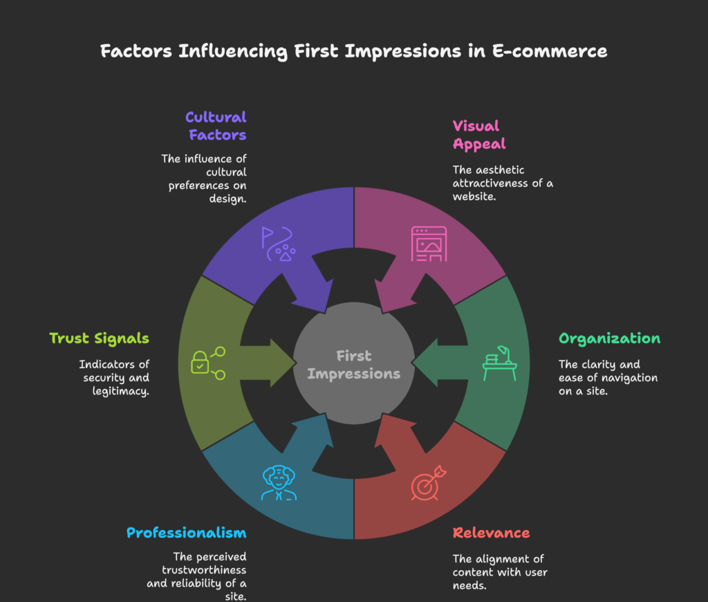
When someone lands on your homepage, their brain is rapidly making decisions based on:
- Visual appeal – Is this site pleasant to look at?
- Organization – Can I find what I’m looking for?
- Relevance – Does this seem like it matches what I need?
- Professionalism – Does this business seem trustworthy?
The famous 10-20 second rule applies here: you have about 10-20 seconds to convince visitors they’re in the right place before they leave. During this brief window, they’re not reading thoroughly—they’re scanning. Eye-tracking studies show that people typically scan webpages in an F-pattern (across the top, down the left side, and occasionally across the middle) or a Z-pattern (across the top, diagonally down to the opposite corner, and across the bottom).
Trust signals play a crucial role in these first moments. Your visitors are subconsciously looking for indicators that your store is legitimate and reliable. Clean design, professional images, security badges, and familiar payment icons all contribute to this sense of trust before a visitor has even engaged with your content.
Cultural and demographic factors also influence how visitors perceive your design. Colors, images, and even layout preferences can vary significantly across different cultures and age groups. For instance, older demographics typically prefer larger text and simpler layouts, while younger shoppers might expect more interactive elements.
Now that we understand the lightning-fast judgment happening in your visitors’ minds, let’s look at the specific elements that will help your homepage pass this split-second test with flying colors. After all, you can’t fix what you don’t understand first, right?
Key Elements of a High-Converting Shopify Homepage
Your homepage needs certain critical components to turn visitors into customers. In this section, we’ll break down the essential building blocks that every successful Shopify homepage should include—and how to implement them effectively.
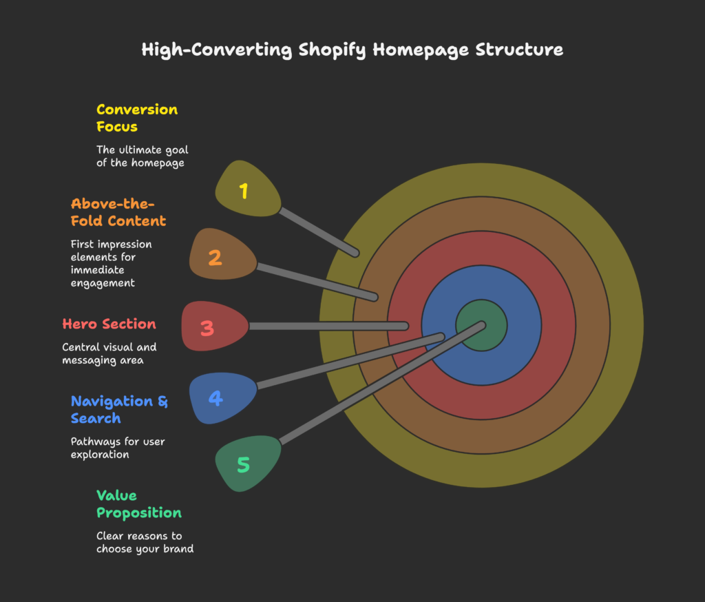
Let’s start with what might be the most important real estate on your entire website: the above-the-fold content. This is everything visible without scrolling and includes:
- Hero section – The large, prominent area at the top of your homepage that typically features a compelling image or video, headline, and call-to-action
- Navigation menu – Your site’s roadmap that helps visitors find exactly what they’re looking for
- Search bar – For visitors who already know what they want
- Value proposition – A clear statement explaining why customers should buy from you instead of competitors
Your hero image or video should be high-quality and instantly communicate what you sell. Blurry, generic, or confusing imagery signals unprofessionalism and causes visitors to question your credibility. Similarly, your headline should be concise yet powerful—think of it as your store’s elevator pitch in about 6-10 words.
The primary call-to-action (CTA) in your hero section should stand out visually and direct visitors to take the next logical step, whether that’s “Shop Now,” “View Collection,” or “Get Started.” This button deserves special attention because it’s often the main conversion point for new visitors.
As visitors scroll down, your homepage should continue to guide them with these key elements:
- Featured products or collections – Showcase your best-selling or seasonal items
- Social proof – Customer reviews, testimonials, media mentions, and trust badges
- Brand story – A brief explanation of who you are and what makes your brand unique
- Visual design elements – Consistent colors, typography, and imagery that reinforce your brand identity
The navigation design is particularly crucial—it’s how visitors will explore your store. Keep it simple and intuitive with clear categories and minimal dropdown levels. Too many options can cause decision paralysis and frustrate users.
While these elements may seem straightforward, the magic lies in how you arrange and prioritize them. So how do you structure all these pieces into a cohesive, conversion-focused homepage? That’s exactly what we’re about to explore next…
Strategic Structure for Shopify Homepages
Having the right elements is only half the battle—organizing them effectively is what transforms a good homepage into a great one. In this section, we’ll explore how to structure your homepage content to create a natural flow that guides visitors toward conversion.
Think of your homepage as a story with a clear beginning, middle, and end. Each section should logically lead to the next, answering visitors’ questions before they even ask them. This storytelling approach helps create an emotional connection while moving visitors through your sales funnel.
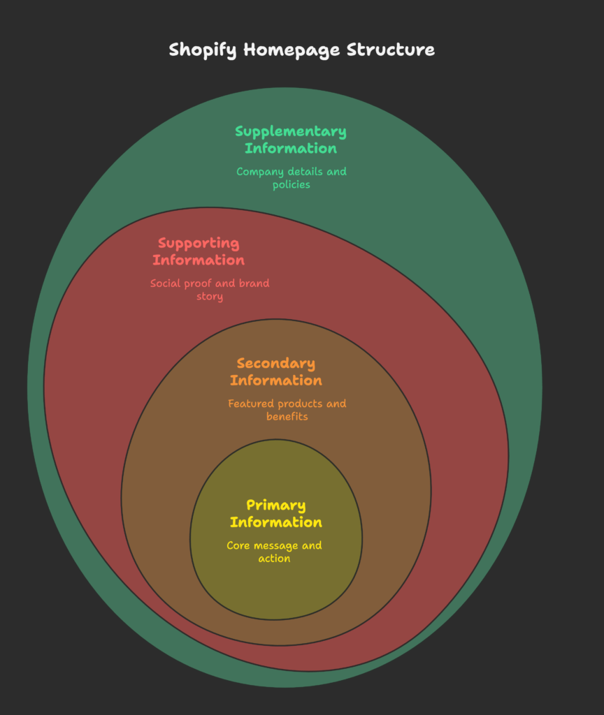
Start by organizing your content according to information hierarchy—placing the most important elements where they’ll get the most attention:
- Primary information (above the fold): Your value proposition, hero image, and main CTA
- Secondary information (mid-page): Featured products, collections, or benefits
- Supporting information (lower page): Social proof, brand story, additional CTAs
- Supplementary information (footer): Company details, policies, newsletter signup
When designing your layout, consider both the F-pattern (for text-heavy sections) and Z-pattern (for visual sections) to match how users naturally scan web pages. This alignment places your most important elements where eyes naturally land.
Breaking your homepage into distinct sections improves readability and helps visitors process information more easily. Use visual cues like background color changes, dividing lines, or spacing to create natural breaks between sections. This sectioning technique creates a rhythm that keeps visitors engaged as they scroll.
Remember to embrace white space (also called negative space)—the empty areas between elements. Contrary to what some might think, white space isn’t wasted space; it’s a powerful design tool that:
- Improves readability by reducing visual clutter
- Helps important elements stand out
- Creates a more premium, sophisticated feel
- Reduces cognitive load for visitors
Finding the right balance between information density and breathing room is crucial. Too much content crammed together overwhelms visitors, while too much empty space might not provide enough information to drive conversion.
Now that we’ve covered the overall structure, let’s zoom in on arguably the most critical section of your homepage—the area visible without scrolling. Are you making the most of those precious first seconds? Let’s find out…
The Above-the-Fold Strategy
The term “above the fold” comes from newspaper days—it referred to the content visible before you had to unfold the paper. In web design, it’s everything visitors see before scrolling. This prime real estate deserves special attention because it can make or break your first impression. Let’s explore how to maximize its impact.
Your above-the-fold content should immediately answer three questions for visitors:
- What do you sell?
- Why should they buy from you?
- What should they do next?
The hero section is the star player here. For maximum impact, include:
- A compelling hero image or video that instantly communicates your product category and brand aesthetic. Product-in-use images often outperform standalone product shots.
- A headline that clearly states your unique selling proposition (USP). Focus on benefits, not features. For example, “Handcrafted Leather Bags That Last a Lifetime” is more compelling than “Quality Leather Products.”
- A subheadline that provides supporting information or addresses a common objection.
- A prominent primary CTA that stands out visually and uses action-oriented language.
Many successful Shopify stores also include a “free shipping threshold” announcement or key policy information (like “Free Returns” or “30-Day Guarantee”) above the fold. These elements reduce purchase barriers by addressing common concerns upfront.
Remember that “above the fold” varies by device. What’s visible without scrolling on a desktop may require scrolling on mobile. This means you need to prioritize even further for mobile users, focusing on just the most critical elements. We’ll cover mobile optimization more thoroughly later.
A/B testing is particularly valuable for above-the-fold content. Small changes to headlines, images, or CTA buttons can dramatically impact conversion rates. Consider testing:
- Different hero images (lifestyle vs. product-focused)
- Headline variations (question vs. statement, benefit-focused vs. problem-solving)
- CTA button colors, text, and placement
- Including vs. excluding elements like shipping information or countdown timers
Your above-the-fold content sets the tone for the entire user experience. But to truly keep visitors engaged, we need to ensure the whole journey through your site feels intuitive and frictionless. So how do we design a homepage that’s not just pretty, but actually works for users? That’s what we’ll tackle next…
User Experience (UX) Design Principles for Shopify Homepages
A beautiful homepage that’s difficult to use is like a sports car with no steering wheel—attractive but ultimately useless. In this section, we’ll explore how to create a homepage that not only looks good but provides an intuitive, frustration-free experience for your visitors.
The foundation of good UX is intuitive navigation. Your site menu should be immediately visible and logically organized. Limit main navigation items to 5-7 categories to prevent overwhelming visitors. For stores with many products, consider a mega menu that displays subcategories when a main category is hovered over.
Search functionality is especially important for returning customers who know what they want. Make your search bar prominent and consider adding auto-suggest functionality to help users find products quickly. Location-wise, the top right corner is where most visitors expect to find it.
Visual cues help guide visitors through your homepage without them even realizing it. These include:
- Directional cues – Arrows, pointing hands, or even the gaze direction of people in photos can subtly direct attention to important elements
- Color contrast – Using contrasting colors for CTAs and important information makes them stand out
- Size hierarchy – Larger elements naturally draw more attention than smaller ones
- White space – Strategic empty space around elements makes them more noticeable
Page load speed is a critical yet often overlooked aspect of UX. A one-second delay in page response can result in a 7% reduction in conversions. Optimize your homepage by:
- Compressing images without sacrificing quality
- Minimizing the use of custom fonts
- Leveraging browser caching
- Reducing the number of apps and plugins that affect load time
Microinteractions—small, subtle animations that provide feedback when users interact with your site—can significantly enhance the experience. These might include hover effects on buttons, smooth scrolling animations, or a subtle movement when adding items to cart. However, use these sparingly; too many animations can be distracting and slow down your site.
Consistency in design elements creates a sense of reliability and professionalism. Your buttons, links, headings, and other UI elements should follow a consistent style throughout the homepage. This consistency reduces the cognitive load on visitors, making navigation feel effortless.
Accessibility should never be an afterthought. Designing an inclusive homepage means ensuring that people with disabilities can use your site effectively. This includes:
- Maintaining sufficient color contrast for text readability
- Adding alt text to all images
- Ensuring the site is navigable by keyboard
- Using headings and structure that work with screen readers
Creating a homepage with excellent UX is crucial, but today’s shoppers aren’t just sitting at their desks anymore. Most are browsing on their phones—which brings us to our next critical topic: how do you create a homepage that works beautifully on those small screens? Let’s find out…
Mobile Optimization for Homepage Design
Did you know that over 70% of Shopify store traffic now comes from mobile devices? Yet, many stores still treat mobile as an afterthought. In this section, we’ll explore how to create a homepage that not only works on mobile but truly shines on smaller screens.
The mobile-first design approach means exactly what it sounds like—designing for mobile devices first, then adapting for larger screens. This approach forces you to prioritize the most important content and functionality, resulting in a cleaner, more focused experience across all devices.
Responsive design is the technical implementation that makes your site adapt to different screen sizes. Thankfully, most modern Shopify themes are responsive by default, but you should still test how your specific content and customizations appear on different devices.
For mobile users, touch-friendly design is essential. This means:
- Larger tap targets – Buttons and links should be at least 44×44 pixels to prevent “fat finger” errors
- Adequate spacing – Elements that are too close together cause frustration when users accidentally tap the wrong thing
- Simplified navigation – Usually implemented as a “hamburger menu” (those three horizontal lines)
- Thumb-friendly zones – The most important interactions should be within easy reach of thumbs
Content prioritization is even more critical on mobile. The limited screen space means you need to be ruthless about what deserves to be seen first. Your value proposition and primary CTA absolutely must be visible without scrolling on mobile devices.
Typography needs special attention on smaller screens. Fonts that look elegant on desktop can become illegible on mobile. As a rule of thumb:
- Body text should be at least 16px
- Line height should be approximately 1.5 times the font size
- Avoid thin or decorative fonts for important information
- Maintain high contrast between text and background
Mobile-specific features like swipe functionality for product carousels can enhance the user experience when implemented correctly. However, be careful not to implement gestures that might conflict with standard mobile browsing behaviors.
Always test your homepage on actual mobile devices, not just browser emulators. Pay attention to how it performs on both newer and older devices, Android and iOS, and different connection speeds. What looks perfect on your brand-new iPhone might be frustratingly slow on an older Android device with a poor connection.
Once you’ve nailed the technical aspects of your mobile homepage, it’s time to focus on the visual elements that communicate your brand and connect emotionally with visitors. After all, shopping isn’t just a rational activity—it’s deeply emotional. Let’s explore how to make that emotional connection through design…
Visual Design Elements and Brand Communication
Visual design isn’t just about making your homepage pretty—it’s a powerful communication tool that conveys your brand’s personality, values, and positioning before visitors read a single word. In this section, we’ll explore how to use visual elements strategically to create an emotional connection with your target audience.
Color psychology plays a significant role in how visitors perceive your brand. Different colors evoke different emotional responses:
- Blue suggests trustworthiness and stability (perfect for financial or business services)
- Green evokes nature, growth, and health (ideal for eco-friendly or wellness brands)
- Red creates urgency and excitement (effective for clearance sales or bold brands)
- Black communicates luxury and sophistication (common in high-end fashion)
- Orange feels energetic and affordable (often used by budget-friendly brands)
Your color palette should include 2-3 primary colors plus 1-2 accent colors for CTAs and highlights. Consistency in color usage trains visitors to recognize what elements are interactive and which are most important.
Typography choices significantly impact how your brand is perceived. Serif fonts (with little “feet” at the ends of letters) often feel traditional, established, and authoritative. Sans-serif fonts (without those decorative elements) typically feel modern, clean, and approachable. Script fonts can add elegance but should be used sparingly as they’re often harder to read.
For most Shopify stores, a typography hierarchy works well:
- A distinctive heading font that reflects your brand personality
- A highly readable body font for product descriptions and longer text
- Possibly a third font for accents or special elements (use sparingly)
Photography selection can make or break your homepage’s effectiveness. High-quality, consistent imagery that shows your products in context generally outperforms plain product photos on white backgrounds. Lifestyle photography that depicts your target customers using your products helps visitors imagine themselves as owners.
Video content can dramatically increase engagement when used strategically. Consider incorporating:
- Short, auto-playing (but muted) background videos in your hero section
- Product demonstration videos for complex items
- Behind-the-scenes content that tells your brand story
Just be careful with video file sizes—large videos can significantly slow down your page load time, especially on mobile devices.
Illustrations and graphic elements can add personality and visual interest to your homepage. Custom illustrations are particularly effective for brands targeting younger demographics or those with a playful, creative positioning.
Animation and motion, when used subtly, can draw attention to important elements and make your homepage feel more dynamic. However, excessive or distracting animations can annoy visitors and distract from your products.
All visual elements should work together to create a cohesive brand experience. Inconsistent design signals unprofessionalism and can undermine trust in your store.
Now that we’ve established how to visually communicate your brand, let’s focus on what you’re actually selling. After all, presenting your products effectively is what ultimately drives conversions. Ready to explore the art and science of product presentation? Let’s go…
Category and Product Presentation Strategies
Your products are the stars of the show, and how you present them on your homepage can significantly impact your conversion rates. In this section, we’ll explore strategies to showcase your products effectively and organize them in ways that make sense to your visitors.
Featured collections are a powerful way to highlight specific product groups on your homepage. These might include:
- Bestsellers – Social proof in product form, showing new visitors what others love
- New arrivals – Creating excitement and giving returning customers a reason to explore
- Seasonal collections – Keeping your homepage feeling current and relevant
- Curated collections – “Staff picks” or themed groupings that tell a story
Visual merchandising principles apply to digital storefronts just as they do to physical ones. Consider these techniques:
- Group complementary products together to encourage multiple purchases
- Create visual hierarchy with varying image sizes, highlighting your most profitable items
- Use consistent product photography styles for a cohesive, professional look
- Show products in context when possible, not just against plain backgrounds
Category navigation should be intuitive and reflect how your customers think about your products. Rather than organizing solely by product type, consider alternative categorization methods like:
- Solution-based categories (“Gifts for Her,” “Beach Essentials”)
- Occasion-based groupings (“Wedding,” “Home Office”)
- Benefit-oriented collections (“Energy Boosters,” “Space Savers”)
New arrivals and bestseller sections create urgency and leverage social proof. Position these prominently on your homepage, and consider adding labels like “Just Added” or “Customer Favorite” directly on product images.
Seasonal and promotional collections keep your homepage fresh and give returning visitors new things to explore. Update these sections regularly to reflect current seasons, holidays, or special promotions.
Cross-selling opportunities shouldn’t be limited to the cart page. Your homepage can suggest complementary products with sections like “Complete the Look” or “Frequently Bought Together.”
Product information previews should provide enough detail to entice clicks without overwhelming. For homepage product listings, focus on:
- Product name (clear and descriptive)
- Price (with sale pricing clearly indicated)
- A key feature or benefit
- Average star rating (if available)
- Color/variant options (when applicable)
Presenting your products effectively gets visitors interested, but converting interest into action requires something else—trust. Without it, even the most beautifully presented products won’t sell. So how do you build trust with visitors who’ve never purchased from you before? That’s our next topic…
Trust-Building Elements for Shopify Homepages
In the world of online shopping, trust isn’t just important—it’s essential. When customers can’t physically touch your products or see your store, they need other signals that you’re reliable and legitimate. This section explores the trust elements that can significantly boost your conversion rates.
Social proof is perhaps the most powerful trust builder available. When potential customers see that others have purchased and enjoyed your products, they feel much more confident doing the same. Effective forms of social proof include:
- Customer reviews and ratings – Consider featuring a few detailed reviews directly on your homepage
- User-generated content – Photos of real customers using your products
- Testimonials – Especially powerful when they address common concerns or objections
- Sales counters – “Joined by 10,000+ happy customers” or “Over 50,000 products shipped”
Security badges and payment method displays reassure visitors that their personal and financial information is safe with you. Display recognizable payment icons (Visa, Mastercard, PayPal, etc.) and security certifications in your footer or near checkout buttons.
Shipping, returns, and guarantee information addresses common pre-purchase concerns. Prominently feature policies like “Free Shipping Over $50,” “30-Day Returns,” or “100% Satisfaction Guarantee” near the top of your homepage. These trust signals can significantly reduce abandonment rates.
Brand credentials help establish authority and legitimacy. If applicable, showcase:
- Years in business
- Industry awards or certifications
- Notable clients or partnerships
- Membership in professional organizations
Media mentions and press features act as third-party endorsements of your brand. A “As Seen In” section with recognizable media logos can significantly boost credibility, especially for newer stores.
Partner and affiliation logos serve a similar purpose. If you’re an authorized retailer for well-known brands or have partnerships with respected organizations, displaying these connections transfers their established trust to your store.
Now that you’ve built trust with your visitors, you need to channel that trust into action. This is where strategic calls-to-action come in—guiding visitors to take the next step in their journey. So how do you create CTAs that actually convert? Let’s find out…
Call-to-Action (CTA) Optimization
Calls-to-action are the bridges between browsing and buying. They’re the signposts that guide visitors toward conversion, and optimizing them can dramatically improve your homepage’s effectiveness. In this section, we’ll explore how to create CTAs that visitors actually want to click.
Understanding the hierarchy between primary and secondary CTAs is essential. Your primary CTA represents the main action you want most visitors to take—usually “Shop Now,” “View Collection,” or something similar. Secondary CTAs offer alternative paths for visitors who aren’t ready for the primary action, such as “Learn More,” “See How It Works,” or “Read Reviews.”
Visual distinction between these CTA types helps visitors understand their relative importance:
- Primary CTAs should use bold colors, larger sizes, and possibly animation or highlighting effects
- Secondary CTAs often work best as outlined buttons, text links, or smaller buttons in less prominent colors
Button design best practices include:
- Size – Large enough to be easily tapped on mobile (minimum 44×44 pixels)
- Shape – Rounded rectangles often perform best, as they draw the eye to the contained text
- Color – High contrast with surrounding elements, consistent with your brand palette
- Position – In the natural eye flow path, often at the end of a persuasive section
- White space – Surrounded by enough empty space to stand out
CTA copy can make or break conversion rates. The most effective CTA text is:
- Action-oriented – Starts with a verb (“Shop,” “Discover,” “Get”)
- Specific – Clearly indicates what will happen next (“Shop Summer Collection” vs. just “Shop”)
- Benefit-focused – Hints at the value (“Get Your Free Guide” vs. “Download”)
- Urgent – Creates FOMO when appropriate (“Shop Limited Edition” or “Join Waitlist”)
Strategic placement throughout the homepage is crucial. Rather than having just one CTA at the top, include contextually relevant CTAs throughout your page:
- After introducing a problem your product solves
- Following social proof elements
- At the end of product category showcases
- Near the bottom of the page for visitors who’ve consumed all your content
Mobile-specific CTAs require special attention. On smaller screens, buttons should be larger, with more surrounding space to prevent accidental taps. Consider sticky CTAs that remain visible as users scroll on mobile devices for important actions like “Add to Cart” or “View Cart.”
A/B testing is particularly valuable for CTAs because small changes can yield significant results. Consider testing:
- Button colors and contrast levels
- Text variations (“Shop Now” vs. “Explore Collection” vs. “See What’s New”)
- Button shapes and sizes
- Positioning on the page
- Adding icons or animations
Well-designed CTAs are essential, but they’re just one piece of a larger puzzle. To bring all these elements together effectively, you need to understand the technical side of Shopify homepage implementation. Ready to get a bit more technical? Let’s dive in…
Technical Implementation on Shopify
Even the best homepage design is only as good as its implementation. In this section, we’ll explore the technical aspects of bringing your homepage vision to life on the Shopify platform, from theme selection to advanced customization.
Selecting the right Shopify theme is your first and perhaps most important technical decision. When evaluating themes, consider:
- Design flexibility – How many homepage sections and layouts does it offer?
- Mobile optimization – How does it look and function on different devices?
- Loading speed – Does it use efficient code and optimized assets?
- Built-in features – Does it include important functionality without requiring additional apps?
- Update frequency – Is it regularly maintained and updated by the developer?
Shopify’s theme editor allows you to customize many aspects of your homepage without coding knowledge. You can typically:
- Add, remove, and rearrange homepage sections
- Modify text, images, and colors
- Adjust spacing and layout options
- Enable or disable specific features
- Set up collection highlights and product showcases
For more advanced customization, you may need to work with Shopify’s Liquid code. Liquid is Shopify’s templating language that allows for dynamic content and complex functionalities. Common homepage customizations that might require Liquid include:
- Creating custom section layouts not included in your theme
- Implementing conditional content that changes based on customer behavior
- Developing unique interactive elements
- Integrating with custom data sources or APIs
App integrations can enhance your homepage functionality without extensive custom coding. Useful apps for homepages include:
- Advanced product recommendation engines
- Social proof and review displays
- Countdown timers and stock counters
- Pop-up and banner managers
- Custom section builders
However, be cautious about installing too many apps, as each one can impact your site’s loading speed.
Performance optimization is critical for conversion rates. Some technical strategies to improve homepage speed include:
- Compressing and lazy-loading images
- Minimizing custom JavaScript
- Reducing the number of HTTP requests
- Leveraging browser caching
- Using a content delivery network (CDN) for assets
SEO considerations should be built into your homepage implementation. Make sure your:
- Title tag and meta description are compelling and keyword-rich
- Heading structure is properly hierarchical (H1, H2, H3)
- Images have descriptive alt text
- Page loads quickly (a key ranking factor)
- Schema markup is implemented for rich search results
Version control and testing methodologies are essential when making significant changes to your homepage. Always:
- Backup your theme before making changes
- Test modifications on a duplicate theme first
- Check changes across multiple devices and browsers
- Implement one change at a time to isolate issues
With your homepage technically implemented, how do you know if it’s actually working? That’s where testing and optimization come in—turning homepage design from an art into a science. Let’s explore how to measure and improve your homepage’s performance…
User Testing and Conversion Optimization
The most beautiful homepage in the world isn’t successful if it doesn’t convert visitors into customers. In this section, we’ll explore how to test, measure, and continuously improve your homepage’s performance through data-driven optimization.
A/B testing (sometimes called split testing) is the gold standard for homepage optimization. This involves creating two versions of an element—like a headline, image, or button—and directing equal portions of your traffic to each version to see which performs better. Effective A/B testing follows these principles:
- Test only one element at a time for clear results
- Run tests long enough to achieve statistical significance
- Set clear success metrics before starting (conversion rate, click-through rate, etc.)
- Document everything, including unsuccessful tests, to build institutional knowledge
Heatmap and session recording tools provide visual data about how visitors interact with your homepage. Heatmaps show where visitors click, move their cursor, and how far they scroll. Session recordings let you watch anonymized visitor sessions to identify points of friction or confusion. These insights can reveal:
- Elements that visitors try to click but aren’t clickable
- Content that’s frequently skipped or ignored
- How far down the page most visitors scroll
- Points where visitors commonly abandon the page
Conversion rate benchmarks help you understand how your homepage is performing relative to industry standards. While these vary by industry, some general benchmarks for Shopify stores include:
- Average homepage-to-product page click-through rate: 30-40%
- Average add-to-cart rate from homepage featured products: 5-10%
- Overall website conversion rate: 1-3% (higher for established brands)
User feedback can provide invaluable qualitative insights that analytics alone can’t capture. Methods for collecting user feedback include:
- Exit-intent surveys (“What stopped you from making a purchase today?”)
- Customer interviews with recent buyers
- User testing with services like UserTesting.com
- Direct feedback requests to your email list
The iterative design process is the cornerstone of continuous improvement. This cycle involves:
- Collecting data through analytics, testing, and feedback
- Analyzing the data to identify opportunities for improvement
- Formulating hypotheses about what changes might improve performance
- Implementing and testing those changes
- Measuring results and starting the cycle again
Common homepage issues revealed through testing often include:
- Unclear value propositions that don’t immediately communicate benefits
- CTAs that don’t stand out visually or use compelling language
- Navigation systems that are confusing or overwhelming
- Mobile experiences that feel like afterthoughts
- Slow loading times, especially on mobile networks
- Trust elements that are hidden or not prominent enough
Remember that optimization is never “done”—it’s an ongoing process of refinement based on changing customer behaviors, new design trends, and evolving business goals.
Learning from others can accelerate your optimization journey. Let’s look at some real-world examples of Shopify stores with homepages that convert at above-average rates…
Case Studies: Successful Shopify Homepage Examples
Nothing teaches quite like real-world examples. In this section, we’ll analyze several high-performing Shopify homepages across different industries, identifying the specific elements that make them successful and how you can apply these lessons to your own store.
Case Study 1: Minimal Design Approach – Fashion Brand
A high-end clothing brand implemented a minimalist homepage with a stark white background, large product photography, and limited text. Key success elements included:
- Ultra-clean design with significant white space creating a premium feel
- Full-width hero image changing seasonally to showcase new collections
- Single, prominent CTA reading “Shop New Arrivals”
- Subtle animations on hover to create interactive interest
- Simplified navigation with dropdown collections
Results: This approach increased their average order value by 23% and conversion rate by 15%, demonstrating that sometimes less truly is more. The minimal design communicated luxury and allowed the products to take center stage.
Case Study 2: Storytelling-Focused Homepage – Sustainable Home Goods
A sustainable home goods store created a narrative-driven homepage that educated visitors about their mission while showcasing products. Their approach included:
- Opening with a problem statement (environmental impact of conventional products)
- Transitioning to their solution (sustainable materials and ethical practices)
- Featuring founder story with authentic photography
- Showing production processes and material sourcing
- Integrating product showcases within the narrative flow
- Ending with impactful statistics about their positive environmental contribution
Results: This storytelling approach resulted in a 35% increase in time on site and a 28% improvement in conversion rate. By connecting emotionally with visitors who shared their values, they created customers who were not just buyers but brand advocates.
Case Study 3: Mobile-Optimized Homepage – Beauty Brand
Recognizing that over 80% of their traffic came from mobile devices, a beauty brand redesigned their homepage with a mobile-first approach:
- Significantly simplified navigation with a tidy hamburger menu
- Large, tappable product category tiles instead of text links
- Sticky “Shop Now” button that follows as users scroll
- Horizontal scrolling product carousels requiring minimal screen space
- Before/after image sliders demonstrating product efficacy
- One-tap add-to-cart functionality from the homepage
Results: The mobile optimization increased mobile conversion rates by 41% and reduced bounce rates by 25%. The experience felt native to mobile users rather than a compressed version of a desktop site.
Case Study 4: Before-and-After Redesign – Kitchen Supplies Store
A kitchen supplies store underwent a complete homepage redesign after identifying several conversion barriers:
Before:
- Cluttered layout with too many competing elements
- Generic stock photography that didn’t showcase actual products
- Confusing navigation with inconsistent categorization
- Multiple promotional banners creating visual noise
- No clear primary CTA or value proposition
After:
- Streamlined design with clear visual hierarchy
- Custom photography showing products in use by real people
- Simplified navigation based on customer shopping patterns
- Single, prominent promotional section that changes periodically
- Clear value proposition (“Professional-Quality Kitchen Tools for Home Chefs”)
- Strong primary CTA with supporting secondary options
Results: The redesign increased homepage-to-product click-through rates by 65% and overall conversion rates by 32%. The clearer structure helped visitors find what they were looking for more quickly, reducing frustration and abandonment.
These success stories are inspiring, but it’s equally important to understand what not to do. Let’s examine some common homepage pitfalls and how to avoid them…
Common Pitfalls and How to Avoid Them
Even with the best intentions, it’s easy to fall into common homepage design traps that can hurt your conversion rates. In this section, we’ll identify these pitfalls and provide practical strategies to avoid them.
Pitfall #1: Information Overload and Content Cluttering
The desire to showcase everything your store offers can lead to overwhelming visitors with too much information. This causes decision paralysis and makes it harder for visitors to focus on taking action.
How to avoid it: Embrace the principle of progressive disclosure—reveal information gradually as visitors express interest by scrolling or clicking. Start with only your most compelling offerings and value proposition. Use clear sectioning and white space to organize content visually.
Pitfall #2: Inconsistent Branding and Messaging
When your visual elements, tone of voice, and messaging vary throughout your homepage, it creates a disjointed experience that can undermine trust and confuse visitors about your brand identity.
How to avoid it: Create a style guide that defines your brand’s visual identity (colors, fonts, imagery style) and voice (formal vs. casual, playful vs. serious). Ensure every element on your homepage adheres to these guidelines. Review regularly for consistency.
Pitfall #3: Poor Mobile Adaptation
Many Shopify stores still treat mobile as an afterthought, leading to compressed layouts, tiny text, difficult navigation, and frustrating tap targets that drive mobile visitors away.
How to avoid it: Adopt a mobile-first design approach. Test your homepage on actual mobile devices, not just in browser simulations. Ensure all interactive elements are at least 44×44 pixels for easy tapping. Simplify and prioritize content for smaller screens.
Pitfall #4: Slow Loading Times
Pages that take more than 3 seconds to load can lose up to 40% of visitors before they even see your content. Common causes include unoptimized images, too many apps, custom fonts, and complex animations.
How to avoid it: Compress all images without sacrificing quality. Minimize the number of apps affecting your homepage. Consider using system fonts or limiting custom fonts to headings only. Use Shopify’s built-in speed testing tools or Google PageSpeed Insights to identify specific issues.
Pitfall #5: Unclear Value Propositions
Generic statements like “Quality Products” or “Best Selection” don’t tell visitors what makes your store truly unique or why they should buy from you instead of competitors.
How to avoid it: Craft a specific, benefit-focused value proposition that addresses your target customers’ primary pain points or desires. A good formula is: [What you offer] + [How it’s different] + [Who it’s for]. For example: “Handcrafted leather wallets that age beautifully, for men who appreciate lasting quality.”
Pitfall #6: Navigation Complexity
Overly complex navigation with too many options, inconsistent categorization, or unintuitive organization confuses visitors and increases the cognitive load required to shop at your store.
How to avoid it: Limit main navigation categories to 5-7 options. Organize products in ways that match how customers think about them, not just by internal categorization. Test navigation with actual users to identify points of confusion.
Pitfall #7: Lack of Clear Calls-to-Action
Without obvious next steps, visitors may browse passively rather than taking actions that lead to purchases. This happens when CTAs blend in visually, use vague language, or are positioned poorly.
How to avoid it: Ensure primary CTAs stand out through contrast, size, and positioning. Use action-oriented, specific language that clearly indicates what will happen next. Include contextually relevant CTAs throughout your homepage, not just at the top.
Learning to avoid these common pitfalls is essential, but to stay competitive, you also need to look ahead. What emerging trends will shape the future of Shopify homepage design? Let’s explore what’s coming next…
Future Trends in Shopify Homepage Design
The e-commerce landscape evolves rapidly, and staying ahead of homepage design trends can give your Shopify store a competitive edge. In this section, we’ll explore emerging trends that are likely to shape the future of homepage design and how you can start incorporating them today.
Personalization and Dynamic Content
Static, one-size-fits-all homepages are giving way to dynamic experiences that adapt based on visitor behavior, preferences, and history. Advanced Shopify stores are now showing:
- Different hero sections based on traffic source (social media vs. organic search)
- Personalized product recommendations for returning visitors
- Location-based content showing relevant shipping options or nearby stores
- Weather-based product suggestions (showing rain gear during rainy seasons)
- Time-sensitive content that changes throughout the day
To implement this: Start with simple personalization by showing different content to new versus returning visitors, or by adjusting featured collections based on season or location. As you grow, consider more advanced personalization apps available in the Shopify App Store.
AI-Driven Product Recommendations
Artificial intelligence is revolutionizing how products are showcased on homepages. Rather than manually curating featured products, AI algorithms can:
- Identify which products are most likely to appeal to specific visitor segments
- Dynamically adjust recommendations based on browsing behavior
- Predict and showcase products with the highest conversion potential
- Create personalized “you might also like” sections based on similar customer journeys
To implement this: Several Shopify apps offer AI-powered recommendation engines that can be integrated into your homepage. Start with a solution that matches your store size and complexity, then scale up as you gather more customer data.
Interactive and Immersive Experiences
Passive browsing is being replaced by interactive elements that engage visitors more deeply with your brand and products:
- Product configurators that let visitors customize items directly on the homepage
- Interactive lookbooks where visitors can explore different styling options
- Quizzes that help visitors discover the right products for their needs
- Micro-interactions that respond to user actions with subtle animations
- Storytelling elements that unfold as visitors scroll
To implement this: Start with simple interactive elements like hover effects or reveal animations. As you grow, consider more complex interactions that align with your specific products and customer journey.
Video and Animation Integration
As internet speeds increase and video production becomes more accessible, homepage video content is evolving:
- Cinemagraphs (still photos with subtle moving elements) creating visual interest without distraction
- Background videos that demonstrate products in use
- Short-form vertical videos inspired by social media formats
- User-generated video content showcasing real customers with products
- Interactive video that responds to user scrolling or hovering
To implement this: Begin with simple, high-quality background videos in your hero section. Ensure they’re properly compressed and include fallback images for slower connections. As video capabilities evolve, experiment with more interactive formats.
Accessibility and Inclusive Design
As awareness grows around digital accessibility, future homepage design will increasingly prioritize inclusive experiences:
- Higher contrast ratios between text and backgrounds
- Alternative navigation methods for users with different abilities
- Reduced motion options for those sensitive to animations
- Voice navigation compatibility
- Screen reader optimizations beyond basic alt text
To implement this: Start by running your homepage through accessibility checkers like WAVE or axe. Address the most critical issues first, such as color contrast and keyboard navigation. Over time, build accessibility testing into your regular design process.
Voice Search and AI Assistant Integration
As voice interfaces become more common, leading Shopify stores are preparing their homepages:
- Voice-activated search functions integrated directly on the homepage
- Content structured to answer common voice queries
- AI shopping assistants that help visitors find products through conversation
- Voice-navigation compatible interfaces
To implement this: Ensure your product descriptions and homepage content use natural language that matches how people speak. Consider adding a prominent search function that supports voice input on mobile devices.
Augmented Reality Previews
AR is moving from novelty to necessity for certain product categories:
- Virtual “try-on” for fashion and accessories
- “See it in your space” for furniture and home decor
- Interactive 3D product models that can be manipulated by the user
- AR-enhanced product demonstrations accessible from the homepage
To implement this: If relevant to your products, start exploring AR apps available in the Shopify App Store. Feature AR capabilities prominently on your homepage to encourage engagement.
Now that we’ve explored both current best practices and future trends, let’s bring everything together in a practical roadmap for your Shopify homepage…
Conclusion
We’ve covered a lot of ground in this guide to Shopify homepage design, from psychological principles to technical implementation to future trends. Let’s recap the key takeaways and provide a practical roadmap for implementing these insights.
Your homepage is much more than just the first page visitors see—it’s a strategic conversion tool that should be continuously optimized. The most effective homepages strike a balance between aesthetic appeal and functional design, creating an experience that’s both visually engaging and intuitively usable.
Remember these fundamental principles:
- First impressions happen in milliseconds and are primarily based on visual design
- Clear value propositions immediately tell visitors what makes your store unique
- Intuitive navigation helps visitors find what they’re looking for without frustration
- Strategic CTAs guide visitors toward conversion at every step
- Trust signals reduce purchase anxiety and build confidence in your brand
- Mobile optimization is non-negotiable in today’s smartphone-dominated world
- Testing and iteration turn homepage design from an art into a data-driven science
Implementation roadmap:
- Assess your current homepage against the principles in this guide
- Identify your biggest opportunities for improvement
- Prioritize changes based on potential impact and implementation difficulty
- Implement updates in a systematic way, testing as you go
- Measure results using analytics and user feedback
- Iterate and improve continuously based on performance data
As e-commerce continues to evolve, the most successful Shopify stores will be those that can balance timeless design principles with emerging trends and technologies. Your homepage should grow and adapt alongside your business and customer expectations.
Remember that optimization is never truly “finished”—it’s an ongoing process of refinement based on changing customer behaviors, new design possibilities, and evolving business goals. The most successful store owners view their homepage as a living document that requires regular attention and updates.
Ready to take your Shopify store to the next level? Consider using the Shopify Growth Suite app to accelerate your sales. This powerful tool helps you implement many of the strategies we’ve discussed, from personalized product recommendations to conversion-focused layouts, all while providing valuable analytics to guide your optimization efforts.
References
- Semantic Scholar. (2024, April 2). A Typology of Minimal Homepage Design: The Case of Global Fashion Brands.
- Blackbelt Commerce. (2025, March 15). Want to Create a Killer Home Page on Shopify?
- Soda Web Media. (2023, November 6). Shopify Homepage Checklist: Conversion Best Practices.
- Instant. (2025, March 13). The Ultimate Guide on Shopify UX for Store Owners.
- ConvertCart. (2024, February 20). Shopify Homepage CRO: 20 Proven Ideas to Boost Conversions.
- Semantic Scholar. (2023, September 7). Interaction Design Improvement of Content Preferences, Report, and Homepage Feature of Shopee Video Using User-Centered Design.
- Semantic Scholar. (2023, August 24). Design and Build a Tourism Website Using Shopify Framework.
- GemPages. (2024, January 10). 10 Best Shopify Homepage Examples for Your Inspiration.
- Fox Ecom. (2025, March 17). 20+ Best Shopify Homepage Design Examples to Get Inspired.