
Have you ever filled out a long, confusing form and thought, “Why is this so complicated?” We’ve all been there. But did you know that a smoother, simpler form can dramatically boost your Shopify store’s conversions? This article will teach you how to optimize every form on your Shopify site, from contact forms to checkout pages. By the time you finish reading, you’ll be able to make form-filling a breeze for your customers, which means more sales for you. Ready to discover the power of well-designed forms? Let’s begin!
In this section, you’ll learn about the importance of forms in the customer journey, the different types of forms on Shopify, and why investing in form optimization is essential for your business growth. Keep reading to see how forms can turn casual browsers into loyal buyers!
The Critical Role of Forms in the Shopify Customer Journey
Forms are the gates through which your customers pass to contact you, sign up for a newsletter, or complete a purchase. They collect vital information—like shipping addresses or payment details—making them central to the overall shopping experience on your store.
Impact of Form Optimization on Conversion Rates
A better form design can reduce friction and confusion. When customers feel confident filling out a form, they’re more likely to hit “Submit” and less likely to abandon their carts. This directly translates to higher sales and improved conversion metrics.
Overview of Form Types Commonly Used in Shopify Stores
Shopify stores use a range of forms, including contact forms, newsletter signups, checkout forms, and special request or pre-order forms. Each form serves a unique purpose, but all of them share the same goal: collecting data while minimizing barriers.
Current State of Form Optimization in Ecommerce
Many ecommerce businesses still struggle with poorly designed forms. They often have too many fields, confusing layouts, or lack mobile responsiveness. As a result, they miss out on potential conversions and valuable customer information.
The Business Case for Investing in Form Optimization
Optimizing your forms is one of the most cost-effective ways to boost sales and improve customer satisfaction. By making it easier for users to submit data, you can reduce cart abandonment, increase newsletter signups, and even collect better-quality leads for remarketing.
You’ve discovered how crucial forms are to your Shopify success. Next, we’ll explore the psychology behind form completion so you can create forms that truly resonate with users.
Understanding the Psychology of Form Completion
Here, we’ll dive into the mental processes that happen when users decide whether to complete or abandon a form. By the end, you’ll know how to reduce cognitive load, build trust, and handle mobile users who expect faster, more convenient experiences. Ready to explore your customers’ minds?
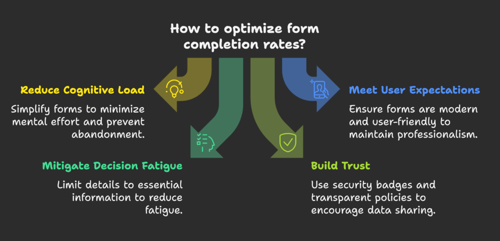
Cognitive Load Theory and Form Complexity
Cognitive load refers to the amount of mental effort needed to complete a task. If your form is too long or complicated, people might decide it’s not worth the effort, resulting in abandoned forms.
User Expectations in the Digital Shopping Experience
Online shoppers expect quick, user-friendly interfaces. If your forms feel out-of-date or clunky, potential customers may question the professionalism of your entire store.
Decision Fatigue and Its Impact on Form Abandonment
When users are asked for too many details, they can experience decision fatigue. Keeping forms simple and only asking for essential info can significantly lower this fatigue.
The Psychology of Commitment and Progressive Disclosure
People are more likely to finish a process once they start it. Progressive disclosure—a design method where you reveal additional fields step-by-step—helps maintain momentum.
Trust Factors That Influence Users’ Willingness to Submit Information
If customers don’t trust your website or worry about data misuse, they will hesitate to share personal details. Display security badges and transparent policies to ease these fears.
Mobile vs. Desktop Form Completion Psychology
Mobile users often fill out forms on the go. They need larger buttons, fewer steps, and quick-load pages. Desktop users may have more patience, but they still appreciate streamlined designs.
We’ve seen the psychological drivers. Now, let’s look at the key elements that make Shopify forms convert like crazy.
Key Elements of High-Converting Shopify Forms
This section covers everything from layout principles to button design. By the end, you’ll have a checklist of best practices to ensure your forms are user-friendly and visually appealing. Ready for a deep dive into design details?
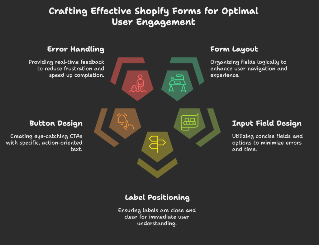
Form Layout and Visual Hierarchy Principles
Organize fields logically so users can move through them intuitively. Align labels and fields clearly, and use headers or spacing to separate distinct sections.
Input Field Design Best Practices
Keep fields as short as possible, using drop-down menus or checkboxes when appropriate. This shortens completion time and reduces errors.
Label Positioning and Clarity
Place labels close to their respective fields. Clear, concise wording ensures users instantly understand what’s required.
Button Design and Call-to-Action Optimization
Use eye-catching colors that contrast with the background. Make sure your CTA text is specific—like “Sign Up Now” or “Complete Purchase”—rather than just “Submit.”
Error Handling and Validation Techniques
Notify users instantly if they make a mistake, highlighting the exact field. This real-time feedback saves frustration and speeds up form completion.
Progress Indicators and Multi-Step Form Considerations
Break large forms into steps. Show a progress bar or step count so users see how much they’ve done and what remains.
Mobile Responsiveness Requirements
Ensure your form elements adapt to different screen sizes. Use larger touch targets and reduce the need for zooming or scrolling.
Accessibility Standards for Inclusive Form Design
Follow guidelines like adding alt text for images and ensuring color contrast meets accessibility standards. This helps all users, including those with disabilities.
Armed with best practices, let’s explore the different form types on Shopify and how to optimize each one.
Common Form Types in Shopify and Their Optimization
You’ll learn targeted tips for various forms, from contact pages to pre-order signups. By the end, you’ll be ready to tackle each form in your store with a tailored approach. Let’s see how to fine-tune each type!
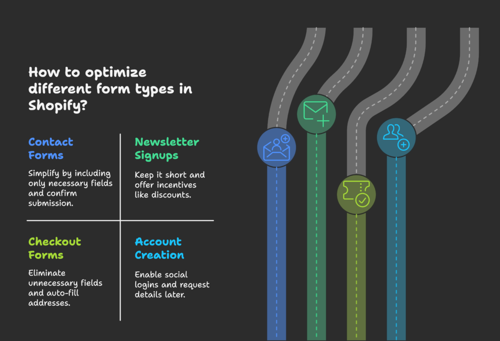
Contact Forms Optimization Strategies
Simplify these forms by including only the necessary fields—like name, email, and a message box. Make sure to show when the form was successfully submitted.
Newsletter Signup Form Best Practices
Keep it short: just an email field and a “Subscribe” button. Offer an incentive (like a discount code) to boost signups.
Checkout Form Conversion Optimization
Eliminate unnecessary fields. Auto-fill addresses and provide clear shipping/payment options. The fewer steps, the better.
Account Creation Forms
Enable social or one-click logins if possible. If more details are needed, consider requesting them later so users aren’t overwhelmed upfront.
Product Customization Forms
Use conditional fields that appear based on earlier selections, so customers only see relevant options. Provide visual previews to avoid confusion.
Customer Feedback and Survey Form Optimization
Keep surveys short, focusing on one topic at a time. Offer progress indicators so respondents know how many questions remain.
Contest and Giveaway Entry Forms
Ask for minimal data—like name and email. More fields can deter entries, so only collect extra info if it’s absolutely necessary.
Pre-order and Waitlist Forms
Explain clearly how pre-orders or waitlists work. Set expectations for when items will be available to avoid disappointment.
Next, we’ll look at how to technically implement these optimized forms in Shopify. Let’s dive into the setup!
Technical Implementation of Optimized Forms in Shopify
Here, we discuss Shopify’s native form features, working with Liquid, and using apps to supercharge your forms. By the end, you’ll know how to build, validate, and secure your forms across devices. Let’s unlock Shopify’s technical potential!
Using Shopify’s Native Form Capabilities
Shopify provides built-in contact forms and simple templates. Explore the theme editor to customize these basics before adding more complex features.
Working With Liquid to Create Custom Forms
Liquid is Shopify’s templating language. By adding custom code, you can build unique forms that match your branding and collect specialized data.
Form Apps and Integrations for Enhanced Functionality
Look for apps that offer drag-and-drop builders, multi-step forms, or advanced analytics. Many integrate seamlessly with Shopify for easy setup.
Form Validation Implementation Techniques
Use either client-side JavaScript or server-side checks. Ideally, combine both for maximum security and a smoother user experience.
AJAX Form Submission for Improved User Experience
AJAX eliminates full-page reloads after submission, offering instant feedback and keeping users engaged on the same page.
Security Considerations for Form Implementation
Use HTTPS to encrypt data and include measures like spam filters or CAPTCHA where needed, especially on contact and comment forms.
Cross-Browser and Cross-Device Testing Approaches
Always test your forms on different browsers (Chrome, Safari, Firefox, Edge) and devices (mobile, tablet, desktop) to ensure consistent performance.
Performance Optimization for Forms
Minimize scripts and compress images to keep form pages loading quickly. Slow load times can cause users to abandon your form.
Technical aspects covered! Now, let’s uncover advanced strategies to make your forms even more dynamic and user-friendly.
Advanced Form Optimization Strategies
Learn how conditional logic, inline validation, and other cutting-edge techniques can make your forms a joy to fill out. By the end, you’ll be able to add unique features that delight customers. Ready for the next level?
Conditional Logic Implementation to Simplify Forms
Show or hide fields based on previous answers. This technique keeps forms clutter-free and relevant to each user’s needs.
Smart Defaults and Auto-Fill Capabilities
Use location data or saved user preferences to pre-populate fields. This speeds up completion and reduces errors.
Contextual Help and Tooltips Placement
If a question might confuse users, place a small icon or tooltip with extra guidance. This prevents interruptions or second-guessing.
Inline Validation Techniques
Instantly tell users if an email format is wrong or if a password is too short. This real-time feedback lowers frustration.
Real-Time Feedback Mechanisms
Progress bars or success indicators keep users motivated. They know exactly how close they are to completion.
Form Field Masking and Formatting Assistance
Automatically format phone numbers, dates, or credit card entries. By doing this, you reduce mistakes and keep the layout neat.
One-Click Solutions and Social Login Integration
Allow customers to sign in with Facebook, Google, or other networks. Removing multiple steps can significantly increase completed forms.
Autosave Functionality for Complex Forms
If your form is lengthy, let users save their progress and come back later. This is especially helpful for advanced customization or survey forms.
Now that you have advanced tactics, let’s see how to measure your success in form optimization.
Measuring Form Performance and Optimization
In this section, you’ll learn which metrics to track, how to implement analytics, and methods to spot abandonment patterns. By the end, you’ll be able to pinpoint what’s working—and what isn’t—in your forms. Ready to crunch some data?
Key Metrics for Evaluating Form Effectiveness
Look at completion rate, time spent on the form, and drop-off points. These metrics reveal bottlenecks and highlight top-performing fields.
Setting Up Form Analytics in Shopify
You can embed Google Analytics or other tracking scripts to monitor form submission events. Some form apps come with built-in analytics dashboards.
Identifying Form Abandonment Patterns
Check at which field users typically exit. If a certain question consistently drives them away, consider removing or rephrasing it.
Implementing Heatmaps and Session Recordings
Tools like Hotjar or Lucky Orange show you where users click, scroll, or stumble. This visual feedback helps refine form design further.
Form Field Analysis Techniques
Analyze which fields cause confusion or take too long to fill. You may need to rename them, add placeholders, or remove them altogether.
Conversion Funnel Analysis for Forms
Place each form step as a stage in your conversion funnel. Monitor drop-offs at each stage to see exactly where improvements are needed.
Benchmarking Against Industry Standards
Compare your form metrics to typical ecommerce benchmarks. This context helps you set realistic goals for improvement.
Creating a Dashboard for Ongoing Form Performance Tracking
Set up a dedicated dashboard that displays metrics like submission rates, error rates, and average time to complete forms. Review it weekly or monthly.
Let’s move from measurement to A/B testing, so you can systematically improve your forms.
A/B Testing Framework for Shopify Forms
This section shows you how to set up, run, and interpret split tests for different form elements. By the end, you’ll know how to continuously refine your forms for higher conversions. Curious about what variations to test? Let’s find out!
Elements to Test in Shopify Forms
Try different headlines, button text, field labels, or entire layouts. Even small changes like label placement can impact conversions significantly.
Setting Up Split Tests for Forms
Many apps let you duplicate your form and show versions randomly to your visitors. Always keep track of which version each user sees.
Sample Size Considerations for Valid Results
You need enough visitors and submissions per variation to ensure statistical significance. Running a test for just a day might not cut it.
Test Duration and Statistical Significance
Aim for a minimum of a week or two per test, to account for daily fluctuations in traffic. Stop the test only when your results are stable.
Interpreting Test Results Accurately
Look beyond the initial conversion bump. Check whether the winning variation consistently outperforms the original over time.
Implementing Winning Variations
Once you pick a winner, deploy that form version to all users. Then, consider new tests to refine it further.
Continuous Testing Methodology
Testing is never truly “done.” As user preferences evolve, keep experimenting and adjusting your forms.
Common A/B Testing Pitfalls to Avoid
Don’t test too many changes at once. That makes it hard to know which element caused the difference. Also, avoid stopping tests too soon out of excitement.
Next up, we’ll discover mobile-specific tips for form optimization, because mobile users have unique needs.
Mobile Optimization for Shopify Forms
In this section, you’ll learn how to tailor your forms for small screens, from touch-friendly inputs to thumb-zone considerations. By the end, you’ll be ready to convert on-the-go shoppers with ease. Let’s go mobile!
Touch-Friendly Input Design Principles
Use larger buttons and ensure enough spacing between fields so users don’t accidentally tap the wrong element on their phone.
Form Layout Considerations for Small Screens
Stack fields vertically to minimize horizontal scrolling. Use collapsible sections or multi-step forms to avoid cluttering the screen.
Keyboard Optimization for Different Input Types
For numbers, display a numeric keypad. For email, prompt the “@” symbol. These small changes save time and reduce user errors.
Handling Viewport Adjustments When Keyboard Appears
On mobile, the keyboard can shift the view. Make sure your form remains visible when the keyboard pops up.
Thumb Zone Considerations in Form Design
Place important buttons within easy thumb reach (usually at the lower half of the screen on mobile). Avoid making users stretch or shift grips awkwardly.
Reducing Form Fields for Mobile Users
Mobile visitors tend to fill out fewer fields. Only keep what’s absolutely necessary to prevent abandonment.
Mobile-Specific Validation and Error Messages
Ensure errors are visible without forcing the user to scroll back. Clear, concise messages help users fix mistakes quickly.
Performance Optimization for Mobile Form Submission
Compress images and minimize code to keep load times short. If pages take too long to load, mobile users might bail.
You’ve mastered mobile. Now, let’s see how to build trust around your forms for higher submission rates.
Building Trust Elements Around Forms
Learn how adding security badges, privacy statements, and social proof can reassure visitors. By the end, you’ll know exactly how to make customers feel safe sharing their information. Ready to boost confidence in your brand?
Strategic Placement of Trust Signals
Place logos or badges near the form fields or submit button. These can include “Secure Checkout” icons or recognized payment logos.
Security Badges and Certifications
Show seals like SSL encryption, McAfee, or Norton if applicable. These signals can greatly reduce worries about fraud.
Privacy Policy Integration and GDPR Compliance
Link to a clear privacy policy. If you operate in Europe or serve European customers, ensure you follow GDPR for data protection.
Transparent Form Purpose Statements
Explain why you need each piece of data. This honesty can alleviate concerns about spam or misuse.
Social Proof Integration Near Form Elements
Display testimonials or the number of people who’ve already signed up. People feel more comfortable if they know others trust you too.
Testimonials and Reviews to Increase Form Trust
Highlight positive feedback close to the form. This sense of community approval can encourage new users to submit.
Clear Expectations Setting for Post-Submission
Let users know what happens next—such as receiving an email confirmation. This avoids confusion or disappointment.
Handling Sensitive Information Collection
If you’re asking for data like credit card numbers or birth dates, be extra transparent about how you’ll store and protect it.
Ready to see real-world examples? Next, we’ll look at case studies of successful Shopify form optimizations.
Case Studies: Successful Shopify Form Optimizations
Here, we’ll explore how various businesses, from small to enterprise, improved their forms and saw tangible results. By the end, you’ll be inspired to try similar strategies. Let’s learn from those who did it right!
Before and After Examples With Metrics
Some stores cut their form fields from 10 to 5 and saw a 20% increase in signups. Another brand introduced multi-step checkout and reduced cart abandonment by 15%.
Small Business Form Optimization Success Stories
A small boutique boosted newsletter subscriptions by placing a simple popup form on the homepage with a first-order discount incentive.
Enterprise-Level Form Optimization Case Studies
Large retailers tested new layouts and used advanced A/B testing. They saw significant increases in sales from streamlined checkout forms.
Industry-Specific Form Optimization Examples
Beauty stores often use product quiz forms to personalize recommendations, while electronics shops focus on quick checkout forms to handle impulse buyers.
Mobile Form Optimization Success Stories
One store made its entire sign-up process single-page on mobile, cutting steps. They doubled their conversion rate from mobile traffic.
Checkout Form Optimization Case Studies
Implementing address auto-complete and removing unnecessary steps led to faster checkouts. This approach significantly improved user satisfaction.
Lead Generation Form Optimization Examples
Companies offering free samples simplified their request forms, leading to more leads gathered and better follow-up campaigns.
Multi-Step Form Conversion Improvements
Shops that split long forms into smaller sections discovered that users were more willing to keep going if each step was short and clear.
Having seen these successes, let’s check common mistakes you should avoid in your own form optimization.
Common Form Optimization Mistakes to Avoid
This section reveals typical errors—from asking too many questions to providing unclear error messages. By the end, you’ll be able to steer clear of these pitfalls in your own Shopify forms. Ready to learn what not to do?
Excessive Form Fields and Information Requests
People don’t want to share more than necessary. Ask only for the essentials, or risk scaring them off.
Unclear Error Messages and Validation
If users make a mistake, they should immediately understand the error and know how to fix it. Vague messages frustrate them.
Poor Mobile Optimization Implementation
Fields that are too small, slow-loading pages, or awkward scrolling can kill mobile conversions fast.
Lack of Logical Form Field Grouping
Jumping from contact details to shipping info and back again confuses users. Group related fields together.
Missing or Confusing Form Labels
Placeholder text alone might disappear when users start typing, leaving them uncertain about what goes where.
Intimidating Form Appearance and Complexity
Long paragraphs of text or endless dropdowns can look scary. Keep it clean and simple to encourage submissions.
Slow Form Loading and Submission Experience
If the form lags or takes forever to process, users might bail out mid-way. Optimize for speed.
Privacy and Security Concerns
Not mentioning how data will be used or stored can erode trust. Always be transparent about security measures.
Now that you know what to avoid, let’s look ahead at future trends in Shopify form optimization.
Future Trends in Shopify Form Optimization
Here, you’ll discover emerging technologies—like AI, voice input, and biometric authentication—that will shape how we design forms. By the end, you’ll be prepared for tomorrow’s ecommerce landscape. Let’s take a peek into the future!
AI-Powered Form Field Predictions
Machine learning can auto-suggest user details or help with faster address inputs, cutting down on typing and mistakes.
Voice Input for Form Completion
As voice assistants become more widespread, customers may speak their information instead of typing it, speeding up the process.
Biometric Authentication Integration
Fingerprint or facial recognition could replace traditional logins, making it faster and more secure for repeat buyers.
Progressive Web App Form Implementations
PWAs offer app-like experiences on mobile, ensuring forms load quickly even on slow connections.
Augmented Reality Elements in Product Customization Forms
For stores selling custom items, AR can allow users to visualize a product and fill forms accordingly.
Hyper-Personalized Form Experiences
Advanced systems might adjust questions based on browsing history or purchase behavior, offering a truly tailored experience.
Conversational UI and Chatbot Form Alternatives
Instead of a static form, a chatbot could guide users through each question. This interactive approach can be more engaging.
Blockchain for Secure Form Submissions
In the future, blockchain might provide an extra layer of security and data transparency for sensitive forms.
Exciting stuff! Next, let’s outline a roadmap for Shopify store owners to implement these ideas.
Implementation Roadmap for Shopify Store Owners
Learn how to systematically audit your forms, plan improvements, and allocate resources for ongoing maintenance. By the end, you’ll have a clear path forward to make your forms shine. Let’s map out your next steps!
Form Audit and Assessment Methodology
Start by listing all forms on your store. Check each one for essential fields, user flow, and submission rates. Identify top priorities based on biggest potential impact.
Prioritization Framework for Form Improvements
Focus first on revenue-driving forms (like checkout or newsletter signup). Then refine secondary forms (contact, feedback, etc.).
Technical Resource Planning for Implementation
Determine if you need developer help or if an app can handle your needs. Outline the budget and time required.
Timeline Considerations for Optimization Projects
Form redesigns might coincide with sales campaigns or new product launches. Plan so you can measure improvement effectively.
Budget Allocation Guidelines for Form Optimization
Even small stores can benefit from cost-effective apps or a freelance developer. Larger merchants might invest in advanced testing tools.
Team Training for Form Maintenance
Ensure your staff can update forms, run A/B tests, and read analytics. This keeps optimization ongoing rather than a one-time project.
Documentation Practices for Form Changes
Record each form edit and test results in a shared document. This history helps you track improvements and avoid repeating mistakes.
Continuous Improvement Framework for Forms
Review metrics regularly and tweak forms as user behaviors evolve. Form optimization is never truly finished—it’s an ongoing process.
Now, let’s wrap it all up with a conclusion on how form optimization ties into your broader Shopify strategy.
Conclusion
From understanding the psychology of form completion to leveraging advanced strategies like conditional logic and AI, you’ve learned how to build forms that delight your customers and boost your revenue. When done right, form optimization is a powerful tool that drives conversions, reduces cart abandonment, and fosters brand trust.
Keep in mind that not every tip applies equally to every store. Be strategic, prioritize the most impactful forms, and continually measure and adjust. Over time, optimized forms can become a seamless part of your ecommerce strategy, helping you collect vital data while keeping your shoppers happy.
Quick reminder: If you’re looking for an easy way to manage and optimize these strategies, consider the Growth Suite. It can simplify your campaigns, track form performance, and guide you toward higher conversions in no time.
Here’s to crafting streamlined, user-friendly forms that turn curious visitors into loyal customers!
References
- Formaloo. (n.d.). Shopify: 4 Tips to create a form with high conversion rates.
- Shopify Community. (2024, April 5). How can I enhance my contact form design for better usability?.
- HulkApps. (2020, February 2). The Ultimate Guide on How to Add Forms in Shopify – Enhancing User Engagement and Data Collection.
- Instant. (2025, March 4). 22 Practical tips for Shopify conversion rate optimization.
- Praella. (2024, November 29). Mastering Shopify Form Optimization: Enhance Your Conversion Rates.
- Shopify Partners. (2020, May 27). How to Use Liquid to Build Forms on Shopify for Themes.
- Cialdini, R. B. (2006). Influence: The Psychology of Persuasion. Harper Business.
- Nielsen Norman Group. (2016). Form Design Best Practices.
- Baymard Institute. (2023). Checkout Usability: Form Field Optimization Research.
- Shopify. (2022). Shopify Theme Development: Forms and Validation.