
Have you ever been on a web store, seen the “Buy Now” button, and instantly felt the urge to click? Or maybe the opposite happened—you overlooked a small, dull button and missed out on a great deal. CTAs (Call-to-Actions) are the *literal* driving force behind sales on your Shopify store. By the time you finish reading this article, you’ll know how to create powerful buttons that grab attention, inspire action, and ultimately boost conversions. Ready to transform those dull “Add to Cart” buttons into conversion superstars? Let’s get started!
Introduction to CTAs in E-commerce
In this section, you’ll learn what a CTA actually is, why it matters so much in e-commerce, and the psychology behind those all-important clicks.
Definition and Importance
A Call-to-Action (CTA) is any button or link that encourages your visitor to take a specific step—like buying a product, signing up, or requesting a demo. On Shopify, CTAs are critical because they literally move a casual browser closer to completing a purchase. Research shows compelling CTAs can boost conversions by up to 22%. CTAs act as a bridge: they turn mere browsing into actual buying decisions.
The Psychology Behind Effective CTAs
CTAs work by tapping into your customers’ decision-making triggers. Things like urgency, curiosity, or clarity can all make people click. Too much pushiness can feel off-putting, but not enough urgency may mean lost sales. The trick is balancing emotional appeal with enough logical value—so a shopper feels safe *and* inspired to proceed.
You’ve just learned why CTAs matter. Next, let’s explore the fundamental elements that make your buttons irresistible.
Fundamental Elements of High-Converting CTAs
This section reveals the building blocks of effective CTA design and copy—everything from button color to persuasive text.
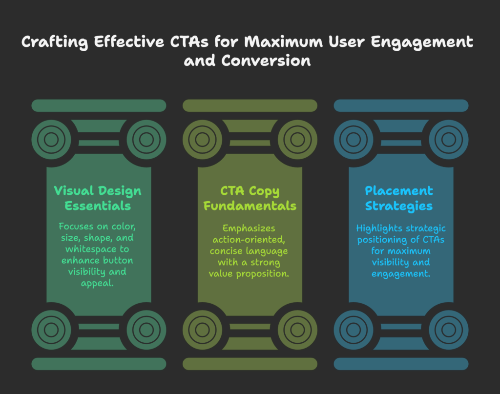
Visual Design Essentials
- Color Psychology: Pick a color that contrasts with your site’s background. Reds or oranges often stand out, while blues and greens can feel calming.
- Size & Proportion: A small, hard-to-see button won’t get clicks. Make it large enough to draw the eye, but not overwhelming.
- Button Shape: Rounded corners can look more friendly, while sharp corners may appear more modern. Find a style that fits your brand.
- Whitespace: Leave space around the button so it doesn’t compete with other elements.
CTA Copy Fundamentals
- Action-Oriented Language: Use words like “Get,” “Grab,” “Buy,” or “Start.” Avoid passive phrases like “Click here.”
- First-Person vs. Second-Person: Studies show first-person text (e.g., “Start My Free Trial”) can increase conversions by up to 90% compared to second-person (“Start Your Free Trial”).
- Concise & Clear: Keep it short—around 2-5 words is often best. You can use subtext if needed, but the button text itself should be simple.
- Value Proposition: If space allows, hint at a benefit—like “Claim My Discount” or “Get My Free Sample.”
Placement Strategies
Above-the-Fold vs. Below-the-Fold: Place at least one CTA so visitors see it without scrolling. That way, you catch impulsive shoppers.
- Reading Patterns: Most people follow an F-shaped or Z-shaped path across a webpage. Position your CTA where the eye naturally lands.
- Multiple CTAs: For long pages, repeating a CTA can help, but make sure each instance is meaningful.
- Mobile Layout: On phones, bigger is better. Keep your CTA “thumb-friendly” and near the bottom for easy tapping.
Now that you know the essentials, let’s explore how to implement CTAs within Shopify specifically.
Technical Implementation on Shopify
In this section, you’ll learn about the built-in Shopify features for CTAs, plus custom code options and specialized Buy Button tactics.
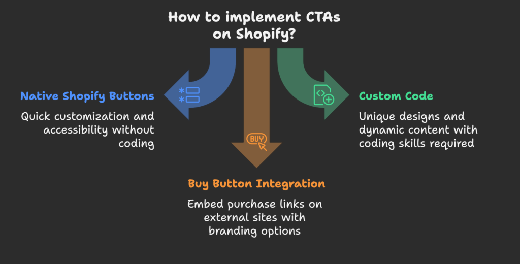
Native Shopify Button Implementation
Theme Editor: Most Shopify themes let you customize button styles—color, size, and text—through the theme editor. This is perfect for quick changes without coding.
Accessibility: Ensure your button labels are descriptive, especially for screen readers. Use contrasting colors for easy visibility.
Sections & Blocks: Shopify’s sections allow you to drag-and-drop a button into place on your homepage or landing pages, making setup simple.
Custom Code Implementation
- HTML/CSS: If you want a more unique design, you can create custom markup. Keep it straightforward to maintain load speed.
- Liquid for Dynamic Content: Show different CTAs based on whether someone is logged in or if a product is low in stock.
- JavaScript Effects: Add hover animations or real-time updates (like “X left in stock!”) for extra engagement.
Buy Button Integration
Creating Buy Buttons: Shopify’s built-in “Buy Button” feature lets you embed your product’s purchase link on external sites or landing pages.
Advanced Customization: You can style these to match your brand, so shoppers feel consistent brand vibes wherever they click.
Product vs. Collection Buttons: A single product button works well for a targeted campaign, while collection buttons help highlight multiple items at once.
Now let’s talk about optimizing CTAs for different page types—from your store’s homepage to the final checkout.
CTA Optimization for Different Page Types
Not all pages serve the same purpose. Discover how to tailor CTAs for homepages, product pages, collections, and the cart/checkout flow.
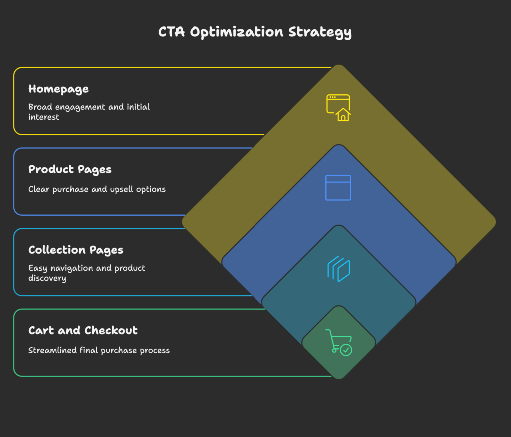
Homepage CTAs
- Hero Section: Typically the first CTA invites visitors to explore bestsellers or new arrivals.
- Featured Collections: Use “Shop Now” or “Explore” buttons for each showcased category.
- Newsletter Signup: Position a “Join Our List” or “Get Updates” button for easy lead capture.
- Balancing CTAs: Don’t overcrowd your homepage with too many different messages; pick the top 1-2 actions you want them to take.
Product Page CTAs
“Add to Cart” Optimization: Make it large, contrasting, and near the product’s main info. You want zero confusion about how to buy.
- Cross-Sell CTAs: After the main “Add to Cart,” consider “Complete the Look” or “You Might Also Like.”
- Variant Selection Buttons: If you have multiple sizes/colors, keep the CTA near them so it’s a smooth click from picking size to adding to cart.
- Post-Add CTAs: After someone clicks “Add to Cart,” show “Checkout Now” or “Continue Shopping” to guide their next step.
Collection Page CTAs
Shop Now Buttons: Let users jump straight to a product detail page. Each product card might have a small CTA, or you can do a quick “Add to Cart” if your theme supports it.
- Filtering CTAs: Buttons that let customers refine by category or price can be crucial on large inventories.
- “Load More” vs. Pagination: Some stores find a “Load More” button leads to better engagement than multi-page pagination.
Cart and Checkout CTAs
- Proceed to Checkout: Make it obvious and stand out—this is the final step towards payment.
- Upsell Buttons: Suggest related items with a small “Add” button, but keep it secondary to the main checkout CTA.
- Trust Indicators: Surround your checkout CTA with small icons or text about secure payments or free returns to ease last-minute doubts.
You’ve seen how to optimize each part of your Shopify store. Now let’s look at some advanced tricks for making your CTAs stand out even more.
Advanced CTA Strategies
If you’re ready to push the envelope, these techniques can further boost conversions by aligning with user psychology and device-specific behavior.
Creating Urgency and Scarcity
- Limited-Time Offers: Pair your CTA with a countdown timer or “24 Hours Only!” text to heighten urgency.
- Low Stock Alerts: “Only 3 left in stock—Order Now!” can nudge indecisive shoppers.
Personalization Techniques
Segmented CTAs: Show returning customers a “Shop Our New Arrivals” button while new visitors see “Check Our Bestsellers.”
Behavioral Targeting: If someone recently bought shoes, a CTA for matching socks or accessories might appear next time they visit.
Mobile-Specific Optimization
- Touch-Friendly Buttons: At least 44×44 pixels so fingers can easily tap.
- Sticky CTA: A floating “Buy Now” bar that follows them as they scroll can help on small screens.
- Short Copy: Mobile users read less text. Keep CTA text clear and short.
Now that you have the strategies, let’s move on to measuring what’s actually working by testing and tracking performance.
Testing and Measuring CTA Performance
Learn how to run experiments to figure out which CTA designs work best, which metrics to track, and how to optimize continuously.
A/B Testing Methodologies
- Elements to Test: Try different button colors, wording, or placements.
- Shopify Setup: You can use third-party apps to split traffic and track conversions.
- Time & Sample Size: Let the test run for at least a week or until you have enough data to be statistically meaningful.
Key Metrics to Track
Click-Through Rate (CTR): The percentage of people who see your CTA and click it.
Conversion Rate: How many of those clicks result in actual sales or signups.
Bounce Rate: If you see a high bounce rate after a new CTA, it might be too pushy or misaligned.
Heatmaps & Recordings: Tools like Hotjar can show you if users are missing the button or just ignoring it.
Optimization Workflow
- Baseline: Record current performance for reference.
- Test One Change: Alter color or wording, not both at the same time, so you know what caused any change in results.
- Iterate: Take the winning version, test a new variable, and keep improving step by step.
Want real success stories? Let’s check out some case studies next!
Case Studies and Examples
Below, you’ll find how other stores improved their CTA performance and what you can learn from them.
Successful CTA Transformations
- Apparel Brand: Changed “Add to Bag” to “Grab My Style” and saw a 15% lift in clicks. The fresh, upbeat wording resonated with fashion-conscious buyers.
- Tech Gadget Store: Moved the main CTA above the fold and swapped color from gray to bright green. Conversion rate rose by 20% in two weeks.
Button Examples by Purpose
Purchase CTAs: “Buy Now,” “Add to Cart,” or “Shop Now”
Lead Generation: “Subscribe,” “Join Now,” “Get Started”
Cross-Sell/Upsell: “Complete the Look,” “Bundle & Save,” “You Might Also Like”
Feedback CTAs: “Leave a Review,” “Rate Your Experience,” “Give Feedback”
We’ve seen the success stories. Now, let’s ensure you avoid common mistakes that can sabotage your CTA performance.
Common CTA Mistakes and How to Avoid Them
In this part, you’ll learn about typical pitfalls with design, copy, and strategic placement that undermine your CTA success.
Design Missteps
- Low Contrast: If your button’s color blends in, nobody notices it.
- Inconsistent Styles: Different button styles can confuse customers and break brand unity.
- Overcrowding: Too many CTAs in one area make it unclear which is most important.
Copy and Content Errors
Generic Text: Buttons like “Submit” or “Click Here” lack clarity and excitement.
Too Long: A mini-paragraph on a button is tough to read quickly.
Weak Benefit: If you don’t convey what’s in it for them, visitors feel no push to click.
Strategic Mistakes
- Too Many CTAs: Don’t offer “Buy Now,” “Sign Up,” and “Learn More” all at the same stage. Keep it single-focused.
- Premature CTA: Asking for a purchase before you’ve explained your product’s value can feel rushed.
- Not Testing: If you never test or iterate, you’re leaving potential revenue on the table.
CTAs evolve with technology. Let’s peek into the future trends for CTA optimization in e-commerce next.
Future Trends in CTA Optimization
Check out emerging tools and ideas that might shape how online stores create and display CTAs in the coming years.
AI and Personalization
- Machine Learning: Tools that automatically pick CTA color or wording based on user data.
- Predictive Analytics: CTA timing or incentives adjusted real-time, predicting what each user is likely to respond to.
Interactive and Animated CTAs
Micro-Interactions: Subtle animations on hover or click can draw attention.
Progressive Buttons: Buttons that evolve as the user scrolls or completes steps in your funnel.
Gamification: Some sites give points or achievements for clicking CTAs, spicing up the shopping journey.
Finally, let’s wrap this all together with a handy implementation checklist and an action plan.
Implementation Checklist and Next Steps
You’ve gained a lot of knowledge. Here’s how to systematically apply it to your Shopify store.
CTA Audit Framework
- Check that all CTAs are consistent in design, color, and message.
- Evaluate current performance (CTR, conversions) for each major CTA.
- Identify the worst-performing CTAs first and plan improvements.
Action Plan Development
Quick Wins: Tweak button text or color and see immediate results.
Long-Term Improvements: Plan for advanced personalization, bigger design changes, or multi-page A/B tests.
Resources: Allocate some budget for new design assets or time for coding custom button solutions.
Timeline & ROI: Space out your tests to keep data clear, always measuring conversion lifts.
Quick Note: If you’re also looking for an easy way to ramp up your Shopify store’s revenue, try Growth Suite. It automates marketing steps and helps you track essential metrics, letting you focus on important tasks—like perfecting your CTAs!
References
- The Genie Lab. (2024, May 29). Driving Sales: Perfecting Your Shopify Call-to-Action.
- LinkedIn. (2024, September 2). Transform Your Shopify Store Conversions with Strong CTAs.
- Shopify Partners Blog. (2017, September 13). Building a Clickable Call-to-Action Button for Your Shopify Theme.
- HulkApps. (2020, February 2). How to Add a Button to Your Shopify Page: Enhancing User Experience and Conversion Rates.
- Dynamic Dreamz. (2025, January 10). 10 Most Used eCommerce Call to Action Examples That Boost Sales.
- Engati. (2023, June 1). Which call to action (CTA) will work best for your Shopify store?
- Shopify Community. (2023, May 18). Adding a call to action button on my theme.
- Shopify Help Center. Creating a Buy Button.
- Reddit. Great way to increase conversions – work on your calls to action.