
Smartphones are no longer just accessories—they’re the core of how people explore and buy products online. In many markets, mobile devices generate most e-commerce sales, and this trend only grows stronger each year. In fact, roughly 70% of e-commerce transactions now happen on mobile screens. Meanwhile, 61% of potential shoppers leave sites that aren’t optimized for their phones, and 40% will quickly switch to a competitor if they find a smoother mobile experience. By the end of this article, you’ll understand exactly why designing with a mobile-first mindset matters for your Shopify store and how to use psychological principles to keep on-the-go shoppers engaged.
Below, we’ll talk about how mobile users think and behave, the psychological hooks that drive them to make faster decisions, and the design tactics that help them move smoothly from browsing to checkout. Ready to learn how to connect with your mobile audience and boost sales? Let’s jump right in.
I. Understanding Mobile Shopper Psychology
A. The Mobile Mindset
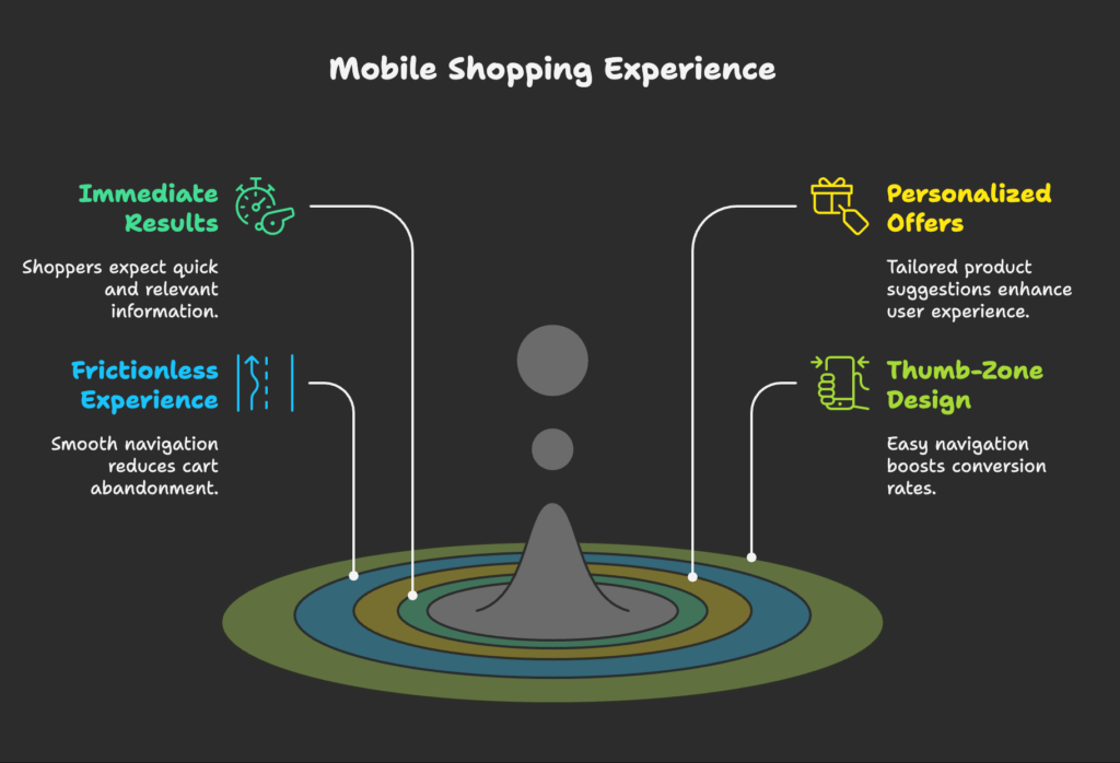
Mobile users often browse from anywhere—on a lunch break, commuting, or multitasking at home. This context shapes their shopping style. They expect immediate, personalized results because they’re usually short on time and attention. These brief windows are sometimes called “micro-moments,” where a user quickly checks reviews, compares prices, or orders right on the spot. If your mobile store takes too many clicks or fails to deliver relevant information fast, you risk losing these fleeting opportunities.
B. Mobile User Expectations
Convenience and speed top the list of what mobile shoppers want. They prefer seeing products and offers tailored to their tastes, so make sure your store recognizes returning customers and shows them items that match their previous browsing. They also hate friction—long forms, too many checkout steps, or slow-loading pages. If your Shopify store takes longer than three seconds to load, you’re likely losing out on sales. A fluid experience that allows people to do everything themselves—from browsing inventory to managing returns—goes a long way in building loyalty.
C. Thumb-Zone Psychology
It helps to think about how a phone is held and how thumbs move across the screen. The easiest areas to tap without strain are typically the center and lower portions of the display. That’s why placing critical buttons, like “Add to Cart” or “Buy Now,” within comfortable reach can significantly improve conversions. Touch interactions also have a distinctly different feel from using a mouse. A shopper can easily become frustrated if buttons are too small, spaced too tightly, or hard to reach with one hand. Design with the thumb in mind, and you’ll keep visitors on your site.
II. Key Principles of Mobile-First Design Psychology
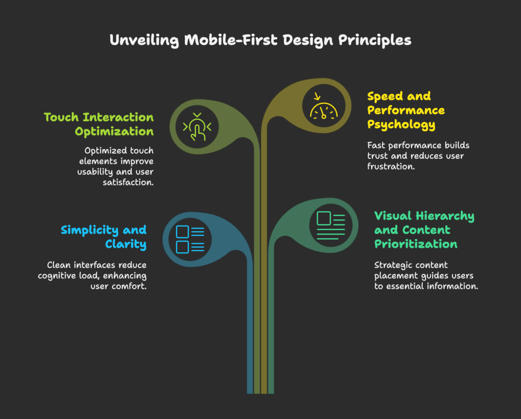
A. Simplicity and Clarity
A clean, uncluttered interface makes people feel more at ease. The goal is to reduce cognitive load by focusing on what truly matters: product images, core descriptions, and the path to purchase. Minimalist layouts, generous white space, and easy-to-read text allow your products to shine without overwhelming shoppers. When faced with a messy screen, people can get distracted or confused—and confused shoppers rarely convert.
B. Visual Hierarchy and Content Prioritization
Because phone screens are smaller, mobile users tend to scan in quick vertical swipes. Important details—like product details or main calls to action—should appear above the scroll line. Strategic use of headings, subheadings, and concise text helps readers find what they need right away. Aim to break information into short sections and use bold text to highlight key points. This guides the user’s eye and keeps them moving forward.
C. Touch Interaction Optimization
On a phone, elements that look “clickable” must actually feel good to tap. Buttons should be large enough for a thumb to press comfortably, and feedback should be immediate (for example, a slight change in color) so the user knows their tap registered. Poorly sized buttons cause accidental clicks or missed presses, which can lead to frustration and abandonment. An interface designed for touch, with natural gestures like swiping to view product images, elevates the user’s overall perception of your brand.
D. Speed and Performance Psychology
Slow sites irritate users. Even a slight lag makes people question your store’s reliability. Keep mobile load times short by optimizing image sizes and using efficient page structures. When a longer loading process is unavoidable, adding a simple progress bar or loading indicator can ease potential anxiety. A little feedback tells visitors you’re aware of their time and working behind the scenes to bring up the next page.
III. Mobile-First Strategies for Shopify Merchants
A. Mobile-Responsive Design Implementation
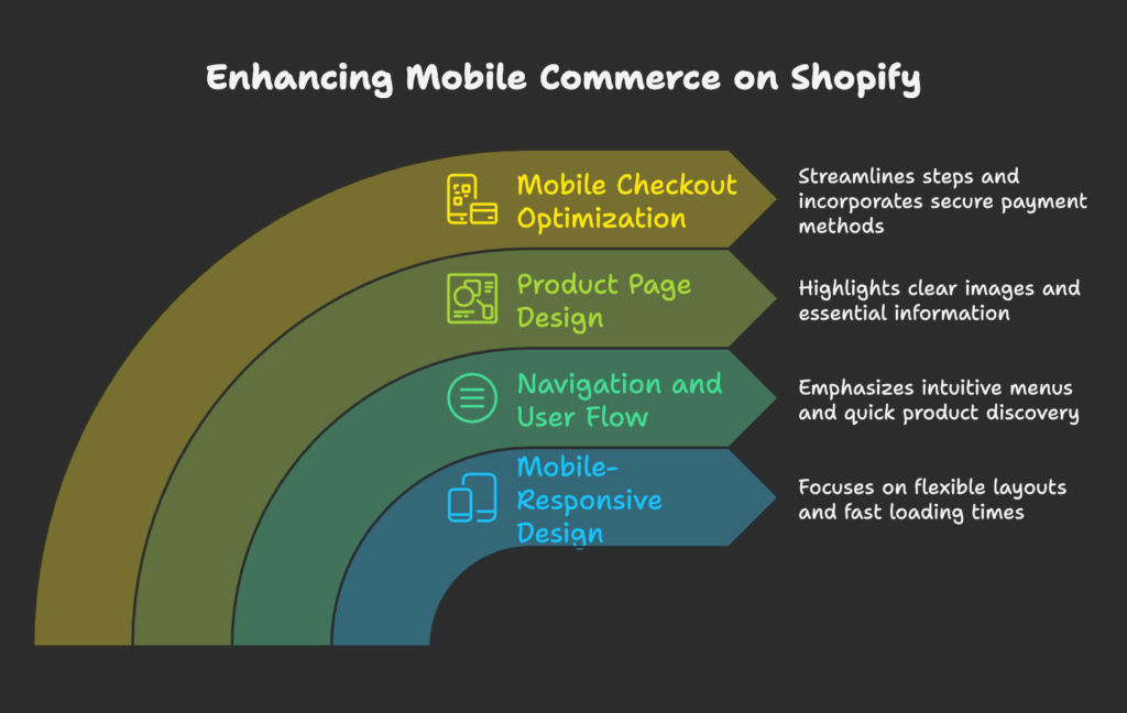
Start with a flexible theme or layout that automatically adjusts to various screen sizes. Rather than scaling a desktop layout down, focus on truly mobile-first elements like vertical scrolling, larger text, and compressed images. This ensures fast loading. Be mindful of typography by choosing fonts that remain readable on smaller devices. Use adaptive design when you need certain features to load differently on mobile, but responsive design is generally the simpler path for most Shopify stores.
B. Navigation and User Flow Psychology
Mobile users dislike digging through deep menus. Make sure your main menu is concise and intuitive. A prominent search bar can speed up product discovery. Breadcrumb trails might seem minor, but they help people quickly retrace their steps if they tapped on an item by mistake. Smooth, guided pathways to product listings and checkout keep customers engaged from the very first tap.
C. Product Page Psychology
On a phone, your product pages should stand out with big, clear images. Include a pinch-to-zoom feature or multiple angles if possible. Use short yet convincing descriptions so users get the essentials without scrolling endlessly. Highlight social proof like ratings or brief testimonials, but avoid adding too much clutter. Keep variants and options easy to tap. A good product page answers the main questions and eliminates hesitation right away.
D. Mobile Checkout Optimization
The fewer steps between cart and confirmation, the better. Minimize form fields and consider using auto-fill features to speed things up. Many mobile shoppers love using payment methods like Apple Pay or Shop Pay because they skip entering card details. Reassure customers that checkout is secure by displaying trust signals without overloading the screen. Also, keep an eye on abandonment patterns and set up automated reminders for those who leave before finishing.
IV. Personalization and Mobile Shopping Behavior
A. Leveraging First-Party Data
Your Shopify data can reveal a shopper’s past purchases, recently viewed items, and preferred categories. Use this to present products they’re more likely to want. For instance, greet returning visitors by referencing items they previously browsed. This subtle recognition triggers a feeling of familiarity, which can encourage them to explore further. Just make sure you’re transparent about data collection so shoppers stay comfortable.
B. Location-Based Personalization
Stores that offer local pickup or real-time inventory checks can appeal strongly to mobile users. A quick “In Stock Near You” label can spark immediate interest. Whether you’re an online-exclusive business or have physical locations, tying in location data gives people the impression of a more customized experience. Just remember to ask for permission or use commonly accepted forms of geolocation so customers feel safe sharing their information.
C. Mobile App vs. Mobile Web Psychology
People who install a store’s dedicated mobile app often do so because they anticipate buying regularly or accessing special features. Once inside, they expect a smooth, personalized feel with things like push notifications for limited releases or loyalty programs. If you haven’t moved into app territory yet, a well-tuned mobile website can still offer a robust experience. Decide which path is right for your brand based on your audience and resources.
V. Case Studies: Successful Mobile-First Shopify Stores
A. Allbirds
Allbirds presents products with large, minimal layouts and crisp photography. Shoppers instantly see what they’re getting, and there’s no clutter to slow them down. Scrolling is seamless, navigation is straightforward, and sustainability details are easy to find. It’s a prime example of how a mobile site can look simple while still feeling complete.
B. Gymshark
Gymshark engages its community with energetic visuals and streamlined performance. Every page is designed for quick loading, which appeals to mobile users who expect to shop and go. Gymshark also integrates fitness content into the user journey, creating a stronger link between its products and the active lifestyle it promotes.
C. Kylie Cosmetics
Kylie Cosmetics stands out by letting shoppers visualize the products instantly. High-quality images, fast product pages, and a straightforward “Quick Buy” option all help make mobile purchases fast. Limited-edition releases, accessible via mobile notifications or site announcements, also drive a sense of urgency that’s easy to act on.
D. Alo Yoga
Alo Yoga merges commerce with a lifestyle approach, offering interactive product pages and even virtual yoga class links for mobile visitors. This strategy helped the company see major improvements in mobile sales, with nearly 50% growth after focusing on a phone-first layout. By blending community, content, and retail, Alo Yoga keeps users engaged on smaller screens.
VI. Testing and Optimization for Mobile Psychology
A. Mobile Usability Testing Approaches
Prioritize testing with actual mobile users on real devices. Tools like heat maps can reveal where thumbs hover and which elements get ignored. Simple A/B tests let you compare different button placements or font sizes. Record sessions if you can, then watch how people navigate. You’ll see exactly where they hesitate or abandon the process, giving you data to refine the design.
B. Key Mobile Metrics to Track
Monitor your mobile conversion rates separately from desktop, as they can differ significantly. Keep tabs on page load times, bounce rates, and cart abandonment. Look at how many users rely on your search function or how often they exit a page right after landing. Patterns in search and navigation can highlight issues in your funnel or point to new opportunities for improvement.
C. Continuous Improvement Strategies
As mobile behavior evolves, your store should evolve too. Regularly refresh your layouts, update page elements for newer phone models, and stay mindful of shifting user habits. Even small tweaks—like adjusting the size of a button—can produce better conversions over time. The key is to watch changes in user feedback and adapt quickly.
VII. Future Trends in Mobile-First E-Commerce
A. Voice Search and Mobile Shopping
With the rise of voice assistants, some shoppers are now speaking product requests instead of typing. This creates an opportunity to optimize your site copy for common search phrases. While it’s still a smaller portion of e-commerce, voice tech can make sense for brands targeting audiences that embrace hands-free options. Just be sure your key product details are easy to interpret verbally.
B. Augmented Reality (AR) and Mobile Shopping
AR features let users “test” products like furniture or makeup through their phones, which can boost purchase confidence. Shopify apps and third-party services make this accessible to stores of all sizes. By offering customers the chance to see an item in their personal space, you help them overcome doubts about color, size, or appearance—all on their phones.
C. Social Commerce and Mobile Integration
Social media and online stores are often linked, especially on phones, where people switch between a brand’s Instagram feed and its product pages within seconds. Tying social proof directly into your product listings can reassure shoppers. User-generated content is particularly powerful on mobile—customers enjoy tapping through authentic posts that show real people using your items.
D. Mobile Payment Evolution
Payment options on phones continue to expand. One-tap ordering, fingerprint scans, and face recognition create a secure but fast checkout process. If your store can let a shopper finalize a purchase with minimal manual input, you’ll likely see a better conversion rate. Subscription services also benefit from these advancements because recurring payments feel easier to manage on a phone.
VIII. Conclusion
Placing mobile-first design at the heart of your Shopify strategy sets you apart in an environment where countless brands compete for attention. By understanding the psychology of on-the-go shoppers, you can craft experiences that feel natural, simplify decision-making, and encourage repeat visits. Remember that small touches—like thumb-friendly layouts or lightning-fast performance—can be the deciding factor that keeps customers from wandering to a competitor. Evaluate your site from a mobile perspective regularly, test frequently, and adjust as user expectations shift. In doing so, you’ll stay ready for whatever the mobile future brings.
References
- “The Complete Guide to Mobile Personalization (2025).” Shopify. https://www.shopify.com/enterprise/blog/how-to-create-personalized-experiences-for-first-time-black-friday-cyber-monday-mobile-traffic
- “Mobile-First Design: A Key to E-commerce Development Success.” Webskitters. https://www.webskitters.com/mobile-first-design-a-priority-for-e-commerce-development
- “Embracing Mobile-First Design for E-commerce Success.” Erawatech. https://erawatech.com/embracing-mobile-first-design-for-e-commerce-success/
- “Mobile-First Design: The Complete Guide.” ScaleupAlly. https://scaleupally.io/blog/mobile-first-design/
- “10 Best Practices for Mobile-First Ecommerce Design.” UltraLabs. https://ultralabs.digital/blogs/ecom-insights/10-best-practices-for-mobile-first-ecommerce-design
Ready to supercharge your Shopify store’s sales with perfectly optimized discount codes? Growth Suite is a Shopify app that helps you do just that. Install it with a single click and start seeing results!