
Ever watched potential customers fill their carts, march confidently toward checkout, then vanish like they’ve seen a ghost? You’re not alone. Nearly 70% of online shoppers abandon their carts, and most of that happens right at checkout. But here’s the kicker – what if I told you that simply changing how your checkout looks could boost your sales by 7.5% overnight?
You’re probably wondering: should I use Shopify’s sleek one-page checkout or stick with the traditional multi-step approach? It’s not just about looking modern. This decision could literally make or break thousands of dollars in revenue. The wrong choice doesn’t just cost you sales – it trains customers to expect a frustrating experience every time they try to buy from you.
By the time you finish this article, you’ll know exactly which checkout flow works best for your store, how to test it properly, and most importantly, how to squeeze every possible conversion out of your traffic. Ready to turn those cart abandoners into paying customers? Let’s dive in.
The Critical Role of Checkout Optimization in E-commerce
Let’s start with the brutal truth about e-commerce. Your checkout isn’t just another page – it’s your digital cash register, and right now, it might be broken. Think about it this way: you’ve spent money on ads, crafted perfect product descriptions, and convinced someone to add items to their cart. Everything you’ve invested comes down to this one moment.
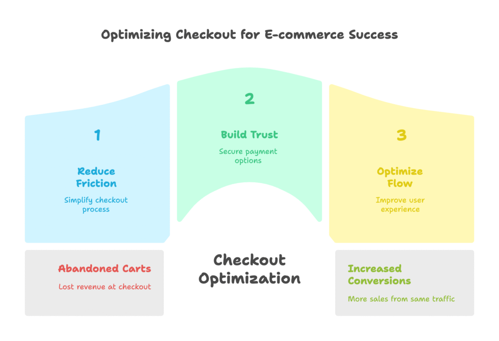
The numbers are staggering. Cart abandonment costs online retailers approximately $18 billion annually. That’s not just big companies losing millions – that’s thousands of small Shopify stores watching potential customers slip through their fingers every single day. But here’s what makes this even more frustrating: most of this loss happens at checkout, the very last step of the buying process.
Consider this scenario: you’re running Google Ads and paying $2 per click. Out of 100 visitors, 20 add products to their cart. If your checkout converts at 50%, you make 10 sales. But if you optimize that checkout and push conversion to 57%, you suddenly have 11.4 sales from the same traffic. That’s a 14% increase in revenue without spending an extra penny on ads.
The return on investment from checkout optimization often exceeds 300%. Unlike other marketing investments that require ongoing spending, a better checkout keeps making you money indefinitely. Yet most store owners spend more time picking the perfect product photos than optimizing the one page that actually generates revenue.
But checkout optimization isn’t just about numbers – it’s about psychology. When someone reaches your checkout, they’re in a vulnerable state. They’re about to spend money, share personal information, and trust you with their credit card details. Any friction, confusion, or doubt can instantly break that trust. Understanding this psychology is crucial for making the right choices about your checkout flow.
Now that we understand why checkout optimization matters so much, you might be wondering what options Shopify actually offers. Let’s explore how Shopify’s checkout has evolved and what tools you have at your disposal.
Shopify’s Checkout Evolution and Current Options
In this section, we’ll explore how Shopify has transformed its checkout system over the years and what options are available to you right now. You’ll discover which Shopify plans include advanced checkout features and how these changes affect your conversion potential.
Shopify didn’t always offer flexible checkout options. For years, merchants were stuck with a basic multi-step checkout that, frankly, felt outdated compared to what customers experienced on other platforms. The checkout was functional but hardly optimized for modern shopping behaviors, especially on mobile devices where over 80% of e-commerce traffic now originates.
The game changed when Shopify introduced their one-page checkout feature. This wasn’t just a cosmetic update – it represented a fundamental shift in how Shopify viewed the checkout experience. The company had been studying conversion data across millions of transactions and realized that fewer steps often meant fewer opportunities for customers to change their minds.
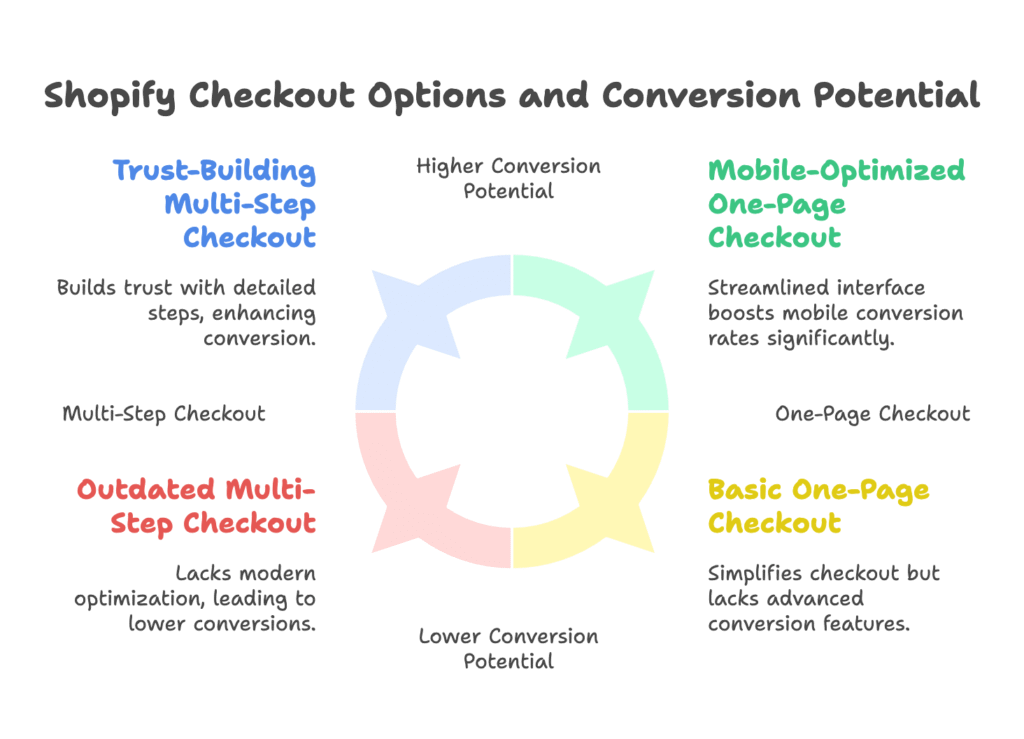
Today’s Shopify checkout landscape offers several distinct options. The traditional multi-step checkout breaks the process into separate pages: customer information, shipping details, and payment. Each step requires a page load and gives customers multiple chances to reconsider their purchase. The newer one-page checkout condenses everything into a single, streamlined interface where customers can see their entire order and complete their purchase without ever leaving the page.
But here’s where it gets interesting – and where many store owners make costly mistakes. Not all Shopify plans include advanced checkout features. The one-page checkout option is primarily available on Shopify Plus, though some features have been rolled out to lower-tier plans. If you’re on a basic plan and wondering why your checkout looks different from your competitor’s, this might be why.
The technical differences between these checkout types go beyond just appearance. One-page checkouts require more sophisticated JavaScript handling, better server optimization, and more careful attention to mobile responsiveness. Multi-step checkouts, while seemingly simpler, actually require more complex session management and state preservation across multiple page loads.
What’s particularly fascinating is how Shopify’s data influenced these changes. Internal studies showed that stores using one-page checkout experienced significant improvements in mobile conversion rates. The reduction in cognitive load – essentially, the mental effort required to complete a purchase – directly correlated with higher completion rates.
However, this doesn’t mean one-page checkout is always better. Shopify’s own research revealed that the optimal checkout depends heavily on factors like average order value, product complexity, and customer demographics. A jewelry store selling $500 necklaces might benefit from the trust-building elements of a multi-step checkout, while a t-shirt shop could see better results with the simplicity of one-page checkout.
Understanding these options is just the beginning. The real question becomes: how do these different checkout types actually perform? Let’s examine the specific characteristics that make each approach unique.
Understanding Different Checkout Flow Types
Now we’re getting into the meat of the matter. In this section, you’ll learn the specific features and psychological principles behind each checkout type. Understanding these differences will help you predict which approach might work better for your specific store and customers.
Let’s start with one-page checkout, the newer kid on the block. Picture this: your customer clicks “checkout” and immediately sees everything – their order summary, shipping options, payment fields, and total cost – all on one screen. There’s no guessing, no surprises, and no additional page loads. This transparency can be incredibly powerful for building trust and reducing anxiety.
The psychology behind one-page checkout taps into what behavioral economists call “cognitive ease.” When people see all information at once, their brains process it as less threatening and more manageable. It’s similar to how restaurants with clearly displayed prices seem more trustworthy than those where you have to ask. Customers appreciate knowing exactly what they’re getting into before they start entering personal information.
One-page checkout also leverages the psychological principle of momentum. Once customers start filling out fields, they’re more likely to complete the entire process if they can see the finish line. It’s like the difference between climbing a mountain when you can see the peak versus climbing when the summit is hidden by clouds. The visible endpoint provides motivation to continue.
But one-page checkout isn’t without challenges. The single screen can feel overwhelming, especially on mobile devices with limited screen space. Some customers, particularly older demographics, may find the condensed format confusing or rushed. The key is presenting information in a logical visual hierarchy that guides the eye naturally from one section to the next.
Multi-step checkout takes a completely different psychological approach. Instead of showing everything at once, it uses a principle called “progressive disclosure.” This technique reveals information gradually, reducing cognitive load at each step. Think of it like a guided conversation rather than a form to fill out.
The staged approach of multi-step checkout can actually increase completion rates for complex purchases. When someone is buying a $1,000 item, they might appreciate the deliberate pace that allows them to consider each aspect of the transaction. Each step provides a micro-commitment that psychologically increases their investment in completing the purchase.
Multi-step checkout also offers superior data collection opportunities. Each step can be optimized for specific information gathering, and you can track exactly where customers drop off. This granular data is invaluable for optimization. If 20% of customers abandon at the shipping step, you know exactly where to focus your improvement efforts.
However, multi-step checkout has significant drawbacks in today’s mobile-first world. Each page load creates an opportunity for distraction or technical issues. Slow internet connections, which are common in many markets, can make multi-step checkout feel frustratingly sluggish. Every additional second of loading time can reduce conversions by up to 7%.
The technical implementation differences between these approaches are substantial. One-page checkout requires more sophisticated front-end development but simpler session management. Multi-step checkout needs robust state preservation and error handling across multiple pages but can be easier to debug when issues arise.
Mobile optimization presents unique challenges for both approaches. One-page checkout must carefully manage screen real estate and input focus, while multi-step checkout must ensure smooth transitions between pages on touch interfaces. Given that mobile users now represent the majority of e-commerce traffic, these technical considerations can make or break your conversion rates.
Understanding these fundamental differences is crucial, but how do they translate into actual performance? Let’s examine real data about how these checkout types perform in the wild.
Performance Metrics and Real-World Conversion Analysis
Here’s where theory meets reality. In this section, we’ll dive into actual performance data and metrics that show how these checkout types perform in real Shopify stores. You’ll see specific conversion rate improvements and learn how to measure success in your own store.
Let’s cut straight to the most important number: conversion rate. This isn’t just about how many people visit your site – it’s about how many people who reach checkout actually complete their purchase. For most Shopify stores, this number typically ranges between 45% and 65%. If yours is below 50%, you’re literally watching money walk out the door.
One compelling case study comes from a fashion retailer that tested both checkout types over six months. Their multi-step checkout was converting at 54% – not terrible, but not great either. After implementing one-page checkout, their conversion rate jumped to 57%. That seemingly small 3-percentage-point increase translated to a 7.5% boost in revenue. For a store doing $50,000 monthly, that’s an extra $3,750 every month, or $45,000 annually.
But here’s what makes this data particularly interesting: the improvement wasn’t uniform across all customer segments. Mobile users saw the biggest boost, with conversion rates jumping nearly 5 percentage points. Desktop users showed more modest improvements of about 2 percentage points. This pattern repeats across multiple studies and highlights why mobile optimization should be your primary concern when choosing checkout flows.
Average order value (AOV) tells another part of the story. Interestingly, one-page checkout often results in slightly lower AOV compared to multi-step checkout. The theory is that the faster, more streamlined process encourages impulse purchases but doesn’t give customers as much time to consider add-ons or upgrades. For stores with AOV under $75, this trade-off typically favors one-page checkout. Above $150, multi-step often performs better.
Time-to-completion metrics reveal fascinating behavioral patterns. One-page checkout users complete purchases an average of 23% faster than multi-step users. However, multi-step users who do complete their purchases show higher customer lifetime value in subsequent analysis. This suggests that the deliberate pace of multi-step checkout may attract more committed, higher-value customers.
Cart abandonment patterns also differ significantly between the two approaches. Multi-step checkout shows predictable drop-off points – typically 15% at the shipping step and 8% at payment. One-page checkout shows more gradual abandonment, with customers more likely to leave mid-form rather than at specific transition points. This difference is crucial for understanding where to focus optimization efforts.
Geographic and demographic factors play surprisingly important roles in checkout performance. Customers from regions with slower internet connections strongly favor one-page checkout, likely due to reduced page load requirements. Older customers (45+) show slight preference for multi-step checkout, possibly due to familiarity with traditional forms. Younger customers (18-34) convert significantly better with one-page checkout.
Industry variations are substantial. Fashion and accessories stores typically see better results with one-page checkout, likely due to the impulse-driven nature of these purchases. Electronics and high-ticket items often perform better with multi-step checkout, where the additional time allows customers to feel more confident about significant purchases.
Seasonal patterns also emerge in the data. During high-traffic periods like Black Friday or holiday shopping, one-page checkout often outperforms multi-step checkout by larger margins. The urgency of these shopping periods seems to amplify the benefits of streamlined checkout. However, during slower periods, the performance gap narrows, suggesting that customer patience varies with context.
Mobile device performance shows particularly stark differences. iOS users consistently show higher conversion rates with one-page checkout, while Android users show more varied results depending on device performance and internet connection quality. This highlights the importance of considering your specific customer base when making checkout decisions.
These performance insights are valuable, but they’re meaningless unless you can test them in your own store. How do you actually set up reliable A/B tests to determine which checkout works best for your specific situation?
Setting Up Effective A/B Testing for Shopify Checkout
This is where the rubber meets the road. In this section, you’ll learn exactly how to set up proper A/B tests for your checkout flows. We’ll cover the technical setup, statistical requirements, and common pitfalls that can invalidate your results.
Before diving into the technical setup, let’s address the elephant in the room: most checkout A/B tests fail not because of poor implementation, but because of poor planning. You can’t just flip a switch and hope for the best. Successful checkout testing requires understanding your baseline performance, identifying specific hypotheses to test, and ensuring you have enough traffic to reach statistical significance.
Start with your current checkout performance as a baseline. Log into your Shopify Analytics and examine your checkout conversion rate over the past 30 days. Look for patterns – does performance vary by traffic source, device type, or time of day? These patterns will inform your testing strategy and help you identify the most impactful opportunities.
For technical implementation, Google Tag Manager becomes your best friend. You’ll need to install GTM across all pages of your site, with special attention to checkout pages. The key is ensuring that your tracking fires consistently across both checkout variants. Create custom events for checkout_started, checkout_step_completed, and purchase_completed. These events will be crucial for measuring the impact of your changes.
Google Optimize integration with Shopify requires some technical finesse. Unlike regular page tests, checkout testing involves multiple pages and complex user flows. You’ll need to set up URL targeting that captures all relevant checkout pages while avoiding conflicts with Shopify’s own tracking. The most common mistake is creating targeting rules that accidentally exclude mobile users or specific payment methods.
Hypothesis formation is where many tests go wrong. “One-page checkout will convert better” isn’t a testable hypothesis – it’s just a guess. A proper hypothesis might be: “One-page checkout will improve mobile conversion rates by at least 5% because it reduces page load times and eliminates navigation friction for our fashion-focused, mobile-heavy audience.” Notice how this hypothesis is specific, measurable, and based on reasonable assumptions about your customers.
Sample size calculation is critical but often overlooked. With typical checkout conversion rates around 55%, you’ll need approximately 1,000 checkout sessions per variant to detect a 5% improvement with 95% confidence. If your store only gets 200 checkout sessions per week, you’ll need to run your test for at least 10 weeks to get reliable results. Many store owners make decisions based on insufficient data, leading to costly mistakes.
The technical implementation process starts with creating your test variants in Google Optimize. For checkout testing, you’ll typically use redirect tests rather than on-page modifications. This means setting up separate checkout flows and redirecting traffic between them. The challenge is ensuring that Shopify’s own analytics and your third-party tools properly track both variants.
Quality assurance becomes incredibly important with checkout testing. Unlike testing a product page, checkout errors can directly cost you sales. Test both variants thoroughly across different devices, browsers, and payment methods. Pay special attention to edge cases like discount codes, shipping calculations, and tax handling. A test that breaks checkout functionality for even 1% of users can negate any conversion improvements.
Timing your test launch strategically can significantly impact results. Avoid starting tests during major sales events, holiday periods, or right after marketing campaigns. These events can skew your baseline and make it difficult to isolate the impact of checkout changes. The best time to start is during relatively stable traffic periods when customer behavior is predictable.
Monitoring your test requires daily attention, especially in the first week. Watch for technical errors, unusual traffic patterns, or unexpected conversion fluctuations. Set up automated alerts for significant performance changes – both positive and negative. A poorly configured test can cost you thousands in lost sales before you notice the problem.
Statistical significance isn’t just about reaching your target sample size. You also need to consider practical significance – is the improvement large enough to matter for your business? A 1% conversion improvement might be statistically significant but not worth the technical complexity of implementation. Most successful checkout optimizations show improvements of at least 3-5% to justify the effort.
Understanding these technical requirements is essential, but successful checkout optimization goes beyond just A/B testing. What do your customers actually experience when they interact with different checkout flows?
User Experience Research and Behavioral Psychology
Now we’re diving into the human side of checkout optimization. This section will help you understand the psychological and emotional factors that influence checkout behavior. You’ll learn practical research methods to uncover what your customers really think about your checkout process.
Let’s start with a fundamental truth: checkout is inherently stressful for customers. They’re about to spend money, share personal information, and trust a website with their credit card details. Understanding this emotional state is crucial for designing effective checkout flows. It’s not just about making checkout faster – it’s about making it feel safer and more trustworthy.
One powerful research method is the diary study approach. Ask 10-15 recent customers to document their checkout experience immediately after purchase. Provide them with simple questions: What thoughts went through your mind during checkout? What almost made you abandon your purchase? What convinced you to complete it? The insights from these subjective experiences often reveal friction points that analytics can’t capture.
Card sorting exercises can revolutionize how you organize checkout information. Present customers with different pieces of checkout information (shipping address, billing address, payment method, order summary) and ask them to arrange these elements in their preferred order. You’ll often discover that customer expectations differ significantly from conventional checkout flows. For example, many customers prefer seeing the order summary first, while most checkouts bury it at the bottom.
User interviews, when conducted properly, provide the deepest insights into checkout psychology. But here’s the key: don’t ask customers what they want – observe what they actually do. Set up screen sharing sessions where customers complete a test purchase while thinking aloud. The gap between what people say they want and what they actually respond to is often enormous.
The psychology of financial transactions reveals several critical insights for checkout design. When people are about to spend money, their brains activate the same regions associated with physical pain. This is why checkout optimization isn’t just about convenience – it’s about pain reduction. Every unnecessary form field, confusing instruction, or unexpected charge intensifies this psychological discomfort.
Trust signals become exponentially more important at checkout than anywhere else on your site. Security badges, SSL certificates, and clear return policies aren’t just nice-to-have elements – they’re essential psychological tools for reducing transaction anxiety. The placement of these trust signals matters enormously. A security badge next to the credit card field can be more effective than the same badge in the footer.
Cognitive load management is where one-page versus multi-step checkout creates the most significant differences. One-page checkout frontloads cognitive load – customers see everything they need to process at once. Multi-step checkout distributes cognitive load across multiple interactions. Neither approach is inherently better, but they suit different customer mindsets and purchase contexts.
The mobile experience introduces unique psychological factors that desktop users never encounter. Mobile checkout happens in more distracting environments – people shop on phones while commuting, watching TV, or multitasking. This context means mobile checkout must be even more intuitive and forgiving than desktop checkout. Every extra tap or swipe becomes a potential abandonment point.
Touch interface psychology differs significantly from mouse-and-keyboard interaction. Mobile users expect larger, more responsive buttons. They’re more sensitive to form field errors because typing on mobile keyboards is inherently more difficult. Auto-completion and smart defaults become crucial for reducing mobile friction. Address auto-completion, for example, can reduce mobile checkout time by up to 30%.
Progressive web app capabilities can dramatically improve mobile checkout psychology. Features like offline functionality, push notifications, and home screen installation create a more app-like experience that customers associate with higher quality and reliability. These technical features translate directly into psychological comfort and increased conversion rates.
Cultural and demographic factors also influence checkout psychology. Younger customers (18-29) show higher tolerance for streamlined, minimal checkouts. They’re comfortable with social logins and stored payment methods. Older customers (45+) often prefer more detailed, step-by-step processes that give them control over each aspect of the transaction. Geographic factors matter too – customers from regions with higher fraud rates show stronger preferences for detailed checkout processes.
Understanding customer psychology is powerful, but it’s meaningless without proper data to back up your decisions. How do you actually measure and monitor the performance improvements from your checkout optimizations?
Advanced Analytics and Performance Monitoring
This section transforms you from someone who guesses about checkout performance to someone who knows exactly what’s happening and why. You’ll learn to set up sophisticated tracking systems and interpret data that most store owners never see.
Most Shopify store owners look at conversion rates and think they understand their checkout performance. But overall conversion rate is like looking at your car’s speedometer and thinking you understand everything about engine performance. The real insights come from granular analysis of the checkout funnel, user behavior patterns, and cohort performance over time.
Start with checkout funnel analysis that goes beyond basic metrics. Traditional analytics might show you that 55% of people who start checkout complete their purchase. Advanced analytics shows you that 15% abandon after seeing shipping costs, 8% leave at payment entry, and 12% complete checkout but their payment fails. Each of these metrics requires different optimization strategies.
Shopify’s native analytics provides valuable baseline data, but it’s limited in scope. To truly understand checkout performance, you need custom event tracking that captures micro-interactions. Track when customers expand shipping options, hover over trust badges, or spend excessive time on specific form fields. These behavioral signals often predict abandonment before it happens.
Google Analytics integration should go far beyond basic e-commerce tracking. Set up enhanced e-commerce events that capture checkout step progression, payment method selection, and shipping option choices. Create custom segments for different user types – new versus returning customers, mobile versus desktop users, and different traffic sources. Each segment often shows dramatically different checkout preferences and performance patterns.
Real-time monitoring becomes critical once you start optimizing checkout flows. Set up automated alerts for unusual conversion rate drops, payment processing errors, or traffic anomalies. A checkout bug that affects even 5% of users can cost hundreds of dollars in lost sales per hour. Early detection systems can mean the difference between a minor glitch and a major revenue loss.
Cohort analysis reveals long-term patterns that daily metrics miss. Compare the lifetime value of customers who converted through different checkout flows. Often, customers who take longer to convert initially show higher lifetime value and lower return rates. This insight can completely change your optimization priorities from maximizing quick conversions to attracting high-value customers.
Seasonal variation analysis helps you understand when checkout preferences change. During high-traffic periods like Black Friday, customers show different behavior patterns than during regular shopping periods. Mobile usage spikes, attention spans shorten, and price sensitivity changes. Your checkout flow should ideally adapt to these seasonal behavioral shifts.
Attribution modeling becomes complex but crucial for checkout optimization. The checkout experience influences not just immediate conversions but also customer satisfaction, word-of-mouth marketing, and repeat purchase likelihood. Track metrics like post-purchase survey responses, customer service ticket volume, and social media mentions related to the checkout experience.
Performance monitoring should include technical metrics alongside conversion metrics. Page load speeds, server response times, and error rates directly impact checkout success. A checkout page that loads 2 seconds slower can reduce conversions by 14%, completely negating any optimization improvements. Use tools like Google PageSpeed Insights and GTmetrix to continuously monitor technical performance.
Cross-device tracking reveals increasingly important patterns as customers use multiple devices throughout their purchase journey. A customer might research on mobile, add to cart on desktop, and complete purchase on mobile. Understanding these cross-device patterns helps you optimize each touchpoint in the customer journey, not just the final checkout experience.
Competitive benchmarking provides context for your performance metrics. While you can’t directly access competitor checkout data, you can use tools like SimilarWeb, SEMrush, and industry reports to understand relative performance. If your conversion rates are above industry average but below top performers, you know there’s room for improvement without massive overhauls.
Data visualization transforms raw analytics into actionable insights. Create dashboards that show checkout performance trends, segment comparisons, and real-time monitoring alerts. The goal is making data accessible to everyone on your team, not just those comfortable with analytics platforms. When your entire team understands checkout performance, everyone becomes invested in optimization.
These analytics insights are valuable, but they become truly powerful when you see how they apply to real businesses. What do successful implementations actually look like in practice?
Real-World Case Studies and Implementation Examples
Now we’re getting into the stories that matter – real Shopify stores that made checkout changes and saw dramatic results. This section gives you concrete examples of what works, what doesn’t, and most importantly, why certain strategies succeed in specific situations.
Let’s start with a fashion accessories store that perfectly illustrates the power of matching checkout flow to customer behavior. This store was selling items averaging $35 per order – jewelry, scarves, and small leather goods. Their original multi-step checkout was converting at 52%, which seemed reasonable until they dug deeper into the data. Mobile users, who represented 78% of their traffic, were converting at only 47%.
The breakthrough came when they analyzed customer behavior patterns. Most purchases were impulse-driven – customers would browse Instagram, click a link, and buy within minutes. The multi-step checkout was interrupting this momentum. After implementing one-page checkout, mobile conversions jumped to 61%, while desktop conversions improved modestly to 54%. The overall revenue increase was 18% within the first month.
But here’s what made this case study particularly instructive: the same strategy failed for their sister company selling handbags with an average order value of $180. Higher-priced items required more consideration time, and customers actually preferred the multi-step process that let them review shipping costs and return policies before entering payment information. This highlights how average order value fundamentally changes optimal checkout strategy.
A particularly fascinating case involved a home decor store that discovered their checkout performance varied dramatically by product category. Decorative items under $50 converted better with one-page checkout, while furniture items over $200 performed better with multi-step checkout. They implemented dynamic checkout selection based on cart value – a technical solution that boosted overall conversions by 12%.
The mobile-first transformation story comes from a t-shirt printing business that was hemorrhaging mobile customers. Despite 85% mobile traffic, their conversions were terrible on mobile devices. The original checkout required excessive scrolling, had tiny form fields, and showed the order summary only after payment entry. Customers couldn’t see what they were paying for until after entering credit card information.
Their solution involved more than just switching to one-page checkout. They redesigned the entire mobile flow with larger touch targets, prominent order summaries, and progressive disclosure of optional information. The result was a 34% increase in mobile conversions and a 28% increase in overall revenue. The lesson: checkout optimization often requires comprehensive mobile-first redesign, not just layout changes.
A high-end jewelry store provides insight into trust-building for expensive purchases. Their customers were buying items averaging $450, but cart abandonment was crushing – only 38% of checkout initiators completed purchases. Exit surveys revealed that customers felt rushed and uncertain about return policies and authenticity guarantees.
They implemented a hybrid approach: one-page checkout for items under $150, multi-step checkout for higher-value items. The multi-step flow included dedicated pages for security information, return policies, and product authenticity certificates. This seemingly counterintuitive approach of making checkout more complex actually increased conversions to 52% for high-value items.
Digital product sales present unique checkout considerations, as demonstrated by an online course seller. Since there were no shipping costs or physical products, traditional checkout assumptions didn’t apply. They found that one-page checkout worked exceptionally well because customers could see the entire transaction – course details, price, and access information – on a single screen. Conversions improved from 64% to 73% after the switch.
The subscription business model creates another layer of complexity. A meal kit delivery service discovered that their checkout needed to clearly communicate subscription terms, delivery schedules, and cancellation policies. Multi-step checkout allowed them to dedicate specific pages to subscription education, resulting in higher conversion rates and dramatically lower churn rates in the first month after signup.
International expansion brings checkout challenges that domestic stores never consider. A clothing brand expanding from the US to European markets found that checkout preferences varied significantly by country. German customers strongly preferred detailed, multi-step checkouts with extensive shipping and return information. French customers favored streamlined, one-page processes. They implemented geolocation-based checkout selection, improving international conversions by 19%.
Perhaps the most instructive case study involves a store that A/B tested checkout flows for an entire year. They discovered that optimal checkout flow varied by season, traffic source, and even time of day. Social media traffic converted better with one-page checkout, while Google search traffic preferred multi-step. Holiday shoppers favored speed, while regular customers preferred thoroughness. Their final solution involved dynamic checkout selection based on multiple factors.
These real-world examples show that checkout optimization isn’t about finding one perfect solution – it’s about understanding your specific customers and matching checkout flow to their preferences and behaviors. But how do you actually implement these insights in your own store?
Technical Implementation and Best Practices
This is where we roll up our sleeves and get practical. In this section, you’ll learn the specific technical steps, design principles, and implementation strategies that turn checkout optimization insights into real results for your store.
Let’s start with the foundation: your checkout page is only as fast as your slowest element. Before worrying about one-page versus multi-step layouts, ensure your checkout loads quickly. Slow checkout pages kill conversions faster than any design decision. Use tools like Google PageSpeed Insights to identify bottlenecks, but focus on real-world loading times, not just laboratory scores.
Image optimization becomes critical in checkout design. Product images should be compressed and properly sized for different devices. The order summary section often includes multiple product images, and these can quickly bloat page size. Implement lazy loading for images below the fold, and consider using WebP format for modern browsers. Every additional second of loading time reduces mobile conversions by 7-10%.
Form field optimization requires understanding both technical implementation and user psychology. Auto-completion should work seamlessly across all form fields – not just addresses. Credit card inputs should automatically format numbers and detect card types. Expiration date fields should accept various input formats (MM/YY, MM/YYYY, or dropdown selections). These seemingly minor details can reduce form completion time by 15-20%.
Error handling and validation deserve special attention in checkout implementation. Never clear form fields when customers make mistakes – nothing frustrates users more than re-entering all information because of a single error. Implement real-time validation that provides helpful feedback as customers type. For credit card fields, show which cards you accept and why a card might be declined before the customer submits.
Visual hierarchy in checkout design guides customer attention through the completion process. The most important elements – typically the “Complete Purchase” button and order total – should be visually prominent. Use color psychology strategically: green often works well for completion buttons because it’s associated with “go” and “safe.” Red should be reserved for error messages and cancellation options.
Mobile-first design isn’t just about making elements larger – it’s about rethinking the entire interaction model. Mobile users rely more heavily on auto-complete, they’re more sensitive to form field errors, and they abandon more quickly when confused. Implement touch-friendly design with adequate spacing between form elements. Consider how keyboards behave on different mobile devices when designing form layouts.
Security implementation goes beyond just having SSL certificates. Display security badges prominently, but ensure they’re from recognized authorities like Norton, McAfee, or Trustpilot. Fake or generic security badges can actually decrease trust and conversions. Position security information near payment fields where customer anxiety peaks.
Payment method optimization requires understanding your customer base and their preferences. Offer popular payment methods for your demographic, but don’t overwhelm customers with too many choices. Studies show that more than 4-5 payment options can actually reduce conversions due to decision paralysis. PayPal, Apple Pay, and Google Pay can significantly improve mobile conversion rates by reducing form completion requirements.
Progressive enhancement ensures your checkout works across all devices and connection speeds. Start with a basic, functional checkout that works without JavaScript, then enhance the experience for modern browsers. This approach protects you against technical failures and ensures accessibility for all customers.
Testing implementation requires attention to detail that goes beyond basic A/B testing. Test checkout flows with different cart compositions – single items, multiple items, high-value orders, and discount codes. Edge cases like international shipping, multiple addresses, and gift orders often reveal implementation problems that standard testing misses.
Performance monitoring should include both technical metrics and user experience indicators. Set up alerts for checkout page load times, form completion rates, and payment processing errors. Monitor these metrics across different devices, browsers, and geographic locations. International customers often experience different performance characteristics than domestic users.
Integration considerations become complex when using third-party apps and services. Ensure that analytics tracking, marketing pixels, and customer service tools work properly across all checkout variants. Many optimization efforts fail because third-party integrations break during implementation, creating blind spots in data collection.
Accessibility compliance isn’t optional – it’s a legal requirement in many jurisdictions and a moral imperative. Ensure your checkout works with screen readers, supports keyboard navigation, and provides adequate color contrast. Accessible design often improves usability for all customers, not just those with disabilities.
These technical implementations provide the foundation for success, but truly advanced optimization requires more sophisticated strategies. How can you take your checkout optimization to the next level?
Advanced Optimization Strategies and Future-Proofing
We’re now entering the realm of sophisticated optimization techniques that separate amateur tinkering from professional-grade conversion optimization. This section reveals advanced strategies that can deliver substantial improvements even after you’ve implemented basic optimizations.
Multivariate testing represents the next evolution beyond simple A/B testing. Instead of testing just checkout layout, you can simultaneously test button colors, form field arrangements, payment method positioning, and trust signal placement. The interactions between these elements often produce surprising results that individual tests can’t reveal. For example, a green checkout button might perform better with certain trust badge placements but worse with others.
Behavioral targeting takes checkout optimization from one-size-fits-all to personalized experiences. Customers arriving from social media often prefer streamlined, visual checkout flows. Customers from Google search traffic may prefer more detailed, information-rich checkout experiences. Email subscribers might respond well to loyalty messaging during checkout. Implementing dynamic checkout experiences based on traffic source can improve conversions by 8-15%.
Predictive analytics can identify customers likely to abandon checkout before they actually do. By analyzing factors like time spent on checkout pages, form completion patterns, and browser behavior, you can trigger targeted interventions. A strategically timed discount offer or shipping upgrade can convert a likely abandoner into a successful sale. This requires sophisticated tracking but can dramatically improve recovery rates.
Geographic and demographic segmentation reveals optimization opportunities that broad testing misses. Customers from different regions show distinct checkout preferences based on local e-commerce norms, payment method popularity, and cultural factors. Age demographics also influence checkout preferences – younger customers typically prefer minimalist designs while older customers often appreciate more detailed information.
AI-driven optimization is moving from experimental to practical implementation. Machine learning algorithms can analyze thousands of variables to determine optimal checkout experiences for individual customers. While full AI implementation requires significant technical resources, even basic algorithmic approaches can improve performance. Start with simple rule-based personalization before advancing to machine learning solutions.
Cross-platform consistency becomes increasingly important as customers use multiple devices throughout their purchase journey. A customer might browse on mobile, add items to cart on desktop, and complete purchase on tablet. Ensuring consistent checkout experiences across all platforms prevents confusion and reduces abandonment during device switching.
Voice commerce integration is emerging as smartphones and smart speakers become more sophisticated. While still early-stage, optimizing for voice-initiated purchases requires rethinking traditional checkout flows. Voice checkout favors stored payment methods, simplified shipping options, and clear verbal confirmation of purchase details.
Augmented reality checkout experiences are becoming practical for certain product categories. Customers buying furniture, clothing, or home decor items can benefit from AR visualization during checkout. Seeing products in context reduces uncertainty and can increase conversion rates while decreasing return rates.
Blockchain and cryptocurrency integration represents frontier territory for checkout optimization. While adoption remains limited, customers using cryptocurrency often show higher average order values and lower chargeback rates. For stores targeting tech-savvy demographics, offering cryptocurrency payment options can provide competitive advantages.
Privacy-first optimization acknowledges increasing customer concerns about data collection and usage. Transparent privacy policies, minimal data collection, and clear consent mechanisms can actually improve checkout conversion rates among privacy-conscious customers. Being explicit about data usage can build trust rather than create friction.
International expansion requires sophisticated localization beyond just currency and language translation. Payment method preferences, checkout flow expectations, and trust signal requirements vary significantly across global markets. European customers often prefer detailed privacy information, while Asian markets may prioritize mobile payment integration.
Regulatory compliance is becoming more complex as privacy laws evolve globally. GDPR, CCPA, and similar regulations affect how you can track customer behavior and personalize checkout experiences. Staying compliant while maintaining optimization effectiveness requires careful implementation of consent management and data handling procedures.
Accessibility standards continue evolving, with new requirements for inclusive design. Advanced accessibility goes beyond basic compliance to create truly inclusive experiences. Features like voice navigation, high-contrast modes, and simplified interfaces can expand your addressable market while improving usability for all customers.
Platform evolution means staying current with Shopify’s roadmap and new features. Shopify regularly updates checkout functionality, adds new payment methods, and introduces optimization tools. Early adoption of new platform features often provides temporary competitive advantages before they become standard.
These advanced strategies are powerful, but their impact depends on understanding long-term performance patterns. How do you measure success beyond immediate conversion improvements?
Measuring Long-Term Impact and Business Results
This section shifts focus from quick conversion wins to sustainable business growth. You’ll learn to measure the true impact of checkout optimization on customer lifetime value, brand perception, and overall business health.
Immediate conversion rate improvements are exciting, but they’re just the beginning of checkout optimization’s impact on your business. The customers who successfully complete optimized checkout experiences often show different long-term behavior patterns than those who struggled through poorly designed checkout flows. Understanding these patterns helps you optimize for business growth, not just quick sales.
Customer lifetime value (CLV) analysis reveals the hidden impact of checkout optimization. Customers who complete purchases through well-designed checkout experiences typically show 15-25% higher CLV than those who struggled through problematic checkout flows. This improvement comes from multiple factors: higher customer satisfaction, increased likelihood of repeat purchases, and more positive word-of-mouth recommendations.
Repeat purchase rate correlation with checkout experience is stronger than most store owners realize. Customers who rate their checkout experience as “excellent” show repeat purchase rates 40% higher than those who rate it as “poor” or “frustrating.” This means checkout optimization isn’t just about acquiring customers – it’s about building a foundation for sustainable growth.
Post-purchase survey implementation provides crucial insights into how checkout experience affects overall brand perception. Ask recent customers about their checkout experience specifically, not just overall satisfaction. Questions like “How confident did you feel entering payment information?” and “Did the checkout process match your expectations?” reveal connections between checkout design and brand trust.
Customer support ticket volume often decreases after implementing well-designed checkout flows. Clearer checkout processes reduce confusion about order details, shipping information, and billing questions. Monitor support ticket categories related to order confusion, payment issues, and shipping misunderstandings. Reductions in these categories indicate successful checkout optimization beyond just conversion metrics.
Review and rating analysis shows correlations between checkout experience and product reviews. Customers who have positive checkout experiences are more likely to leave reviews and rate products higher. Negative checkout experiences create frustrated customers who are more likely to leave harsh reviews, even when product quality is good. Monitor review sentiment changes after checkout modifications.
Chargeback and dispute rate monitoring provides another angle on checkout optimization success. Well-designed checkout flows that clearly communicate shipping times, return policies, and product details typically result in fewer chargebacks and payment disputes. Customers who understand exactly what they’re buying and when they’ll receive it are less likely to dispute charges.
Social media mention tracking reveals how checkout experiences influence customer advocacy. Customers who have smooth, pleasant checkout experiences are more likely to share purchases on social media and recommend your store to friends. Monitor social mentions and hashtag usage related to your brand after implementing checkout changes.
Competitive advantage assessment requires monitoring both your performance and industry trends. Track how your checkout conversion rates compare to industry benchmarks over time. Maintaining above-average performance becomes increasingly difficult as competitors optimize their own checkout flows. Continuous improvement is necessary just to maintain competitive position.
Revenue attribution modeling helps you understand checkout optimization’s contribution to overall business growth. While checkout improvements directly impact conversion rates, they also influence customer acquisition costs, customer lifetime value, and organic growth through referrals. Develop models that capture these interconnected effects.
Seasonal performance analysis reveals how checkout optimizations perform under different conditions. Changes that work well during normal traffic periods might behave differently during high-stress situations like Black Friday or flash sales. Monitor checkout performance during peak traffic periods to ensure optimizations remain effective under pressure.
Market expansion implications show how checkout optimization affects your ability to enter new markets or customer segments. Improved checkout flows often enable you to serve customer segments that previously found your purchase process too difficult or confusing. Track demographic shifts in your customer base after implementing checkout improvements.
Brand equity measurement involves tracking how checkout experiences contribute to overall brand perception and value. While difficult to quantify directly, brand equity influences pricing power, customer acquisition costs, and competitive positioning. Surveys, focus groups, and brand awareness studies can help measure these longer-term impacts.
Financial modeling for checkout optimization should include both direct conversion improvements and indirect benefits like reduced customer service costs, decreased marketing expenses due to higher retention rates, and increased average order values from improved customer experience. The total economic impact often exceeds immediate conversion improvements by 200-300%.
These long-term measurements provide context for ongoing optimization efforts. But with technology and customer expectations constantly evolving, how do you prepare for future changes in checkout optimization?
Future Trends and Preparing for Evolution
The checkout optimization landscape is evolving rapidly, and what works today might be obsolete tomorrow. This final section prepares you for emerging trends and helps you build a checkout strategy that adapts to future changes while maintaining current effectiveness.
The most significant trend reshaping checkout optimization is the shift toward invisible checkout experiences. The best checkout is one that customers don’t notice – it happens seamlessly in the background using stored preferences, predictive addressing, and automated payment methods. Companies like Amazon have pioneered one-click purchasing, and customer expectations are moving toward this frictionless ideal.
Artificial intelligence integration is moving from experimental to essential. AI can already predict optimal checkout flows for individual customers, detect fraud in real-time, and personalize checkout experiences based on browsing behavior. Within the next two years, AI-powered checkout optimization will likely become as common as basic A/B testing is today. Early adopters are already seeing 20-30% improvements over traditional optimization methods.
Voice commerce represents a fundamental shift in how customers interact with checkout processes. As smart speakers and voice assistants become more sophisticated, voice-initiated purchases are growing rapidly. Optimizing for voice checkout requires completely different approaches – emphasis on spoken confirmation, simplified options, and trust-building through audio cues rather than visual elements.
Augmented reality checkout experiences are transitioning from novelty to necessity in certain product categories. Customers buying furniture, clothing, jewelry, or home decor increasingly expect AR visualization capabilities. Stores that integrate AR into checkout processes show 40% lower return rates and 25% higher customer satisfaction scores.
Biometric authentication is replacing traditional password and credit card entry methods. Fingerprint, facial recognition, and voice verification create more secure and convenient checkout experiences. Apple Pay and Google Pay have familiarized customers with biometric checkout, and adoption is accelerating rapidly among younger demographics.
Blockchain technology and cryptocurrency integration remain niche but are growing in importance for specific customer segments. Cryptocurrency users often show higher average order values and lower chargeback rates. For stores targeting tech-savvy or privacy-conscious customers, offering cryptocurrency payment options can provide significant competitive advantages.
Privacy-first design is becoming mandatory rather than optional. With regulations like GDPR, CCPA, and emerging privacy laws worldwide, checkout processes must be transparent about data collection and usage. Paradoxically, being explicit about privacy protection often increases customer trust and conversion rates.
Cross-device continuity is evolving from nice-to-have to essential functionality. Customers increasingly expect to start checkout on one device and complete it on another without losing progress. This requires sophisticated session management and data synchronization across platforms.
Social commerce integration is blurring the lines between social media browsing and checkout completion. Instagram Shopping, Facebook Marketplace, and TikTok Shopping allow customers to complete purchases without leaving social platforms. Traditional e-commerce checkout flows must integrate with these social commerce channels.
Subscription and recurring payment models are expanding beyond traditional subscription businesses. Many e-commerce stores are adding subscription options for consumable products, creating new checkout flow requirements. Subscription checkout must clearly communicate billing cycles, cancellation policies, and modification options.
International expansion considerations are becoming more complex as global e-commerce grows. Different regions have distinct payment method preferences, regulatory requirements, and cultural expectations for checkout processes. What works in North American markets often fails in European, Asian, or Latin American contexts.
Accessibility standards continue evolving with new requirements for inclusive design. Future checkout optimization must consider not just visual accessibility but also cognitive accessibility, motor accessibility, and emerging assistive technologies. Universal design principles benefit all customers while ensuring legal compliance.
Platform ecosystem evolution means staying current with Shopify’s roadmap and third-party integrations. Shopify regularly introduces new checkout features, payment methods, and optimization tools. Early adoption of platform improvements often provides temporary competitive advantages.
Preparing for these trends requires building flexible, adaptable checkout systems rather than rigid, optimized solutions. Focus on creating checkout infrastructures that can evolve with changing customer expectations and technological capabilities. The most successful long-term approach is continuous experimentation and adaptation rather than finding one perfect solution.
Creating Your Checkout Optimization Action Plan
We’ve covered a lot of ground, and now it’s time to transform all this information into concrete actions for your store. This final section gives you a practical roadmap for implementing checkout optimization systematically and measuring your success.
Start with baseline measurement – you can’t optimize what you don’t measure. Spend one week collecting detailed data on your current checkout performance. Document your current conversion rate, identify where customers abandon most frequently, and note any patterns by device type, traffic source, or customer segment. This baseline becomes your reference point for measuring all future improvements.
Prioritize improvements based on potential impact and implementation difficulty. Quick wins like improving form field usability or adding trust signals can often be implemented immediately with minimal technical resources. More complex changes like switching from multi-step to one-page checkout require careful planning and testing. Create a prioritized list with estimated effort and expected impact for each potential improvement.
Develop your testing roadmap with realistic timelines and resource requirements. Most meaningful checkout optimizations require 4-8 weeks of testing to reach statistical significance. Plan your tests sequentially rather than simultaneously to avoid contaminating results. Schedule tests during stable traffic periods and avoid major sales events or marketing campaigns that could skew results.
Build your optimization team or identify external resources needed for implementation. Checkout optimization often requires skills in web development, user experience design, analytics implementation, and statistical analysis. Determine which capabilities you have internally and where you need external help. Many successful optimization projects fail due to inadequate technical resources.
Establish monitoring and reporting systems that track both immediate conversion improvements and long-term business impact. Set up automated alerts for significant performance changes, and create regular reporting schedules that keep stakeholders informed of optimization progress. Monthly optimization reports should include conversion metrics, revenue impact, and customer feedback insights.
Create a continuous improvement culture that makes optimization an ongoing process rather than a one-time project. Customer expectations evolve, technology changes, and competitive pressures increase over time. The most successful stores treat checkout optimization as a continuous discipline rather than a destination to reach.
Remember that every store is unique, and what works for others might not work for you. Use the insights and strategies from this article as starting points for your own testing and optimization efforts. Your customers, products, and business model create a unique context that requires customized solutions.
Most importantly, focus on creating genuinely better experiences for your customers rather than just manipulating them into buying. The most sustainable conversion improvements come from removing friction, building trust, and making the purchase process genuinely more convenient and pleasant. When you optimize for customer benefit, business results typically follow.
Boost Your Shopify Store’s Performance Even Further
While optimizing your checkout flow is crucial for conversions, you can take your Shopify store’s performance to the next level with smart targeting and personalized offers. Growth Suite helps Shopify merchants increase sales by intelligently tracking visitor behavior and presenting time-limited, personalized discount offers to hesitant buyers – without devaluing your brand or annoying customers with generic popups.
By combining an optimized checkout flow with Growth Suite’s behavioral targeting, you create a powerful conversion system that captures more sales from your existing traffic. The app seamlessly integrates with your store’s design and works alongside your checkout optimizations to maximize revenue from every visitor.
References
The insights and data presented in this article are based on research from the following sources:
- Digismoothie. (2024, June 30). “Shopify One-page vs. Multi-page Checkout: Real Data Analysis.” Retrieved from https://www.digismoothie.com/blog/one-page-checkout-vs-multi-page-checkout
- Elevar. (2022, April 1). “How to A/B Test Shopify’s Checkout with Google Optimize.” Retrieved from https://getelevar.com/optimization/how-to-ab-test-shopify-checkout-google-optimize/
- Refetrust. (2024, November 20). “One-Page Checkout vs. Multi-Step Checkout: Which Works Best?” Retrieved from https://www.refetrust.com/resources/one-page-checkout-vs-multi-step-checkout-which-works-best
- Commerce Gurus. (2022, January 12). “Checkout flows compared – WooCommerce vs Shopify.” Retrieved from https://www.commercegurus.com/checkout-woocommerce-shopify/