Have you ever wondered why some online stores seem to effortlessly guide you toward clicking that “Buy Now” button, while others leave you confused about where to look or what to do next? It’s not magic—it’s the psychology of visual hierarchy at work! Just like a skilled tour guide leading you through an unfamiliar city, a well-designed Shopify store subtly directs your eyes exactly where they need to go.
In a world where the average online store converts only 2% of visitors into customers, understanding how to arrange your store’s visual elements can be the difference between thriving or barely surviving. The good news? You’re about to discover exactly how to harness these powerful psychological principles to dramatically improve your conversion rates.
By the end of this article, you’ll understand:
- Why your brain automatically processes some elements before others
- How simple design adjustments can guide your visitors toward making purchases
- Practical techniques to implement on your Shopify store today
- Common mistakes that are silently killing your conversion rates
Ready to transform your Shopify store into a conversion-generating masterpiece? Let’s dive in!
The Foundations of Visual Hierarchy
Visual hierarchy isn’t just designer jargon—it’s the invisible framework that determines what we notice first, second, and third when looking at any design. Rooted in Gestalt psychology from the early 20th century, visual hierarchy explains how our brains naturally organize visual information to make sense of what we’re seeing.
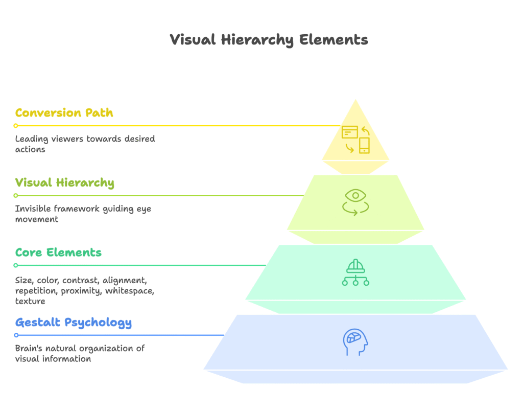
Think of visual hierarchy as the secret language between designers and viewers. By understanding this language, you can essentially “program” your visitors’ eyes to follow the exact path you want—leading them naturally toward conversion.
The core elements that control visual hierarchy include:
- Size – Larger elements grab attention first (it’s why headlines are bigger than body text)
- Color – Bright, vibrant colors stand out against muted backgrounds
- Contrast – Elements that strongly differ from their surroundings immediately catch the eye
- Alignment – When everything is aligned except one element, that outlier commands attention
- Repetition – Repeating styles helps viewers understand which elements are related
- Proximity – Elements placed close together are perceived as belonging to the same group
- Whitespace – More space around an element makes it more prominent
- Texture and Style – Rich textures stand out more than flat designs
Each of these elements works like a dial you can adjust to either amplify or reduce the importance of specific parts of your Shopify store. But why do these elements affect us so strongly? To understand that, we need to look at how our brains actually process what we see.
The Psychology of Visual Perception
Our brains are incredible pattern-recognition machines, constantly working to make sense of the visual information bombarding us. When someone lands on your Shopify store, their brain immediately begins organizing what they see—separating the important from the unimportant, often without conscious thought.
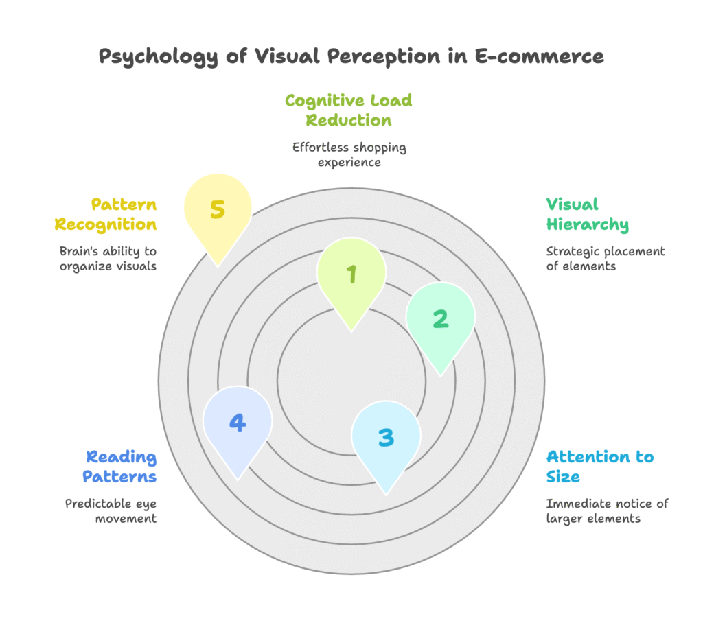
One fascinating aspect of visual processing is how predictable our reading patterns are. Research has identified two primary patterns:
- F-Pattern: Used for text-heavy designs, where eyes scan horizontally across the top, then move down and scan horizontally again, creating an F-shape
- Z-Pattern: For less dense designs like e-commerce pages, where eyes start at the top-left, scan horizontally to the right, then diagonally down to the bottom-left, and finally horizontally to the bottom-right
Understanding these patterns allows you to strategically place your most important elements where eyes naturally land first.
Our attention to size is an evolutionary trait—larger objects might represent either threats or opportunities in nature, making them worthy of immediate attention. This is why larger elements on your page will almost always be noticed before smaller ones.
Perhaps most importantly, good visual hierarchy reduces what psychologists call “cognitive load”—the mental effort required to understand and navigate your store. When visitors don’t have to consciously figure out where to look or what to do next, they have more mental energy available for making purchase decisions. This makes the shopping experience feel effortless and enjoyable rather than confusing or frustrating.
Now that we understand the “why” behind visual hierarchy, let’s explore how these principles specifically apply to the e-commerce context.
Visual Hierarchy in the E-commerce Context
In the digital marketplace, visual hierarchy serves as an invisible roadmap guiding visitors through your store. Unlike physical shops where salespeople can personally direct customers, your website’s design must do all the heavy lifting.
A well-structured visual hierarchy creates a clear path from the moment someone lands on your site to the moment they complete a purchase. This journey typically follows these steps:
- Capture attention with a compelling headline or image
- Build interest by highlighting key product benefits
- Generate desire through strategic product presentation
- Guide toward action with clear, prominent calls-to-action
Beyond conversion, effective visual hierarchy builds trust. When information is presented in a logical, orderly way, visitors subconsciously perceive your brand as more professional and trustworthy. This is why cluttered, chaotic designs rarely convert well—they signal disorganization and unprofessionalism.
The impact on metrics can be dramatic. Stores with intentional visual hierarchy typically see:
- Lower bounce rates (fewer people leaving immediately)
- Increased time on site
- Higher pages per session
- Better conversion rates (potentially well above the Shopify average of 3.3%)
Perhaps most importantly, good visual hierarchy makes shopping intuitive. Visitors shouldn’t have to think about where to find information or how to complete a purchase—the visual cues should naturally guide them there.
But how exactly do we implement these principles within Shopify’s specific platform? That’s exactly what we’ll explore next!
Shopify-Specific Implementation Strategies
Shopify presents unique opportunities and challenges when implementing visual hierarchy. Understanding how the platform structures themes and templates will help you make more strategic design decisions.
At its core, Shopify uses a section-based architecture that allows for customization without coding. This means you can adjust many aspects of visual hierarchy directly through the theme editor. However, some more advanced implementations may require custom code or apps.
When assessing popular Shopify themes through a visual hierarchy lens, consider:
- Default layout patterns – Most Shopify themes follow conventional layouts (header, featured products, collection list, etc.). Understanding these “out-of-box” patterns helps you work with—or intentionally break from—standard visual hierarchies.
- Customization flexibility – Some themes offer more control over visual elements like contrast, spacing, and emphasis.
- Mobile responsiveness – How the visual hierarchy translates to smaller screens is crucial, as over 70% of e-commerce traffic now comes from mobile devices.
One effective Shopify-specific strategy is analyzing theme layouts to position CTAs where they naturally draw the eye. For instance, in a standard product page layout, the “Add to Cart” button is typically placed in the right column, aligned with where the Z-pattern naturally ends.
When implementing visual hierarchy on Shopify, be aware of these technical considerations:
- Theme limitations may restrict certain customizations without code
- Theme updates can sometimes override custom modifications
- Page load speed can be affected by complex visual elements
- Some sections may have fixed positioning that’s difficult to change
Despite these challenges, Shopify offers numerous opportunities to implement strong visual hierarchy. Let’s look at specific strategies for different page types in your store.
Building a Conversion-Focused Visual Hierarchy
Homepage Optimization
Your homepage is often the first impression visitors have of your brand. Creating a clear visual hierarchy here is essential for guiding them toward the next step in their journey.
Start with a strong, attention-grabbing headline and complementary hero image. This should immediately communicate your value proposition and set the visual tone. Position this at the top of the page where it will be seen first.
Use whitespace strategically to create “breathing room” between sections. This separation helps visitors understand where one section ends and another begins, preventing information overload. The most successful Shopify homepages use generous whitespace to separate important elements like featured products, collection highlights, and promotional banners.
Create a visual pathway that leads visitors to take a specific action, whether that’s browsing collections, viewing featured products, or learning more about your brand. Each section should naturally lead to the next through visual cues like directional elements, color progression, or size hierarchy.
Product Page Hierarchy
Product pages are where purchase decisions happen, making visual hierarchy here especially critical. Take inspiration from these effective approaches:
- Strategic merchandise splitting: Like Targus, give prominence to your main product image, making it the largest visual element on the page. This immediately communicates what the product is and draws attention to its design.
- Attention-grabbing CTA buttons: Follow Staghead Designs’ approach by using high-contrast colors for your “Add to Cart” buttons that stand out from the rest of the page. The button should be impossible to miss.
- Smart use of whitespace: Like Spiceology, use ample whitespace around product merchandising to ensure it sits at the top of the visual hierarchy. This isolation reinforces its importance.
Arrange product information in order of importance: title, main image, price, key features, variants, add-to-cart button, then detailed description. This structure aligns with how most visitors process product information.
Cart and Checkout Optimization
Once visitors begin the checkout process, your visual hierarchy should focus on reducing friction and preventing distractions.
Simplify the visual journey by removing unnecessary elements like navigation menus, social media links, and other potential exit points. The checkout process should feel like a clear tunnel toward completion.
Implement clear progression indicators that show customers where they are in the checkout process and what steps remain. These indicators provide reassurance and set expectations about the time required to complete the purchase.
Use visual hierarchy to emphasize security elements and trust signals during checkout. Security badges, payment icons, and guarantee statements should be visible but not distracting from the primary flow.
Now that we’ve covered the structural implementation of visual hierarchy, let’s explore how psychological triggers can be enhanced through strategic visual placement.
Psychological Triggers Enhanced by Visual Hierarchy
Visual hierarchy isn’t just about guiding eyes—it’s about triggering emotions and motivating action. Let’s explore how to leverage powerful psychological triggers through strategic visual placement.
Creating Visual Urgency
Urgency is one of the most powerful motivators in e-commerce. When implemented honestly and visually highlighted, urgency triggers can significantly boost conversion rates.
Consider these approaches for creating visual urgency:
- Limited-time offers: Use contrasting colors and prominent positioning for countdown timers or “sale ends in” messages
- Low stock indicators: Visually highlight “Only 3 left!” messages near the product price and add-to-cart button
- High-demand notices: Draw attention to “20 people are viewing this right now” indicators with subtle animation
The key is ensuring these urgency elements are noticeable without overwhelming the primary product information. They should complement rather than compete with the main visual hierarchy.
Trust Indicators and Their Visual Implementation
Trust is a prerequisite for conversion. Strategically place these trust elements within your visual hierarchy:
- Security badges and SSL certificates: Position these near checkout buttons and payment information fields
- Payment gateway logos: Display recognizable payment options in the footer or checkout area
- Reviews and testimonials: Highlight star ratings near product titles and prices, with detailed reviews further down the page
While trust indicators should be visible, they typically work best in supporting roles within the visual hierarchy. They reassure rather than initiate action.
The Psychology of Color in E-commerce
Color is perhaps the most emotionally powerful element of visual hierarchy. Strategic color use can dramatically influence conversion rates:
- Contrasting CTA colors: Use a button color that contrasts with the overall color scheme to make it instantly noticeable
- Limited color palette: Restrict your store to 2-3 primary colors plus neutrals to create a cleaner visual hierarchy
- Color psychology: Consider the emotional associations of different colors (blue for trust, orange for enthusiasm, green for health or wealth, etc.)
Remember that color effectiveness is contextual—what works depends on your brand, audience, and the specific products you sell. Testing different color approaches is essential for optimizing your store’s visual hierarchy.
With these psychological triggers in mind, let’s explore even more advanced techniques for directing visual attention.
Advanced Techniques for Visual Direction
Ready to take your visual hierarchy to the next level? These advanced techniques can provide subtle yet powerful guidance for your visitors’ attention.
Strategic Use of Animation
Animation, when used sparingly and purposefully, can be a powerful tool in your visual hierarchy toolkit:
- Pulsating buttons: A subtle pulse effect on your primary CTA button can draw attention without being annoying
- Fade-in elements: Having key content elements fade in as the user scrolls creates a sense of discovery and draws focus
- Hover effects: Interactive elements that change appearance when hovered over provide visual feedback and reinforce clickability
The golden rule with animation is restraint—too much movement creates distraction rather than direction. Limit animation to your most important conversion elements.
Directional Cues
Our eyes naturally follow directional cues in designs:
- Inverted pyramid layout: Like Spiceology uses, arrange content in an inverted pyramid shape that naturally funnels attention toward CTAs
- Arrow shapes: Incorporate subtle arrow shapes in your design that point toward important elements
- Gaze direction: If using images of people, position them so their gaze is directed toward key content or CTAs
These directional techniques work because our brains are wired to follow visual paths and implied motion in designs.
Visual Rhythm and Balance
Creating a sense of rhythm in your layout guides visitors through content in a pleasing, predictable way:
- Consistent spacing: Use consistent margins and padding between similar elements to create visual patterns
- Alternating emphasis: Create a left-right-left pattern in multi-section layouts to keep eyes moving down the page
- Visual anchors: Place visually heavy elements strategically to balance the overall composition
A well-balanced layout feels stable and trustworthy, while also creating natural movement through the page that ultimately leads to conversion points.
These advanced techniques can dramatically improve the effectiveness of your visual hierarchy—but how do you know if they’re actually working? That’s what we’ll tackle next.
Measuring and Testing Visual Hierarchy Effectiveness
Implementing visual hierarchy changes without measuring their impact is like driving with your eyes closed. Let’s explore how to systematically test and optimize your Shopify store’s visual direction.
Key Metrics to Track
When evaluating visual hierarchy changes, focus on these specific metrics:
- Click-through rates on primary CTAs
- Time to first click (how quickly visitors interact with your page)
- Scroll depth (how far down the page visitors explore)
- Conversion path analysis (the sequence of pages visited before purchase)
- Exit points (where visitors leave your site)
Shopify Analytics provides many of these metrics, but you may want to supplement with Google Analytics or other specialized tools for deeper insights.
A/B Testing Methodologies
A/B testing is the gold standard for validating visual hierarchy changes:
- Isolate variables: Test one visual hierarchy element at a time (like button color, size, or position)
- Create variations: Develop alternative versions with clear differences
- Split traffic: Send equal portions of your visitors to each version
- Gather sufficient data: Wait until you have statistically significant results
- Implement winners: Apply the most effective version to your live store
Several Shopify apps facilitate A/B testing, including Google Optimize integration, which can streamline this process.
Heat Map Analysis
Heat maps provide visual representations of where visitors click, move, and look on your pages:
- Click maps show where visitors are clicking (or tapping on mobile)
- Scroll maps reveal how far down the page visitors typically scroll
- Attention maps (from eye-tracking studies) show where visitors actually look
These visual tools help you understand if your intended visual hierarchy matches visitors’ actual behavior. Tools like Hotjar, Crazy Egg, or Lucky Orange can be integrated with Shopify to gather this valuable data.
Systematic Improvement Approach
Create a systematic process for continuous visual hierarchy optimization:
- Audit current performance and identify problem areas
- Hypothesize specific visual hierarchy improvements
- Implement and test changes in order of potential impact
- Analyze results and document learnings
- Repeat the process, building on successful changes
This methodical approach prevents random changes and builds a growing body of knowledge about what works for your specific audience and products.
Now that we know how to measure the effectiveness of our visual hierarchy changes, let’s look at some common mistakes to avoid.
Common Visual Hierarchy Mistakes on Shopify Stores
Even with the best intentions, many Shopify store owners make visual hierarchy mistakes that hurt their conversion rates. Let’s identify these common pitfalls so you can avoid them.
Overwhelming Design Elements
One of the most frequent errors is creating visual competition, where multiple elements fight for attention:
- Too many “important” elements: When everything is emphasized, nothing stands out
- Banner blindness: Overuse of flashy banners trains visitors to ignore them
- Animation overload: Excessive movement creates distraction rather than direction
Solution: Follow the 80/20 rule—80% of your design should be calm and supportive, with only 20% commanding primary attention.
Unclear Distinction Between CTAs
Visitors need clear visual signals about which actions are primary and which are secondary:
- Similar styling for different importance levels: “Add to Cart” and “Add to Wishlist” buttons should not look identical
- Competing CTAs: Placing multiple strong CTAs in close proximity creates decision paralysis
- Inconsistent button styling: Using different styles for the same action across your site creates confusion
Solution: Create a clear visual hierarchy of buttons—primary actions should be largest and most colorful, secondary actions more subtle, and tertiary actions the most understated.
Poor Mobile Adaptation
What works on desktop often fails on mobile devices:
- Tiny touch targets: Buttons and links that are too small for fingers to tap accurately
- Collapsed hierarchy: Important elements getting pushed down or diminished on smaller screens
- Horizontal overflows: Content that requires sideways scrolling disrupts the natural vertical flow
Solution: Test your visual hierarchy on actual mobile devices, not just in browser simulations. Ensure primary elements remain prominent and easily tappable.
Cluttered Layouts
Insufficient whitespace creates mental fatigue and confusion:
- Information overload: Cramming too much information “above the fold”
- Insufficient margins: Elements placed too close together create visual tension
- Visual noise: Decorative elements that don’t serve a purpose in guiding attention
Solution: Embrace whitespace as an active component of your design, not empty space to be filled. Give important elements room to breathe.
These common mistakes might seem obvious when pointed out, but they’re surprisingly prevalent across Shopify stores. Let’s look at some real-world examples of how correcting these issues can dramatically improve conversion rates.
Case Studies: Before and After
Nothing illustrates the power of visual hierarchy like seeing it in action. Let’s examine three real-world examples of Shopify stores that transformed their conversion rates through smart visual hierarchy adjustments.
Case Study 1: Homepage Reorganization
A fashion accessories brand was struggling with a cluttered homepage that attempted to showcase everything at once. Their original design featured:
- Multiple competing banners of similar size and prominence
- A grid of products with no clear visual priority
- Several CTAs competing for attention
- Minimal whitespace and a feeling of overcrowding
After applying visual hierarchy principles, they:
- Created a single dominant hero section with one primary message and CTA
- Organized content into clearly defined sections with generous whitespace
- Established a visual flow that guided visitors through their brand story before showcasing products
- Simplified navigation and reduced the number of initial choices
Result: Bounce rate decreased by 23%, and the click-through rate to product pages increased by 37%. Average time on site increased by 45 seconds.
Case Study 2: Mobile Optimization
A home goods store noticed that despite 65% of their traffic coming from mobile devices, their mobile conversion rate was less than half their desktop rate. Their mobile issues included:
- CTA buttons that were too small and placed too close to other interactive elements
- Critical product information requiring extensive scrolling to discover
- Dense product descriptions that created text walls on mobile screens
- Menu navigation that was difficult to use on smaller screens
Their mobile-focused visual hierarchy improvements included:
- Enlarging primary CTA buttons and ensuring adequate tap spacing around them
- Restructuring product pages to place critical information and purchase options earlier in the vertical flow
- Breaking up text with visual elements and expandable sections
- Simplifying the mobile navigation experience with thumb-friendly menus
Result: Mobile conversion rate increased by 86%, nearly matching desktop conversion rates. Cart abandonment on mobile decreased by 34%.
Case Study 3: Product Page Reorganization
A specialty foods company found that visitors were viewing their product pages but rarely adding items to cart. Their original product pages featured:
- Small product images that didn’t showcase the quality of their goods
- Key selling points buried in long paragraphs of text
- “Add to Cart” buttons that blended in with the page design
- Customer reviews placed high on the page, pushing product details down
Their visual hierarchy-focused redesign included:
- Large, high-quality hero images that showcased their products in beautiful detail
- Key selling points presented as scannable bullet points with icons
- High-contrast “Add to Cart” buttons that stood out prominently from the page
- A logical information hierarchy that presented key details before social proof
Result: Add-to-cart rate increased by 64%, and overall conversion rate improved by 41%. Average order value also increased by 22% as customers began adding more items to their carts.
These case studies demonstrate that thoughtful visual hierarchy adjustments can yield dramatic improvements in key performance metrics. Now, let’s look ahead to emerging trends in e-commerce visual hierarchy.
Future Trends in E-commerce Visual Hierarchy
The landscape of e-commerce design is constantly evolving. Staying ahead of these trends can give your Shopify store a competitive edge in guiding visitors toward conversion.
AI-Powered Personalization
Artificial intelligence is revolutionizing how visual hierarchy adapts to individual users:
- Dynamic layouts that rearrange elements based on user behavior and preferences
- Personalized product recommendations with visual emphasis tailored to individual shopping history
- Adaptive CTAs that change appearance or messaging based on the user’s position in the buying journey
As AI capabilities continue to advance, expect to see more Shopify stores implementing personalized visual hierarchies that change in real-time based on user behavior.
Augmented Reality Integration
AR is creating new dimensions in visual hierarchy:
- 3D product visualization that allows customers to “place” products in their own environment
- Virtual try-on experiences that reduce purchase uncertainty for apparel and accessories
- Interactive product exploration that lets customers engage with products in unprecedented ways
AR elements are becoming important focal points in visual hierarchy, often serving as both engagement tools and conversion drivers.
Voice Commerce Integration
As voice shopping grows in popularity, visual hierarchy must adapt:
- Visual cues for voice-enabled features need prominent placement
- Simplified visual flows that complement voice navigation
- Hybrid interfaces that seamlessly blend touch and voice interactions
Stores that effectively integrate voice commerce capabilities into their visual hierarchy will be positioned to capture this growing segment of shoppers.
Accessibility-First Design
Inclusive visual hierarchy is becoming a priority:
- High-contrast options for visually impaired users
- Alternative text hierarchies for screen readers
- Reduced motion options for users sensitive to animation
As e-commerce becomes more inclusive, the most successful Shopify stores will implement visual hierarchies that work for all users, regardless of abilities.
Cross-Device Consistency
With shoppers using multiple devices throughout their buying journey:
- Consistent core experiences across devices while optimizing for each context
- Seamless transitions between devices that maintain the user’s place in the visual journey
- Device-specific emphasis that recognizes the strengths and limitations of each platform
The future belongs to stores that can maintain a coherent visual hierarchy while adapting to the specific context of each device.
These emerging trends point to a future where visual hierarchy becomes more dynamic, personalized, and inclusive. Stores that embrace these developments will gain significant advantages in conversion optimization.
Conclusion
Throughout this article, we’ve explored how the psychology of visual hierarchy directly influences conversion rates on Shopify stores. From the fundamental principles of how our brains process visual information to practical implementation strategies for your store, visual hierarchy emerges as a powerful tool in your conversion optimization arsenal.
We’ve seen that effective visual hierarchy is both art and science—it requires creative thinking about your specific brand and products, combined with an understanding of universal psychological principles that guide human attention. The most successful Shopify stores strike this balance perfectly, creating shopping experiences that feel intuitive and compelling.
If you’re ready to improve your store’s conversion rates through visual hierarchy, start with these steps:
- Audit your current store with fresh eyes, looking for unclear visual pathways
- Identify your most important conversion elements and ensure they receive appropriate visual emphasis
- Implement changes systematically, starting with high-impact pages like your homepage and top product pages
- Test your changes and measure their impact on key metrics
- Continue refining based on data and customer feedback
Remember that visual hierarchy is not about manipulation—it’s about clarity. By thoughtfully guiding your visitors’ attention, you’re actually improving their shopping experience by making it more intuitive and less mentally taxing.
As you implement these visual hierarchy principles on your Shopify store, remember that tools like Growth Suite can further enhance your conversion optimization efforts. Growth Suite works alongside your visual hierarchy improvements to intelligently track visitor behavior, predict purchase intent, and present personalized, time-limited offers to hesitant shoppers—all while maintaining your brand integrity. It’s the perfect complement to a well-structured visual hierarchy strategy.
References
- Interaction Design Foundation. (2025). What is Visual Hierarchy? Retrieved from https://www.interaction-design.org/literature/topics/visual-hierarchy
- Ikonik Digital. (2025). The Role of Visual Hierarchy in Conversion Optimization. Retrieved from https://ikonik.digital/blog/the-role-of-visual-hierarchy-in-conversion-optimization/
- 23Digital. (2024). The Importance of Visual Hierarchy in eCommerce Web Design. Retrieved from https://www.23digital.com.au/the-importance-of-visual-hierarchy-in-ecommerce-web-design/
- Ultrafade. (2024). What Is a Good Conversion Rate on Shopify – The Ultimate Guide. Retrieved from https://www.ultrafade.com/blogs/news/what-is-a-good-conversion-rate-on-shopify-the-ultimate-guide
- Fast Simon. (2024). Visual Hierarchy: How to Create a Stunning eCommerce UI. Retrieved from https://www.fastsimon.com/ecommerce-wiki/optimized-ecommerce-experience/visual-hierarchy-how-to-create-a-stunning-e-commerce-ui-examples/
- Figma. (n.d.). What is Visual Hierarchy? Retrieved from https://www.figma.com/resource-library/what-is-visual-hierarchy/
- Lai, D. (2023). Understanding the MAGIC (Psychology) of Visual Design. Retrieved from https://www.linkedin.com/pulse/understanding-psychology-visual-david-lai
- MasterClass. (2024). Visual Hierarchy in Design: 9 Principles of Visual Hierarchy – 2025. Retrieved from https://www.masterclass.com/articles/visual-hierarchy