
Have you ever wondered why certain online stores feel welcoming while others leave you indifferent? Colors might be the reason. Research suggests that color alone can raise brand recognition by up to 80%, and a striking 85% of shoppers say color influences their buying decisions. By the time you finish reading this article, you’ll understand how to choose colors that fit your Shopify store’s personality and boost conversions. Ready to see how a few color choices can shape your success? Let’s begin!
Strategic color planning in Shopify stores can make a big difference for user experience, brand perception, and sales. Stick around to discover how to harness color for your own store. But first, let’s take a closer look at how color really works.
Understanding Color Psychology Fundamentals
In this section, you’ll learn about the science behind color perception and the emotions tied to different hues. By the end, you’ll see how color can communicate specific feelings. Eager to find out what makes color so persuasive? Let’s check it out.
The Science of Color Perception
The human eye detects color through cells known as photoreceptors in the retina. These cells send signals to the brain, allowing us to see shades and hues. Each color sparks certain mental and emotional responses, which can influence how we feel about brands and products. There are six core ideas in color psychology, such as how colors can soothe or energize us, but one unifying truth stands out: color goes beyond style and truly speaks to our feelings.
We’ve uncovered the basic science behind color. Now let’s explore how certain colors stir our emotions and shape our decisions.
Emotional Associations of Colors
Colors aren’t just visual elements; they act like signals that stir different moods.
Below are some common color groups and how they often affect people:
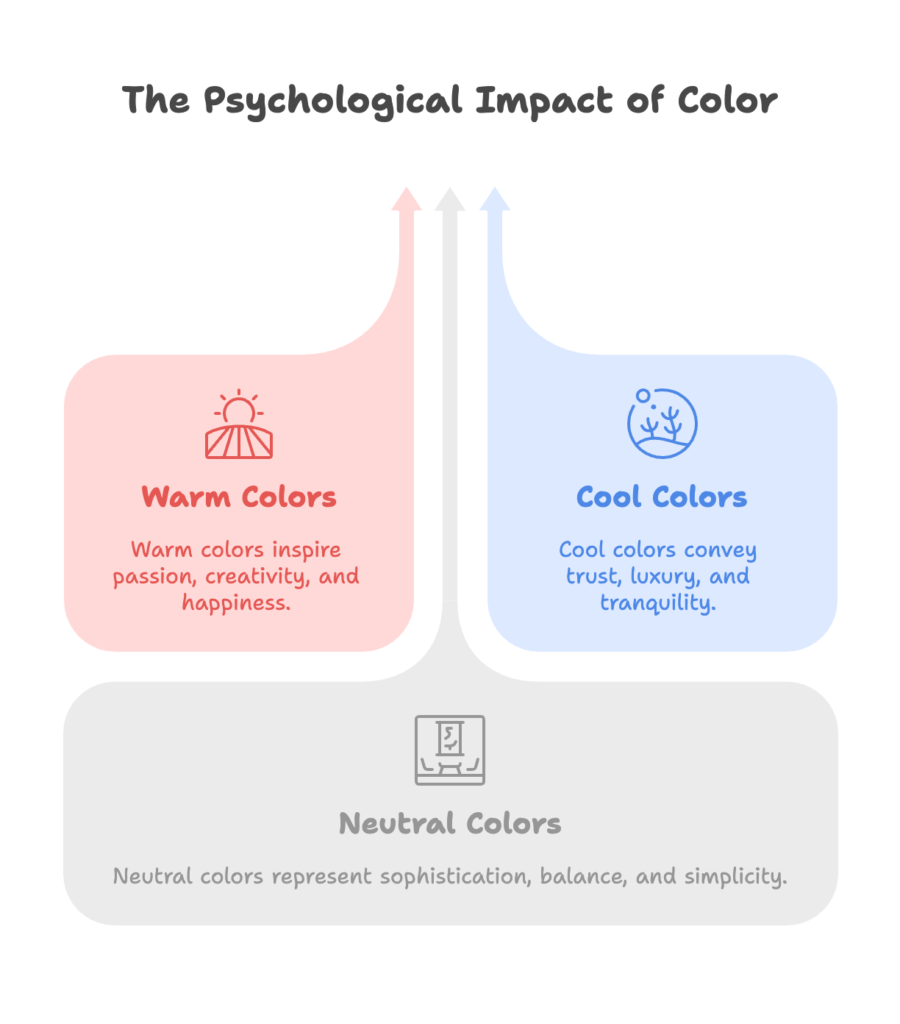
Warm Colors
- Red: Passion, urgency, and excitement. It often encourages impulse purchases.
- Orange: A sense of creativity and friendliness, sometimes linked with affordability.
- Yellow: Brightness and happiness. It also draws immediate attention.
Cool Colors
- Blue: Security, trust, and reliability. Popular among industries that want to appear professional.
- Green: Often associated with nature, health, and growth. Many eco-conscious brands use it.
- Purple: Suggests luxury, creativity, and sometimes spirituality.
Neutral Colors
- White: Purity and simplicity. It also helps create a clean look.
- Black: Linked to sophistication, power, and elegance.
- Gray: Balance and timelessness. It can give a subtle, modern touch.
- Brown: Earthy and stable. It adds a sense of comfort and reliability.
You’ve seen how colors can shape emotions. Ready to put this understanding to good use? Let’s see how these ideas translate into Shopify store design.
Strategic Color Implementation in Shopify Stores
Here, you’ll learn how to align your brand’s message with smart color choices. By the end of this section, you’ll have insights on how colors can play a key role in building your store’s identity. Looking forward to finding fresh ways to outshine the competition? Let’s explore further.
Brand Identity and Color Selection
Your store’s colors should match the essence of your brand. For instance, a playful children’s boutique often picks cheerful hues like yellow and orange, while a high-end jewelry store might rely on darker or more refined tones. It’s also wise to consider the audience’s tastes, cultural backgrounds, and what’s popular in your sector. Once you’ve chosen a palette that speaks to your style, you’ll set yourself apart from other stores in your market.
So, you know how to pick colors that fit your brand. Next, let’s see where and how to use them effectively throughout your Shopify store.
Primary Shopify Store Elements and Color Application
- Header and Navigation: A bold color in the header can offer instant brand recall, but be sure it’s easy on the eye.
- Product Pages: Keep the background simple so your items take center stage. Subtle accent colors help highlight key details.
- Call-to-Action Buttons: Contrasting colors grab attention and encourage clicks. Think of a bright color that stands out against your background.
- Background and Text: Aim for readability. Dark text on a light background or vice versa prevents strain on the eyes.
- Shopping Cart and Checkout: Calming colors like blue or green can reduce cart abandonment, as they feel secure and reassuring.
- Footer: A place for important but less urgent information. Neutral tones keep it subtle.
You’ve discovered where to use color in your store. Now, let’s check out some well-known color schemes you can try.
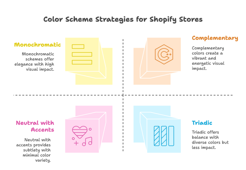
Color Scheme Strategies for Shopify
- Monochromatic: Uses different shades of a single color for a smooth and elegant look.
- Complementary: Pairs opposite colors on the color wheel (like red and green) to create energy.
- Analogous: Chooses neighboring colors (like blue, teal, and green) for harmony.
- Triadic: Balances three colors evenly spaced on the color wheel, adding a fun, vibrant style.
- Neutral with Accents: Relies on a mostly neutral palette, with bright pops of color to lead the eye to key elements.
Now that you know various color approaches, let’s look at how different people and regions react to these choices.
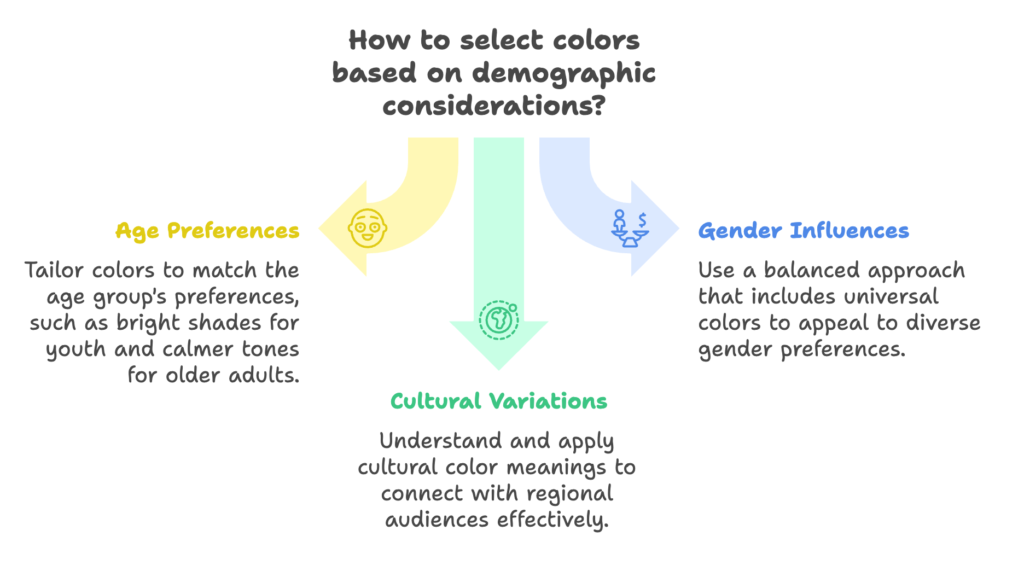
Demographic Considerations in Color Selection
In this part, you’ll see how color preferences can vary by age, gender, and culture. Once done, you’ll understand how to tailor your design for different audiences.
Ready to take a closer look? Let’s do it.
Age-Based Color Preferences
Younger shoppers often like brighter shades such as bold blues and playful yellows. Teenagers and young adults might prefer neon hues or daring combos that reflect energy. Middle-aged folks might favor steady and refined colors, while older adults often appreciate calmer tones that feel soothing and traditional. By keeping these differences in mind, you can create color schemes that speak directly to your target group.
We’ve covered age, but that’s just one part of the story. Let’s see how gender perceptions factor in next.
Gender Influences on Color Perception
Classic thinking associates certain colors with specific genders, but these ideas are shifting. Some men love pink, and some women like dark tones. Also, many brands decide to step beyond old-fashioned color norms to appeal to a broader crowd. A balanced approach—using universal colors like green or blue—can help reach a wide audience without drawing on outdated color labels.
Next up, we’ll see how color meanings shift across regions. If your store is global, this is especially important.
Cultural and Geographic Variations
Shoppers in one area might see white as purity, while another region could link it with mourning or seriousness. Red can signal fortune in certain cultures but caution in others. Look into what colors mean in your buyers’ regions to avoid accidental missteps and show cultural respect. This helps you connect with your target market on a deeper level.
Now you’ve got a sense of how demographics shape color choices. Let’s get practical by checking out real Shopify store examples.
Case Studies: Successful Color Implementation in Shopify Stores
Here, you’ll see how various brands use color to leave lasting impressions. By the end, you’ll have fresh ideas on applying these strategies to your own store. Sound good? Let’s explore some standout approaches.
Luxury and High-End Brands
Premium brands frequently depend on shades like black, gold, or refined neutrals. This limited use of color sends a message of exclusivity. For instance, a luxury watch store might lean on black and gold in its headers and typography, giving the entire site a regal and polished look.
Now that you’ve seen how high-end brands do it, let’s shift our focus to stores aiming for a young and energetic vibe.
Youth-Oriented and Vibrant Brands
Brands that cater to younger customers often grab attention with bright, lively colors. Take Tactical Baby Gear, for example. By updating its palette with energetic hues and bold contrasts, it created a playful, inviting experience that appealed to parents seeking modern baby products. The lesson here? Bold colors can create a fun environment that strengthens brand loyalty among energetic audiences.
Vibrant colors aren’t for everyone, so what if you sell natural products? Let’s see how green can work wonders.
Eco-Friendly and Natural Products
Green is the standard bearer for nature, health, and growth. Earth tones like brown or tan also reinforce an outdoorsy, grounded look. This works beautifully for brands that focus on sustainability or organic goods. By weaving these colors through their site, they tell a story of caring for the environment and offering pure products.
Finally, let’s see how stores pushing technology and fresh ideas tap into color to build trust.
Technology and Innovation Brands
Many tech-focused Shopify stores use blue and gray for a sense of stability. Blue stands for reliability, while gray feels modern. This blend can calm uncertain customers, letting them feel your brand is both cutting-edge and trustworthy.
You’ve checked out different brands and their color methods. Wondering how to set up these colors behind the scenes in Shopify? That’s next.
Technical Implementation of Color Psychology in Shopify
This part covers theme selection, color consistency, and more. By the end, you’ll see how to unify your store’s design so it feels seamless. Ready to get hands-on? Let’s get started.
Theme Selection and Customization
Shopify provides both free and paid themes. When you pick one, look for options that make it simple to switch colors. Some themes allow easy changes to headers, footers, and buttons. Others may be more rigid, which can limit how you apply your chosen palette. Make sure the theme you pick can show off your brand colors in the best possible way.
Now that you know about themes, let’s see why matching colors across all channels is so valuable.
Color Consistency Across Touchpoints
Color consistency helps shoppers recognize your brand right away. That means using the same shades on your site, in your product photos, and even on social media images. Consistent use of your color palette gives customers a sense of dependability and makes your store look more professional.
Next, let’s consider a few technical points that matter when fine-tuning colors.
Technical Considerations
- Accessibility: Some users have color vision challenges. Following WCAG guidelines for contrast is a helpful practice.
- Device Variations: Colors can appear slightly different depending on screen settings and browser types. Test on several devices.
- Color Formats: RGB is common for screens, while CMYK is typical for print. HEX codes are often used in web design. Use the format that suits your needs.
You’re now equipped to set up your store’s colors in a practical way. Next, let’s see how to test and adjust those choices to keep them performing at their best.
Testing and Optimizing Color Schemes
This section explains how to run color experiments and track the results. By the end, you’ll know how to confirm whether your color picks are boosting sales. Excited to discover which shades truly resonate? Let’s find out.
A/B Testing Methodologies
A/B testing involves showing two versions of a single element to different groups of visitors. For instance, you might try a red button versus a green button. Keep everything else the same so you can identify whether color alone changed click rates. Then gather data and roll out the winner. It’s a straightforward but powerful way to see if a color is helping or hurting your conversions.
After you set up these tests, you’ll need clear metrics to see how each color change affects your performance.
Key Metrics for Color Effectiveness
- Conversion Rate: Tracks whether more people buy or sign up after seeing specific colors.
- Time on Page and Bounce Rate: See if visitors spend more time browsing when your color layout is appealing.
- Heat Maps: Identify how users interact with colored elements.
- Feedback and Reviews: Ask visitors or existing customers if they find the colors pleasing or distracting.
Now that you’re familiar with key performance indicators, let’s talk about keeping your color choices fresh over time.
Continuous Optimization Strategies
Customer preferences and marketing trends can shift throughout the year. Some stores change accent colors for holiday seasons or to keep up with style changes. Gather feedback, run periodic tests, and tweak your palette so it stays relevant. It’s a cycle of observation and small changes that makes a big difference over the long haul.
Ready for even more creative color tactics? Let’s push forward.
Advanced Color Psychology Strategies
Here, you’ll see how color can play a part in pricing perception, product categorization, and emotional triggers. By the end, you’ll have ideas that take your store beyond just “looking nice.” Ready to discover deeper methods? Let’s look closer.
Color and Pricing Perception
Color can affect how expensive or budget-friendly an item feels. Subtle shades like black, silver, or navy often give a sense of upscale value. Bright hues like yellow or orange can suggest a sale or promotion. By choosing the right palette, you can nudge shoppers to see your items as either premium or discounted.
Next, let’s see how color helps people navigate large product catalogs.
Color in Product Categorization
If you have a wide range of products, you can use color to separate them into categories. This reduces confusion and speeds up browsing. Color-coded badges or labels can direct attention to specific product groups and make it simpler for shoppers to find what they need.
Finally, let’s talk about how combining colors can guide or excite your visitors.
Psychological Triggers Through Color Combinations
Sometimes, pairing two or three colors can spark excitement or urgency. A vibrant accent with a neutral background can hint that something is important or requires action. Consistent color use across your store also builds trust, letting customers feel at ease while they explore.
Now that you’re loaded with advanced tips, let’s gaze into the future of color in online selling.
Future Trends in Color Psychology for E-Commerce
This section will touch on emerging color tech, shifting consumer tastes, and the possibilities of AI. By the end, you’ll see where color trends might be headed. Feeling curious about what’s coming next? Let’s find out.
Emerging Color Technologies
Some stores experiment with dynamic color changes based on user actions, making the experience feel more personal. Augmented and virtual reality let customers see how products look in different colors. These tools can help shoppers connect more deeply with what’s on offer.
Up next, let’s look at new consumer preferences that could shape your design choices.
Evolving Consumer Color Preferences
Events around the world can influence how people respond to color. After major events or cultural shifts, certain palettes become more popular. Younger generations may crave boldness, while older audiences might prefer calmness. Paying attention to these shifts can help you stay relevant to changing tastes.
Finally, let’s explore how AI can take color selection and testing to a new level.
AI and Data-Driven Color Selection
AI tools can track shopper behavior in real time, suggesting quick adjustments to your store’s palette. These systems might also predict which colors will connect with specific audience segments. Automated A/B testing can optimize your designs without needing constant manual input.
Wondering how to put all of this into practice right away? Let’s see some actionable steps.
Implementation Guide for Shopify Store Owners
Here, you’ll learn how to audit your store’s current color setup, collaborate with designers, and work with a limited budget. By the end, you’ll be able to craft a plan that suits your needs. Ready to get started? Let’s jump in.
DIY Color Psychology Audit
- Review Your Store: Check each page to see if your colors look scattered or consistent.
- Evaluate Emotional Tone: List the feelings you want to create. Does your palette support these feelings?
- Use Online Tools: Color scheme generators can spark ideas. Keep your brand identity in mind when using them.
When you finish your audit, you might want to talk with a professional. Let’s see how that might work.
Working with Designers and Developers
If you collaborate with designers, explain your goals clearly. Show them examples of stores you admire. A common pitfall is favoring personal style over store performance. Stay open to feedback that aligns with color psychology. When a developer codes your color changes, give them guidelines on how each color is meant to be used.
But what if you have limited funds? Don’t worry—there are still simple changes you can make.
Budget-Friendly Color Optimization Strategies
- Update Key Areas First: Focus on headers, footers, and call-to-action buttons for a quick visual boost.
- Use Free Tools: Many free color pickers and contrast checkers help you refine your palette without extra costs.
- Test Gradually: Even a slight shift in button color can produce a better click rate. Start small and observe results.
By now, you have many ways to improve your store through color. Let’s wrap up all these ideas in one final section.
Conclusion
Color isn’t just an artistic detail. It’s a powerful element that influences how people feel, the trust they place in your store, and even how much they buy. When you combine your brand’s unique style with thoughtful color choices, you can stand out and create a smooth shopping journey. As trends shift, stay curious and open to new ideas. With consistent testing and a willingness to adapt, your store’s color strategy can keep driving growth.
References
- HubSpot. (2023, July 11). Color Psychology: How To Use it in Marketing and Branding. Retrieved from https://blog.hubspot.com/the-hustle/psychology-of-color
- Uxcel. (2025, January 15). Color Psychology in Branding – Understanding the Power of Color. Retrieved from https://uxcel.com/blog/beginners-guide-to-color-psychology
- Straits Research. (n.d.). The Key Role of Color in Branding and Marketing. Retrieved from https://straitsresearch.com/statistic/role-of-color-in-branding-and-marketing
- Floow Talent. (2024, March 18). How Color Psychology Influences Consumer Behavior. Retrieved from https://floowitalent.com/how-color-psychology-influences-consumer-behavior/
- Costa, C. D. (2023, November 20). The Influence of Colors on Buyer’s Psychology. Medium. Retrieved from https://medium.muz.li/the-influence-of-colors-on-buyers-psychology-9b613107039f
Ready to supercharge your Shopify store’s sales with perfectly optimized discount codes? Growth Suite is a Shopify app that helps you do just that. Install it with a single click and start seeing results!