
Have you ever paused to wonder just how often you pick up your phone to shop? It happens more than most people realize. In 2025, mobile shopping has grown so quickly that it’s outpacing traditional desktop habits. This massive shift means if your Shopify store isn’t optimized for mobile, you could be missing out on a lot of revenue. By the time you finish this article, you’ll see why fine-tuning your store for smartphones isn’t just a good idea—it’s an essential strategy for success. Ready to discover the key points behind this new era of online shopping? Let’s begin!
In this opening section, we’ll explore the surge of mobile commerce and how it affects Shopify stores. We’ll look at data on shopping behavior, discuss the gap between desktop and mobile conversions, and explain why mobile optimization is no longer optional. Stick with us to get the full picture. You’ll soon learn about the subtle ways mobile users think and act, so let’s step into the next section and see what drives people to buy on their phones.
Understanding Mobile Shopping Behavior
You’re about to explore how mobile commerce has evolved and what shoppers expect in 2025. By the end of this section, you’ll know how browsing turns into buying on a phone and why mobile expectations differ from desktop habits. Ready to see what makes mobile shoppers tick? Let’s break it down!
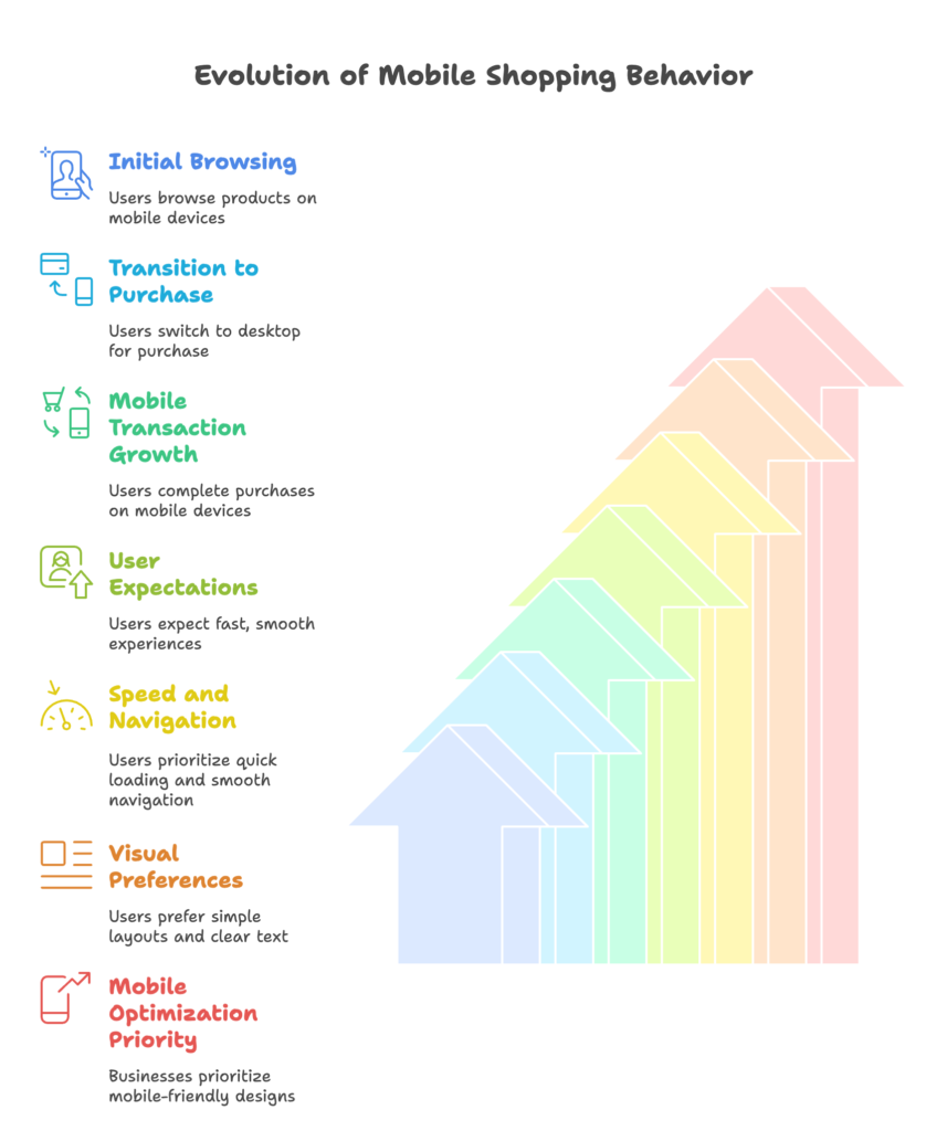
The Evolution of Mobile Commerce
A few years ago, most people used their phones to browse products and read reviews, but they often switched to a computer for the final purchase. In 2025, that’s changed. Mobile users are comfortable completing the entire journey on their phones, from initial research to payment. Statistics show a steep climb in mobile transactions, and that gap between desktop and mobile is widening in favor of smartphones.
This shift has also influenced how products are displayed, how quickly sites need to load, and how streamlined the checkout experience must be. People want quick information and a fast path to placing an order. The psychology here is simple: if it’s easy and fits into a busy lifestyle, more buyers will follow through on mobile.
Now that you see how mobile commerce has expanded, it’s time to examine the deeper reasons behind this switch, like speed and user-friendliness. Let’s see what today’s mobile shoppers really expect.
Mobile User Expectations
Speed is a big deal. If a page takes more than a couple of seconds to load on a phone, it’s easy for a shopper to give up and move elsewhere. Smooth navigation also matters. Menus, product listings, and checkout steps should feel intuitive on a smaller screen. Any extra hiccup, from too many fields in a form to cramped images, can send shoppers running.
Visually, mobile users prefer simple layouts and clear text. Large buttons, easy-to-read fonts, and minimal clutter all help keep them engaged. Every extra second or step can lower your conversion rate. Remember, mobile shoppers often juggle many tasks at once, so they appreciate designs that help them find what they want quickly and painlessly.
You now have a glimpse into the evolution of mobile commerce and the expectations of on-the-go customers. Let’s move on to see how these behaviors translate into revenue and why you should make mobile optimization a top priority.
The Business Case for Mobile Optimization
In this section, you’ll see how a mobile-focused approach boosts your revenue, improves your search engine rankings, and builds stronger customer loyalty. By the end, you’ll know exactly why investing in mobile enhancements can have a major impact on your bottom line. Ready to dig in? Let’s go!
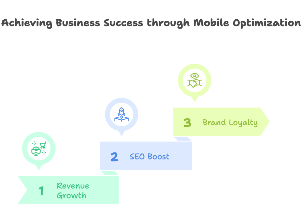
Direct Impact on Revenue
When a Shopify store is optimized for mobile, it usually sees higher conversion rates than stores that rely on a one-size-fits-all design. Shoppers click “Buy” more often when they don’t have to pinch and zoom their way around a product page. On top of that, mobile-optimized sites often enjoy higher average order values because visitors can explore more products without hassle.
Abandoned carts also come into play. Mobile checkout can feel tedious if it’s not designed well. By streamlining the process—such as reducing the number of form fields and allowing easy one-tap payments—you can dramatically lower drop-offs. Fewer abandoned carts, more purchases, and a friendly shopping experience: that’s a winning combination for revenue growth.
With revenue potential in mind, let’s see how going mobile-friendly can also give you a boost in organic search results and overall visibility.
SEO and Visibility Benefits
Google has been leaning into mobile-first indexing, which means your site’s mobile performance can affect where you land on search results. A site that loads quickly on phones not only pleases shoppers but also signals to Google that it’s worth a higher rank. That increased visibility can lead to more clicks and sales.
Page speed on mobile is also a factor Google checks when determining where to place you in the search listings. If your store is slow to load on smartphones, expect it to slip down the rankings. On the other hand, a well-tuned mobile site can lead to a surge in organic traffic because it’s both user-friendly and favored by search engines.
Next, let’s explore how mobile optimization shapes the way people feel about your brand and why it can keep them coming back for more.
Brand Perception and Customer Loyalty
A mobile store that loads quickly and looks great sends a clear signal: “We care about your experience.” That positive feeling encourages shoppers to trust your brand. When customers can zip through a product page, see images clearly, and tap a button to check out with no fuss, they’re more likely to return. They might even share their positive experience with friends via social media or word-of-mouth.
That ongoing trust also increases the likelihood of repeat purchases. If mobile browsing is hassle-free, customers see your store as reliable and convenient. Over time, that trust grows into loyalty, which turns one-time shoppers into regular buyers who help sustain your business.
Convinced that mobile optimization has a direct link to revenue, rankings, and loyalty? Great! Now it’s time to look at the practical side: how to actually optimize your Shopify store for mobile devices.
Core Components of Shopify Mobile Optimization
Welcome to the heart of the topic. In this section, you’ll explore the fundamental elements that make your Shopify store function beautifully on mobile devices. From design principles to page speed techniques, you’ll gain a solid foundation for building a smooth, high-performing site. Ready to learn the nuts and bolts? Let’s get started!
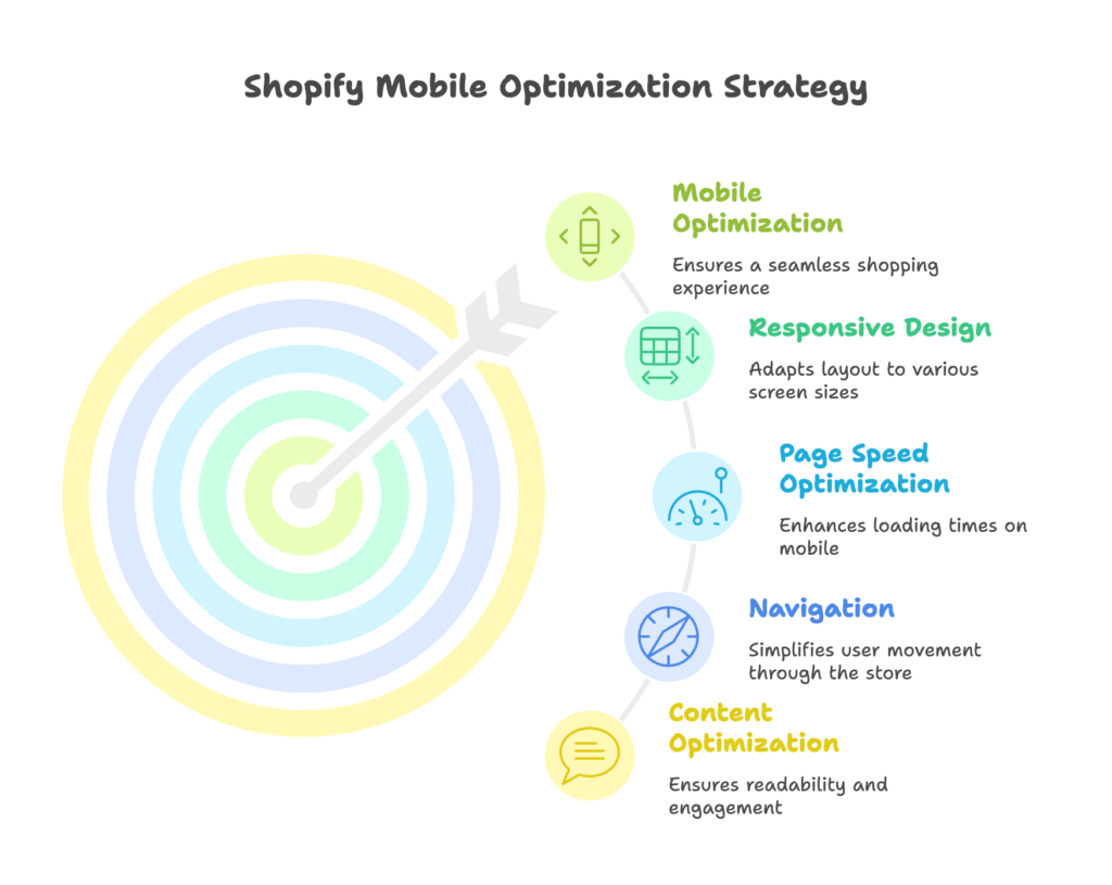
Responsive Design Fundamentals
Responsive design means your store layout adapts to fit any screen size. Many Shopify themes are built with this in mind, but it’s worth checking that every element—images, text, and navigation—truly scales for smartphones. A responsive site ensures that visitors see your content in a clean format, whether they’re on a tiny phone or a large desktop monitor.
Simple design practices can help. Fluid grids, flexible images, and appropriate viewport settings allow your page to rearrange itself without breaking. These small steps can make your store much easier to browse on mobile.
Now that you know the basics of responsive design, let’s see how speed can make or break that experience in the next part.
Mobile Page Speed Optimization
Page speed is especially important on mobile connections, which may not always be as fast as Wi-Fi. Focus on compressing images, using modern image formats (like WebP), and minimizing JavaScript and CSS files. Caching can also help repeat visitors load your store in a snap.
Accelerated Mobile Pages (AMP) is another path some Shopify stores choose. Although AMP can strip down certain features, it can lead to faster loading times. Weigh the pros and cons before deciding if AMP aligns with your store’s needs.
After boosting your speed, we’ll move on to how you can refine navigation so users can zip around your store without stumbling.
Mobile Navigation and Information Architecture
Compact screens demand simplified menus. A classic hamburger menu or a well-organized bottom navigation lets users move around with minimal fuss. Keep categories clear and logical so people aren’t forced to dig too deep. Sticky elements—like a consistent call-to-action button—can also be handy for quick purchases.
Search functionality should be easy to spot. Many mobile shoppers type in a product name and expect fast results. Clean category organization can help them find exactly what they want, even if they aren’t sure how you’ve labeled your products.
Now that your navigation is running smoothly, let’s see how content itself can remain eye-catching and readable on smaller screens.
Mobile-Optimized Content
When space is limited, focus on what matters most. Break up text into short paragraphs. Pick easy-to-read fonts and make sure they’re large enough for mobile viewing. Use white space to your advantage, giving each section some breathing room.
For product descriptions, choose straightforward language that conveys features and benefits quickly. If you use video or other rich media, make sure it’s compressed for mobile speeds and doesn’t slow down the page.
Ready to translate these design fundamentals into a fully polished shopping experience? The next section dives into product pages, checkout flows, and features made specifically with mobile users in mind.
Optimizing the Mobile Shopping Experience
Now you’ll explore the tangible steps that make shopping on a phone feel effortless. We’ll look at product pages, checkout funnels, and mobile-exclusive features that grab attention. By the end, you’ll have a toolkit of ideas to turn casual visitors into happy customers. Let’s jump in!
Product Page Optimization
A product page on mobile should be crystal clear. Use large, high-quality images that can be easily zoomed. Arrange product details in a way that shows the main points first, followed by more detail below. This lets shoppers see key information without scrolling too much.
Don’t forget social proof. Adding customer reviews or testimonials near the product description can encourage buyers to trust the item. Finally, a bright, easy-to-tap “Add to Cart” button placed front and center can help seal the deal.
Ready to nudge shoppers all the way to “Place Order”? Let’s look at checkout optimization next.
Mobile Checkout Optimization
Checkout on a phone should feel straightforward. Reduce the number of fields and allow autofill for things like addresses. Offer digital wallets such as Apple Pay, Google Pay, or Shop Pay so shoppers can pay with a single tap. This simplicity can curb cart abandonment and encourage quicker decisions.
Some stores let users check out as a guest. This removes the sign-up barrier, which can be especially helpful on mobile. The fewer steps you have between “Add to Cart” and “Order Confirmation,” the better.
We’ve sorted out the buying flow. Next, let’s see how features made just for mobile can push your store to a new level of convenience.
Mobile-Specific Features
Think about offering mobile-focused coupons or short-term deals that shoppers can quickly apply. Push notifications can also keep users in the loop about flash sales or new arrivals—though make sure not to overwhelm them. Location features can help tailor deals based on where users live, and voice search options may appeal to those who prefer to speak rather than type.
In some cases, a dedicated mobile app could provide an even smoother experience. However, maintaining an app requires extra resources, so consider whether you have enough demand to make the investment worthwhile.
Feeling inspired by these mobile-focused improvements? Let’s talk about how to implement them, from choosing the best Shopify theme to using apps that enhance performance.
Technical Implementation Strategies
In this section, you’ll see practical steps to put all those great optimization ideas into action. By the end, you’ll know how to pick the right Shopify theme, which apps can help boost your store’s performance, and when to bring in a developer. Ready to build a stronger mobile experience? Let’s go!
Choosing the Right Shopify Theme
Your theme sets the stage for how your store looks and feels on mobile. Some free themes are already built for speedy load times, while premium themes may offer extra features or unique layouts. Look at reviews, test demos on your own phone, and see how quickly the theme responds to taps and swipes.
If a theme doesn’t meet your speed standards or design preferences, you can look into minor customizations. Adjustments like changing font sizes or reordering page elements can make a big difference in mobile usability.
Next, we’ll explore the apps that can fine-tune your store without requiring heavy coding.
Essential Shopify Apps for Mobile Optimization
Many apps specialize in making your Shopify store faster or friendlier for mobile. Some compress images automatically, while others simplify checkout forms. There are even tools that help you analyze your store’s mobile performance so you can spot problem areas.
However, be cautious about installing too many apps, as each one can add extra load time. Strike a balance between functionality and speed. Test after each installation to ensure you’re not slowing down the overall experience.
If you find you need more than simple tweaks, it might be time to consider deeper customization. Let’s look at when and why you might do that.
Custom Development Considerations
Sometimes, you need more than a theme or an app can offer. Custom code can let you create unique mobile features or integrate with special systems. If you decide to hire a Shopify developer, make sure you explain your goals clearly and keep performance in mind at all times.
In large projects, it helps to define a performance budget that keeps page load times within a set limit. That way, new features don’t come at the cost of speed. By focusing on both form and function, you can deliver an impressive mobile shopping experience.
Now that you have an idea about how to implement these changes, let’s see how to test your results and measure success.
Testing and Measuring Mobile Optimization
Time to see if all your hard work is paying off. This section will show you how to test your store on different devices, track the most important metrics, and run A/B tests to fine-tune your approach. By the end, you’ll have a clear plan for improving your mobile strategy continuously. Ready to measure your progress? Read on!
Mobile Testing Methodologies
Testing on actual devices is the best way to see how real shoppers interact with your site. Try smartphones with different screen sizes, operating systems, and browsers. If that’s not feasible, use emulators to get a rough idea, but nothing beats real-world checks. Don’t forget to test for accessibility so that everyone, including users with disabilities, can navigate your store easily.
Set aside time for both manual testing and automated tools. Manual tests let you catch design quirks or weird scroll issues, while automated tests can quickly spot slow-loading images or scripts.
Next, let’s explore which metrics show whether your site is truly improving with these mobile changes.
Key Performance Metrics
Your mobile conversion rate is one of the most revealing numbers. If it’s going up, your optimizations are working. Keep an eye on page load times, since even a slight delay can reduce sales. Tracking engagement—such as how long users stay on a page or how many pages they view—can also show if your store is interesting enough to hold their attention.
Revenue attribution is another vital piece of the puzzle. You want to see if your overall earnings on mobile are climbing over time and how much of that growth comes from changes you’ve made.
Curious about how to pinpoint which tweak works best? That’s where A/B testing steps in. Let’s examine that next.
A/B Testing for Mobile Optimization
A/B testing means showing different versions of a page to separate groups of visitors. For instance, you might test two kinds of checkout pages to see which design yields more orders. Keep tests focused—change one element at a time to know exactly what caused any shifts in behavior.
If you see a clear winner, apply that version permanently. Then move on to the next test. Iterative improvements can add up to a big difference in how your store performs over the long haul.
Now that you have methods to measure and optimize your efforts, let’s look at real-world examples of businesses that turned mobile changes into tangible results.
Case Studies: Successful Mobile Optimization
This section will let you see how certain companies used mobile optimization to generate real profits. By the end, you’ll understand what worked well for smaller stores and what worked for larger ones, giving you ideas to apply to your own Shopify business. Ready to get inspired? Let’s check them out!
Small Business Success Stories
Oliver Cabell’s 11% Revenue Boost: This direct-to-consumer shoe brand improved its mobile experience by focusing on image quality and storytelling. The result was a noticeable rise in revenue. Their approach was all about clear visuals and a streamlined path to purchase.
DoggieLawn’s 33% Conversion Increase: After moving to Shopify and optimizing for mobile, this subscription-based pet product store saw a large jump in conversions. They simplified their product pages, brightened up calls to action, and focused on mobile checkout, which encouraged customers to finalize their orders quickly.
Intrigued by these smaller brands? Let’s see how large-scale companies achieve success with extensive resources and broader markets.
Enterprise-Level Transformations
Bigger brands often face more complexity when rolling out mobile optimization across multiple regions or product lines. Some have adopted advanced features like augmented reality for virtual try-ons, while others have integrated local payment methods in each region. These investments often lead to higher global conversions because the user experience feels natural, no matter where a shopper is located.
Large-scale changes don’t happen overnight, but the rewards can be huge. Now, let’s take a look at what the future might hold, so you can stay ahead of the curve.
Future Trends in Mobile Optimization
Get ready to see where mobile commerce is heading in the next few years. You’ll learn about emerging technology and changing user behaviors that might affect your Shopify store. By staying informed, you can adapt quickly and keep your shop relevant. Let’s explore what’s next!
Emerging Technologies
Progressive Web Apps (PWAs) can blend the convenience of an app with the accessibility of a website. Some stores are also experimenting with AR for product try-ons and VR for immersive experiences. AI is helping personalize product recommendations, and widespread 5G adoption may make faster mobile speeds the norm.
These advancements open new doors for store owners who want to offer novel experiences. It’s worth keeping an eye on these technologies, even if you’re not ready to adopt them right away.
Next, we’ll look at the ever-shifting preferences of users, especially younger generations who are growing up with smartphones as their primary shopping tool.
Evolving User Behaviors
Gen Z shoppers are known for their reliance on social media for product discovery. They’re more inclined to buy directly through social apps, so features like Instagram Shopping or TikTok integrations can be a huge plus. We’re also seeing more interest in mobile-first subscription services and one-click reorders.
Omnichannel experiences, where a shopper can start on a phone and continue on a laptop, are also becoming more popular. And as social commerce grows, your store might need to merge social channels with your Shopify site to meet shoppers where they are.
Now that you have a glimpse of the future, let’s map out a practical timeline that guides you from quick fixes to becoming a top-tier mobile store.
Implementation Roadmap
This section will give you a structured plan to tackle mobile optimization in stages. By the end, you’ll know what to work on first, what to tackle in the medium term, and how to keep improving over time. Ready for a clear plan of action? Here it is!
Quick Wins (1-30 Days)
- Run a mobile audit: Spot immediate problems like slow load times or broken images.
- Compress large images: Save bandwidth and speed up key pages.
- Trim excessive apps: Remove anything non-essential that could slow down your store.
- Simplify checkout: Reduce the number of fields and let users pay with a single tap.
By focusing on these quick updates, you’ll see fast results. Now, let’s plan for more structured changes in the coming months.
Medium-Term Strategy (1-3 Months)
- Invest in A/B testing: Experiment with different page designs to improve conversions.
- Enhance navigation: Rethink your menus for minimal taps and faster product access.
- Optimize content: Use short paragraphs, clear headings, and visible calls to action.
- Review your theme: Check if a new or customized theme would boost mobile speed and experience.
These tasks may take more time, but they build a stronger foundation. Next, let’s see what you can do in the long run to maintain high standards.
Long-Term Mobile Excellence (3-12 Months)
- Adopt advanced technologies: Consider PWAs or other emerging tools to stand out.
- Plan continuous improvements: Keep testing site changes so you don’t lose momentum.
- Focus on global strategies: Explore local payment options or multiple languages if you sell internationally.
- Build a mobile-first mindset: Align your whole team around prioritizing phone-based experiences.
By following this roadmap, you’ll shift from quick adjustments to a complete mobile-focused culture. Now, let’s bring everything together with a final recap.
Conclusion
A mobile-friendly store can open doors to new shoppers, higher conversion rates, and a brighter brand reputation. In 2025, ignoring phones and tablets might cost you valuable sales. By focusing on user-friendly layouts, fast loading times, and a smooth checkout, you can meet the expectations of busy shoppers who rely on their phones every day.
If you act now, you can still get ahead of competitors who may be slow to optimize. The steps are clear: start with quick fixes, move on to more detailed tests and improvements, and keep an eye on emerging technology. Your future customers are waiting on their phones, and they’ll appreciate a store that caters to their on-the-go lifestyle.
References
- EcommFaction. (2025, January 7). Why Mobile Optimization is Critical for Ecommerce Conversions? Retrieved from https://ecommfaction.com/mobile-optimization-for-ecommerce-conversions/
- RND Experts. (2024, April 16). Importance of Mobile Optimization for Your Shopify Ecommerce Store. Retrieved from https://rndexperts.com/importance-of-mobile-optimization-for-your-shopify-ecommerce-store/
- Makro Agency. (2025, March 25). Shopify Plus Mobile Optimization: Increasing Conversion Rates for Mobile Shoppers. Retrieved from https://www.makroagency.com/insights/shopify-plus-mobile-optimization-increasing-conversion-rates-for-mobile-shoppers
- TinyIMG. (2023, August 25). Optimize Shopify for Mobile: Best Practices and Tips. Retrieved from https://tiny-img.com/blog/mobile-shopify-optimization/
Ready to boost your store’s sales with perfectly optimized discount codes? Growth Suite is a Shopify app that helps you do just that. Install it with a single click and start seeing results!